Thx!RoastCabose wrote: Fri Jul 12, 2024 12:55 pmThese are Parameterized Blueprints: https://factorio.com/blog/post/fff-392
Real nifty, huh?
Friday Facts #419 - Display Panel & Inserter pickup fixes
Re: Friday Facts #419 - Display Panel & Inserter pickup fixes
Re: Friday Facts #419 - Display Panel & Inserter pickup fixes
Obviously the most important part to mention is that the animations for the new machines are way too beautiful and mesmerizing. I 100% guarantee that as soon as I unlock some of those buildings, I will lose track of how much time I spend staring at it and probably get attacked by biters.
So excited for this expansion.
So excited for this expansion.
- The Phoenixian
- Filter Inserter

- Posts: 270
- Joined: Mon May 26, 2014 4:31 pm
- Contact:
Re: Friday Facts #419 - Display Panel & Inserter pickup fixes
I feel like this should be possible already. One might be able to use some combination of divisors and/or the Modulo operator to 10, 100, 1000, 10,000, etc, to extract each digit, then feed that into a bank of combinators against to check against values 1-9 plus either "no signal" or 10 for 0, and pass the digit that corresponds to a set of displaysKoub wrote: Fri Jul 12, 2024 2:11 pm As a few others have requested/suggested before me, I with I could display the value of a signal alongside with the icon on the display screens. Use cases : link any buffer tank to a display, and display its content.
And cherry on top, if I could do that also for chests would be super neat (to keep an eye on strategic buffer chests (those I use as buffers, not the logistic buffer chest).
Maybe there will be a way with the combinators 2.0, I'll tinker with them when 2.0 is out.
Well, it's a cathode ray tube, and generally overclocking one of those gets you a small particle accelerator, IIRC.Splitframe wrote: Fri Jul 12, 2024 11:06 am What benefit do legendary quality Display Panels provide?
The greatest gulf that we must leap is the gulf between each other's assumptions and conceptions. To argue fairly, we must reach consensus on the meanings and values of basic principles. -an old friend
-
Unintended
- Manual Inserter

- Posts: 1
- Joined: Fri Jul 12, 2024 2:54 pm
- Contact:
Re: Friday Facts #419 - Display Panel & Inserter pickup fixes
Made an account to second this! "Show in Chart" sounds like I'd see it in the production graphs somehow.alefu wrote: Fri Jul 12, 2024 2:37 pm Great changes, as always! But why is it called "Show in chart" and not "Show on map"?
If they think "Show on Map" might be interpreted as a toggle for displaying in the world in general, I'll toss out "Show in Map View" as an alternative.
Re: Friday Facts #419 - Display Panel & Inserter pickup fixes
I don't mind the fact that burner (or even normal, gold) inserters eventually become obsolete. It's the march of technology! Perhaps to keep up with express belts, one would need god-quality burners? At least if the older inserters are run at higher rates, they should break down, with the amount of "overdrive" being exponentially related to breakdown speed. A model-T run on a track at 80 mph is just going to explode, after all.
Re: Friday Facts #419 - Display Panel & Inserter pickup fixes
Not sure you missed the part where i tell it's joke or not, in case i added it back x)gnutrino wrote: Fri Jul 12, 2024 11:48 ammmmPI wrote: Fri Jul 12, 2024 11:30 am I have to temper that joy though, because i am very disappointed by the inserter rework, i used to rely on this to create very intricate mechanism that would pick things up only if the belts were full and back up, and miss the item otherwise.
[ no i'm kidding i don't mind THIS change, because i saw on the last video that sometimes an inserter miss an item and i'm already planning to use corner green belts and low power yellow inserter to achieve the same results !]
Re: Friday Facts #419 - Display Panel & Inserter pickup fixes
Yes, exactly!Panzerknacker wrote: Fri Jul 12, 2024 1:16 pm
The whole point of faster inserters was that they are reliable able to pickup items from the fastest belts because other than that they are usually worse than the other inserters (higher power consumption) and should only be used when needed for that or for higher insertion frequency.
Re: Friday Facts #419 - Display Panel & Inserter pickup fixes
I thought this would be the first comment, honestly. “Show in chart” immediately makes me think I can somehow make the output appear as some kind of graph. “Show on map” is a much better description in my opinion.alefu wrote: Fri Jul 12, 2024 2:37 pm Great changes, as always! But why is it called "Show in chart" and not "Show on map"?
Love the display and inserter changes overall though! I agree with other commenters that a token system and possibly a 2x2 entity would be useful too.
Re: Friday Facts #419 - Display Panel & Inserter pickup fixes
Sorry but this was meant as joke, you could also have the belt wired directly and connected to the inserter, so it picks up item only if " condition", or yeah splitter filter, or output priority, there are quite a few possibilitiesGergely wrote: Fri Jul 12, 2024 11:54 amIsn't this use case covered by splitter output priority?mmmPI wrote: Fri Jul 12, 2024 11:30 am I have to temper that joy though, because i am very disappointed by the inserter rework, i used to rely on this to create very intricate mechanism that would pick things up only if the belts were full and back up, and miss the item otherwise.
[ no i'm kidding i don't mind THIS change, because i saw on the last video that sometimes an inserter miss an item and i'm already planning to use corner green belts and low power yellow inserter to achieve the same results !]
I think it's the internal name in the game, "chart" instead of "map" as if the whole game is just a chart representing some datas.alefu wrote: Fri Jul 12, 2024 2:37 pm Great changes, as always! But why is it called "Show in chart" and not "Show on map"?
When looking for "rechart" i found this term was shown here : viewtopic.php?t=106308
To me rechart is used when you want some part of the map to be re-evaluated, either to update the fog of war or terrain. I may be wrong thoughAdded optional surface parameter to LuaForce::rechart.
Last edited by mmmPI on Fri Jul 12, 2024 4:08 pm, edited 1 time in total.
-
TheComputerLurker
- Manual Inserter

- Posts: 3
- Joined: Thu Mar 21, 2024 11:47 am
- Contact:
Re: Friday Facts #419 - Display Panel & Inserter pickup fixes
Ooooh. These display panels look good! It'll be nice to have a signpost system that doesn't involve map tags, and can be used to do things like dynamic warnings! (Yeah the programmable speaker can also do warning systems, but let's face it: Hearing HONK-HONK-HONK-HONK! or some other alarm ad nauseam whenever something runs out of resources is an absolute cacophony.)
Also love the inserter fix - feeding burner-based power plants could get really annoying once it comes time to start using blue belts everywhere.
Also love the inserter fix - feeding burner-based power plants could get really annoying once it comes time to start using blue belts everywhere.
Re: Friday Facts #419 - Display Panel & Inserter pickup fixes
The display combinator is a great addition! I really enjoy the customisation possible.
On that note, will it be possible to change how large the icon / text appears on the map? I find that a problem with the current icons: at a certain zoom level, it can be hard to see the icon, and it's harder to indicate which icons are more important than others.
Could the icon appearing on the map also be toggleable by the circuit network (e.g as a modifiable option in the list item that matches circuit conditions)?
Re: map vs. chart, it might be a linguistic thing: numerous eastern European languages have something similar to 'karta' to mean map, from the German. Czech might be similar. Thus chart may the more natural seeming English translation, even though map is currently preferred.
Re: Friday Facts #419 - Display Panel & Inserter pickup fixes
I'm glad there aren't ugly scanlines or lense flares on the Display Panel.
Am I correct that Remote View removes the ugly scanline "vignette" currently on the map view? (I hacked the shader to remove it years ago, so actually I have no idea if it still exists. But I assume it isn't gone yet.) This would be a trend of removing things that are ugly for no reason. I appreciate it.
Am I correct that Remote View removes the ugly scanline "vignette" currently on the map view? (I hacked the shader to remove it years ago, so actually I have no idea if it still exists. But I assume it isn't gone yet.) This would be a trend of removing things that are ugly for no reason. I appreciate it.
- GregoriusT
- Filter Inserter

- Posts: 382
- Joined: Wed Apr 10, 2019 6:42 pm
- Contact:
Re: Friday Facts #419 - Display Panel & Inserter pickup fixes
Now that ingame Text is more prevalent, may i request use of a more complete Font so that I can OωO properly without it turning into O|O due to lack of Greek support? XD
(note, i am talking about just filling in missing unicode characters, the already existing characters should ofcourse stay)
(note, i am talking about just filling in missing unicode characters, the already existing characters should ofcourse stay)
Don't underestimate Landmines!
Biters bite, Spitters spit, Spawners spawn and Worms... worm? - No, they throw their vomit! They even wind up to directly hurl it at you! friggin Hurlers...
Biters bite, Spitters spit, Spawners spawn and Worms... worm? - No, they throw their vomit! They even wind up to directly hurl it at you! friggin Hurlers...
Re: Friday Facts #419 - Display Panel & Inserter pickup fixes
New items too 
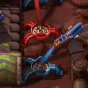 cable ?
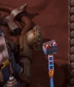 new battery ?
 cable ?
 new battery ?
Re: Friday Facts #419 - Display Panel & Inserter pickup fixes
According to online translation, the Czech word for "map" seem to be "mapa". I had to verify because i found it interesting and i have nothing else to do, in french it's "carte" for "map" which is also the word used for "cards". it come from latin "carta" like the "magna carta" also sometimes refered to as magna charta they say on wikipedia.Necandum wrote: Fri Jul 12, 2024 3:50 pm Re: map vs. chart, it might be a linguistic thing: numerous eastern European languages have something similar to 'karta' to mean map, from the German. Czech might be similar. Thus chart may the more natural seeming English translation, even though map is currently preferred.
I had always thought "map" was coming from german but no ! i found online it's said to come from latin "mappa mundi" translating as "map of the world" and in that origin "map" was used to describe the cloth/napkin on which the "world" was drawn.
Sorry for all that newly acquired pedantry
Yes it is still there, and sometimes i still try to do things from map view not realizing i'm in map view because those "aren't visible enough". I too hope those are rework for something that would be more visible than intentionnal blur, probably no longer necessary if the overall look of the map view makes it more obvious we are in map view with useful pannel of train/logistic information rather than "lost space". I can't tell if you are correct saying that this was already announced, i wish you aremorsk wrote: Fri Jul 12, 2024 3:59 pm Am I correct that Remote View removes the ugly scanline "vignette" currently on the map view? (I hacked the shader to remove it years ago, so actually I have no idea if it still exists. But I assume it isn't gone yet.) This would be a trend of removing things that are ugly for no reason. I appreciate it.
Maybe, when i saw it i thought of fabrics, the kind of which you'd dip in resin and then let it dry to mold some particular shape , but then cable makes more sense in Factorio maybe.Still it look like fabrics to me
Re: Friday Facts #419 - Display Panel & Inserter pickup fixes
I have to emphasize this. My first thought upon seeing "Show in chart" was to expect some sort of integration with the graphs in the "Production statistics" window to e.g. display alerts about some resource being low. The existing terminology everywhere else in the game is "Map," from the default shortcut key being M for "Toggle world map", the tooltip shown on mouseover, "Ping a map location," etc.Daneel_ wrote: Fri Jul 12, 2024 3:12 pmI thought this would be the first comment, honestly. “Show in chart” immediately makes me think I can somehow make the output appear as some kind of graph. “Show on map” is a much better description in my opinion.alefu wrote: Fri Jul 12, 2024 2:37 pm Great changes, as always! But why is it called "Show in chart" and not "Show on map"?
Last edited by Therax on Fri Jul 12, 2024 5:18 pm, edited 1 time in total.
Miniloader — UPS-friendly 1x1 loaders
Bulk Rail Loaders — Rapid train loading and unloading
Beltlayer & Pipelayer — Route items and fluids freely underground
Bulk Rail Loaders — Rapid train loading and unloading
Beltlayer & Pipelayer — Route items and fluids freely underground
Re: Friday Facts #419 - Display Panel & Inserter pickup fixes
Yeah at first i thought the same thing .. some sort of fabric comb ... but being bactorio and the resulting item looks like a battery...
i can see it as some sort of copper rod with cables in a coil.. like some magnet
-
dragon_gawain
- Long Handed Inserter

- Posts: 81
- Joined: Sun Dec 19, 2021 11:37 pm
- Contact:
Re: Friday Facts #419 - Display Panel & Inserter pickup fixes
Two thoughts:
1. It would be nice if the on map/alt display text had some sort of symbol to let me (and others) know that there was more text that can be seen upon hovering over/opening the display panel.
2. That extension speed buff... I'm wondering how it'll effect Bob's custom inserters where you can have an inserter pick up from two tiles away, but drop off only one tile away.
As always, great stuff! Excited for everything to come!
Edit: After reading through pretty much all the other comments and noticing a few people saying stuff about how it would be nice if the display ports were bigger, I offer this solution (and I apologize in advance, cause it'll prolly be hell to code if you go with this idea):
If you place display ports directly next to each other, the display faces combine into one larger display area.
(more practical solution would be to prolly just add in another tech for like, 'larger display ports' and unlock a 2x2 and 3x3 display port or something like that, but I wanted to toss out the idea of nxm sized ports created just by sticking them next to each other)
Re: Friday Facts #419 - Display Panel & Inserter pickup fixes
On showing quantities, something like may be a good fit from the user side (compared to existing in rich text). Though of course I don't know if you can get at the numbers easily from the engine side.
Code: Select all
[signal=iron-plate]Code: Select all
[item=iron-plate]Re: Friday Facts #419 - Display Panel & Inserter pickup fixes
If only there was a mod to take ideas from...
Seriously, why no segmented displays and numbers? Seems like a no-brainer.
Seriously, why no segmented displays and numbers? Seems like a no-brainer.


