
Mockup of proposal:
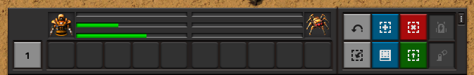
Ideally the bars would also have little icons to state what they represent (plus symbol for health, for instance).
Not sure how it should look in various situations that would not result in bars, but I would assume:
- No armour that takes modules (only HP bar for character)
- Not in a vehicle (character bars take up full width?)
- Vehicle doesn't take modules (same as player)
- Player/Vehicle takes modules, but no armour/battery (always empty?)
- Player cannot die (HP bar always full?)
These bars could also instead be above the appropriate UI block that 1.1 adds for the character and their current vehicle (if any), which in 1.0 is either the character or vehicle sitting bottom-right.


