Friday Facts #290 - Rail building changes & High-res icons
Re: Friday Facts #290 - Rail building changes & High-res icons
After I told about the 64px icons, our humble overhaul projects artist just died a little bit inside.
About 1000 times to be exact.
About 1000 times to be exact.
-
OutOfNicks
- Inserter

- Posts: 25
- Joined: Sat Dec 03, 2016 9:34 pm
- Contact:
Re: Friday Facts #290 - Rail building changes & High-res icons
That's why you always make resources at 2x or 4x target resolution to be prepared for future change in use. :3Patus wrote: Fri Apr 12, 2019 7:55 pm After I told about the 64px icons, our humble overhaul projects artist just died a little bit inside.
About 1000 times to be exact.
-
Uristqwerty
- Inserter

- Posts: 20
- Joined: Tue May 06, 2014 8:00 pm
- Contact:
Re: Friday Facts #290 - Rail building changes & High-res icons
So players may care about 5 bits of rail configuration
- Place ghosts
- Destroy trees
- Destroy rocks
- Destroy cliffs
- Use landfill
and this change reduces the available configurations, in order to simplify the input mode. Would it be reasonable to let the player customize the behaviour of shift and non-shift rail building in the options? Or have a blueprint-like item for placing with a non-default configuration?
Re: Friday Facts #290 - Rail building changes & High-res icons
also much appreciated would be a function to set a size to a minimap icon because sometimes you want to mark a structure maybe mall with 1 icon but this is sooo large on minimap view that it covers the whole region tbh
Re: Friday Facts #290 - Rail building changes & High-res icons
To be honest, sprite popping/resolution change with draw size is such a common sight in games that I hardly notice it anymore. Especially when deliberately zooming in/out in discrete steps, my eyes take like half a second to adjust to the new picture anyway and only if I really look for an imperfect transition I manage to actually spot them. Sooo, I know you are perfectionists, but investing work into crossfades seems like taking it a little bit too far. 
-
zebediah49
- Fast Inserter

- Posts: 122
- Joined: Fri Jun 17, 2016 8:17 pm
- Contact:
Re: Friday Facts #290 - Rail building changes & High-res icons
As much as I actually prefer the key-based modal version, I think this is the best option available.Uristqwerty wrote: Fri Apr 12, 2019 8:37 pm So players may care about 5 bits of rail configuration
- Place ghosts
- Destroy trees
- Destroy rocks
- Destroy cliffs
- Use landfill
and this change reduces the available configurations, in order to simplify the input mode. Would it be reasonable to let the player customize the behaviour of shift and non-shift rail building in the options? Or have a blueprint-like item for placing with a non-default configuration?
I often want to be able to build rails entirely avoiding trees.. but sometimes that's unavoidable. In those cases though, I usually want to at least avoid cliffs.
Having a rail planner that, like the other planners, would let me choose what types of entities to destroy, would be excellent.
I would also add that players potentially care about additional pieces too: signals, power poles, concrete, lights, etc. I don't know exactly how it would work, but a cross between FARL and the rail planner would be super amazing: you could blueprint down a 4-lane rail line, with auto-routing around water and factory bits, if you so desired.
- BattleFluffy
- Fast Inserter

- Posts: 215
- Joined: Sun Mar 31, 2019 4:58 pm
- Contact:
Re: Friday Facts #290 - Rail building changes & High-res icons
Thanks for the insight once again to the dev process :>
I love the look of those assembling machine icons! But I agree the 3 interlocking gears look a little bit jarring. In the interest of looking more mechanically realistic, perhaps one of the gears could be on top of the other two, as if it is on a different axle rod, and not interlocking with the other two gears but instead adjacent and slightly overlapping them. Sort of like these gears here:
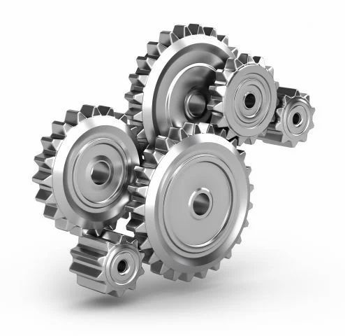
Another possibility would be a set of planetary gears, which imho is the coolest looking configuration of gear wheels. :>
I love the look of those assembling machine icons! But I agree the 3 interlocking gears look a little bit jarring. In the interest of looking more mechanically realistic, perhaps one of the gears could be on top of the other two, as if it is on a different axle rod, and not interlocking with the other two gears but instead adjacent and slightly overlapping them. Sort of like these gears here:

Another possibility would be a set of planetary gears, which imho is the coolest looking configuration of gear wheels. :>
Re: Friday Facts #290 - Rail building changes & High-res icons
Blueprint Extensions now has a "Add landfill to every tile of this blueprint that needs it" option, if you want to try it out.Philip017 wrote: Fri Apr 12, 2019 6:43 pm on a side note, still waiting for the shift click build over water, hey robots can place landfill now, why can't they do with shift click method and also placing blueprints with shift click.
Disclaimer: I'm the author, self-horn-tooting is happening.
- Omnifarious
- Filter Inserter

- Posts: 286
- Joined: Wed Jul 26, 2017 3:24 pm
- Contact:
Re: Friday Facts #290 - Rail building changes & High-res icons
I could get behind some sort of planner thing. Partly because I think it would be really useful to be able to do parallel rails and things, but making that work is really complex, and about the only way it could ever work is with some sort of blueprint-like object that let you configure what you were trying to do.zebediah49 wrote: Fri Apr 12, 2019 9:56 pm As much as I actually prefer the key-based modal version, I think this is the best option available.
I often want to be able to build rails entirely avoiding trees.. but sometimes that's unavoidable. In those cases though, I usually want to at least avoid cliffs.
Having a rail planner that, like the other planners, would let me choose what types of entities to destroy, would be excellent.
I would also add that players potentially care about additional pieces too: signals, power poles, concrete, lights, etc. I don't know exactly how it would work, but a cross between FARL and the rail planner would be super amazing: you could blueprint down a 4-lane rail line, with auto-routing around water and factory bits, if you so desired.
It adds a lot of complexity though. :-/ But, given my frustration, and the things I read people write about cliffs (and realize they're right about), it makes a lot of sense to have a way to configure this that isn't a bunch of toggles in the gameplay settings. Because it isn't a game-wide thing. It's something that changes depending on what you're trying to do and what technologies and materials you have available to you.
I must say that I'm not fond of FARL though.
-
azurill_used_splash
- Burner Inserter

- Posts: 6
- Joined: Fri Mar 01, 2019 5:11 am
- Contact:
Re: Friday Facts #290 - Rail building changes & High-res icons
One thing about the icons that's jarring for me is that many of them become confusing, especially when you're using the entity as the icon. I posted in another thread that the steel chest and the grey assembler 1 were simply too much alike, causing mis-clicks and visual confusion.
I think the idea of using high-res symbolic icons is a good one, *BUT*, great care needs to be taken to make sure that each of those icons strikes most players differently, and if you have two conflicting icons, or one icon and one entity bitmap that are conflicting, one of those needs to change.
Using the example given of the big transmission power pole, it strikes me that the symbolic icon will be confused with the rail item. Is that in .17.30? I'll try it and see if so.
-- Edit --

Power poles, assemblers, and chests on the quickbar, sized at 100%. The default 75% was giving me a headache. Right away, even scaled up, there's far too much visual similarity between the items. If you know what you're looking for, you can tell them apart, but you have to actually look at them and come to a decision that an icon is one or the other.
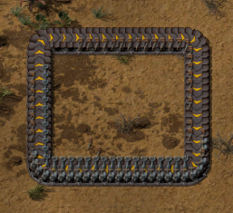
Here are the three steel power items on a belt at a reasonable zoom. It's almost impossible to pick them apart. That little blob of orange at the top of the medium pole and the blob of grey near the bottom of the substation are really the only visual clues you have.
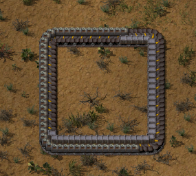
The forementioned steel chests and grey assemblers. Aghghgh!
The problem is very simple. There are too many items that are simply different shades and tints of grey on top of other grey items or backgrounds, in the case of the quickbar.
Colorblind engineers, is this a big a problem for you as it is for me?
I humbly suggest involving much more color in those icons. In the case of the grey assembler, I suggest a more radical change, one that may not be popular, but I think will help a lot with this particular headache. Make Assembler 1 yellow, or give it yellow hazard stripes. Make assembler 2 red, or give it a red pattern that's different from hazard stripes. Then make assembler 3 dark blue (much darker than the current assembler 2) or give it a blue pattern. This accomplishes a few different things: You remove 'grey' from the menu of assemblers. You avoid the most common red/green colorblindness situation. You also make assemblers consistent with belts. Yellow == Medium, Red == Fast, Blue == Express.
I think the idea of using high-res symbolic icons is a good one, *BUT*, great care needs to be taken to make sure that each of those icons strikes most players differently, and if you have two conflicting icons, or one icon and one entity bitmap that are conflicting, one of those needs to change.
Using the example given of the big transmission power pole, it strikes me that the symbolic icon will be confused with the rail item. Is that in .17.30? I'll try it and see if so.
-- Edit --

Power poles, assemblers, and chests on the quickbar, sized at 100%. The default 75% was giving me a headache. Right away, even scaled up, there's far too much visual similarity between the items. If you know what you're looking for, you can tell them apart, but you have to actually look at them and come to a decision that an icon is one or the other.

Here are the three steel power items on a belt at a reasonable zoom. It's almost impossible to pick them apart. That little blob of orange at the top of the medium pole and the blob of grey near the bottom of the substation are really the only visual clues you have.

The forementioned steel chests and grey assemblers. Aghghgh!
The problem is very simple. There are too many items that are simply different shades and tints of grey on top of other grey items or backgrounds, in the case of the quickbar.
Colorblind engineers, is this a big a problem for you as it is for me?
I humbly suggest involving much more color in those icons. In the case of the grey assembler, I suggest a more radical change, one that may not be popular, but I think will help a lot with this particular headache. Make Assembler 1 yellow, or give it yellow hazard stripes. Make assembler 2 red, or give it a red pattern that's different from hazard stripes. Then make assembler 3 dark blue (much darker than the current assembler 2) or give it a blue pattern. This accomplishes a few different things: You remove 'grey' from the menu of assemblers. You avoid the most common red/green colorblindness situation. You also make assemblers consistent with belts. Yellow == Medium, Red == Fast, Blue == Express.
Last edited by azurill_used_splash on Fri Apr 12, 2019 11:08 pm, edited 2 times in total.
Re: Friday Facts #290 - Rail building changes & High-res icons
Yeah, current rail building is not ideal. But, instead of bringing in another mod (FARL), you remove options, which ruins rail building in the early game (especially in slow-research options like marathon / deathworld). Why ruin? Currently you can use planner in early game. Now you won't be able to, because it will path in a way that makes you kill tons of trees (and remove ghosts in the process, yay), or worse, go through cliffs.
And for me personally this is terrible change as I rotate counter-clockwise a lot when using planner (now impossible?), and tend to avoid destroying trees / cliffs for many reasons.
Please don't turn Factorio into Google "remove all options for sake of dumb simplicity" product.
And for me personally this is terrible change as I rotate counter-clockwise a lot when using planner (now impossible?), and tend to avoid destroying trees / cliffs for many reasons.
Please don't turn Factorio into Google "remove all options for sake of dumb simplicity" product.
Re: Friday Facts #290 - Rail building changes & High-res icons
I hope that even if multiple icon variations are adopted for vanilla items, the functionality will be retained to use just a single icon and scale at runtime.Patus wrote: Fri Apr 12, 2019 7:55 pm After I told about the 64px icons, our humble overhaul projects artist just died a little bit inside.
About 1000 times to be exact.
Miniloader — UPS-friendly 1x1 loaders
Bulk Rail Loaders — Rapid train loading and unloading
Beltlayer & Pipelayer — Route items and fluids freely underground
Bulk Rail Loaders — Rapid train loading and unloading
Beltlayer & Pipelayer — Route items and fluids freely underground
Re: Friday Facts #290 - Rail building changes & High-res icons
I like the idea of being able to start the rail planner without placing a rail first, but please keep the ability to connect to an existing rail too. Especially on the diagonals and curves it can be difficult to eyeball a connection, so being able to explicitly continue an existing rail will remain desirable.
On the rail mode change, I don't personally mind the loss of the obstacle-avoiding ghost mode, but the way it interacts with default keybinding to make it impossible to rotate the end of a ghost rail clockwise is seriously annoying. Especially since rails goes in 45° steps; you might need to press R seven times to get the right facing.
I'll probably end up rebinding rotate somehow, but the way it works currently is not what I'd call reasonable default behavior.
Re: Friday Facts #290 - Rail building changes & High-res icons
I may be partial to the fact i play with very few cliffs or none at all, so destroying them is no biggie for me, i haven't found a good reason to have lots of them, mainly because i like to build on a very large scale and they tend to only spawn nicely at the spawn point, where my base is gona be. if i built very small and had small but very rich resources i could get away with the way they spawn, but for me i need 8 lanes of copper, 6 iron and 4 steel, 4 electronic circuits, advanced circuits, processors, batteries, coal, stone, solid, bricks, plastic and lube. and that much belt bus means all the cliffs have to go away.
now for a base my size the only cliffs that spawn out in the open then become those around water, and they don't make a good enough choke point compared to just water imo. i end up just making water high and the choke points that are naturally formed get the lasers and walls, with outpost defense rail stop, or i clear the biters from my pollution zone with enemy expansion turned off.
as for the rail planner i have blueprints i use for the bulk of my planning out side of my main base, but in my base i want clear land, no trees, no cliffs, no water except where oil and power is. so when i am starting with the rails having to switch back and forth from building and planning gets annoying quick, once i have mk2 power armor and fast robots, it's sit in the train and let the robots do all the work, when they are slow and i have only modular armor, i build the bulk of it and this change is extremely helpful for that time period.
as for the rare occasion that people are trying to plan around the trees and cliffs, it perhaps could be optional (a check in the options) to enable tapping of shift to turn the planner into ghost building, thus not chopping the trees and demoing the cliffs. but i believe that the occasion for these will be rare, especially since i never use them, i just clear the trees, rocks and cliffs, and prefer straight rails as much as possible.
but for reals, i would like to be able to hold shift and place any entity, or blueprint and have the robots place the landfill before building. i mean i can already copy and paste land, and the robots will fill in the water for me, so i don't see why i can't do the same with entities.
Thanks again for making this awesome game.
Re: Friday Facts #290 - Rail building changes & High-res icons
Yeah this is a bit of an annoyance for me too. I like the idea of the new change, but I do find it a little awkward that it now always rotates one way.werelord wrote: Fri Apr 12, 2019 7:15 pm The change to rails, while nice, annoys me a bit..
I like to force a direction for the rails to face before placing them by using the rotate function.. however with this change, being forced to hold down shift allows me to rotate only in one direction (counter-clockwise), as is normal holding shift+"r".. Normally releasing shift and pressing "r" would rotate clockwise, but with this change releasing shift disables the ghost planner completely, not allowing me to rotate at all..
Funny thing is, for ages after I started playing I didn't realise that you didn't need to hold shift down when in rail planner mode. I always held shift down as long as I was planning rails, and just assumed couldn't rotate both directions in this mode. Finally I actually tested it and realised I didn't need to keep holding shift, and so finally I could do a normal R/Shift-R to rotate either way. Which I was really pleased about.
So it's a bit of a shame that with the new mode, I can't again
Yeah maybe something like this. And/or change the toggle key from shift to control, if it's not too late in the day for such a change?werelord wrote: Fri Apr 12, 2019 7:15 pm Perhaps stay locked in ghost planner (rail builder) once entering that mode, rather than having to keep holding shift to stay in that mode?
So either Control is held in place of Shift, or Control is used as an/off toggle (no need to hold), which would be my preference. Either would free up shift and allow R/shift-R to select either rotation.
Yeah some kind of planner would be awesome. And in general I agree that ideally there needs to be a way to configure these options. Even just a default mode in Settings->Interface "Remove environmental entities in Rail Planner" / "Don't" would be better than nothing, as an interim measure at least.zebediah49 wrote:As much as I actually prefer the key-based modal version, I think this is the best option available.
I often want to be able to build rails entirely avoiding trees.. but sometimes that's unavoidable. In those cases though, I usually want to at least avoid cliffs.
Having a rail planner that, like the other planners, would let me choose what types of entities to destroy, would be excellent.
Cliffs seem especially problematic before the user has cliff explosives. It's going to make it hard to route around cliffs, which have to be avoided until the user has a means of destroying them. So some of the automation of the planner will potentially be lost if the user has to manually ensure cliffs are routed around rather than going straight through them, as the rail planner will now always do by default.
Though I suppose that particular problem can be resolved if the planner was smart enough to not set deconstruction orders for cliffs before the user had access to explosives, and instead route around in that situation.
But I can still see people wanting to choose for themselves as to the removal of environmental entities, so hopefully some compromise can be found.
-
IronCartographer
- Filter Inserter

- Posts: 464
- Joined: Tue Jun 28, 2016 2:07 pm
- Contact:
Re: Friday Facts #290 - Rail building changes & High-res icons
Omnifarious wrote: Fri Apr 12, 2019 7:32 pmAdditionally, this does not create parity with ghost buildings. With ghost buildings, you have to hold shift to get item destruction. Otherwise, it doesn't let you place the blueprint. That's not the same behavior as what you've done with the rail planner in which item destruction is the default behavior.
The rail planner confusion comes in with the distinction between ghost (aka rail planner) mode and item placement mode. Rails are the only thing that has a sort of 'ad-hoc' large scale 'blueprinting' ability. And so, in many ways, rail planning ghost mode is like, but also not like a blueprint placement. I don't think it's possible to make the features comparable because they are different in a couple of important ways.
I must agree. It was not my intent to inspire such zealous streamlining. The FFF where the rail planner was demonstrated for the first time makes a big deal about how it avoids trees, no less!
This is reminding me of when kovarex said he was fixing a bug with the electrical network and ended up removing the functionality entirely, forcing an ugly hack in the Induction Charging mod to re-create dynamic input power for a single-prototype power-tap.
It's great to have things clean and simple, but sometimes the losses affect more people than you realize as well.
Last edited by IronCartographer on Fri Apr 12, 2019 11:05 pm, edited 1 time in total.
Re: Friday Facts #290 - Rail building changes & High-res icons
Hi. Coming from reddit.
My biggest issue with Factorio is, output and module icons (alt-mode) on assemblers are blurry and make my eyes hurt after a while. I think all icons have the same resolution but have different sizes (I'm playing the latest stable version).
If higher res icons are coming I would be delighted.
My biggest issue with Factorio is, output and module icons (alt-mode) on assemblers are blurry and make my eyes hurt after a while. I think all icons have the same resolution but have different sizes (I'm playing the latest stable version).
If higher res icons are coming I would be delighted.
Re: Friday Facts #290 - Rail building changes & High-res icons
Why not use a toggle feature that switch between normal and planner mod with cap lock if you like this area (and because we couldn't be able to rotate counter clockwise is this uses shift, even if I have some doubts about people using the counter clockwise rotation)
Also, passing through all the trees and cliffs... Why ? Why suppressing this tool ? And why do you hate theses powerful defenses that provides a complete protection against bitters ?
Also, passing through all the trees and cliffs... Why ? Why suppressing this tool ? And why do you hate theses powerful defenses that provides a complete protection against bitters ?
-
MageKing17
- Long Handed Inserter

- Posts: 66
- Joined: Thu Jun 01, 2017 6:52 pm
- Contact:
Re: Friday Facts #290 - Rail building changes & High-res icons
For me, personally... less of a problem, because I'm more used to differentiating by shape than color. Steel chests and basic assemblers look completely different to me, ditto substations and large power poles... my problem is that the medium poles look invisible, not indistinguishable.azurill_used_splash wrote: Fri Apr 12, 2019 10:18 pm Colorblind engineers, is this a big a problem for you as it is for me?
