Cursor placement in "Select a signal"

Post your ideas and suggestions how to improve the game.

Moderator: ickputzdirwech

Byproduct
Inserter
Inserter
Posts: 21
Joined: Sat Dec 08, 2018 9:42 pm
Contact:

Typing combinator values faster

Post by Byproduct »

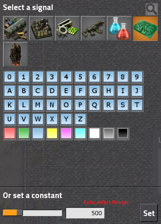
Sometimes I have to input many values in combinators. It'd be nice if I could just start typing after clicking on the combinator or on condition screen. Currently I have to hit the typing box ("or set a constant") with the mouse first. If that one could be auto-selected, it'd be sweet.

Sorry if this was already suggested somewhere, didn't find it using search.
Image
User avatar
Ingolifs
Long Handed Inserter
Posts: 81
Joined: Fri Mar 17, 2017 3:18 am
Contact:

Re: Typing combinator values faster

Post by Ingolifs »

Yes, this is a pain to do manually. Also i'm often taken off-guard when you try to delete the preset number and it won't let you, and you end up typing one too many zeros.
User avatar
Optera
Smart Inserter
Smart Inserter
Posts: 2920
Joined: Sat Jun 11, 2016 6:41 am
Contact:

Re: Typing combinator values faster

Post by Optera »

+1
One of those small things you don't notice until someone spells it out, but keep noticing afterwards.

On the same note I'd like to confirm entering values by pressing enter.
Koub
Global Moderator
Global Moderator
Posts: 7784
Joined: Fri May 30, 2014 8:54 am
Contact:

Re: ui-qol: combinator constant input field pre-select

Post by Koub »

[Koub] Merged into older topic with same suggestion
8-)
Such a good idea HAD to have been already suggested :mrgreen:
Koub - Please consider English is not my native language.
Pi-C
Smart Inserter
Smart Inserter
Posts: 1732
Joined: Sun Oct 14, 2018 8:13 am
Contact:

Re: Cursor placement in "Select a signal"

Post by Pi-C »

I have an additional suggestion, although it does not really fit under this topic as it's not about typing but selecting values by using the slider: Currently, the slider works only for values >0. Would it be possible to let the slider work for negative values as well? Of course, I could use the slider to choose a positive value and manually insert a minus sign before it. But that's where the old cat-mouse-problem comes into play. :-)

Why would I want to insert values with the mouse at all when typing it in would be so much faster and more precise? Well, sometimes the cat (pet) gets comfy on my lap and obstructs movement of the one hand, while the other one is occupied with the mouse (device). Typing in values means I have not only to let go of the mouse, but I'm also forced to make awkward movements because I have to type one-handed. It would be so much easier if I could use the slider!

Also, once there is a value >0, you can't use the slider to set it to 0 again -- it will only accept values of 1 or greater. So, being able to set negative values with the mouse would also make it possible to reset the it to 0.
A good mod deserves a good changelog. Here's a tutorial (WIP) about Factorio's way too strict changelog syntax!
Sad_Brother
Fast Inserter
Fast Inserter
Posts: 209
Joined: Mon Jan 08, 2018 4:54 pm
Contact:

Re: Cursor placement in "Select a signal"

Post by Sad_Brother »

Pi-C wrote: Tue Dec 18, 2018 12:50 pm Well, sometimes the cat (pet) gets comfy on my lap and obstructs movement of the one hand, while the other one is occupied with the mouse (device).
:D
Just give your pet other device to play.
Or play with the pet yourself leaving device to rest.
Best wishes!
quyxkh
Smart Inserter
Smart Inserter
Posts: 1031
Joined: Sun May 08, 2016 9:01 am
Contact:

Re: Cursor placement in "Select a signal"

Post by quyxkh »

Of all the QoL tweaks, this is the one I want most.

I get that you can still use keystrokes for movement, you can bring up a combinator panel while still being able to run and fire and whatnot, and that's really handy too, but specifically the digits and +/- "should", in my view, be hijacked for value input in this specific case. The way it works now is one of the low-grade annoyances in an otherwise impressive ui flow.
Byproduct
Inserter
Inserter
Posts: 21
Joined: Sat Dec 08, 2018 9:42 pm
Contact:

Re: ui-qol: combinator constant input field pre-select

Post by Byproduct »

Koub wrote: Mon Dec 17, 2018 7:56 pm [Koub] Merged into older topic with same suggestion
Ah, there it is. Missed it. Thanks for the merge!
l1ng0
Burner Inserter
Burner Inserter
Posts: 10
Joined: Sat Jul 07, 2018 11:51 am
Contact:

Auto-focus numeric-input elements in GUI

Post by l1ng0 »

Please auto-focus numeric-input elements in the GUI

I find myself using far more clicks than I would like to with the GUIs. This is particularly true for the circuit GUIs.
I would love it if you can make the numeric-input controls auto-focus for the arithmetic and comparison combinators. (potato-quality) Screenshot attached.
If an item is selected, then it will use the item, otherwise I can just type numbers and press enter. A lot less clicking in the long run.

A great game, thanks! I've given it as a gift to friends.

Apologies if this has already been requested, the forum search seems to be very simplistic and I couldn't find a similar request.
Attachments
Auto-focus this box
Auto-focus this box
Desktop 1_009-thumb.jpg (20.25 KiB) Viewed 6069 times
CJ5Boss
Fast Inserter
Fast Inserter
Posts: 130
Joined: Thu Apr 05, 2018 11:55 pm
Contact:

Re: Auto-focus numeric-input elements in GUI

Post by CJ5Boss »

I would like this feature as well, good suggestion.
Koub
Global Moderator
Global Moderator
Posts: 7784
Joined: Fri May 30, 2014 8:54 am
Contact:

Re: Cursor placement in "Select a signal"

Post by Koub »

[Koub] Merged into older topic with same suggestion
Koub - Please consider English is not my native language.
User avatar
provet
Fast Inserter
Fast Inserter
Posts: 133
Joined: Thu Feb 12, 2015 9:49 pm
Contact:

Re: Cursor placement in "Select a signal"

Post by provet »

1+

Was just about to suggest it myself. Been thinking of suggesting it for a long time just to find out that it has already been :)
Koub
Global Moderator
Global Moderator
Posts: 7784
Joined: Fri May 30, 2014 8:54 am
Contact:

Re: Cursor placement in "Select a signal"

Post by Koub »

provet wrote: Tue Mar 05, 2019 9:26 pm 1+

Was just about to suggest it myself. Been thinking of suggesting it for a long time just to find out that it has already been :)
Almost everything has already been ^^ I don't see genuine new suggestions often.
And I'm thankful you searched :mrgreen:
Koub - Please consider English is not my native language.
ikarikeiji
Long Handed Inserter
Posts: 98
Joined: Sun Jul 12, 2015 6:28 pm
Contact:

Re: ui-qol: combinator constant input field pre-select

Post by ikarikeiji »

JohnyDL wrote: Tue Oct 03, 2017 9:32 pm
nljr wrote:Automatically selecting the first required field is just good UI form design. This is basic stuff.

At worst, a Tab should take you to that field.
it's not a required field, it's not in a form, tab changes weapon. But if it was a web doc not a game I would agree on all 3 points
Why not just add an extra keybind to cycle between available text boxes and "no text box". Players can then easily bind this to tab or whatever other (non-typing) key they want.

Then it's a case of, click somewhere to open the "select signal" gui, press tab (or whatever), then type the number. And has the additional advantage that if you need to "de-focus" some text box you can tab away from it back to having no text box in focus.
Darinth
Filter Inserter
Filter Inserter
Posts: 323
Joined: Wed Oct 17, 2018 12:17 pm
Contact:

Re: ui-qol: combinator constant input field pre-select

Post by Darinth »

ikarikeiji wrote: Wed Mar 06, 2019 6:51 am
JohnyDL wrote: Tue Oct 03, 2017 9:32 pm
nljr wrote:Automatically selecting the first required field is just good UI form design. This is basic stuff.

At worst, a Tab should take you to that field.
it's not a required field, it's not in a form, tab changes weapon. But if it was a web doc not a game I would agree on all 3 points
Why not just add an extra keybind to cycle between available text boxes and "no text box". Players can then easily bind this to tab or whatever other (non-typing) key they want.

Then it's a case of, click somewhere to open the "select signal" gui, press tab (or whatever), then type the number. And has the additional advantage that if you need to "de-focus" some text box you can tab away from it back to having no text box in focus.
I don't actually see a benefit to this over just having the field highlighted by default. There's no other text boxes in that form. Everything else is best controlled by the mouse. "Open select signal gui, type number, press enter to confirm" is the fastest workflow for setting a constant and utilizing this workflow wouldn't be any kind of a hindrance to any other game activities.
JohnyDL
Filter Inserter
Filter Inserter
Posts: 535
Joined: Fri May 16, 2014 3:44 pm
Contact:

Re: Cursor placement in "Select a signal"

Post by JohnyDL »

Given that my original problem with this idea is I don't want my keyboard to rebind and do funny things outside of my control in a game at any point (even more so where biters are involved) and there are good reasons for not doing it beyond just my personal preference (accessibility being the biggest, consistent UX being the next which is something they've worked on a lot with 0.17)

So I'd say a keyboard shortcut might be a good compromise. I don't think tab since swapping weapons is that button one scenario I want to avoid is a biter to coming at me while I'm in a menu, I hit tab to change to my SMG from my Nukes and then not bing able to shoot cause I'm in a text box holding space, then eventually realising that and exiting out only to not realise I'm still on Nukes with my weapons and blow myself up. If it's configurable that'd be good, shift+E might be good for me since it's going deeper into a menu and E is coming out of a menu, would also be usable as a shortcut to search and in other places in the game but that might not be the right choice for everyone, if it's a keyboard option it can be rebound or even turned off.

I'd much rather have this than auto snapping.
ikarikeiji
Long Handed Inserter
Posts: 98
Joined: Sun Jul 12, 2015 6:28 pm
Contact:

Re: ui-qol: combinator constant input field pre-select

Post by ikarikeiji »

Darinth wrote: Wed Mar 06, 2019 1:53 pm
ikarikeiji wrote: Wed Mar 06, 2019 6:51 am
JohnyDL wrote: Tue Oct 03, 2017 9:32 pm
nljr wrote:Automatically selecting the first required field is just good UI form design. This is basic stuff.

At worst, a Tab should take you to that field.
it's not a required field, it's not in a form, tab changes weapon. But if it was a web doc not a game I would agree on all 3 points
Why not just add an extra keybind to cycle between available text boxes and "no text box". Players can then easily bind this to tab or whatever other (non-typing) key they want.

Then it's a case of, click somewhere to open the "select signal" gui, press tab (or whatever), then type the number. And has the additional advantage that if you need to "de-focus" some text box you can tab away from it back to having no text box in focus.
I don't actually see a benefit to this over just having the field highlighted by default. There's no other text boxes in that form. Everything else is best controlled by the mouse. "Open select signal gui, type number, press enter to confirm" is the fastest workflow for setting a constant and utilizing this workflow wouldn't be any kind of a hindrance to any other game activities.
The rebuttal to this was already posted:
JohnyDL wrote: Sat Sep 30, 2017 9:08 pm when you click on an entity be it a chest or combinator you can continue to use your WSAD and hot keys if you want by snapping to a text box E to Exit the inventory space or the selector wouldn't work, you're also putting in the input of an item's quantity before selecting the item in your ordering.
The game *cannot* justify auto focusing a field that disables most of the game's controls. Focusing has to be an explicit action by the user. And it is only one extra key press, you would quickly get used to typing it before your number.
Darinth
Filter Inserter
Filter Inserter
Posts: 323
Joined: Wed Oct 17, 2018 12:17 pm
Contact:

Re: ui-qol: combinator constant input field pre-select

Post by Darinth »

ikarikeiji wrote: Thu Mar 07, 2019 1:00 pm
Darinth wrote: Wed Mar 06, 2019 1:53 pm ...
The rebuttal to this was already posted:
JohnyDL wrote: Sat Sep 30, 2017 9:08 pm when you click on an entity be it a chest or combinator you can continue to use your WSAD and hot keys if you want by snapping to a text box E to Exit the inventory space or the selector wouldn't work, you're also putting in the input of an item's quantity before selecting the item in your ordering.
The game *cannot* justify auto focusing a field that disables most of the game's controls. Focusing has to be an explicit action by the user. And it is only one extra key press, you would quickly get used to typing it before your number.
1. In this particular instance I actually can and would justify disabling the game's other controls. By clicking the selector, you'd be acknowledging that the other controls will be disabled while you select a signal or input a constant, an action that would take tiny amounts of time if this change were implemented. However...

2. Since the field is strictly a numeric field there's no reason to disable most of the game's controls. The text box needs to intercept numeric keypresses, everything else should ideally remain usable.
JohnyDL
Filter Inserter
Filter Inserter
Posts: 535
Joined: Fri May 16, 2014 3:44 pm
Contact:

Re: ui-qol: combinator constant input field pre-select

Post by JohnyDL »

Darinth wrote: Thu Mar 07, 2019 1:50 pm 1. In this particular instance I actually can and would justify disabling the game's other controls. By clicking the selector, you'd be acknowledging that the other controls will be disabled while you select a signal or input a constant, an action that would take tiny amounts of time if this change were implemented. However...

2. Since the field is strictly a numeric field there's no reason to disable most of the game's controls. The text box needs to intercept numeric keypresses, everything else should ideally remain usable.
Except
1: How do new users know this the first time they interact with the thing? opt in is only opt in so long as you know, if they don't know then they think that their controls being taken away is a bug
2:
JohnyDL wrote: Sun Oct 01, 2017 4:24 pm I think maybe I need to explain it in a better way

Snapping even a limited number of keys away from their default uses without warning or explanation or an obvious way to undo it in a panic is bad UI design. Since all the keys can be remapped you don't know that everyone uses the number keys the same way you do, someone using the numpad for their primary controls to me seems an obvious, and valid, alternative to WSAD and E you don't but it doesn't mean nobody does.

In UI design consistency is important so as not to disorientate new users and screw up their User Experience, if you snap to a box in one place then you should snap to a box in all places that have similar apearances. In this case snapping to a slider with a number attached would be applicable in requester chests as well but the hot bar keys already have uses there, and the snapping there is ambiguous, if there are 8 items being requested which one gets the benefit of the snapping feature, and what does that mean if there are no items being requested?

In your own inventory there is a slider for trash slots and requesting while the hot bar keys can be used to assign items to the toolbar.

In trains there are sliders and numbers attached too, but not in all cases how do you provide a consistent and pleasant UI in that example?

But if you're snapping to text boxes why not the names of blueprints? or search functions?
Darinth
Filter Inserter
Filter Inserter
Posts: 323
Joined: Wed Oct 17, 2018 12:17 pm
Contact:

Re: ui-qol: combinator constant input field pre-select

Post by Darinth »

JohnyDL wrote: Thu Mar 07, 2019 2:17 pm 1: How do new users know this the first time they interact with the thing? opt in is only opt in so long as you know, if they don't know then they think that their controls being taken away is a bug
The first time they interact with the thing, they'd learn. Especially since most of their controls are still perfectly functional, it's a trade-off, and one that I think in excess of 99% of players come away on top. Standard keys to escape from dialogs still function perfectly fine. This dialog is in fact a special case, in that the only reason to pull up the dialog is to either enter a constant or select a signal. The dialog is up for a very short period of time, and this change reduces the amount of time the dialog is up even further.
JohnyDL wrote: Sun Oct 01, 2017 4:24 pm Snapping even a limited number of keys away from their default uses without warning or explanation or an obvious way to undo it in a panic is bad UI design. Since all the keys can be remapped you don't know that everyone uses the number keys the same way you do, someone using the numpad for their primary controls to me seems an obvious, and valid, alternative to WSAD and E you don't but it doesn't mean nobody does.
The obvious ways to close the dialog still work for the vast majority of people. It's unfortunate that a reasonable keybind concept (swapping the WASD + E over to the numpad) would develop a minor issue with this, but even then it's only a minor issue. They swap E over to the "+", "-", "*", "/", ".", or the numpad enter key and the UI becomes more functional for them.
JohnyDL wrote: Sun Oct 01, 2017 4:24 pm In UI design consistency is important so as not to disorientate new users and screw up their User Experience, if you snap to a box in one place then you should snap to a box in all places that have similar apearances. In this case snapping to a slider with a number attached would be applicable in requester chests as well but the hot bar keys already have uses there, and the snapping there is ambiguous, if there are 8 items being requested which one gets the benefit of the snapping feature, and what does that mean if there are no items being requested?

In your own inventory there is a slider for trash slots and requesting while the hot bar keys can be used to assign items to the toolbar.

In trains there are sliders and numbers attached too, but not in all cases how do you provide a consistent and pleasant UI in that example?

But if you're snapping to text boxes why not the names of blueprints? or search functions?
You've answered your own questions in a lot of these circumstances. Requester chests? You're frequently moving from chest to chest looking at things. It would be a regular disruption to take away user controls every time they open them and of minimal value. If you're adjusting values in one, you almost always have to move your mouse over there anyways to select items. Though I could make an argument that upon selecting an item, it might be beneficial to highlight the item selection field under the same set of rules as above. Being able to select the item, type 10, and then press a key (E by default) to unbind my input from that field makes a lot of sense.

Your own inventory? That's regularly opened and closed and taking away user controls every time they open up their inventory would be a major hassle. To basically every player. Even just removing the ability to use numerics would be a substantial hassle to a lot of players. It's obvious why this is a bad idea.

Trains have multiple text boxes and sliders. There's no 'obvious' first choice for where to focus text input and the need to type text into trains is infrequent at best. There's no need or benefit from any kind of automatic text focusing there and it's ambiguous.

Blueprints? Search functions? No need for this optimization and these would would take away inherently all user controls as these text boxes allow full text entry.

UI Consistency is important, but it's not a 100% unbreakable rule. There are exceptions. You talk about all of these other locations where the slider shows up or other places where other text boxes show up but there are good obvious reasons that a large number of players aren't going to want those text boxes auto-focused. This is in fact a special case. Even if it meant completely removing all controls to allow this simple optimization in this one spot, I'd still support it. When you start doing constants on lots of combinators, it's a major time saver and I'm hard pressed to believe it'd be any substantial annoyance to any substantial number of users.

Simply put, I think you're comparing apples and oranges. There are times that UIs with substantially different purposes follow a slightly different set of rules. Even if I was someone who rebound movement to the number keys of the num pad, I'd still rather have those keys focused to that input.
Post Reply

Return to “Ideas and Suggestions”