OK, you're right: viewtopic.php?f=18&t=31964
Still, it isn't exactly a good UI if you have to search a forum to figure out how it works.
OK, you're right: viewtopic.php?f=18&t=31964
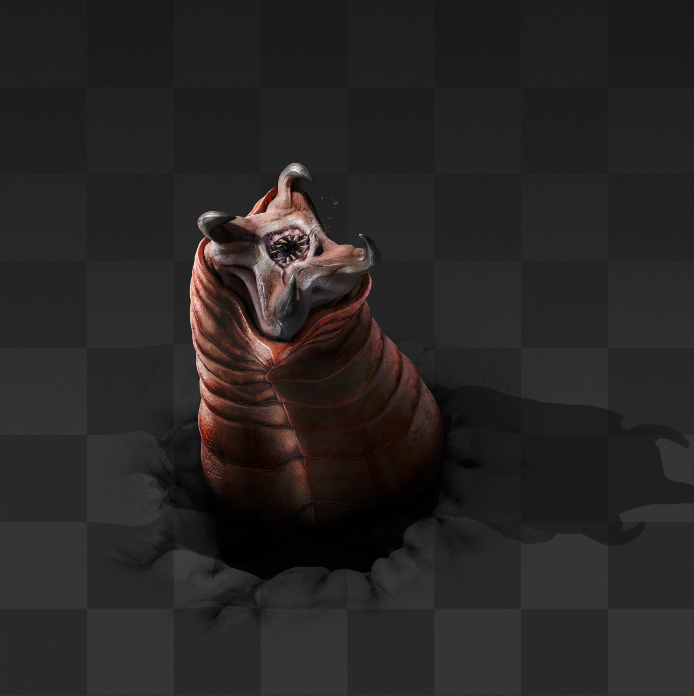
oh happy to see when you are done with themLight wrote: Fri Jan 25, 2019 6:17 pm The nests and worms need a texture update as they're lacking shadows and detail compared to their smaller brethren. The new biters and bile projectiles look great though.

Better to offload logic to combinators, this system is way too simple to be really used by humans for complex cases.<NO_NAME> wrote: Fri Jan 25, 2019 10:33 pmOK, you're right: viewtopic.php?f=18&t=31964
Still, it isn't exactly a good UI if you have to search a forum to figure out how it works.


I was initially pondering about that as well, and then the question popped into my mind: why doesn't the GUI also show the train's wagon contents? This way we could simultaneously see the condition bar filling up, and the wagon contents emptying out. There could be an horizontal ribbon below the map with a simple view of fuel + content wagon by wagon (just showing how many slots are filled). I assume that the detailed contents of each wagon would be available in the "Fuel" tab that the devs haven't shown yet.invisus wrote: Fri Jan 25, 2019 9:27 pmAgreed. When deleting files, the progress bar still progresses right to left to show "progress toward completing current action."weaknespase wrote: Fri Jan 25, 2019 9:20 pm
Counterargument — green bar represents condition fulfillment and it usually helps to have same GUI elements to behave consistently across application.
Absolutely. I can see the value in being able to visualize the contents of a wagon(s) as it's filled or emptied. I just didn't like the idea of conflating the progress toward the configured condition, and the wagon(s) current contents. Specifically in that item count would be the only condition I see where "progressing backward" like this would make sense. Perhaps other conditions as well, but breaking convention of a typical progress bar seemed more confusing and painful than easily being able to see the contents of the wagon(s) fill or empty.funky.bibimbap wrote: Sat Jan 26, 2019 3:01 am This way we could simultaneously see the condition bar filling up, and the wagon contents emptying out.

It just needs to show fuel: wood, (wood power pole), coal, solid fuel, rocket, nuke. I'm sure they can find space for the train's 3 slots and a slot and total count of each fuel in your inventory.pleegwat wrote: Fri Jan 25, 2019 6:14 pmFuel also needs to display an inventory. Though I could see workflows where you only want to view the amount of fuel, or refuel from your action bar.Avezo wrote: Fri Jan 25, 2019 6:09 pm Why can't train fuel be in the same tab? It's annoying having to switch tabs just for such a small use case.
FWIW, my train/name every alike station the same blueprint actually skips stations, it's possible with the circuit network (outside of the train schedule logic).AlexAegis wrote: Fri Jan 25, 2019 10:18 pmYes, this! For station skipping, a perfect use case is refueling stations! Or trains with multiple mine locations with the same name skip the stations if the wagons are already full (and an extra circuitry would disable the mining outpost if it's low on ore buffer to balance things a little, and an extra one to disable every other except itself if its full, my mind is full with ideas!)PacifyerGrey wrote: Fri Jan 25, 2019 10:10 pm No station skipping conditions? I am truly disappointed...
Was a perfect opportunity but you just missed it...

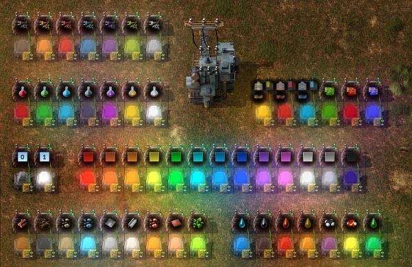
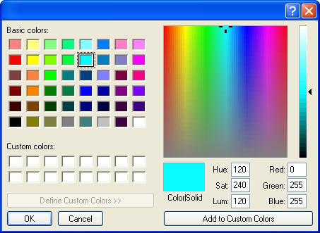
I second this, perhaps include a colour scheme not unlike Dectorio'sR3vo wrote: Fri Jan 25, 2019 11:11 pm I like the new train GUI and the spitters look splendid as well.
However, is there any change you can improve the colour settings for trains stations and trains?
What I think of is a colour pallet which a player can quickly choose a desired colour from (copper, iron, coal... etc.). Additionally, it would be great if players could define their own colours and save them as presets.


If you're talking about train stops I do this regularly in Vanilla using the standard copy/paste key/mouse clicks.AlexAegis wrote: Fri Jan 25, 2019 9:57 pm Hey, would be a nice touch to copy and paste train station conditions. It wouldn't even need extra buttons, I would be happy to be able just hover over a scheduled stop and press ctrl-c then ctrl-v to a blank area to create a copy then I can just change the station, or hover over another existing one and overwrite the conditions on that entry.


