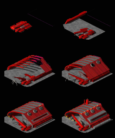
westwood style folding out buildings command and conquer
Moderator: ickputzdirwech
westwood style folding out buildings command and conquer
thought it might be a nice aesthetic when a building constructs or deconstructs rather than a puff of smoke they ...  maybe fold out and back in when being constructed or deconstructed like in the old command and conquer games


Re: westwood style folding out buildings command and conquer
+1
I love this idea (maybe because of I am a fan of C&C Red Alert 2)
It would make the game look more... living? (didn't find a good word )
)
Great idea
I love this idea (maybe because of I am a fan of C&C Red Alert 2)
It would make the game look more... living? (didn't find a good word
Great idea
-
FishSandwich
- Smart Inserter

- Posts: 1847
- Joined: Sun Feb 23, 2014 3:37 pm
- Contact:
Re: westwood style folding out buildings command and conquer
I would actually prefer this to how it is now. It seems like buildings are dropped from somewhere instead of being built.
- CreeperDaReeper
- Fast Inserter

- Posts: 228
- Joined: Fri May 23, 2014 8:59 pm
- Contact:
Re: westwood style folding out buildings command and conquer
I've played quite a few of the C&C games. Watching them unpack/unfold, not the most game changing thing, but it just screamed, AWESOME! +1
Re: westwood style folding out buildings command and conquer
nice, but probably not going to happen. they already have problems with the memory because there are so many sprites. this would let the number of sprites explode. also, it's a lot of work they better spend on something else, don't you think?
-
FishSandwich
- Smart Inserter

- Posts: 1847
- Joined: Sun Feb 23, 2014 3:37 pm
- Contact:
Re: westwood style folding out buildings command and conquer
Yes, but nobody here said its something that had to be implemented immediately. :pBleda wrote:nice, but probably not going to happen. they already have problems with the memory because there are so many sprites. this would let the number of sprites explode. also, it's a lot of work they better spend on something else, don't you think?
Re: westwood style folding out buildings command and conquer
yeah i expect if something like this was to be implemented it will most likely be at the polishing stage when they release version 1.0 retail
guess i never thought memory was an issue the game doesn't exactly scream memory hogging to me but iv got 32GB of ram so unless it starts taking the 4GB 32b limit i wouldn't notice a memory issue
guess i never thought memory was an issue the game doesn't exactly scream memory hogging to me but iv got 32GB of ram so unless it starts taking the 4GB 32b limit i wouldn't notice a memory issue
Re: westwood style folding out buildings command and conquer
It's about video memory though, not RAM. A lot of people still have 512MB VRAM(the absolute minimum required atm). And all sprites have to be loaded into the VRAM at game launch. Low gfx mode compresses sprites to lower-res so it can fit on cards that only have a small amount of VRAM.
Ignore this
Re: westwood style folding out buildings command and conquer
ahh yeah i understand what u mean atm my gpu is 2GB and can uses dimm 4 for extra if its needed thats a whole 8GB of 1600mhz ram i forget some older systems dont get this feature iv never had to tap into it except 1 game
maybe it should be a selectable option if they do add it stating increase in vram needed
same as what watch dogs has where u can select texture ram size 1, 2, 3 GB
maybe it should be a selectable option if they do add it stating increase in vram needed
same as what watch dogs has where u can select texture ram size 1, 2, 3 GB
-
deepdriller
- Fast Inserter

- Posts: 185
- Joined: Sat Apr 11, 2015 7:52 pm
- Contact:
Command&Conquer style construction animations

I think it's kind of boring that the buildings just appear out of nowhere when built. I think there should be slightly more to it.
Most RTS's I know have some form of construction animation, but the C&C style (as seen in the image) is the most fitting in this case.
If anything, it could be used to explain how the player can transport so many objects all at once: By showing how the building gets unpacked from a tiny box, for example.
Also, the respective deconstruction animations could be tied into this.
(Final note: Heavily damaged buildings could look different from undamaged ones?)
Re: Command&Conquer style construction animations
Haha that reminds me of an old post from me 
viewtopic.php?f=6&t=7475&p=59175&hilit=dune+2000#p59175
More seriously, I have seen this suggestion a few times before.
viewtopic.php?f=6&t=10032&p=77751&hilit=dune+2000
viewtopic.php?f=6&t=4169&p=32404&hilit=command+conquer
I personnally like the idea (as you might have guessed) .
.
viewtopic.php?f=6&t=7475&p=59175&hilit=dune+2000#p59175
More seriously, I have seen this suggestion a few times before.
viewtopic.php?f=6&t=10032&p=77751&hilit=dune+2000
viewtopic.php?f=6&t=4169&p=32404&hilit=command+conquer
I personnally like the idea (as you might have guessed)
Koub - Please consider English is not my native language.
Re: Command&Conquer style construction animations
I think the afford to create such animations is in strong contradiction to the enhancement in gameplay. 
Cool suggestion: Eatable MOUSE-pointers.
Have you used the Advanced Search today?
Need help, question? FAQ - Wiki - Forum help
I still like small signatures...
Have you used the Advanced Search today?
Need help, question? FAQ - Wiki - Forum help
I still like small signatures...
Re: Command&Conquer style construction animations
This wouldn't really remove anything out of the game and add a bit of that "game feel" - the satisfaction of just interacting with the game.
There are only two issues with this:
1. A very minor one in my opinion - it would increase the size of the game. It's currently about a 200MB download, which in this day and age is next to nothing. You can download it in seconds, you could have the game take up 10 times the space and it would still be fine. There's a lot of room for expansion, way more than we'd take up with these new animations.
2. It might be difficult to do. Most likely not so much code-wise as the effort involved in creation of such a large amount of graphical assets. The graphics guys would have to make new animations for almost everything in the game - but honestly, I don't think they would mind too much, if anything they seem glad to help make the game better in any way possible. Besides, I'm sure they're eager to prove their paychecks worth
EDIT: Crap forgot about the VRAM issues the game has... Well that might be a real problem.
Suggestion - Simple Build Animation Overlay
Problem - Objects just instantly appear in the game world. Looks naff.
Suggestion - Have a simple build animation play when something is built.
Implementation -
1. Make a big, square shaped, animation. Blue electrical plasma movements (like in the game "Subnautica"), rocky brown boulders and dirt flying around, grey granite boulders and grey dirt flying around, that kind of thing. Could have several animations, assigned to objects by theme.
2. Apply a transparency image mask to a newly created object. Black = Object invisible (0%), White = Object visible (100%), Greys inbetween = Transparency level. Match the shape of the object. The object instantly is in the game world and instantly functioning - as per the current game implementation. However, the black part of the image mask makes the object completely invisible.
3. Play the animation over the object. Animation transparency is the inverse of the object transparency.
4a. Two choices here: Either, make the object go wholly from 0% visible to 100% visible over the duration of the animation. The animation becomes progressively invisible, while the object becomes progressively more visible.
OR
4b. A more fancy way would be to make any area that the animation draws over becomes visible - having the animation sweep over the whole object through its duration. (The game "Subnautica" demonstrates this. Notably, in 3D, but this is entirely implementable in 2D).
Animation duration would vary according to building size/importance. Fraction of a second for belts, perhaps several seconds for launch pad.
- eradicator
- Smart Inserter

- Posts: 5211
- Joined: Tue Jul 12, 2016 9:03 am
- Contact:
Re: Suggestion - Simple Build Animation Overlay
From an eye-candy perspective it'd be nice to have some sort of animation for large machines (i.e. not belts/inserters). But i'm sceptical wheather it's possible to generate a generic animation on the fly. I guess one could use the non-transparent bits of the building as a mask for the building animation so it's not too large, but it's still a bit wonky. Things are further complicated by the construction overlay of the thing you're holding in the cursor, which at the time of building overshadows the actual structure (not an issue for bots).
Do you have a link to what it looks in subnautica? Edit: searched for random bits on yt and i guess you mean the effect in this video @ 26:23? That looks more like a highly erratic paint job than a construction animation. Things aren't constructed from random floating bits outwards. :)
From an in-lore perspective you're not really building stuff on site. It's already premade and you just carry it over to where you want it and put it on the ground.
Author of: Belt Planner, Hand Crank Generator, Screenshot Maker, /sudo and more.
Mod support languages: 日本語, Deutsch, English
My code in the post above is dedicated to the public domain under CC0.
Mod support languages: 日本語, Deutsch, English
My code in the post above is dedicated to the public domain under CC0.
Re: Suggestion - Simple Build Animation Overlay
Given the building is compressed, and expanded on-site, perhaps animate the building expanding?
Re: Suggestion - Simple Build Animation Overlay
"...perhaps animate the building expanding?" - That sounds like a good solution.
- bobingabout
- Smart Inserter

- Posts: 7352
- Joined: Fri May 09, 2014 1:01 pm
- Contact:
Re: Suggestion - Simple Build Animation Overlay
this kind of reminds me of the old command and conquer stuff, like the MCV deploying and growing in size, or just things like the war factory coming up from underground and expanding.
- eradicator
- Smart Inserter

- Posts: 5211
- Joined: Tue Jul 12, 2016 9:03 am
- Contact:
Re: Suggestion - Simple Build Animation Overlay
Expansion from center doesn't work because you can't derive the center of a building from the sprite. Think of a tall building with a small footprint (i.e. a gas vent). I'd go for a linear blend in. Here's a crude example:Watsong wrote: Sun Oct 14, 2018 5:39 pm "...perhaps animate the building expanding?" - That sounds like a good solution.
Author of: Belt Planner, Hand Crank Generator, Screenshot Maker, /sudo and more.
Mod support languages: 日本語, Deutsch, English
My code in the post above is dedicated to the public domain under CC0.
Mod support languages: 日本語, Deutsch, English
My code in the post above is dedicated to the public domain under CC0.
Re: Suggestion - Simple Build Animation Overlay
Actually, it should work, most (but not all) of the tall entities have a selection/collision box centred around the base area.
Power poles, for example, have a collision box that's centred around their base area, so scaling the entity image from icon-size to entity size around the centre of entity should look about correct.
"Flat" entities (most of the crafting machines) likely have the centre sufficiently close to the visual centre of the image that just varying the scale of the graphic should look okay-ish.
Ideally, the visual centre of the entity and the centre of the collision box should coincide, but that's an artefact of the graphical design; arguably all buildings should extend somewhat above the top of the tiles that they sit upon.


