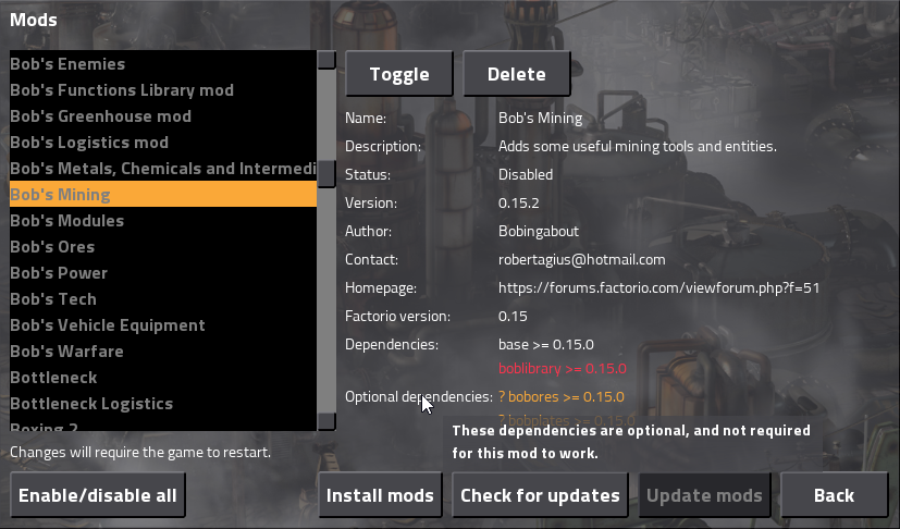
Currently, Factorio enumerates mod dependencies like so:
So this mod has two required dependencies without which the mod cannot run: the base game itself (a universal requirement, really) and the Bob's Library mod. It also has two optional mod dependencies, Bob's Plates and Dytech Core, but the mod can still work just fine without these mods installed.
However, many players can be confused by this, as the only thing that indicates that a dependency is optional is the question mark, and only experienced modders know the significance of this. This leads to confused users.
I suggest that the mod window be clarified to list the mandatory dependencies and optional dependencies separately, and have them clearly marked as such. Say something sort of like:
Clarify that Optional dependencies really are Optional
Moderator: ickputzdirwech
-
Supercheese
- Filter Inserter

- Posts: 841
- Joined: Mon Sep 14, 2015 7:40 am
- Contact:
- bobingabout
- Smart Inserter

- Posts: 7352
- Joined: Fri May 09, 2014 1:01 pm
- Contact:
Re: Clarify that Optional dependencies really are Optional
This is one of those things where you really should be asking "Why isn't this done already?".
Needless to say, I agree, this should be done.
Needless to say, I agree, this should be done.
Re: Clarify that Optional dependencies really are Optional
Thank you for the suggestion,
It has been implemented for 0.15.33:

It has been implemented for 0.15.33:

Re: Clarify that Optional dependencies really are Optional
I apologize if this sounds mean, but I'm not sure how else to say it.
Has this really been implemented? The original suggestion was to add a field labelled 'Optional', which would clearly communicate the difference to the user. Sure, the colour may help differentiate the objects in the list, but there is no legend in the UI explaining this to users. Those who follow the changelogs will understand, but will other/new users understand the colour difference any easier than the leading question mark?
I suggest either reconsidering a secondary dependency field, clearly labelled, for optional dependencies; or some type of Legend/Detail in the UI to explain the significance of the colour and question mark.
Re: Clarify that Optional dependencies really are Optional
Addtional lable would be good for the color blind also. I'm sure dark grey and light grey are somewhat different.. but one never can tell since we see red and yellow ourselves.
Re: Clarify that Optional dependencies really are Optional
Is something like this better?

The 0.15 was very simple to do, just a check to see if its optional, and if so, change the style.
This proper solution adds strings and more translations, but it was too late in the 0.15 cycle to add them

The 0.15 was very simple to do, just a check to see if its optional, and if so, change the style.
This proper solution adds strings and more translations, but it was too late in the 0.15 cycle to add them
-
Rockstar04
- Fast Inserter

- Posts: 171
- Joined: Sun Feb 17, 2013 4:31 pm
- Contact:
Re: Clarify that Optional dependencies really are Optional
I personally think that looks much better, and gives the end user plenty of information. With the separated areas you could also drop the leading "?" on the optional dependencies.

