maybe it's a nice idea to show the tech tree in a different way than it is right now.
now it's downward shown and cut of at some part.
my new idea:
what if it was shown as the tech tree in civilization 5, the tech tree will go from left to right and is scrollable. the desctription of the tech can go on the left, the pro of it is: you can see al the tech so it's easier to plan/know/choose what to do to go to some techs, the infinite resource can be shown with a lemniscate with the level you at right next to it.
tech tree interface
Moderator: ickputzdirwech
Re: tech tree interface
Tech tree in Factorio is hard to layout. Technically we have (and Civilization has) oriented graph, not tree, and our graph is not planar (which means it can't be drawn on a piece of paper without some connections crossing). We have vanilla technologies under control, so we could rework them to make the graph planar but the game needs to be usable with whatever technologies mods define. So we figures we reduce the problem if we draw just part of the graph relevant to selected technology.
DaveMcW made really nice tech tree visualization (http://davemcw.com/factorio/tech-tree/) we might take inspiration from that in future . If you click on "Electronics" technology and scroll down, you'll see what I meant by non-planar graph.
DaveMcW made really nice tech tree visualization (http://davemcw.com/factorio/tech-tree/) we might take inspiration from that in future
Re: tech tree interface
A possibly minor change to ease the Tech Interface would be to enable the arrow keys to nagivate the existing GUI.
Re: tech tree interface
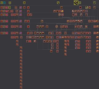
This is what the entire tree looks like rendered using the in-game algorithm.

Notice how an individual technology's tree can spread really wide – battery, for example, spreads to the left to battery and battery mk2 armour equipments, and to the right to laser turrets and their shooting speed researches. It really is just a giant mess and doesn't exactly help you get a good idea of what's going on. Limiting the view to only some technologies actually helps you see what the tree looks like and if you want to see more, you can just click.
And for a comparison, here's Bob's mods tech tree:

You can see that some technologies have so many displayed children, the lines connecting them merge together into a single block.
Also, another aspect is performance – laying out a graph like that isn't exactly easy, and doing the entirety of Bob's mods took a few seconds already. By limiting the size of the displayed portion of the tree, we can also limit how long it will take for the tree to render.
So, being able to see all the tech isn't such a huge advantage as you might have thought.

Notice how an individual technology's tree can spread really wide – battery, for example, spreads to the left to battery and battery mk2 armour equipments, and to the right to laser turrets and their shooting speed researches. It really is just a giant mess and doesn't exactly help you get a good idea of what's going on. Limiting the view to only some technologies actually helps you see what the tree looks like and if you want to see more, you can just click.
And for a comparison, here's Bob's mods tech tree:

You can see that some technologies have so many displayed children, the lines connecting them merge together into a single block.
Also, another aspect is performance – laying out a graph like that isn't exactly easy, and doing the entirety of Bob's mods took a few seconds already. By limiting the size of the displayed portion of the tree, we can also limit how long it will take for the tree to render.
So, being able to see all the tech isn't such a huge advantage as you might have thought.
Re: tech tree interface
Nice pictures 
Do you have some hidden functionality in game for this or it's a dev tinkering?
(silently hopes for hidden functionality that we could get )
)
Do you have some hidden functionality in game for this or it's a dev tinkering?
(silently hopes for hidden functionality that we could get
Re: tech tree interface
I tweaked the code a little. 
Re: tech tree interface
That picture will be added to the wiki  Please send me the new 0.15 one when that comes out if that is possible. We are really lacking some nice tech tree images that show everything.
I'm an admin over at https://wiki.factorio.com. Feel free to contact me if there's anything wrong (or right) with it.
- bobingabout
- Smart Inserter

- Posts: 7352
- Joined: Fri May 09, 2014 1:01 pm
- Contact:
Re: tech tree interface
My mods make the tech tree big.


