[0.12.24] research ui way to big
-
SuperSandro2000

- Filter Inserter

- Posts: 742
- Joined: Sun Jan 12, 2014 3:54 am
- Contact:
[0.12.24] research ui way to big
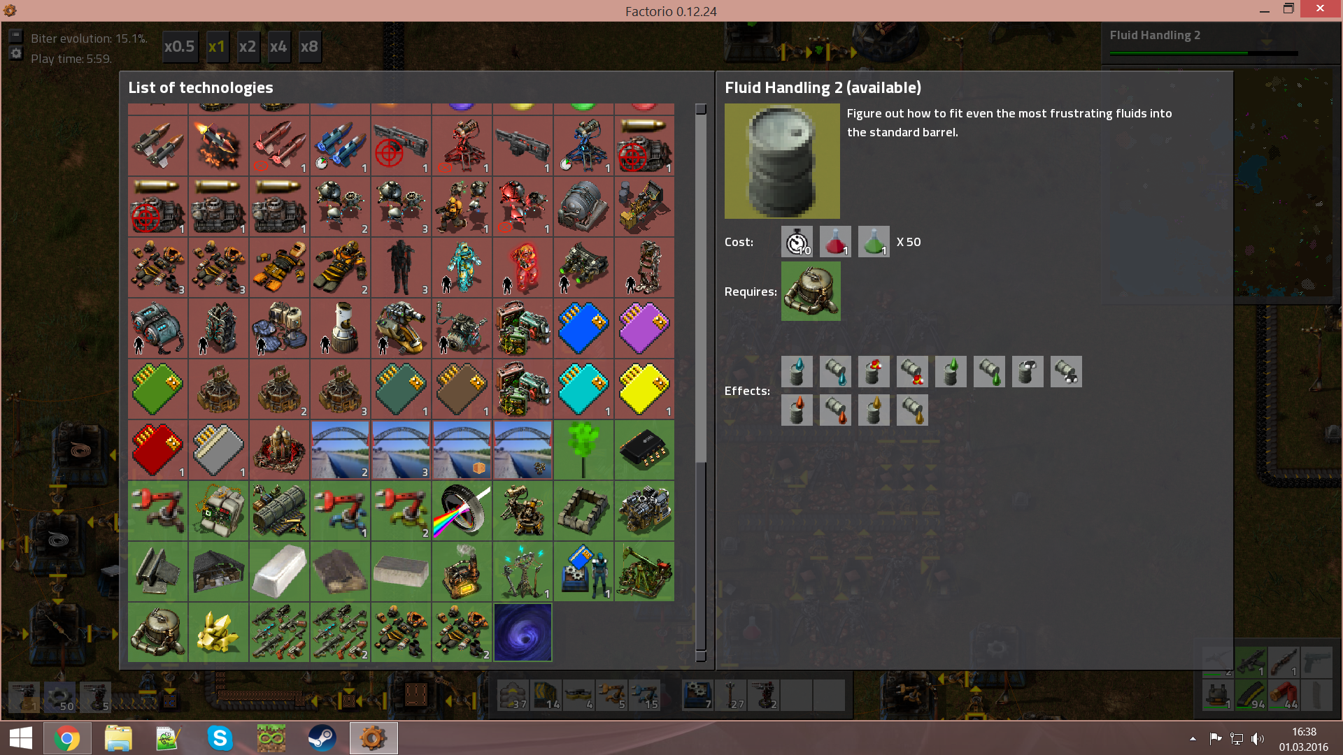
I have ui scale set to the default 125% and everything is fine expect the research screen that is massive.
Please call me simply Sandro.
My Main Mods: Sandro's fixes, Expanded Rocket Payloads Touched by an AngelBob and more can be found here

My Main Mods: Sandro's fixes, Expanded Rocket Payloads Touched by an AngelBob and more can be found here

Re: [0.12.24] research ui way to big
Can you post a screenshot of the GUI with 100% and again with 125%? Is it scaling past 125% of the original size?
If you want to get ahold of me I'm almost always on Discord.
-
StoneLegion

- Filter Inserter
- Posts: 687
- Joined: Fri Sep 05, 2014 7:34 pm
- Contact:
Re: [0.12.24] research ui way to big
I can't speak of his 125% but I assume it's suppose to fit no matter what size one uses. I tried 200% for fun.
http://i.imgur.com/bPIlP0E.png
http://i.imgur.com/bPIlP0E.png
Re: [0.12.24] research ui way to big
The research ui is going to be redone in 0.13 and it is supposed to work the properly with different ui sizes, so I don't want to waste time by fixing it for 0.12 only.
In other words, fixed for 0.13
In other words, fixed for 0.13
-
SuperSandro2000
- Filter Inserter
- Posts: 742
- Joined: Sun Jan 12, 2014 3:54 am
- Contact:
Re: [0.12.24] research ui way to big
 Compared to everything else it is really big.
What would be need for the redone:
-search for techs
-option to show really all techs, every unlocked and locked
-priority list
Please call me simply Sandro.
My Main Mods: Sandro's fixes, Expanded Rocket Payloads Touched by an AngelBob and more can be found here
My Main Mods: Sandro's fixes, Expanded Rocket Payloads Touched by an AngelBob and more can be found here
Re: [0.12.24] research ui way to big
The research screen is now always fullscreen, so this problem doesn't exist anymore.

Re: [0.12.24] research ui way to big
I absolutely hate that the research screen is now always full screen. My personal preference.kovarex wrote:The research screen is now always fullscreen, so this problem doesn't exist anymore.
Re: [0.12.24] research ui way to big
I understand, but if we want to show the tech tree and not resize the window when you switch between techs, which is both needed, I don't see any other way.garath wrote:I absolutely hate that the research screen is now always full screen. My personal preference.kovarex wrote:The research screen is now always fullscreen, so this problem doesn't exist anymore.
Re: [0.12.24] research ui way to big
I remember the issues where the 'Research' button was hidden or partially cut off when the player selected certain techs. So, I know you are trying to avoid those problems by making the Research screen full screen.kovarex wrote:I understand, but if we want to show the tech tree and not resize the window when you switch between techs, which is both needed, I don't see any other way.garath wrote:I absolutely hate that the research screen is now always full screen. My personal preference.kovarex wrote:The research screen is now always fullscreen, so this problem doesn't exist anymore.
I wish there were some other way to solve this problem. The rest of the game is so finely crafted that it is a shame this particular screen is so insanely ugly. Because only this one screen is full screen, it hurts the consistency of the user interface and makes the game seem less polished. In my personal opinion, simply creating a few pixel difference between the Research screen and "Full screen" would at least make this window consistent with the rest of the user interface. Yes, it would still be a very large window. But it would at least look like a popup window like all the others.
Running at 1920x1080, that research button feels like it is a million miles away. I get exhausted dragging the mouse from the list of the tech on the left to the absolute far right of the screen to click the Research button. This makes me wish the research button was on the far left.

Re: [0.12.24] research ui way to big
Makes me wish we could click on the icon for the tech to start researching it... So many clicks wasted clicking the icon before I realize I actually have to click the button that says researchgarath wrote: Running at 1920x1080, that research button feels like it is a million miles away. I get exhausted dragging the mouse from the list of the tech on the left to the absolute far right of the screen to click the Research button. This makes me wish the research button was on the far left.