Suggestions for the Wiki regarding Factorio Expansion Add-ons

Anything related to the content on our wiki (https://wiki.factorio.com/)

Moderator: Bilka

User avatar
xaetral
Long Handed Inserter
Posts: 50
Joined: Sun Apr 28, 2019 2:25 pm
Contact:

Suggestions for the Wiki regarding Factorio Expansion Add-ons

Post by xaetral »

I don't claim to bring all the solutions (or any actually) to all the issues that may come from the addition of the new optional vanilla "mods" that will be bundled in the expansion but I just wanted to bring my thoughts. (and anyone else is welcomed to do so here as well)

As a general idea I'd treat the game + all add-ons as if it was the whole game itself, and make the wiki pages like usual.
The only exception is that I would put a mention about each entry's "restricted" access on of them.

For example, on the data.raw page, I would just add a small icon with a tooltip:
Image

The icon itself might even be a tiny dedicated image so that we could recognize the required add-on without even hovering it.

Here's another suggestion on how the ownership to a specific add-on might be hinted:
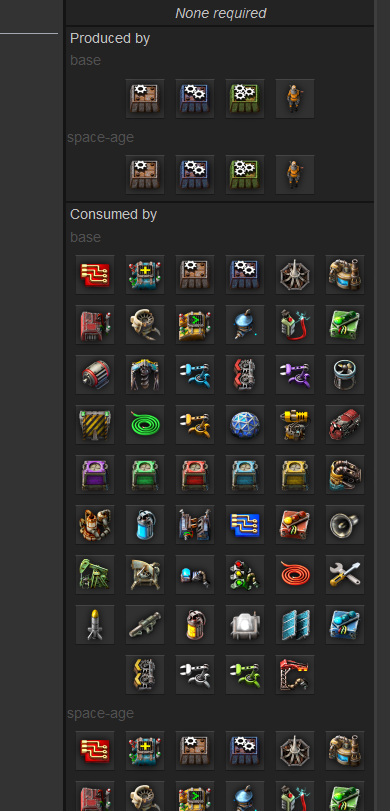
Image

And finally, here is what I have in mind for looking at all the quality-varying stats in the entity descriptions:
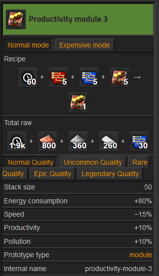
Image
User avatar
DaveMcW
Smart Inserter
Smart Inserter
Posts: 3717
Joined: Tue May 13, 2014 11:06 am
Contact:

Re: Suggestions for the Wiki regarding Factorio Expansion Add-ons

Post by DaveMcW »

It's pretty standard in wikis for other games to use the expansion icon next to expansion features.
Bilka
Factorio Staff
Factorio Staff
Posts: 3310
Joined: Sat Aug 13, 2016 9:20 am
Contact:

Re: Suggestions for the Wiki regarding Factorio Expansion Add-ons

Post by Bilka »

I have collected some ideas as well.

For the icon next to expansion features, it could also be a short abbreviation. Examples:
DaveMcW wrote: Mon Oct 02, 2023 3:41 am It's pretty standard in wikis for other games to use the expansion icon next to expansion features.
Do you have an example that you could link? I'm curious about the size and readability of an icon.

More ideas regarding infoboxes, to differentiate between base game and space age:
  • Same system as the tabs already used for normal and expensive. (Subpoint: Save the state of these tabs sitewide)
  • Animation/Slideshow between the different versions (e.g. how the crafting recipes on the minecraft wiki are done)
  • List all versions of all the things all the time (e.g. how both recipe and total raw always show)
  • One master version with potential additions marked with the icon (for something like "consumed by", hard to apply to recipes if needed)
More ideas regarding infoboxes, regarding quality (affects numeric stats):
  • List them next to each other, e.g. 5/6/7/8/9. Potentially with icons and/or colors to indicate the level.
  • List them as a vertical list. Potentially with icons and/or colors to indicate the level. Minecraft wiki example
  • Vertical list with rows per quality + item icon. Stardew valley wiki example
Something to think about regarding organisation is that it's not just the space age expansion. But it's also expensive-mode, quality, space-age, and elevated-rails mods. So there are more combinations than just two (expansion and not expansion). What exact combinations is to be seen (whether certain mods depend on other mods).

Space age mod in particular will also affect the page text, not just the infobox. Ideas for that:
  • Integrate it directly in the text with the icon ideas above. E.g. This entity works in xyz way on space platforms*.
  • Different sections for expansion/non-expansion.
  • Completely different page tabs for expansion/non-expansion. (Subpoint: Save the state of these tabs sitewide)
  • Completely different pages for expansion/non-expansion.
Another completely different idea would be to create separate wikis for expansion and non-expansion.

More thoughts and ideas welcome!
I'm an admin over at https://wiki.factorio.com. Feel free to contact me if there's anything wrong (or right) with it.
User avatar
xaetral
Long Handed Inserter
Posts: 50
Joined: Sun Apr 28, 2019 2:25 pm
Contact:

Re: Suggestions for the Wiki regarding Factorio Expansion Add-ons

Post by xaetral »

Bilka wrote: Mon Oct 02, 2023 9:15 am Space age mod in particular will also affect the page text, not just the infobox. Ideas for that:
  • Integrate it directly in the text with the icon ideas above. E.g. This entity works in xyz way on space platforms*.
  • Different sections for expansion/non-expansion.
  • Completely different page tabs for expansion/non-expansion. (Subpoint: Save the state of these tabs sitewide)
  • Completely different pages for expansion/non-expansion.
Another completely different idea would be to create separate wikis for expansion and non-expansion.
I like the first 2 proposals, having everything on the same page is nice.
Also because for now I believe SA and other add-ons won't change the entities very deeply, at least not in the overworld.
aka13
Filter Inserter
Filter Inserter
Posts: 805
Joined: Sun Sep 29, 2013 1:18 pm
Contact:

Re: Suggestions for the Wiki regarding Factorio Expansion Add-ons

Post by aka13 »

Bilka wrote: Mon Oct 02, 2023 9:15 am
Do you have an example that you could link? I'm curious about the size and readability of an icon.
I have, see https://civilization.fandom.com/wiki/Di ... _districts
Or any CIV6/5 pages.
Pony/Furfag avatar? Opinion discarded.
Tertius
Filter Inserter
Filter Inserter
Posts: 945
Joined: Fri Mar 19, 2021 5:58 pm
Contact:

Re: Suggestions for the Wiki regarding Factorio Expansion Add-ons

Post by Tertius »

Input and opinions from me:
  • add items and documentation for the expansion to the current wiki. No extra wiki.
  • add text and tags to all pages to show to what they belong: base game, expansion1, expansion2, ... These tags should be at the top of the page, near the language selection or the title. Infoboxes should also have this tag. May be as (tiny) icon in the infobox, and as text in the article. The infobox tag should be small and could be located behind/below the item name at the top, but still above the image. May be as small as characters like these, just appended to the name: ® © ℗
  • someone who owns the whole game should be able to navigate through the wiki without noticing this categorization.
  • someone who owns part of the game should be able to directly see if the article he is currently seeing is applying to his configuration or not.
  • may be links to articles that deal with expansion-specific items could carry the expansion icon as well, so it's clear if this link is relevant for someone owning only the base game, or not.
  • General articles about game mechanics that need to be expanded with expansion-specific text should contain sections tagged with the corresponding expansion they apply to. Editors should try to collect new info into as few sections as possible to not clutter the article.
  • I propose icons for tags, because in my opinion longer abbreviations are ugly and clutter the article, and you cannot use the full name of an expansion more than once in a text, although you might refer to an expansion item multiple times in a text. Having said that, the really short colored abbreviations in the Dead Cells Wiki are a good compromise between a graphical icon and an abbreviation. Would be my favorite, if it's required the tags contain text only.
  • If there are features of an item that differ according to what expansions are active, the infobox could have different tabs as currently with normal and expensive mode, and have some tiny note in the default tab that tells this item has different features according to activated mods. The user should be able to define his default tab, which should be remembered in his browser cookies.
Things to do:
  • create the expansion name. Or names, if the expansion is split into multiple mods you can acquire or activate separately.
  • create icons/colored abbreviations for the tags.
  • try to find good locations to place both, and find good icon sizes.
  • create wiki templates/macros to help with linking to expansion-specific articles, so the template creates a properly tagged link. This way it's also possible to change the appearance later.
By the way, this could be the moment infobox localization could be streamlined and automated. Half of the translation template is full of "english => <localized>" pairs, and it's a chore to grep an english text, then find the corresponding localized text in the game language files and add both to the language template. This could be fully automated by using the text tags from the game localization files. The key should be the tag from the game localization, not the raw english text. The lookup tables could then be generated from the game localization files, not edited manually. At least a big part of it. Don't translate "from english". Instead, translate everything, even the english infoboxes, and use the keywords from the game localization files.
Nidan
Filter Inserter
Filter Inserter
Posts: 270
Joined: Sat Nov 21, 2015 1:40 am
Contact:

Re: Suggestions for the Wiki regarding Factorio Expansion Add-ons

Post by Nidan »

Bilka wrote: Mon Oct 02, 2023 9:15 am For the icon next to expansion features, it could also be a short abbreviation. Examples:
Regardless of the way of rendering it, I'd add links. In the Dead Cells example, in case you want more information about the expansion, you'd have to (mis)type the tooltip text into the search bar.
Having icons would clash with the current style of linking by name only. That said, generally using a pattern of "Icon Name" for links (see for example the League of Legend wiki) is fine, as long as the icons are scaled to not expand line height.
More ideas regarding infoboxes, to differentiate between base game and space age:
  • Same system as the tabs already used for normal and expensive. (Subpoint: Save the state of these tabs sitewide)
  • Animation/Slideshow between the different versions (e.g. how the crafting recipes on the minecraft wiki are done)
  • List all versions of all the things all the time (e.g. how both recipe and total raw always show)
  • One master version with potential additions marked with the icon (for something like "consumed by", hard to apply to recipes if needed)
I'd advocate against a slideshow, in the Minecraft wiki it works since the recipes shown follow the same pattern with only the material changed. In factorio minor details (e.g. item count for expensive mode) become relevant.
More ideas regarding infoboxes, regarding quality (affects numeric stats):
  • List them next to each other, e.g. 5/6/7/8/9. Potentially with icons and/or colors to indicate the level.
  • List them as a vertical list. Potentially with icons and/or colors to indicate the level. Minecraft wiki example
  • Vertical list with rows per quality + item icon. Stardew valley wiki example
From what we know about quality, the effects seem to be limited to health and one or two other stats. That'd result in a table with mostly identical rows when using the Stardew approach making spotting the actual differences difficult.
I'd use option 1, 2 or a hybrid of both: list the base value as now, then an extra row for improved qualities

Code: Select all

Health:    160
           Q2 208 / Q3 256 / Q4 304 / Q5 400  (use icons instead of Qx)
Something to think about regarding organisation is that it's not just the space age expansion. But it's also expensive-mode, quality, space-age, and elevated-rails mods. So there are more combinations than just two (expansion and not expansion). What exact combinations is to be seen (whether certain mods depend on other mods).

Space age mod in particular will also affect the page text, not just the infobox. Ideas for that:
  • Integrate it directly in the text with the icon ideas above. E.g. This entity works in xyz way on space platforms*.
  • Different sections for expansion/non-expansion.
  • Completely different page tabs for expansion/non-expansion. (Subpoint: Save the state of these tabs sitewide)
  • Completely different pages for expansion/non-expansion.
Let's try to break down the scope of the changes made by each mod. From what we know currently, the impact of expensive-mode, quality and elevated-rails is limited:
  • expensive-mode introduces alternate recipes (I count 18 in my current install). With the upgrade to full mod it could do much more, but even the possibilities allowed by the current difficulty API aren't fully used in vanilla. The current solution with tabs is probably fine.
  • quality introduces more item variants. Like expensive-mode, this mostly affects info boxes but can interact with other mechanics. Scanning the list from FFF 375 Inserters is probably the only mechanics page that needs significant changes, in particular extra rows to the tables in the "Inserter speed" and "Inserter throughput" sections due to additional swing speeds introduced by quality.
  • elevated-rails adds more layout options but doesn't turn the rail mechanic on its head. A section each in rail related pages like railways and rail planner might do.
Space-age is, of course, a big unknown.
There will be changes to recipes and tech tree, which could be handled with tabs like expensive-mode, but affecting a larger section of the info box, which would include stuff like "can only be placed in space" (as an aside, landfill's info box doesn't mention that it must be placed on water).
There will be new mechanics, each deserving their own wiki page and, like quality above, adjustments to the existing mechanic pages to describe interactions.
But will it turn existing mechanics on its head, completely invalidating them? If yes, a separate page for that mechanic is reasonable. If no, see the above point. (My gut feeling was that the answer it most likely no here, but you wrote "E.g. This entity works in xyz way on space platforms". A reasonable discussion might require a prior FFF allowing us to judge the extent in which existing mechanics will be changed.)
Another completely different idea would be to create separate wikis for expansion and non-expansion.
That'll be a nightmare to keep in sync for things common across base and expansion and also a potential combinatorial explosion should you decide to create more expansions later on. In addition, mod combinations like base with elevated-rails but without space-age would technically belong into the expansion wiki but, as described above, would only change minor details making the non-expansion wiki the preferred one to use most of the time.
User avatar
DaveMcW
Smart Inserter
Smart Inserter
Posts: 3717
Joined: Tue May 13, 2014 11:06 am
Contact:

Re: Suggestions for the Wiki regarding Factorio Expansion Add-ons

Post by DaveMcW »

Bilka wrote: Mon Oct 02, 2023 9:15 am
Do you have an example that you could link? I'm curious about the size and readability of an icon.
Rimworld has very distinct icons, I think looking good on the wiki was part of their design document.
https://rimworldwiki.com/wiki/Apparel#C ... mbinations

Europa Universalis 4 uses icons AND the full name.
https://eu4.paradoxwikis.com/Subject_nation
mmmPI
Smart Inserter
Smart Inserter
Posts: 3655
Joined: Mon Jun 20, 2016 6:10 pm
Contact:

Re: Suggestions for the Wiki regarding Factorio Expansion Add-ons

Post by mmmPI »

The way Europa Universalis tells you the precise DLC you need is very clear despite them having like 20+ DLC because even if the small icon is quite similar to another you keep seing the icon and the name next to it and it prevent any mistake and make it easier to recognize it later.

As mentionned it also works well in some CIV game where there exist tiny icon of the ressource and sometimes their name are written next to it, like a green apple icon and food written next to it, or a purple music note and culture next to it, the colors helps for small number.

If it was an icon it could be one like those used in the rich text in game for train station. It doesn't need to be super recognizable if the name is written next to it and if it is a tiny version of something well identified like a logo.

Then i think it can be stamped a bit everywhere on the regular wiki to link infos to their corresponding mod, or at top of a page if there are some that would be specific to a mod.

I imagine the expansion has a logo/icon, and then each mod it contained has its own logo/icon.

It's hard to propose ideas to organize information when you don't have the information yet btw :)

But i dream of clicking some icon at the top of the website in EU4 and only see relevant information based on what i'm using as DLC. Which makes me think in factorio it would be selecting the features of the expansion by their icon, same for "expansive" or death world, having their icon, and then the wiki would only show info that apply to my game.

If i select nothing, then no curation is done all the tables contains all the infos with the icons and name.
Koub
Global Moderator
Global Moderator
Posts: 7784
Joined: Fri May 30, 2014 8:54 am
Contact:

Re: Suggestions for the Wiki regarding Factorio Expansion Add-ons

Post by Koub »

Not expansion oriented, but platform oriented, the Terraria wiki is one of the best I've ever seen. There is no expansion per se in Terraria, or rather the whole game evolves, but the differences between platforms are shown clearly by a platform icon whenever it makes sense.
Could also be applied to the differences between PC version and switch version, but I think it would be more useful with the expansions.

Also, I'm not blaming anyone, but I think Terraria wiki is superior to Factorio wiki in what's accessible from the front page. Factorio wiki could be improved by reproducing the way Terraria wiki is organised.
Koub - Please consider English is not my native language.
Bilka
Factorio Staff
Factorio Staff
Posts: 3310
Joined: Sat Aug 13, 2016 9:20 am
Contact:

Re: Suggestions for the Wiki regarding Factorio Expansion Add-ons

Post by Bilka »

Looks like everyone agrees that we should stick to one wiki and make things work within that. That's great, because I think so too. For the details I think a lot will depend on exactly how much and what the expansion and the specific mods will change/touch. So to be discussed as more FFF's go out. But there are a few things I can already note:
Nidan wrote: Mon Oct 02, 2023 4:16 pm expensive-mode introduces alternate recipes (I count 18 in my current install). With the upgrade to full mod it could do much more, but even the possibilities allowed by the current difficulty API aren't fully used in vanilla. The current solution with tabs is probably fine.
The alternate recipes do not just affect the 18 (?) recipes that change, but also the total raw of the recipes that use them. With central items like green circuits being changed by expensive mode, that affects a lot of recipes, e.g. all modules have different total raws in expensive mode despite their recipes not getting changed directly. With the current tabs that's not a problem, but I want to note it because I will reference it in the next paragraph.
quality introduces more item variants. Like expensive-mode, this mostly affects info boxes but can interact with other mechanics. Scanning the list from FFF 375 Inserters is probably the only mechanics page that needs significant changes, in particular extra rows to the tables in the "Inserter speed" and "Inserter throughput" sections due to additional swing speeds introduced by quality.
Based on the FFF, the quality also introduces the recycler. So if there was an infobox row like "recycles into", that would be affected as well. And that's not just for each quality, but also affected by expensive mode changing recipe ingredients. Now, I don't know if this is a thing, but if space-age affects recipes then that will also interact with recycling, expensive mode and total raws to create even more combinations. The one thing preventing an explosion of combinations here may be whether some of the expansion mods depend on others, but that's another topic that's to be seen.
elevated-rails adds more layout options but doesn't turn the rail mechanic on its head. A section each in rail related pages like railways and rail planner might do.
Sadly it's not that easy. At the very least the items (ramp and support) that need to be crafted will affect the "consumed by" infobox of the items in their recipes. Both with quality and elevated-rails there will also be effects on the technology infoboxes to integrate any added/changed researched. So all that will need tabs or extra pages or icons or something.
space-age [...]
There will be new mechanics, each deserving their own wiki page and, like quality above, adjustments to the existing mechanic pages to describe interactions.
But will it turn existing mechanics on its head, completely invalidating them? If yes, a separate page for that mechanic is reasonable. If no, see the above point. (My gut feeling was that the answer it most likely no here, but you wrote "E.g. This entity works in xyz way on space platforms". A reasonable discussion might require a prior FFF allowing us to judge the extent in which existing mechanics will be changed.)
With my example sentence I was thinking of the inserters putting things into space on the platform animation in FFF 373. That's the kind of information that would go on the overall inserters page, but the question is whether it should be an extra section or a sentence with a marker or an extra page or.... Definitely more FFFs needed here.
mmmPI wrote: Tue Oct 03, 2023 1:58 am It's hard to propose ideas to organize information when you don't have the information yet btw :)
Agreed! I likely would have made this thread much closer to expansion release but the conversation came up on discord, so I wanted to at least brain dump the various ideas I already had. And it gives more time for someone to walk in here and come up with something revolutionary :p
Tertius wrote: Mon Oct 02, 2023 12:56 pm By the way, this could be the moment infobox localization ...
Could you make an extra thread for that? While I expect that the infobox code will need a general overhaul, I'd prefer to be able to discuss this specific topic separately.
Koub wrote: Tue Oct 03, 2023 4:44 pm Also, I'm not blaming anyone, but I think Terraria wiki is superior to Factorio wiki in what's accessible from the front page. Factorio wiki could be improved by reproducing the way Terraria wiki is organised.
Could you make an extra thread with more details for how you imagine the ideal factorio main page? Without considering the expansion for now, I guess.
I'm an admin over at https://wiki.factorio.com. Feel free to contact me if there's anything wrong (or right) with it.
Nidan
Filter Inserter
Filter Inserter
Posts: 270
Joined: Sat Nov 21, 2015 1:40 am
Contact:

Re: Suggestions for the Wiki regarding Factorio Expansion Add-ons

Post by Nidan »

Bilka wrote: Wed Oct 04, 2023 11:39 am 18 (?)
Just a quick grep over my current install, to get an idea how many recipes are affected, but I failed to note the
"total raws" and "consumed by"
and any other row that could get influenced by other prototypes. I didn't mention it explicitly in my last post, but I was thinking about an outer base / space-age tab and an inner one for normal / expensive; not a single set of tabs for base / expensive / space-age / expensive+space-age. So each mod could have had it's own enabled / disabled tabs… but thinking this a step further, that's a set of checkboxes to enable each mod, maybe a persistent version of the quality toggle the rimworld wiki uses.
Based on the FFF, the quality also introduces the recycler. So if there was an infobox row like "recycles into", that would be affected as well. And that's not just for each quality, but also affected by expensive mode changing recipe ingredients. Now, I don't know if this is a thing, but if space-age affects recipes then that will also interact with recycling, expensive mode and total raws to create even more combinations. The one thing preventing an explosion of combinations here may be whether some of the expansion mods depend on others, but that's another topic that's to be seen.
You might know more than we do ;). From the FFF, a recycler simply gives 25% of the build cost, with some interface for modders in case multiple recipes produce the same item. Based on that I wouldn't mention the recycling results in every info box; maybe a line "Can (not) be recycled" (including a link to the mechanics page), and only make the recycling recipe explicit in the case of multiple production recipes. Overall, that's one line in the info box; I wouldn't introduce a mod tab/checkbox for that. (Although, it could also control the display of the additional qualities, since those come from the same mod.)
Both with quality and elevated-rails there will also be effects on the technology infoboxes to integrate any added/changed researched. So all that will need tabs or extra pages or icons or something.
(For "consumed by" see above.) Maybe I was assuming a separate tech for bridges there. That tech page would then be exclusively for the elevated-rails mod, so we could skip the elevated-rails mod tab, and instead mention it's mod exclusive near the top of the page. But, of course, it bleeds over into the "allows" section of the techs leading to it, which makes this another case of "consumed by".

Overall, I now think the safest option is a checkbox per mod, persistent across refresh and maybe hidden in some configuration menu/dropdown within the info box, makes the most sense. That approach will work regardless of how complex each mod is.
(If we were to continue my initial approach of considering quality and elevated-rails to be "simpler mods" that mainly add prototypes and maybe a mechanic or two, but don't rearrange things introduced by the other mods, overlaying the mod icon onto the icons in the "consumed by"/"allows"/… sections (similar to the yellow dot for newly researched recipes ingame) could work to keep the combinatoric explosion manageable. But having tabs or checkboxes for one half and icon overlays for the other feels inconsistent.)

With my example sentence I was thinking of the inserters putting things into space on the platform animation in FFF 373. That's the kind of information that would go on the overall inserters page, but the question is whether it should be an extra section or a sentence with a marker or an extra page or.... Definitely more FFFs needed here.
Oh, I missed that when reading the FFF. I blame reading it on mobile, great for text but terrible for complex pictures/animations. As presented there it's a single sentence, e.g. "When using space-age, items put on the ground on a moving space ship will slowly float southwards." (but note that I'm known for delivering the shortest text possible in any writing exercise), or a small paragraph. Currently, a dedicated page feels like overkill, but depending on future FFFs…
mmmPI wrote: Tue Oct 03, 2023 1:58 am It's hard to propose ideas to organize information when you don't have the information yet btw :)
Agreed! I likely would have made this thread much closer to expansion release but the conversation came up on discord, so I wanted to at least brain dump the various ideas I already had. And it gives more time for someone to walk in here and come up with something revolutionary :p
Agreed as well. And you, Bilka, alluded to future FFFs often enough that there's surely a few interactions/headaches to come.
Bilka
Factorio Staff
Factorio Staff
Posts: 3310
Joined: Sat Aug 13, 2016 9:20 am
Contact:

Re: Suggestions for the Wiki regarding Factorio Expansion Add-ons

Post by Bilka »

Nidan wrote: Thu Oct 05, 2023 12:18 am And you, Bilka, alluded to future FFFs often enough that there's surely a few interactions/headaches to come.
That remains to be seen :P

Checkboxes are indeed a good option if the combinations get very complicated. Thank you for linking the rimworld wiki as a demo of that.

Anyway, I'm mostly replying here to write down the idea that "this page is about an expansion item" could be formatted like the Template:About text or using the boilerplate template (like we use for stubs etc). Or there could be some new system, though that's something I got stuck on when reading these posts previously.
I'm an admin over at https://wiki.factorio.com. Feel free to contact me if there's anything wrong (or right) with it.
User avatar
_CodeGreen
Long Handed Inserter
Posts: 72
Joined: Sat Mar 05, 2022 11:30 am
Contact:

Re: Suggestions for the Wiki regarding Factorio Expansion Add-ons

Post by _CodeGreen »

The Binding of Isaac wiki does a decent job of handling different DLC items and such, here's a page with a lot of them (scroll down to synergies):
https://bindingofisaacrebirth.fandom.com/wiki/Brimstone

Just a small icon next to the thing it's related to, slightly large for my liking, but it's very clear what things are from which DLC at a glance.
I think something similar for Space Age would work quite well in certain areas. it wouldn't solve every issue, but I do think it does keep it relatively simple.
My Mods | If you can't make it perfect, make it adjustable
User avatar
BrainGamer_
Long Handed Inserter
Posts: 93
Joined: Sun Nov 14, 2021 9:52 pm
Contact:

Re: Suggestions for the Wiki regarding Factorio Expansion Add-ons

Post by BrainGamer_ »

Another wiki that has to handle several DLCs is the Hollow Knight wiki.
It also uses prefixed icons to do so (but also has separate sections for DLC specific groupings sometimes).
See the pages about enemies and bosses for example.
thatspsychotic
Burner Inserter
Burner Inserter
Posts: 15
Joined: Thu Mar 14, 2019 12:51 am
Contact:

Suggestion: Version selector for the wiki

Post by thatspsychotic »

As more and more information about 2.0 and Space Age gets released, it seems like it would be useful to segment the documentation on the wiki according to the game version being referenced, much like documentation for python packages for example that usually let you select the documentation version that corresponds with the package version you are referencing:
  • The wiki still shows all 1.1 material which makes sense, but it would be nice to be able to reference what's known about 2.0 material (with a banner disclaiming pre-release information subject to change).
  • Space Age could be a separate version identifier, which would make sense for entities that have different ingredients/characteristics between 2.0 and SA.
  • This would allow not just preservation of all the existing 1.1 documentation but easy access to it on a site-wide basis rather than going through individual article version histories.
  • A more seamless cutover from 1.1 to 2.0 information in the wiki. Once 2.0 goes live, banners could be added to the 1.1 pages indicating that the information references a previous version of the game.

Thoughts? What are the existing plans for transitioning the wiki material from 1.1 to 2.0/SA?
Koub
Global Moderator
Global Moderator
Posts: 7784
Joined: Fri May 30, 2014 8:54 am
Contact:

Re: Suggestions for the Wiki regarding Factorio Expansion Add-ons

Post by Koub »

[Koub] Merged into an older thread on the same subject.
Koub - Please consider English is not my native language.
shopt
Fast Inserter
Fast Inserter
Posts: 118
Joined: Tue Jul 13, 2021 9:07 am
Contact:

Re: Suggestions for the Wiki regarding Factorio Expansion Add-ons

Post by shopt »

Overall I think the ideas here are good. I would just advocate for keeping it simple. Factorio only has 1 DLC, at least for quite a while. Yes there are going to be 4 official mods, but 2 are quite simple and Quality only adds a few items/systems and changes some numbers. The space age mod is the only thing that's going to radically affect any more than a handful of pages.

So here's my suggestions:

Expensive mode stays how it is. It pretty much only affects the infobox, but affects a few fields in it. From what I can see it's also not played often. Leave it as a non-default tab so that it doesn't clutter anything.

For any recipes/techs/entities that depend on a specific mod being enabled, just use headings in the "produced by"/"consumed by"/"required technologies" infobox sections.

eg. for steel
===Required Technology:===
==Base Game==
Steel
==Space Age==
Something different
===Produced By:===
* Stone furnace
* Steel furnace
* Electric furnace
==Space Age only==
* Foundry

eg. for rocket silo tech
===Required Technologies:===
==Base Game==
* Concrete
* Prod 3
* (Whatever goes here instead of RCU in 2.0)
* Rocket Fuel
* Speed 3
==Space Age== (this is pure random guess)
* Rocket Fuel
* Different tech 1
* Different tech 2

For Quality, just replace the single numbers with 5 slash separated numbers, ideally colour coded. Maybe a single icon generally indicating the concept of quality (the quality module icon if nothing better becomes apparent) preceding the 5 numbers to make the context clear. I suspect that 5 icons here alongside the numbers would be too much clutter. Most of this should be contained in the infobox, but no reason this can't be done for the few cases it also comes up in the main text too. I'm expecting Quality will be more popular than expensive mode, and it should also affect fewer numbers, so I think it's fine to show up unconditionally (rather than hidden behind a tab or checkbox). Additionally it adds 4 numbers, and leaves the other unchanged, so I don't think we need to hide the "wrong" number like we do for expensive mode. Anyone playing without quality should know to just look at the first number, especially if there's an icon that leads to a Quality page that explains it's a mod that requires the DLC.

For any pages where the page only has meaning when a specific mod is turned on, just put that in a box (probably templated) at the top of the page. eg. "This page/section describes a mechanic or item that is only available when the Quality mod, included with the space age[space age icon here] DLC, is enabled."

Where a section of a page only has meaning where a specific mod is turned on, just put the aforementioned box at the top of the section.

Where the behaviour heavily depends on whether a mod is turned on or not, either just describe that it the article text, or give base game and space age their own sections in the article, or each their own article (preferably this is rare, it makes it harder to see how space age changes the game). The main examples I can think of here would be things to do with the rocket/satellite/space science. And maybe the rail planner page. It doesn't look like the wiki has any example station or junction layouts, which makes this a lot easier regarding elevated rails.

Save the more complex and flexible/generalisable ideas for when we have more than one major official mod/DLC (which has a good chance of being long in the future, or possibly never).
Bilka
Factorio Staff
Factorio Staff
Posts: 3310
Joined: Sat Aug 13, 2016 9:20 am
Contact:

Re: Suggestions for the Wiki regarding Factorio Expansion Add-ons

Post by Bilka »

Mini Factorio Friday Facts so that we can continue this discussion with some more concrete ideas:
  • Expensive mode was completely removed in 2.0, there will be no expensive-mode mod.
  • The Space Age mod depends on the quality and elevated rails mods.
  • Besides recycling/quality effects, quality and elevated rails mods don't meaningfully interact with each other.
  • Space Age is the only planned Factorio expansion.
If you want to discuss the gameplay implications of this information, please make a separate thread in another subforum and keep this thread focused on wiki talk, thank you.

This makes things a lot easier on the wiki. There are generally only two recipe variants: Recipes without the space age mod active and recipes with the space age mod active. Similar for the technology tree and science costs.

I've been working on updating the infobox code behind the scenes to get ready for expanding it with capabilities for quality and the above mentioned recipe changes. So far I think it would be easiest to reuse the tab system from expensive mode for space age. However, that tab state is not saved, so you'd always have to switch the tab if you're looking for space age information. I'm not sure whether that is too much of hassle.

An alternative would be to display both recipes/tech costs/progressions at once, as proposed by shopt. But it could get quite large depending on how much ends up being variable.

For quality, I think it will always be shown as the five numbers all in one or two lines, perhaps with some visual flavor. That seems to be the majority opinion in the thread here, so I'm happy to go with it.

Expansion specific mechanics like the spoil time of items could just be shown as normal, with a marker that they are from the expansion.

A small issue is alternative recipes. Currently the wiki doesn't really deal with them (see e.g. petroleum gas and uranium-235). But with alternative recipes being much more common in 2.0, we need a proper solution to at least show them in the infobox. The wiki could copy what Factoriopedia does: https://cdn.factorio.com/assets/blog-sy ... ecipes.png What do you think?

Besides the infoboxes, the consensus seem to be that we will have information about space age specific behaviour on the same page as the rest of the information about a mechanic. E.g. the Inserters page would also mention that inserters can be used to void items on space platforms by dropping them in the void. If a topic becomes too large, it could still be split off. Elevated rails are such a candidate in my mind, to be split from railway. For the information on the same page, I would keep things flexible for now and not set that restrict things to be in a specific section and just see how it turns out.

For marking the information, what do you think about a small icon to indicate the expansion as a whole? I don't think we will need to distinguish between the individual mods, since it's quite obvious where which entity is from (elevated rails are from elevated rails, the rest is from space age). And what matters in the end is that the expansion as a whole is what is paid (meaning it has an entry barrier), not the individual mods. We use an icon like that in the modding API documentation that I'd ideally just copy:
Screenshot_20241004_192055.png
Screenshot_20241004_192055.png (27.9 KiB) Viewed 4299 times


For current 2.0 information, there are already pages in Category:Upcoming. I would like to already encourage you to create more pages in this category for various bigger topics with the information from the FFFs, like for example the planets. Then these pages can serve as a testing ground while we get the templates ready to mark links and page (sections) as space age specific.

Regarding 1.1: The plan is that the wiki will start getting updated to 2.0 the moment it comes out (so October 21st). I am currently not looking into preserving the 1.1 data in any way, as it is expected that players will update the game, just like they did with previous major versions.
I'm an admin over at https://wiki.factorio.com. Feel free to contact me if there's anything wrong (or right) with it.
Tertius
Filter Inserter
Filter Inserter
Posts: 945
Joined: Fri Mar 19, 2021 5:58 pm
Contact:

Re: Suggestions for the Wiki regarding Factorio Expansion Add-ons

Post by Tertius »

How will the new 2.0 items and technologies find their way into the wiki? Am we supposed to manually create every single infobox and item page, or is it planned to let a bot create stubs and infoboxes for every item from the information found in the *.lua files and base\locale\en\base.cfg and core\locale\en\core.cfg and additionally the official mod locale files?

Given the structured info from the locale files, it may even be possible to create additional stubs for some new game concepts and categories. Or at least offer possible stubs, then the bot operator chooses which ones are to be bot-created, and then do it.

I guess, with perhaps 1 week work and bot programming, one is probably able to create 90% of the 2.0 part of the wiki as stubs that already includes all the infoboxes.
Such a stub can already include the intended document structure with expansion tag, title, infobox reference, history template, "see also" template, category.

We're in automation after all, aren't we?
Post Reply

Return to “Wiki Talk”