TL;DR
There should be more area around a range slider where using the scroll wheel affects the slider.What ?
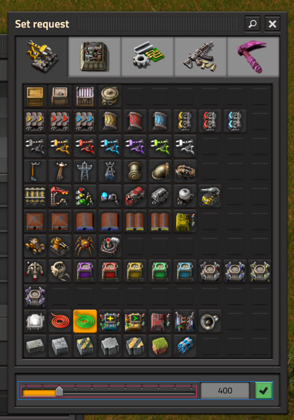
In the image below, the pink square represents how much of the UI is available to use the scroll wheel on the range slider compared to the blue square which shows the rest of the UI component fields height. It would be great if the vertical area that the scroll wheel moves the slider could be increased to roughly the same size as the other UI elements.