Remove the old battery indicator and use the blank space for new battery indicator

Suggestions that have been added to the game.

Moderator: ickputzdirwech

User avatar
Mxdanger
Burner Inserter
Burner Inserter
Posts: 5
Joined: Thu May 04, 2017 1:46 am
Contact:

Remove the old battery indicator and use the blank space for new battery indicator

Post by Mxdanger »

TL;DR
Remove the old outdated battery indicator and use an updated battery indicator in the blank space above the armor slot.
What ?
This change will remove the old battery indicator which stands out as eyesore against the new interface.
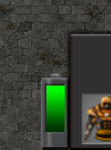
Image

The new design of the battery that was shown in the images in Factorio Friday Facts #289 should be used for a consistent design throughout the interface.
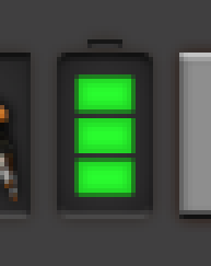
Image

The bare and unused gap above the armor slot should be used for the location of the new battery indicator. When no batteries are equipped in the power armor then it should either be left blank or a dull battery placeholder should be present. To avoid confusion with new players the area could be left as blank until the Personal Battery is unlocked in the tech tree.

Heres a quick and rough example I put together:
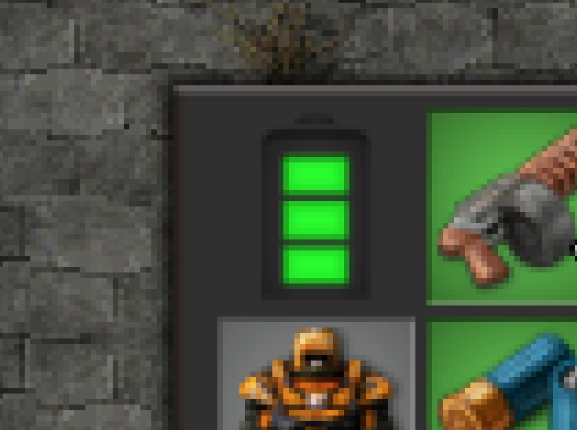
Image

As of now the batteries used in the concept above and the battery found in this image from FFF #289 only has three bars which isn't very helpful compared to having multiple bars or how it is currently done with one single bar that grows or shrinks.
Why ?
  • Removing and old UI element that does not match the style anymore so the UI can look nice.
  • Having consistency between similar elements throughout the interface.
  • Making use of the wasted space left behind by the removed pickaxe.
Last edited by Mxdanger on Fri Dec 10, 2021 9:09 pm, edited 1 time in total.
User avatar
Mxdanger
Burner Inserter
Burner Inserter
Posts: 5
Joined: Thu May 04, 2017 1:46 am
Contact:

Re: Remove the old battery indicator and use the blank space for new battery indicator

Post by Mxdanger »

wobbycarly wrote: Thu Apr 11, 2019 8:45 am Nice idea!
Thanks! :)
User avatar
ickputzdirwech
Filter Inserter
Filter Inserter
Posts: 794
Joined: Sun May 07, 2017 10:16 am
Contact:

Re: Remove the old battery indicator and use the blank space for new battery indicator

Post by ickputzdirwech »

It doesn’t look exactly like suggested here but it was changed to fit the GUI style.
Mods: Shortcuts for 1.1, ick's Sea Block, ick's vanilla tweaks
Tools: Atom language pack
Text quickly seems cold and unfriendly. Be careful how you write and interpret what others have written.
- A reminder for me and all who read what I write
Post Reply

Return to “Implemented Suggestions”