Armour & Gun quickbar location question

Don't know how to use a machine? Looking for efficient setups? Stuck in a mission?
terradus
Inserter
Inserter
Posts: 42
Joined: Mon Mar 14, 2016 9:58 am
Contact:

Re: Armour & Gun quickbar location question

Post by terradus »

Bilka wrote:
Fri Jan 29, 2021 2:59 pm
Moving the outline of the weapon panel to the right shows that it would interfere with the tooltip and the alerts, while it fits between everything on the left. (1080p resolution and 100% GUI scale)
Image
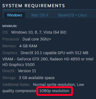
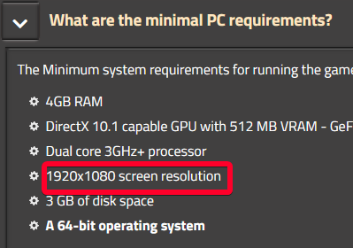
Earlier, I was too hasty with conclusions.
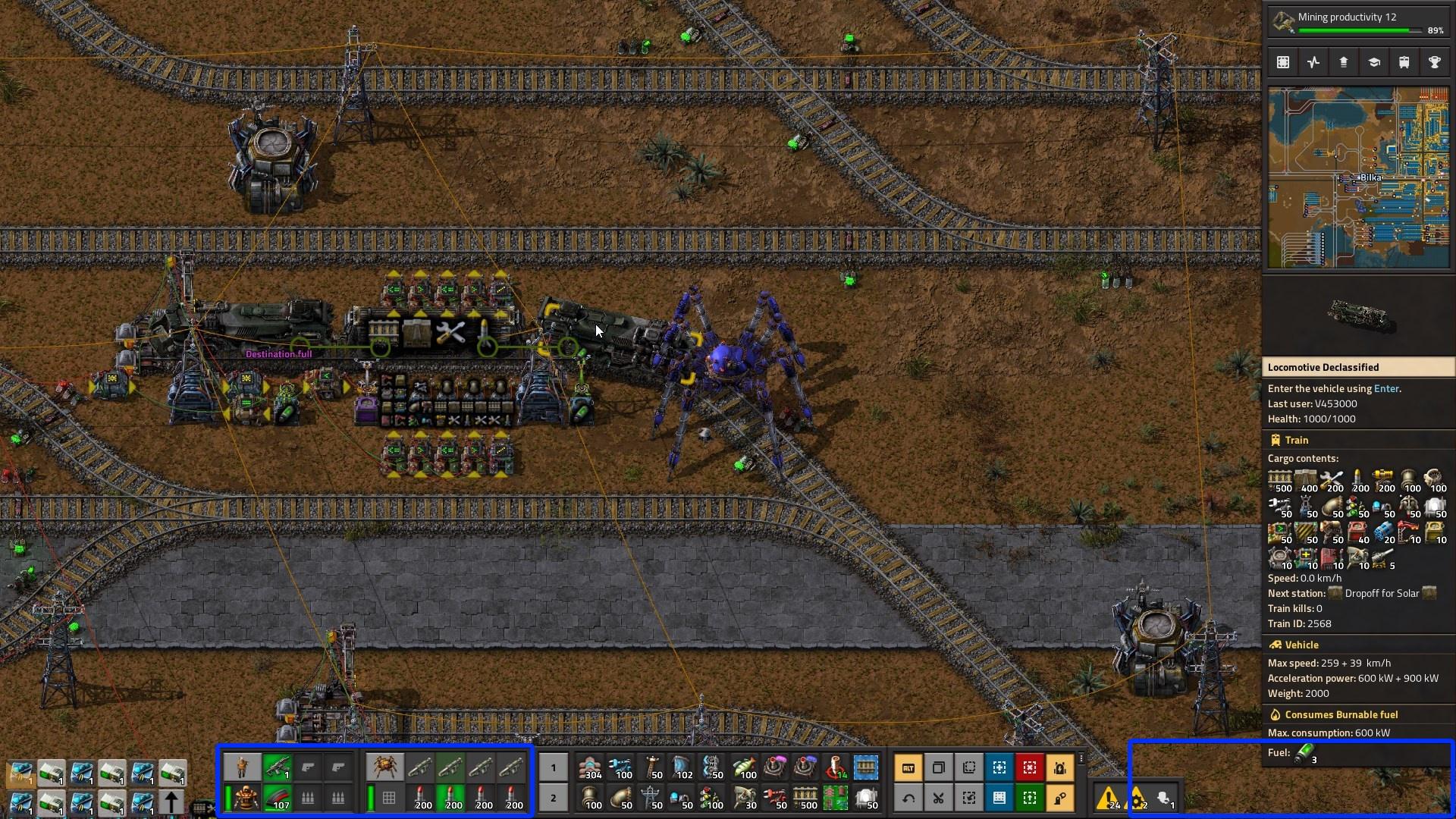
Yes you're right. this is especially noticeable if you select a logistics chest with a huge amount of stuff.
2,752 hours in factorio.

armatas
Burner Inserter
Burner Inserter
Posts: 9
Joined: Sat Aug 29, 2020 1:49 pm
Contact:

Re: Armour & Gun quickbar location question

Post by armatas »

tl;dr: if the weapons can't move right again, allow us to move the minimap to the left at least? puhwease!

I'm sorry for revisiting the topic, but I haven't managed to acclimate to the new weapons toolbar position. :(
I was fine continuing on 1.0, but now I'd really like to play some MP with a friend whom I sold on the game, and of course they are on 1.1.
kovarex wrote:
Thu Jan 28, 2021 3:12 pm
armatas wrote:
Thu Jan 28, 2021 9:50 am
(zip)
This is only a muscle memory, and it will feel natural quite fast when you play.
There is just not enough place on the right for the Character + vehicle window.
I don't mean to sound toxic or ungrateful with my comments, I hope I didn't come across that way. I love all the considerable work invested here, especially considering you are investing all this time into a post-release product (with declining revenue stream), still. And I want to distance myself from other so toxic comments.

But it's not re-learning muscle memory that hurts me in this case, it's eye-coordination in intense skirmishes; where I want the minimap + ammo display on one eye, and my character fighting on the other eye. It wasn't perfect before, but you could glimpse map+ammo out of the corner of one eye, while in a hectic battle now it is really hard for me to focus on the actual fight, while flipping eyes between weapon toggled or ammo count and what's happening on the mini-map (bottom-left to top-right, argh!).
That eye movement is like: top-right, bottom-left, center screen - top-right, center, bottom-left - repeat until headache.

Regarding screen space: I'm playing on a *XGA resolution (1920x1200) and the tooltip UI still stretches all the way to the bottom of the screen. Meaning: on 1920x1080 or similar 16:9 widescreen ratio, it does cut off and just overflow the screen, already ANYWAY. And in the few cases when it does I REALLY DON'T CARE, if that means I can just have the weapon toolbar back on the right side!
Or in other words: since I have 1200px in height, minus the height of the weapon toolbar equals around the same as if I didn't have it there while playing at 1080! I don't see the difference! It'll overflow screen either way. Just let me make the choice of the lesser evil for myself, pleeease?
Even better: The vehicle information is a tooltip element, it only shows when hoovered - so then it can just overflow in front of the weapons toolbar while active (hiding the ammunition info), and it won't be any different to not having the weapons toolbar there. I hope I'm making sense here?

As Bilka took the time to create a visual example (thanks!), I can at least return the favor:
Both weapon toolbars on the right side, even if stacked on top of each other, would only hide neglectable info worst-case scenario.
factorio-screen.jpg (508.36 KiB) Viewed 5553 times

I apologize for being the prissy princess on the pea here, but I'm willing to work for this change, given some chance of success.
  • I've found the style.lua and tried my best to mod the elements, but they seemingly just don't have or expose the parent objects that would allow me to re-position the entire boxes I need (from what I can deduct, since it looks similar enough to CSS to me; and definite props for building it that way!)
  • I found the shader files are exposed, and tried to find a way to "blit"-copy the lower left to the right screen side via framebuffer in a postprocessing shader (so I would at least have it on both sides); but I've not yet been able to figure out the how, if there's even an existing shader that exposes the necessary data to modify it in such fashion.
  • I've considered decompiling the thing, but even if (big if) I could find the correct memory to tweak and the right way to tweak it, that's just way too much hassle for a temporary hack that would just become invalid again with the next update.
Most every RTS game I played and can remember had the UI concentrated at one screen side, or at most two adjacent ones. For westwood titles like Dune, C&C etc. on the right side; Dark Reign, StarCraft etc. on the bottom; Supreme Commander kinda both, but then with moveable (and lua-moddable) UI elements.
Sure, this is NOT an RTS and usually doesn't require the amount of hectic APM (actions/clicks per minute) or coordination of multiplayer RTS, but for the fighter types that like the biter battle action and perhaps MP scenarios like Mountain Fortress :mrgreen: , it's similar enough.

I'd really love to gain just some tiny concession on this topic, so I can continue to enjoy the action-intense moments in Factorio.

Any possible hack is welcome, it doesn't have to be fit for general player consumption. If anyhow possible: please allow users to mod the UI locations themself - if you can somehow give the UI elements a parent element that I can position through the `style.lua` UI, that'd be quite amazing.
I understand that may not be easy, since GUIs like Agui or Vendetta Onlines' similar IUP are more like tiling and not floating window managers, so changing absolute positions of GUI elements may not be intended, but you guys DID make the ingame menu float - so I feel hope that this may also be achievable.

If that's too much work to ask for, the simplest solution to make me happy: if the weapons can't move right again, allow us to move the minimap to the left, ideally in a position close to the weapons toolbars; that'll also free up needed space for the right-hand UI. Whether that's both at the top or bottom wouldn't matter as much to me.

To me it just matters that the "action" and "tactical" UI elements (minimap, weapon/ammo slots, quickbar) are quickly reachable and close to each other, while the overall "strategic" elements (vehicle inventory and equipment, tooltips, vehicle or building infos, research, blueprint and building tools etc.) don't have to be. They can be located elsewhere. So as an example, the tactical stuff could be located on the left screen side while the strategic options are on the right. (So if the minimap could just move to the bottom left of the screen, next to weapons toolbar and quickbar, that would satisfy me. Perhaps the crafting toolbar could be swapped to the bottom right, to make it fit.)

Hypothetical RTS-like UI arrangement (pRPort+Exoskel. toggles might also fit better next to Armor on the left side)
factorio-UI.jpg (589.5 KiB) Viewed 5553 times
I hope it's self-explanatory, but with "tactical" I mean info & tools for short-term in-action decision-making, where as "strategic" info are info & tools in support of more long-term goals and planning; such as the usual base construction, vehicle armament planning before action.

So for example you will want to know how fast your vehicle is, or how many weapons it mounts while planning your strategy; but in the heat of the battle you don't care for that info - only how your current ammunition status is, grenades left in your inventory, HP/damage status, planning escape routes on the map,... that stuff.

Ooohkay. Well, this became a fookin essay. But if it helps my case, ...friggin worth it.

P.S.
Koub wrote:
Thu Jan 28, 2021 11:15 am
armatas wrote:
Thu Jan 28, 2021 10:43 am
And it didn't even warrant a changelog entry?
It did.
Moved the character/vehicle gun window to the left of the quickbar.
Source
Many apologies. I read through the whole ingame changelog post-update; but this line didn't register with me, even after looking for it.

coppercoil
Filter Inserter
Filter Inserter
Posts: 470
Joined: Tue Jun 26, 2018 10:14 am
Contact:

Re: Armour & Gun quickbar location question

Post by coppercoil »

Bilka wrote:
Fri Jan 29, 2021 2:59 pm
Moving the outline of the weapon panel to the right shows that it would interfere with the tooltip and the alerts, while it fits between everything on the left. (1080p resolution and 100% GUI scale)
What 1080p?
There also are other monitors.
QHD.jpg
QHD.jpg (575.93 KiB) Viewed 5547 times

Just add an option.

Bilka
Factorio Staff
Factorio Staff
Posts: 3123
Joined: Sat Aug 13, 2016 9:20 am
Contact:

Re: Armour & Gun quickbar location question

Post by Bilka »

coppercoil wrote:
Wed Feb 10, 2021 4:26 pm
What 1080p?
I assume you mean "Why 1080p?". This should answer it:
Image
Image
I'm an admin over at https://wiki.factorio.com. Feel free to contact me if there's anything wrong (or right) with it.

coppercoil
Filter Inserter
Filter Inserter
Posts: 470
Joined: Tue Jun 26, 2018 10:14 am
Contact:

Re: Armour & Gun quickbar location question

Post by coppercoil »

Bilka wrote:
Wed Feb 10, 2021 4:29 pm
I assume you mean "Why 1080p?".
No. I mean, why not to make a game for ALL 1080+ monitors?
I don't have space issues on the right side. Can I have weapons on the right, please?

User avatar
ickputzdirwech
Filter Inserter
Filter Inserter
Posts: 768
Joined: Sun May 07, 2017 10:16 am
Contact:

Re: Armour & Gun quickbar location question

Post by ickputzdirwech »

Keep in mind that the info panel on the right side can get quite long even in vanilla (usually even more of an issue with mods). If you hover over a logistic chest with several different items inside, the info about what is stored in the network will overflow even on your screen.
Mods: Shortcuts for 1.1, ick's Sea Block, ick's vanilla tweaks
Tools: Atom language pack
Text quickly seems cold and unfriendly. Be careful how you write and interpret what others have written.
- A reminder for me and all who read what I write

Marc90
Inserter
Inserter
Posts: 39
Joined: Wed Oct 07, 2015 5:42 pm
Contact:

Re: Armour & Gun quickbar location question

Post by Marc90 »

ickputzdirwech wrote:
Wed Feb 10, 2021 4:57 pm
Keep in mind that the info panel on the right side can get quite long even in vanilla (usually even more of an issue with mods). If you hover over a logistic chest with several different items inside, the info about what is stored in the network will overflow even on your screen.
So it doesn't actually solve the issue it was supposed to. The info can still overflow the screen, even with the weapons moved to the left. Why not actually solve the issue by making the info panel on the right scrollable if it gets too big and suddenly screen size is not an issue any more and the weapons can be moved to the right again and everyone is happy.

TaylorItaly
Inserter
Inserter
Posts: 20
Joined: Mon Jan 06, 2020 6:02 am
Contact:

Re: Armour & Gun quickbar location question

Post by TaylorItaly »

Marc90 wrote:
Tue Jun 15, 2021 8:45 pm

So it doesn't actually solve the issue it was supposed to. The info can still overflow the screen, even with the weapons moved to the left. Why not actually solve the issue by making the info panel on the right scrollable if it gets too big and suddenly screen size is not an issue any more and the weapons can be moved to the right again and everyone is happy.

+1 for this.

MiniHerc
Fast Inserter
Fast Inserter
Posts: 171
Joined: Fri Jun 26, 2015 11:37 pm

Re: Armour & Gun quickbar location question

Post by MiniHerc »

Marc90 wrote:
Tue Jun 15, 2021 8:45 pm
So it doesn't actually solve the issue it was supposed to. The info can still overflow the screen, even with the weapons moved to the left. Why not actually solve the issue by making the info panel on the right scrollable if it gets too big and suddenly screen size is not an issue any more and the weapons can be moved to the right again and everyone is happy.
+1

User avatar
NotRexButCaesar
Smart Inserter
Smart Inserter
Posts: 1120
Joined: Sun Feb 16, 2020 12:47 am
Contact:

Re: Armour & Gun quickbar location question

Post by NotRexButCaesar »

Marc90 wrote:
Tue Jun 15, 2021 8:45 pm
TaylorItaly wrote:
Wed Jun 16, 2021 4:21 pm
Ambaire wrote:
Mon Jun 21, 2021 3:12 am
19605 & more generally 3354
—Crevez, chiens, si vous n'étes pas contents!

TaylorItaly
Inserter
Inserter
Posts: 20
Joined: Mon Jan 06, 2020 6:02 am
Contact:

Re: Armour & Gun quickbar location question

Post by TaylorItaly »

you give us links to 5 and 7 year old discussions ?

Thank you for your help !!

User avatar
Silari
Filter Inserter
Filter Inserter
Posts: 488
Joined: Sat Jan 27, 2018 10:04 pm
Contact:

Re: Armour & Gun quickbar location question

Post by Silari »

Marc90 wrote:
Tue Jun 15, 2021 8:45 pm
ickputzdirwech wrote:
Wed Feb 10, 2021 4:57 pm
Keep in mind that the info panel on the right side can get quite long even in vanilla (usually even more of an issue with mods). If you hover over a logistic chest with several different items inside, the info about what is stored in the network will overflow even on your screen.
So it doesn't actually solve the issue it was supposed to. The info can still overflow the screen, even with the weapons moved to the left. Why not actually solve the issue by making the info panel on the right scrollable if it gets too big and suddenly screen size is not an issue any more and the weapons can be moved to the right again and everyone is happy.
You ignored the other issues with having it there that are in this thread. Regardless of the entity view, it still overlaps with the shortcuts and alerts that are on the right side. Even if that panel were scrollable there still wouldn't be enough room, as bilka showed in his screenshot just a few posts up.

TaylorItaly
Inserter
Inserter
Posts: 20
Joined: Mon Jan 06, 2020 6:02 am
Contact:

Re: Armour & Gun quickbar location question

Post by TaylorItaly »

This is not true , when playing in higher resulutions than 1980*1080.

User avatar
eradicator
Smart Inserter
Smart Inserter
Posts: 5206
Joined: Tue Jul 12, 2016 9:03 am
Contact:

Re: Armour & Gun quickbar location question

Post by eradicator »

Ultimately any kind of "fixed" window layout will always have pro-fanatics and con-fanatics. The only real solution would be a built-in layout editor like many MMOs have. That let's you freely position the elements. Not to be confused with "make all elements drag-drop all the time" because that just causes too much accidential messing up of the layout.
Author of: Belt Planner, Hand Crank Generator, Screenshot Maker, /sudo and more.
Mod support languages: 日本語, Deutsch, English
My code in the post above is dedicated to the public domain under CC0.

Mysak0CZ
Manual Inserter
Manual Inserter
Posts: 1
Joined: Thu Sep 19, 2019 6:14 pm
Contact:

Re: Armour & Gun quickbar location question

Post by Mysak0CZ »

+1 For this.
I understand there are valid reasons for it to be left by default, however:
Is there something preventing you from providing dropdown/select option (left corner/left of hotbar/right corner) for those that want to choose it even over the possible drawback of windows overlapping a bit more?
Also this option would be even more useful for people with larger screen or smaller UI scale.

astroshak
Filter Inserter
Filter Inserter
Posts: 597
Joined: Thu May 10, 2018 9:59 am
Contact:

Re: Armour & Gun quickbar location question

Post by astroshak »

It’s deliberate because that bottom right corner can become filled with container inventory. Learn to live with it :(

Post Reply

Return to “Gameplay Help”