Splitter GUI, clickable graphical priorities

Post your ideas and suggestions how to improve the game.

Moderator: ickputzdirwech

Ikonos
Burner Inserter
Burner Inserter
Posts: 16
Joined: Sun Mar 11, 2018 3:50 pm
Contact:

Splitter GUI, clickable graphical priorities

Post by Ikonos »

TL;DR
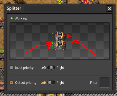
Remake current yellow arrows for priorities in the splitter's GUI as buttons.

splitter_gui.png
splitter_gui.png (122.33 KiB) Viewed 5773 times
What ?
Click an arrow button to set the priority to that side. If it already has the priority, then clears it.
Buttons should be rotated to match the splitter preview.
Current GUI should also be kept.
Why ?
To have a graphical and intuitive way to set priorities.
User avatar
ssilk
Global Moderator
Global Moderator
Posts: 12889
Joined: Tue Apr 16, 2013 10:35 pm
Contact:

Re: Splitter GUI, clickable graphical priorities

Post by ssilk »

Nice and simple.
Cool suggestion: Eatable MOUSE-pointers.
Have you used the Advanced Search today?
Need help, question? FAQ - Wiki - Forum help
I still like small signatures...
User avatar
jodokus31
Smart Inserter
Smart Inserter
Posts: 1622
Joined: Sun Feb 26, 2017 4:13 pm
Contact:

Re: Splitter GUI, clickable graphical priorities

Post by jodokus31 »

+1
And display the splitter in the same direction as in the World (probably is already but i cant Check atm)
User avatar
ickputzdirwech
Filter Inserter
Filter Inserter
Posts: 794
Joined: Sun May 07, 2017 10:16 am
Contact:

Re: Splitter GUI, clickable graphical priorities

Post by ickputzdirwech »

jodokus31 wrote: Wed Dec 02, 2020 7:36 am +1
And display the splitter in the same direction as in the World (probably is already but i cant Check atm)
It is already displayed in the correct direction.
Mods: Shortcuts for 1.1, ick's Sea Block, ick's vanilla tweaks
Tools: Atom language pack
Text quickly seems cold and unfriendly. Be careful how you write and interpret what others have written.
- A reminder for me and all who read what I write
User avatar
jodokus31
Smart Inserter
Smart Inserter
Posts: 1622
Joined: Sun Feb 26, 2017 4:13 pm
Contact:

Re: Splitter GUI, clickable graphical priorities

Post by jodokus31 »

ickputzdirwech wrote: Wed Dec 02, 2020 9:21 am
jodokus31 wrote: Wed Dec 02, 2020 7:36 am +1
And display the splitter in the same direction as in the World (probably is already but i cant Check atm)
It is already displayed in the correct direction.
Thanks. I remember that i always screw up the side. So it would help, if dont have to think about right or left, but visually select the direction via correctly displayed splitter+buttons like op suggested
Ikonos
Burner Inserter
Burner Inserter
Posts: 16
Joined: Sun Mar 11, 2018 3:50 pm
Contact:

Re: Splitter GUI, clickable graphical priorities

Post by Ikonos »

I am glad I am not the only one that has to think (click) twice when setting priorities.

I don't know if the buttons would be confusing when the filter is active. I think It could look like this:

splitter_gui_filter.png
splitter_gui_filter.png (267.93 KiB) Viewed 5661 times

Maybe an " * " on the empty button.
Daeruun
Inserter
Inserter
Posts: 43
Joined: Thu May 04, 2017 8:37 pm
Contact:

Re: Splitter GUI, clickable graphical priorities

Post by Daeruun »

+1
would be wonderful not to click the wrong filter in every second splitter
foamy
Filter Inserter
Filter Inserter
Posts: 432
Joined: Mon Aug 26, 2019 4:14 am
Contact:

Re: Splitter GUI, clickable graphical priorities

Post by foamy »

Yes indeed.
User avatar
Fargotroniac
Burner Inserter
Burner Inserter
Posts: 8
Joined: Thu Dec 03, 2020 8:22 am
Contact:

Re: Splitter GUI, clickable graphical priorities

Post by Fargotroniac »

Looks good.

Clearer and better than the current GUI. :)
Stimpatch
Inserter
Inserter
Posts: 45
Joined: Wed Sep 11, 2019 8:23 am
Contact:

Re: Splitter GUI, clickable graphical priorities

Post by Stimpatch »

Hmm... this suggestion looks nice, yes. But this will create the first entity that has some kind of controls within the simulation box. So it will be a precedent for further "Suggesstions" and "UI Improvements" to come. I dont like that.

Lets remember that the simulation box is just an upgraded display of the entity. Also, it represents the ingame world... and there are no priority buttons in my factory.

A preview would be kinda cool, though. So, if you had iron ore on the left belt and coal on the right, changing the settings could show a preview of how the splitter would work, i guess.
User avatar
ickputzdirwech
Filter Inserter
Filter Inserter
Posts: 794
Joined: Sun May 07, 2017 10:16 am
Contact:

Re: Splitter GUI, clickable graphical priorities

Post by ickputzdirwech »

Stimpatch wrote: Thu Dec 03, 2020 8:47 am A preview would be kinda cool, though. So, if you had iron ore on the left belt and coal on the right, changing the settings could show a preview of how the splitter would work, i guess.
Not sure if I understand you correctly, but the preview already shows all the filters and items on the belt.
Attachments
splitter.png
splitter.png (133.38 KiB) Viewed 5602 times
Mods: Shortcuts for 1.1, ick's Sea Block, ick's vanilla tweaks
Tools: Atom language pack
Text quickly seems cold and unfriendly. Be careful how you write and interpret what others have written.
- A reminder for me and all who read what I write
Stimpatch
Inserter
Inserter
Posts: 45
Joined: Wed Sep 11, 2019 8:23 am
Contact:

Re: Splitter GUI, clickable graphical priorities

Post by Stimpatch »

ickputzdirwech wrote: Thu Dec 03, 2020 12:11 pm Not sure if I understand you correctly, but the preview already shows all the filters and items on the belt.
Yes, my bad. ofc the editor window is live, so if you change something there, no preview is needed :D

Then, i guess i cna only vode agains the suggestion made in this thread.
User avatar
NotRexButCaesar
Smart Inserter
Smart Inserter
Posts: 1133
Joined: Sun Feb 16, 2020 12:47 am
Contact:

Re: Splitter GUI, clickable graphical priorities

Post by NotRexButCaesar »

+1. This would prevent me from accidentally mirroring what I want to do.
—Crevez, chiens, si vous n'étes pas contents!
Sad_Brother
Fast Inserter
Fast Inserter
Posts: 209
Joined: Mon Jan 08, 2018 4:54 pm
Contact:

Re: Splitter GUI, clickable graphical priorities

Post by Sad_Brother »

+1. I do not mistake on splitters usually but this looks good.
Squelch
Filter Inserter
Filter Inserter
Posts: 346
Joined: Sat Apr 23, 2016 5:31 pm
Contact:

Re: Splitter GUI, clickable graphical priorities

Post by Squelch »

I like this too.

I wouldn't need to turn my monitor over to try and work out which side to set :D
User avatar
imTheSupremeOne
Long Handed Inserter
Posts: 65
Joined: Wed Aug 30, 2017 4:13 pm
Contact:

Click inside GUI displays feature

Post by imTheSupremeOne »

TL;DR
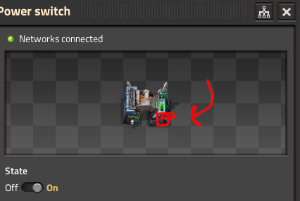
Make additional clicking buttons inside GUI displays for some things:
Image

Why ?
It would be really convenient for things like splitters as you would never have to think where is right or left this time. Also mb this could be used by other entities as well to create more enjoyable and natural interactions then with regular sliders — like an actual breaker on power switch and many other interactions... I think something like that would definitely add more coolness and impressiveness to the game...
Image
User avatar
ssilk
Global Moderator
Global Moderator
Posts: 12889
Joined: Tue Apr 16, 2013 10:35 pm
Contact:

Re: Splitter GUI, clickable graphical priorities

Post by ssilk »

joined with existing thread

The more ground laying idea you described at the end. You are free to make an extra suggestion out of that. Don’t forget to make specific examples, because I’m not 100% sure, if I understood the idea with the circuit breaker for the switch (which is kind of big circuit breaker). E. g. What should happen when clicked?
Cool suggestion: Eatable MOUSE-pointers.
Have you used the Advanced Search today?
Need help, question? FAQ - Wiki - Forum help
I still like small signatures...
User avatar
imTheSupremeOne
Long Handed Inserter
Posts: 65
Joined: Wed Aug 30, 2017 4:13 pm
Contact:

Re: Splitter GUI, clickable graphical priorities

Post by imTheSupremeOne »

ssilk wrote: Thu Jul 15, 2021 4:44 am joined with existing thread

The more ground laying idea you described at the end. You are free to make an extra suggestion out of that. Don’t forget to make specific examples, because I’m not 100% sure, if I understood the idea with the circuit breaker for the switch (which is kind of big circuit breaker). E. g. What should happen when clicked?
It's just additional stylistic GUI feature like in Satisfactory where you press not a sliders but actual realistic buttons, breakers... I did enjoyed it, and looking at the window it doesn't conflict with sliders. So just visually to the power switch could be added a breaker that you could press on entity display to interact with power switch to turn it On or Off...
Post Reply

Return to “Ideas and Suggestions”