Friday Facts #363 - 1.1 is getting close
- Unknow0059
- Fast Inserter

- Posts: 101
- Joined: Tue Aug 08, 2017 7:37 pm
- Contact:
Re: Friday Facts #363 - 1.1 is getting close
Beautiful Quality of Life!
Re: Friday Facts #363 - 1.1 is getting close
Please please please please please add a shortcut key to change/toggle a train the character is sitting in between manual and automatic. Please?
Re: Friday Facts #363 - 1.1 is getting close
+1 +1 +1 ...BHakluyt wrote: Sun Nov 15, 2020 7:51 am Please please please please please add a shortcut key to change/toggle a train the character is sitting in between manual and automatic. Please?
+---+
| M | (almost 3000 hours)
+---+
| M | (almost 3000 hours)
+---+
Re: Friday Facts #363 - 1.1 is getting close
Woa, how has nobody thought of this yet? Is there a mod that does this? I would loove glowy trains!Illiou wrote: Sat Nov 14, 2020 2:41 am Btw, the steam locomotive is also burning stuff, maybe a slight orange glow from the cabin would look cool.
-
ablumonkey
- Manual Inserter

- Posts: 1
- Joined: Sun Nov 15, 2020 4:43 pm
- Contact:
Re: Friday Facts #363 - 1.1 is getting close
I'm just throwing this out there (because it's the best idea ever...well not ever...but at least it's one I have been mulling over for quite some time). With the 'Belt building in line', it would be amazing if you could toggle it off, BUT still be able to use the function by holding a key, such as SHIFT, while building the belts. Or the default could be as it is being designed for 1.1, but holding a key (shift) would let you return to the tried and true spray and pray method. 


-
TheoMarque
- Long Handed Inserter

- Posts: 94
- Joined: Tue Feb 27, 2018 6:06 pm
- Contact:
Re: Friday Facts #363 - 1.1 is getting close
Overall good changes but 3 are discutable and one maing game unplayable for players with irritable contrast ingame.
1. Flat Charager Gui is worst change in factorio I saw until I play (0.15, near 4000 h). This is irritable beacause on center screen I see personal logistcs what is set once and forget without any purpose laters. Who constantly move sliders in this menu? If i neeed 100 stack inserters I need that amount. If I not need any stone or other ores or wood i set on 0 and forget. This options can not be in screen center!
2. Machine small window - today when we click on inserter we give small window with necesary options and things. Nothing more. Why large empty space and covering screen is better than today small window?
3. Night. Is overall good but please - add sliders/checkbox in graphs menu for players that highly contrast in night can irritate eyes and make came confusing.
For point 1 I give you an adivce. Windows with snapping! For example, these 3 windows can be snappable each other by vertical borders. If someone need Logistis in center - he can do it, if someone need crafting in screen center - he can do it.

Second area - sidebars. For example vertical narrow panel allowing hide dedicated window in inventory gui. Ping border is only for show what I think.

Overall - my dream is movable Interface elements for example bottom bar, eq, map and antyhing else, like mod guis.
1. Flat Charager Gui is worst change in factorio I saw until I play (0.15, near 4000 h). This is irritable beacause on center screen I see personal logistcs what is set once and forget without any purpose laters. Who constantly move sliders in this menu? If i neeed 100 stack inserters I need that amount. If I not need any stone or other ores or wood i set on 0 and forget. This options can not be in screen center!
2. Machine small window - today when we click on inserter we give small window with necesary options and things. Nothing more. Why large empty space and covering screen is better than today small window?
3. Night. Is overall good but please - add sliders/checkbox in graphs menu for players that highly contrast in night can irritate eyes and make came confusing.
For point 1 I give you an adivce. Windows with snapping! For example, these 3 windows can be snappable each other by vertical borders. If someone need Logistis in center - he can do it, if someone need crafting in screen center - he can do it.

Second area - sidebars. For example vertical narrow panel allowing hide dedicated window in inventory gui. Ping border is only for show what I think.

Overall - my dream is movable Interface elements for example bottom bar, eq, map and antyhing else, like mod guis.
Re: Friday Facts #363 - 1.1 is getting close
Am i the only one who has problems with understanding those icons? Probably the only icon i immediately understood is the braking power of the train. For most other icons i had to think for a few seconds to understand what the icon meant.
As I read so many people cant decide on the layout of inventory (or hotbar). How about allowing a player to move windows himself? You don't have to add other options to the settings, just implement snapping windows to each other or to the corners of the screen, as in visual studio, for example.
https://youtu.be/9PbNl0QEZfI?t=407
Re: Friday Facts #363 - 1.1 is getting close
On "Character tab removal"
Hi,
I have some feedback and suggestions on the rework of the tabs behind the "e" key.
Right now I play Space Exploration (SE). The mod has more items then Vanilla.
To place or change a logistic request, I frenquently have to search for the spot, if the item is already requested or not. Also existing requests are difficult to see and find, because the white numbers in front of the icons are blocking an easy recognition of the item picture.
I have noticed on twitch, that streamers have the same issue.
To solve and help that, I right now use the mod "Player request crafting layout". It puts all items into the logistic window. The items are arranged in rows like in the crafting tab.
-Logistics,
-Production,
-Recources,
-Manufacturing,
-Science,
-Equipment and Combat.
This helps to find items request in the overwelming
Please as a dev check out and try the mod to get a better understanding of what it does.
Suggestion:
Give the logistic window the same tabs as the the crafting tab has. To find the item in the "Logistics" window, one can cheat on with the crafting tab to find where the item request is.
Also, why not give every item a fixed spot? It fits within the flow of finding items in the crafting tab. And supports the player, because part of placing a logistic request is part of what the player does for crafting.
This would be beneficial for mods with more and new items.
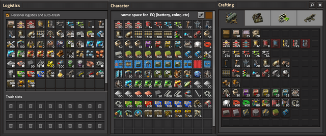
I made a picture of what I have in mind. It has the tabs of SE. Also the mentioned mod listed all items in the Logistics window. Where the player only has to change parameters. I actually really like that. It has less friction then the blank logistics window. But I finding a specific item is still a bit difficult, because I have to scroll down and find it in a long list. Tabs would help here alot.
I hope you like the picture. I agree that the picture has some editing flaws. But It surely helps to understand what the idea has in mind.
Erm, and I forgot to change the window on the crafting side. It is Vanilla and the middle is from SE. Sorry.
Hi,
I have some feedback and suggestions on the rework of the tabs behind the "e" key.
Right now I play Space Exploration (SE). The mod has more items then Vanilla.
To place or change a logistic request, I frenquently have to search for the spot, if the item is already requested or not. Also existing requests are difficult to see and find, because the white numbers in front of the icons are blocking an easy recognition of the item picture.
I have noticed on twitch, that streamers have the same issue.
To solve and help that, I right now use the mod "Player request crafting layout". It puts all items into the logistic window. The items are arranged in rows like in the crafting tab.
-Logistics,
-Production,
-Recources,
-Manufacturing,
-Science,
-Equipment and Combat.
This helps to find items request in the overwelming
Please as a dev check out and try the mod to get a better understanding of what it does.
Suggestion:
Give the logistic window the same tabs as the the crafting tab has. To find the item in the "Logistics" window, one can cheat on with the crafting tab to find where the item request is.
Also, why not give every item a fixed spot? It fits within the flow of finding items in the crafting tab. And supports the player, because part of placing a logistic request is part of what the player does for crafting.
This would be beneficial for mods with more and new items.
I made a picture of what I have in mind. It has the tabs of SE. Also the mentioned mod listed all items in the Logistics window. Where the player only has to change parameters. I actually really like that. It has less friction then the blank logistics window. But I finding a specific item is still a bit difficult, because I have to scroll down and find it in a long list. Tabs would help here alot.
I hope you like the picture.
Erm, and I forgot to change the window on the crafting side. It is Vanilla and the middle is from SE. Sorry.
- Attachments
-
- Suggestion
- 1.jpg (314.02 KiB) Viewed 12808 times
Last edited by andre2 on Sun Nov 15, 2020 10:07 pm, edited 1 time in total.
-
dexteritas
- Burner Inserter

- Posts: 18
- Joined: Fri Nov 13, 2020 5:57 pm
- Contact:
Re: Friday Facts #363 - 1.1 is getting close
When I read the current FFF, I had some thoughts about the character GUI and thought about what sometimes annoys me, especially when it comes to logistics. My solution is the combination of crafting and logistics menu, which I just posted in the forum Ideas and Suggestions.
Re: Friday Facts #363 - 1.1 is getting close
+1Eydamos wrote: Fri Nov 13, 2020 12:57 pm Building belts in a line without spraying them all over the place is really nice. Could you maybe add this also while pressing a button so it can be used for anything? E.g. if I create a new station I have to drag a line of chests but usually spray them all over the place. Being able to go in a straight line while holding e.g. Ctrl would be very nice.
I would love to be able to do this with walls.
Re: Friday Facts #363 - 1.1 is getting close
Hey guys,
what you fixed and implemented since the release of 1.0 is a blast.
I have two types of feedback on the current news:
regarding alert arrows:
Does this also work for alerts generated by programmable speakers? This would really help. I once tried to express my view about how underprivileged custom alarms are compared to the built in alarms ( viewtopic.php?f=6&t=78733 ). After all, custom alerts are something the player specifically wants to be notified about. one destroyed wall tile might be far less important than a custom alert.
regarding the new glow effects:
They look awesome. But where do all the uranium building glows illuminate their surrounding? I can't see any illumination. The heat pipes just glow for themselves now it seems. same seems to be true for the reactor, the centrifuges and the accu arcs. i would expect especially the last ones to shine a bright light on their surroundings. actually for the electric arcs i think the old light effects suited them better.
Re: Friday Facts #363 - 1.1 is getting close
Holy moly, this is simple yet great. Basically so simple that you could call it thinking outside the box.dexteritas wrote: Sun Nov 15, 2020 10:03 pm When I read the current FFF, I had some thoughts about the character GUI and thought about what sometimes annoys me, especially when it comes to logistics. My solution is the combination of crafting and logistics menu, which I just posted in the forum Ideas and Suggestions.
Last edited by Illiou on Mon Nov 16, 2020 2:36 am, edited 1 time in total.
Re: Friday Facts #363 - 1.1 is getting close
That was completely overdone and looked silly. You didn't even see where the light was really coming from. Now it's the inside of the centrifuge and the reactor that is glowing. That works fine without lighting up their surroundingsImpatient wrote: Mon Nov 16, 2020 1:56 am But where do all the uranium building glows illuminate their surrounding?
Glowing heat pipes and accumulators would be nice though.
Also a bit off topic, how about reworking the accumulators on the belt? It doesn't make sense for them to have electric arcs.
-
KatherineOfSky
- Fast Inserter

- Posts: 128
- Joined: Wed Mar 30, 2016 7:54 pm
- Contact:
Re: Friday Facts #363 - 1.1 is getting close
I agree with this... TBH when I wrote my earlier post, I had no idea what to make of it... surely the tiny, compact, beautiful little windows for combinators, etc. are not boing to be replaced by a HUGE welding to the inventory window... ??? It blocks much of the screen and is NOT going to allow you to look at all the things connected nearby, (which is helpful for visualizing the logic for the combinator settings).TheoMarque wrote: Sun Nov 15, 2020 7:19 pm 2. Machine small window - today when we click on inserter we give small window with necesary options and things. Nothing more. Why large empty space and covering screen is better than today small window?
(Why would inventory be needed to look at inserters and combinators on the ground anyway? There is no function there at all).
Tutorials, wild playthroughs, and more! https://www.youtube.com/@KatherineOfSky
Re: Friday Facts #363 - 1.1 is getting close
Inserters have items in hand. With this new GUI you can take items out of the hand of an inserter that got stuck and cannot drop its item.KatherineOfSky wrote: Mon Nov 16, 2020 5:23 am (Why would inventory be needed to look at inserters and combinators on the ground anyway? There is no function there at all).
Combinators don't have an inventory, so the player's GUI will not be attached when checking the combinator. This was clarified earlier.
Re: Friday Facts #363 - 1.1 is getting close
Add large beacon plz. 


Re: Friday Facts #363 - 1.1 is getting close
Hallo Developers,
do you fix the pending bugs also? Some of the bugs are outdated and I think the time is good to clean this subforum.
Nice work, nice game, nice team.
do you fix the pending bugs also? Some of the bugs are outdated and I think the time is good to clean this subforum.
Nice work, nice game, nice team.
Re: Friday Facts #363 - 1.1 is getting close
I don't really see the need for attaching the personal inventory. Can you put items into the inserter hand? If not, why have that big display? The existing inserter window could have a small inventory slot added. The proposed 1.1 inserter gui is absurdly huge.valneq wrote: Mon Nov 16, 2020 5:38 amInserters have items in hand. With this new GUI you can take items out of the hand of an inserter that got stuck and cannot drop its item.KatherineOfSky wrote: Mon Nov 16, 2020 5:23 am (Why would inventory be needed to look at inserters and combinators on the ground anyway? There is no function there at all).
Combinators don't have an inventory, so the player's GUI will not be attached when checking the combinator. This was clarified earlier.
Here's a quick mockup of how it could work:

Alternately, remove the circuit and logistics buttons and add dedicated gui subsections for them.
Last edited by MiniHerc on Mon Nov 16, 2020 12:08 pm, edited 2 times in total.
- Deadlock989
- Smart Inserter

- Posts: 2529
- Joined: Fri Nov 06, 2015 7:41 pm
Re: Friday Facts #363 - 1.1 is getting close
I agree. Several modders including me have been pushing for months/years to be able to do more things (and more nuanced things) with light rendering. I am really pleased that we are now getting those features. In the past, you couldn't have any effect like flames or sparks or arcs of electricity without spamming it with a massive spotlight from on high. Now we can have more plausible-looking lighting effects. It is a small thing with zero effect on mechanics but a huge improvement in my books. In Factorio 0.13-0.16 I literally never turned the alt-mode icon overlay off. More recently I barely ever turn it on.Serenity wrote: Mon Nov 16, 2020 2:35 am That was completely overdone and looked silly. You didn't even see where the light was really coming from. Now it's the inside of the centrifuge and the reactor that is glowing. That works fine without lighting up their surroundings
I would even get rid of the uranium ore patch glow if it were my game.
Re: Friday Facts #363 - 1.1 is getting close
Another patch goes by with basically zero new content. *Yawn*

