The way pollution on the map looks now is an big blob of opaque red, with a fringe of transparent red. This does not give any information about where in your base the pollution comes from, or where the pollution is worst/best. If the value for the most opaque red was not fixed, the pollution overlay on the map view would become incredibly more useful. The lowest pollution red would remain at a value of one, so all the information given now would stay there, and there would be only a benefit. I believe this would not be *too* hard to implement, and would not impact UPS measurably more than the current system, so why would you not add it?
Thank you for the great game, It has given me thousands of hours of fun with both friends, family, and strangers. I look forward to seeing what the studio does next.
Make map pollution color scale with most polluted chunk.
Moderator: ickputzdirwech
-
NotRexButCaesar

- Smart Inserter

- Posts: 1150
- Joined: Sun Feb 16, 2020 12:47 am
- Contact:
Make map pollution color scale with most polluted chunk.
Ⅲ—Crevez, chiens, si vous n'étes pas contents!

Re: Make map pollution color scale with most polluted chunk.
The issue is: scaling the pollution color map linearly to fit the range of pollution values will make it incredibly more complicated to figure out where the border of the pollution cloud is, once the maximum value becomes large.
I am not sure exactly how
But maybe having the pollution cloud be on a logscale could help to make both the border and the internal structure visible? Not sure about that. The diffusion of pollution is so strong that you will probably not see any real structure in the bulk anyways. And most people will not be able to tell that the pollution cloud would be on a logscale, nor how to read that properly.
Then again, the only really interesting part about the pollution cloud is its border: when the border hits the biters, you got a problem. And you need to be able to see this under any circumstances – irrespective how large the maximum value of your pollution is.
Why do you want to see the internal structure of the pollution cloud? To locate polluting machines? There is other ways to do it:
You can locate the biggest polluters fairly reasonably by looking at the "pollution" tab in the production statistics – it's gonna be electric mining drills and heavily moduled assembling machines. Early on maybe boilers, later on maybe some additional pollution from lots of beacons. The producing machines show up in the regular production statistics. And you should know where your machines are. So no real need to read their location from the pollution cloud.
I am not sure exactly how
is supposed to work out.lowest pollution red would remain at a value of one
But maybe having the pollution cloud be on a logscale could help to make both the border and the internal structure visible? Not sure about that. The diffusion of pollution is so strong that you will probably not see any real structure in the bulk anyways. And most people will not be able to tell that the pollution cloud would be on a logscale, nor how to read that properly.
Then again, the only really interesting part about the pollution cloud is its border: when the border hits the biters, you got a problem. And you need to be able to see this under any circumstances – irrespective how large the maximum value of your pollution is.
Why do you want to see the internal structure of the pollution cloud? To locate polluting machines? There is other ways to do it:
You can locate the biggest polluters fairly reasonably by looking at the "pollution" tab in the production statistics – it's gonna be electric mining drills and heavily moduled assembling machines. Early on maybe boilers, later on maybe some additional pollution from lots of beacons. The producing machines show up in the regular production statistics. And you should know where your machines are. So no real need to read their location from the pollution cloud.
-
NotRexButCaesar
- Smart Inserter
- Posts: 1150
- Joined: Sun Feb 16, 2020 12:47 am
- Contact:
Re: Make map pollution color scale with most polluted chunk.
That is one part, but the main reason is just to fix the "big red splotch with a border on it" thing we see now.valneq wrote: Thu Oct 08, 2020 9:07 pm Why do you want to see the internal structure of the pollution cloud? To locate polluting machines?
If the only thing relevant is the border; why even include the scale at all? Might as well increase visibility.
Ⅲ—Crevez, chiens, si vous n'étes pas contents!


Re: Make map pollution color scale with most polluted chunk.
Why is the production view of pollution not enough? I ask, because I think the more important thing is, that I really need to see the borders. And therefore we have this logarithmic display of pollution.
To see the producers we need a completely different overlay! That should work on the difference of pollution. E.g. production of pollution is violet and consumption is green.
To see the producers we need a completely different overlay! That should work on the difference of pollution. E.g. production of pollution is violet and consumption is green.
Cool suggestion: Eatable MOUSE-pointers.
Have you used the Advanced Search today?
Need help, question? FAQ - Wiki - Forum help
I still like small signatures...
Have you used the Advanced Search today?
Need help, question? FAQ - Wiki - Forum help
I still like small signatures...
-
ickputzdirwech

- Filter Inserter

- Posts: 805
- Joined: Sun May 07, 2017 10:16 am
- Contact:
Re: Make map pollution color scale with most polluted chunk.
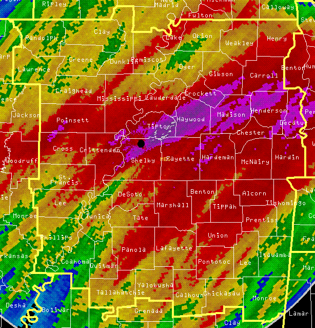
How about different colors like in weather maps? Yellow and/or orange for low pollution, red for high pollution and purple for the highest pollution. (I just took one of the first images I found)
Mods: Shortcuts for 1.1, ick's Sea Block, ick's vanilla tweaks
Tools: Atom language pack
Text quickly seems cold and unfriendly. Be careful how you write and interpret what others have written.
- A reminder for me and all who read what I write
Tools: Atom language pack
Text quickly seems cold and unfriendly. Be careful how you write and interpret what others have written.
- A reminder for me and all who read what I write
Re: Make map pollution color scale with most polluted chunk.
I really like this kind of visualisation. With an auto-adjusting color scale (so that it's always easy to pinpoint where there is most pollution emitted).
Koub - Please consider English is not my native language.