Friday Facts #352 - New website
Re: Friday Facts #352 - New website
Looks great. Kudos to everyone involved!
[Side note - Just seven more FFFs before 1.0. I wonder if the topics for all seven have all been mapped out? I'm guessing there aren't too many more topics related to the game itself, but I could see some interesting discussion topics related to the launch. Marketing events, review copies to press, advertising plans, etc.]
[Side note - Just seven more FFFs before 1.0. I wonder if the topics for all seven have all been mapped out? I'm guessing there aren't too many more topics related to the game itself, but I could see some interesting discussion topics related to the launch. Marketing events, review copies to press, advertising plans, etc.]
Re: Friday Facts #352 - New website
Looks great. Just please, please, for the love of all that you hold dear, DO NOT change the forums to one of those infinite scrolling layouts. You can't search, you can't link. It's a nightmare. I can't even comprehend why they became so popular. Just no, please.
Re: Friday Facts #352 - New website
Seconding this, infinite scrolling pages tend to be massive RAM hogs, often needing the better part of a gigabyte once you scroll down a few "sections". Twitter and a lot of blog sites are really bad for that.Pinga wrote: Fri Jun 19, 2020 5:22 pm Looks great. Just please, please, for the love of all that you hold dear, DO NOT change the forums to one of those infinite scrolling layouts. You can't search, you can't link. It's a nightmare. I can't even comprehend why they became so popular. Just no, please.

Re: Friday Facts #352 - New website
Obligatory solution to the arrow button problem: JSFiddle 
But obviously it's super fiddly to match all the different parts and sizes. I would suggest to just make a SVG image of the whole button and then embed the code of it (maybe as base64) into the CSS (possibly that's what you already meant, although it looks a bit like the image part might just be the arrow?).
But obviously it's super fiddly to match all the different parts and sizes. I would suggest to just make a SVG image of the whole button and then embed the code of it (maybe as base64) into the CSS (possibly that's what you already meant, although it looks a bit like the image part might just be the arrow?).
Re: Friday Facts #352 - New website
I like how the web site works right now. Minimal javascript, smaller sized pages, fast loading pages. Please keep that.
What I do not want to see is a page that takes multiple seconds to minutes to load. When I ran project development, I would have what I called the 5 second rule. If a web page could completely load within 5 seconds on the lowest end connection / computer, that was a complete failure, and I sent that back to be redesigned. Many companies try for the latest and greatest, and when it is fielded, it does not work acceptably on system, unless that is the latest hardware with an internet connection of 500mb+.
Can some components be updated for the web page. Yes, the introduction video is on the top of the list. Beyond that keep the web pages simple, easy to identify buttons for navigation, neutral colors, no flashing or blinking, smaller sized graphics, and most important a easy to understand menu system. The web site just needs a small bit of polish, since there is a very solid foundation upon which to build.
Hiladdar
Re: Friday Facts #352 - New website
Glad to hear that the website isn't going to become horribly bloated all of a sudden. (I can't really judge on style until it comes out.)
Definitely. It's probably easier and smaller to embed a quick 5-vertice SVG than most of the CSS solutions people are posting (you are using SVG, right?)glee8e wrote: Fri Jun 19, 2020 1:54 pmSounds like nerd snipingwhich simply isn't possible to reproduce using CSS (I tried!).
There are 10 types of people: those who get this joke and those who don't.
Re: Friday Facts #352 - New website
Unifying the look of each site is a great idea. The preview of the new site(s) looks fantastic. I can't wait to browse the finished product.
- Kostriktor
- Inserter

- Posts: 41
- Joined: Sun Aug 21, 2016 12:58 pm
- Contact:
Re: Friday Facts #352 - New website
just make my vehicles drive towards my mouse-pointer and were all good.
also, a truck with trailer if you have any spare time.
love you Factorio !
also, a truck with trailer if you have any spare time.
love you Factorio !
Re: Friday Facts #352 - New website
Im glad you are planning on sticking to the minimalist philosophy. Im not a webdev, just a lowly homelabber, but I try to sick to something along the lines of http://bettermotherfuckingwebsite.com/ .
Re: Friday Facts #352 - New website
As always great update, nice to see team that has the comfort of the thinking "hey, we're good on the code side, we can put some of our efforts on websites and stuff during last months before launch".
Made me realize how much I root for you and how I feel like a part of big Factorio family even though my greatest contribution is just buying a copy for me and my wife and having ~360 hours. Kudos for the game design, coding, sharing your progress/decision-making/doubts/ideas/improvements and just look both sides before you cross the tr…
Made me realize how much I root for you and how I feel like a part of big Factorio family even though my greatest contribution is just buying a copy for me and my wife and having ~360 hours. Kudos for the game design, coding, sharing your progress/decision-making/doubts/ideas/improvements and just look both sides before you cross the tr…
-
Serenity09
- Burner Inserter

- Posts: 15
- Joined: Mon Sep 30, 2019 4:26 pm
- Contact:
Re: Friday Facts #352 - New website
i like that you centralized your CSS style system across both sites. that should be nice for your long-term maintenance, and maybe it'll make it easier to do temporary overrides for aesthetic themes, like Halloween or a DLC
not having js reduces maintenance and increases compatibility/accessibility, but im not sure if writing it off entirely is worth it. like you said, a lot of browser interactions benefit from js to not disrupt the user's experience. i cant remember if you already push notifications async to the user's session as they happen, but that's nice during a forum conversation. many luxury features like this wouldn't need to load their js code until after DOM load, if worried about the performance hit, and their luxury status means its not a problem if the user's configuration doesn't support js
the index with forum cards is a little dense on text to me. i love flavor text, but i think this page has too much of it since its meant to be the main navigation page. i think it will encourage a lot of users to skim the description text. maybe the full flavor could go into the sub forum, with a more functional description on the index
are the index cards responsive to the user's resolution? you went flex/grid, so that could be a nice, easy bonus, and it's sortof a middle ground if you want to keep the full flavor text as-is on desktop, while hiding the description on tablet - mobile
im not sure how you ended up doing your buttons with arrows, but it'll undercut the flexibility and maintenance of your CSS style system if your button implementation is split across CSS and, say, svg. there are some interesting things you can do with CSS :after elements, but these can have their own issues and might end up feeling like an unsupported hack. you might consider using svg for all of your buttons, even the ones you had pure CSS solutions for. itd be nice if you could template the svg button and parameterize its differences, but i don't think that's not worth going against your minimalist design approach for
Re: Friday Facts #352 - New website
Dudes I love your game. Been playing since bought.
Re: Friday Facts #352 - New website
It's good to improve your website, but the game's homepage itself look very old too.
It might be a good thing to change this old 3D, there are so many talented artist for concept art !
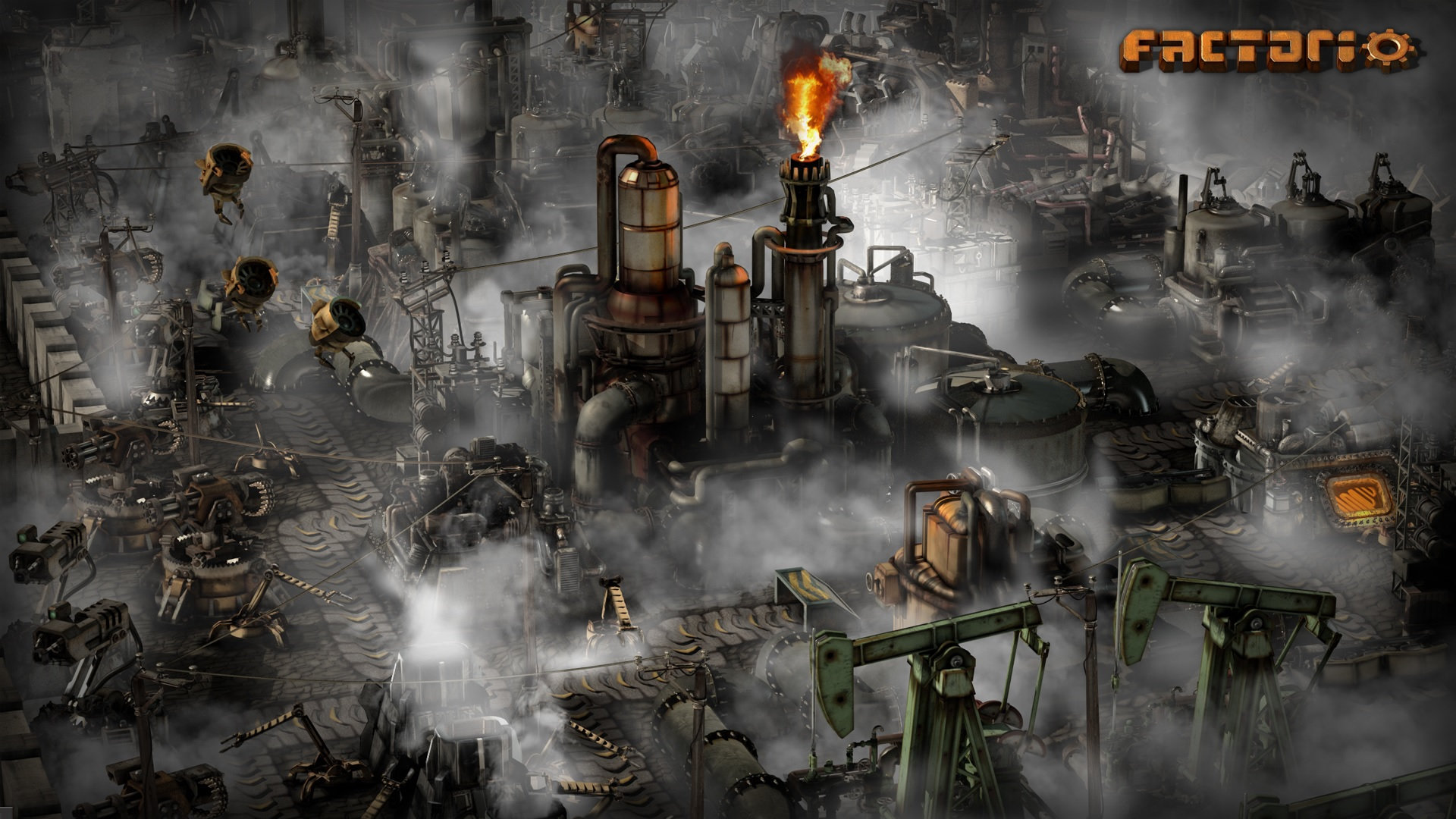
This one could be good : (by Min Guen)
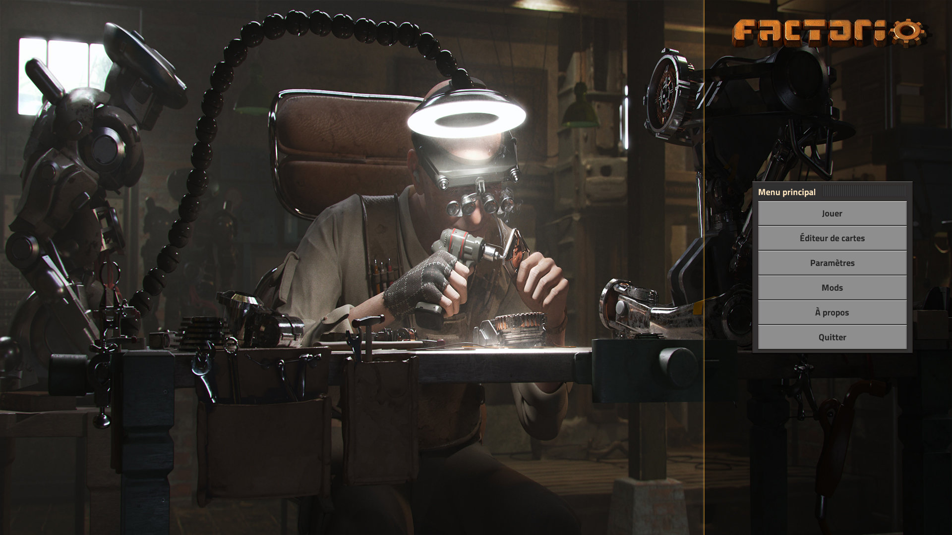
It might be a good thing to change this old 3D, there are so many talented artist for concept art !

This one could be good : (by Min Guen)

Re: Friday Facts #352 - New website
Mmmh yeah, tell us more?while we have a lot to look forward to with Factorio development
What a great journey.part of me feels a bit sad knowing this chapter of the game is drawing to a close.
Re: Friday Facts #352 - New website
I'm with Reika - please avoid bright white on black and preserve the format the forum has, as an example - I think I have the same issue but just never thought is because of bright colors in websitesReika wrote: Fri Jun 19, 2020 4:33 pm One concern I have is that some of the images you show imply the new design is going to be a lot more "dark theme" (ie very bright text on very dark background) than the current design, which (FFF pages aside) is currently mostly "bright text on middle gray" or "middle gray on darker gray".
I am aware of how popular white-on-basically-black themes are, but I am not alone in getting serious eyestrain from even short periods of them. Indeed, when reading the FFF pages I am soon (within 60 seconds or less) seeing afterimages of lines and developing an eye-ache. I never said anything because that site is little-used enough to not really matter. However, if you switch the forums or mod portal over....I am going to have a hard time using them. As it is they are already close to the limit my eyes can tolerate, so there is not a lot of wiggle room.
- stretch611
- Inserter

- Posts: 38
- Joined: Sun Dec 04, 2016 3:44 pm
- Contact:
Re: Friday Facts #352 - New website
I find Google Analytics quite lightweight. After all, I block it on every page. Nothing is as lightweight as something that does not exist.luc wrote: Fri Jun 19, 2020 2:37 pm What I like a lot about the current site is that it's not a mess of javascript and megabytes of large external resources being included. It's just google analytics, jquery via google, and google youtube at the moment (which sounds like it's bad, and it could be better, but it's pretty good compared to many other sites!). I hope the new site can keep that experience up
Related: this page with lightweight alternatives to Google analytics was recently voted very highly on hacker news, perhaps that's worth considering: https://lwn.net/SubscriberLink/822568/61d29096a4012e06/ (hacker news comments: https://news.ycombinator.com/item?id=23560823 )
That's a good question actually, Wube could take a few more weeks now and use the original deadline.silvver wrote: Fri Jun 19, 2020 1:22 pm I hope that 1.0 is still aiming at august 14th? The main reason just got delayed to nov 19th
As a web developer, I agree whole-heartily with this and wish that more people had this common sense.Sanqui wrote:My approach to creating websites is conservative, and in a way mirrors the philosophy we use when developing the game. The Factorio website doesn't use a fancy modern JavaScript framework. I'm not a JavaScript hater. There is no harm in using JavaScript to make parts of the website interactive, and of course many web applications wouldn't be possible with it. But for a website like ours, avoiding the use of bloated JavaScript frameworks helps keep everything load and render quickly, and of course the website can be browsed without JavaScript as well.
Javascript is quite a useful tool... Javascript frameworks are a bloated piece of
-
KatherineOfSky
- Fast Inserter

- Posts: 128
- Joined: Wed Mar 30, 2016 7:54 pm
- Contact:
Re: Friday Facts #352 - New website
The web site redesign looks amazing! So glad you kept the artwork around so people will have an easier time finding it -- some of those images are real gems and bring back lots of memories!
Tutorials, wild playthroughs, and more! https://www.youtube.com/@KatherineOfSky
Re: Friday Facts #352 - New website
Oops, I made an account just to fix the "impossible" CSS problem, and then went on to make every single button combination as well. You can find them all here: https://codepen.io/Jop/pen/mdVRarV
If you need the raw HTML and CSS, use the dropdown arrows at the top of each tab to get the complied code.
If you need the raw HTML and CSS, use the dropdown arrows at the top of each tab to get the complied code.
Re: Friday Facts #352 - New website
You should try Svelte. I'm personally pretty darn content with how incredibly clean things feel with Svelte. It's pretty much the only framework where I don't feel like I'm working around how the framework works, instead I'm just writing my code and it just handles it for me. It's also pretty lightweight, at least in terms of the size of builds, and afaik is pretty fast. It's worlds better than React IMO. Worlds better.stretch611 wrote: Fri Jun 19, 2020 10:37 pmI find Google Analytics quite lightweight. After all, I block it on every page. Nothing is as lightweight as something that does not exist.luc wrote: Fri Jun 19, 2020 2:37 pm What I like a lot about the current site is that it's not a mess of javascript and megabytes of large external resources being included. It's just google analytics, jquery via google, and google youtube at the moment (which sounds like it's bad, and it could be better, but it's pretty good compared to many other sites!). I hope the new site can keep that experience up
Related: this page with lightweight alternatives to Google analytics was recently voted very highly on hacker news, perhaps that's worth considering: https://lwn.net/SubscriberLink/822568/61d29096a4012e06/ (hacker news comments: https://news.ycombinator.com/item?id=23560823 )
That's a good question actually, Wube could take a few more weeks now and use the original deadline.silvver wrote: Fri Jun 19, 2020 1:22 pm I hope that 1.0 is still aiming at august 14th? The main reason just got delayed to nov 19th
As a web developer, I agree whole-heartily with this and wish that more people had this common sense.Sanqui wrote:My approach to creating websites is conservative, and in a way mirrors the philosophy we use when developing the game. The Factorio website doesn't use a fancy modern JavaScript framework. I'm not a JavaScript hater. There is no harm in using JavaScript to make parts of the website interactive, and of course many web applications wouldn't be possible with it. But for a website like ours, avoiding the use of bloated JavaScript frameworks helps keep everything load and render quickly, and of course the website can be browsed without JavaScript as well.
Javascript is quite a useful tool... Javascript frameworks are a bloated piece of
Re: Friday Facts #352 - New website
Seconding this. For people who have actual vision problems that require them to try to avoid eyestrain, dark themes are far worse than light themes plus a warmer color profile for your monitor. Ideally everyone should be using a color profile and monitor brightness settings that approximately match the brightness of the room they're in (which unless they live in a cave, should be reasonably bright) and then light themes on sites are perfectly fine. I had to go into my settings for the forum and change it to the default phpBB one because the Factorio theme was just too dark. (And I had to make a half-assed custom stylesheet to fix the rest of the site.)Reika wrote: Fri Jun 19, 2020 4:33 pmOne concern I have is that some of the images you show imply the new design is going to be a lot more "dark theme" (ie very bright text on very dark background) than the current design, which (FFF pages aside) is currently mostly "bright text on middle gray" or "middle gray on darker gray".
I am aware of how popular white-on-basically-black themes are, but I am not alone in getting serious eyestrain from even short periods of them. Indeed, when reading the FFF pages I am soon (within 60 seconds or less) seeing afterimages of lines and developing an eye-ache. I never said anything because that site is little-used enough to not really matter. However, if you switch the forums or mod portal over....I am going to have a hard time using them. As it is they are already close to the limit my eyes can tolerate, so there is not a lot of wiggle room.


