Friday Facts #352 - New website
- FactorioBot
- Factorio Staff

- Posts: 477
- Joined: Tue May 12, 2015 1:48 pm
- y.petremann
- Filter Inserter

- Posts: 438
- Joined: Mon Mar 17, 2014 4:24 pm
- Contact:
Re: Friday Facts #352 - New website
Whooohoo, I'm on a hype train ... would the lua-api docs get better styles too ?
Re: Friday Facts #352 - New website
regarding that css arrow - would this help?
https://codepen.io/condensed/pen/MwzQym
[Edit]
Evidently not, those shadows are messing it up, there is still square
Sorry
https://codepen.io/condensed/pen/MwzQym
[Edit]
Evidently not, those shadows are messing it up, there is still square
Sorry
-
doppelEben
- Fast Inserter

- Posts: 117
- Joined: Thu Oct 27, 2016 6:21 am
- Contact:
Re: Friday Facts #352 - New website
+1y.petremann wrote: Fri Jun 19, 2020 10:49 am Whooohoo, I'm on a hype train ... would the lua-api docs get better styles too ?
--
looks pretty amazing! good job! (not that I've expected something other...
Re: Friday Facts #352 - New website
The new website is really nice! I like that you avoid images for style. 
But whenever I say that I will do this or that, it looks very different when the time comes.
Re: Friday Facts #352 - New website
As a person who is in web development for 12 years and fan of Albert's art... I'm also on a hype train  Really want to see how it will go.
Re: Friday Facts #352 - New website
What about also unifying it all somehow with the forum and wiki as well?
Or some method to link our forum & wiki accounts to our factorio account.
Or some method to link our forum & wiki accounts to our factorio account.
Re: Friday Facts #352 - New website
For me the unifying theme was the orange headlines on a darker background. The orange very Factorio-like and seems to be a lot less now
- SuperSandro2000
- Filter Inserter

- Posts: 742
- Joined: Sun Jan 12, 2014 3:54 am
- Contact:
Re: Friday Facts #352 - New website
Just keep the downloads links the same or you break a lot of stuff.
Please call me simply Sandro.
My Main Mods: Sandro's fixes, Expanded Rocket Payloads Touched by an AngelBob and more can be found here

My Main Mods: Sandro's fixes, Expanded Rocket Payloads Touched by an AngelBob and more can be found here

Re: Friday Facts #352 - New website
I hope that 1.0 is still aiming at august 14th? The main reason just got delayed to nov 19th
Cyberpunk 2077 Delayed to November 19
https://www.ign.com/articles/cyberpunk- ... 24204642=1
Cyberpunk 2077 Delayed to November 19
https://www.ign.com/articles/cyberpunk- ... 24204642=1
- Cooldude2606
- Fast Inserter

- Posts: 114
- Joined: Sat Sep 16, 2017 9:04 pm
- Contact:
Re: Friday Facts #352 - New website
y.petremann wrote: Fri Jun 19, 2020 10:49 am Whooohoo, I'm on a hype train ... would the lua-api docs get better styles too ?
+1 for both of theseGergely wrote: Fri Jun 19, 2020 11:46 am What about also unifying it all somehow with the forum and wiki as well?
Or some method to link our forum & wiki accounts to our factorio account.
Re: Friday Facts #352 - New website
Sounds like nerd snipingwhich simply isn't possible to reproduce using CSS (I tried!).
Re: Friday Facts #352 - New website
What I like a lot about the current site is that it's not a mess of javascript and megabytes of large external resources being included. It's just google analytics, jquery via google, and google youtube at the moment (which sounds like it's bad, and it could be better, but it's pretty good compared to many other sites!). I hope the new site can keep that experience up 
Related: this page with lightweight alternatives to Google analytics was recently voted very highly on hacker news, perhaps that's worth considering: https://lwn.net/SubscriberLink/822568/61d29096a4012e06/ (hacker news comments: https://news.ycombinator.com/item?id=23560823 )
Related: this page with lightweight alternatives to Google analytics was recently voted very highly on hacker news, perhaps that's worth considering: https://lwn.net/SubscriberLink/822568/61d29096a4012e06/ (hacker news comments: https://news.ycombinator.com/item?id=23560823 )
That's a good question actually, Wube could take a few more weeks now and use the original deadline.silvver wrote: Fri Jun 19, 2020 1:22 pm I hope that 1.0 is still aiming at august 14th? The main reason just got delayed to nov 19th
- AileTheAlien
- Filter Inserter

- Posts: 400
- Joined: Sat Mar 11, 2017 4:30 pm
- Contact:
Re: Friday Facts #352 - New website
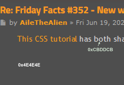
This CSS tutorial has both shadows and a triangle in CSS. Combine it with the above poster's solution for the square+triangle.
Re: Friday Facts #352 - New website
Do you consider updating the Early Access info box on Steam? While it won't be there for long anymore, it could say the set release date there. Also it still mentions plans for a long-form campaign in 1.0.
Looking forward. I always loved the dark background texture on your website, that one will be missed. Hope the detailed background seen on the new design isn't too busy/distracting, especially for new visitors.
Looking forward. I always loved the dark background texture on your website, that one will be missed. Hope the detailed background seen on the new design isn't too busy/distracting, especially for new visitors.
Re: Friday Facts #352 - New website
100% agree with the framework bloat problem. It's like you cannot make a website these days without 5000 node.js dependencies, absolute madness.
Re: Friday Facts #352 - New website
One concern I have is that some of the images you show imply the new design is going to be a lot more "dark theme" (ie very bright text on very dark background) than the current design, which (FFF pages aside) is currently mostly "bright text on middle gray" or "middle gray on darker gray".


I am aware of how popular white-on-basically-black themes are, but I am not alone in getting serious eyestrain from even short periods of them. Indeed, when reading the FFF pages I am soon (within 60 seconds or less) seeing afterimages of lines and developing an eye-ache. I never said anything because that site is little-used enough to not really matter. However, if you switch the forums or mod portal over....I am going to have a hard time using them. As it is they are already close to the limit my eyes can tolerate, so there is not a lot of wiggle room.


I am aware of how popular white-on-basically-black themes are, but I am not alone in getting serious eyestrain from even short periods of them. Indeed, when reading the FFF pages I am soon (within 60 seconds or less) seeing afterimages of lines and developing an eye-ache. I never said anything because that site is little-used enough to not really matter. However, if you switch the forums or mod portal over....I am going to have a hard time using them. As it is they are already close to the limit my eyes can tolerate, so there is not a lot of wiggle room.

Re: Friday Facts #352 - New website
What exactly does the 1.0 release or the end of Early Access signify? No more developement? No more updates? Or just bugfixes?
-
Omarflyjoemacky
- Fast Inserter

- Posts: 104
- Joined: Tue Nov 15, 2016 10:56 pm
- Contact:
Re: Friday Facts #352 - New website
I am a bit sad that the whole development ride is coming to an end. 1.0 is right around the corner! I hate to think "ah man, that's the last FFF."
It is coming... some day.
It is coming... some day.
"And then Bender ran."


