Honestly that's a feature, not a bug. The engineer ISN'T high-tech precision with decades of engineering experience. He's jury rigging everything, lol.dekeonus wrote: Fri Jun 12, 2020 12:11 pmI don't like the module placement - it seems as though it's something a minmatar pilot (eve online) jury rigged together. It doesn't say to me high tech precision. I also see issues with mods which extend beacons to have higher module counts. Given the underground installation I think modules would be installed into carriers to be placed into the beacon (thinking rackmount servers / hdd racks). I do like the idea have having the effect tinted by the module colour.
Friday Facts #351 - Beacon re-redesign & Simplified fluid mixing
Re: Friday Facts #351 - Beacon re-redesign & Simplified fluid mixing
Re: Friday Facts #351 - Beacon re-redesign & Simplified fluid mixing
The icons are on a separate layer, right? What if when ALT mode is on, they would always draw on the first plane? With perhaps the added dark background for contrast.AntiElitz wrote: Fri Jun 12, 2020 4:27 pm I do like the final new beacon design, but removing the alt view from it is a very bad thing imo. It's inconsistent with the modules in asm and it's very much harder to see if the beacon has modules inserted compared to alt mode which is there to actually give that improved overview.
The alt view gui is above all other entities and has great contrast. So what about this case here from the FFF now
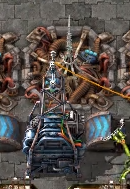
How many modules are inserted here? what color do they have? Is it level 1 2 or 3? I can see that at all.
Following the logic we could also remove alt view from chemical plants or from pipes, because you can see the set recipe from the fluid color in the window ;P
But it's not helping with the overview specifically at far zoomed out game-play.
I hope you reconsider alt mode for beacons!
- The Phoenixian
- Filter Inserter

- Posts: 270
- Joined: Mon May 26, 2014 4:31 pm
- Contact:
Re: Friday Facts #351 - Beacon re-redesign & Simplified fluid mixing
Honestly, with the new beacon, I can't help but wonder how it would look for the animation to play backwards, and then for the pulse to go through the cables after it finishes travelling down the spike. After all, the idea of effect transmission basically being connections via underground cables makes intuitive sense in a way that aerial transmission never did.
Actually....
Yeah, there are online gif and video reversal tools. So I can just reverse the FFF image.
Actually....
Yeah, there are online gif and video reversal tools. So I can just reverse the FFF image.
The reversed FFF gif 4MB mp4
I really like the reversed version. It's simple, clean and the spike goes from a bit too thin for air transmission to naturally communicating that the device is sending a signal underground.The greatest gulf that we must leap is the gulf between each other's assumptions and conceptions. To argue fairly, we must reach consensus on the meanings and values of basic principles. -an old friend
Re: Friday Facts #351 - Beacon re-redesign & Simplified fluid mixing
I have to be honest and say it looks more cluttered to me and less nice. It also looks less "impressive" then the originals.
As someone else said, it looks like the biters destroyed them. (especially zoomed out, like you mentioned these will be viewed as most frequently)
I think there was nothing wrong with the old design, I actually think it blended in better then the new one. The brown is a better overall fit with the world and
the readability is a lot higher I feel.
Also I would much prefer the no fluid mixing style we now have with no mixing possibilities. I remember the old times... *shutters*
Re: Friday Facts #351 - Beacon re-redesign & Simplified fluid mixing
My feedback on the beacon graphics:
1. Most of the beacon being near ground level immediately and intuitively makes me think I can run over it. So imo the collision box (or what is it called in data?) should be restricted to the pole in the middle. I quite like the idea, because mostly there is very little space to move around in heavily beaconized layouts anyways.
2. Please re-add the display of the modules in ALT-mode as overlay and next to each other like with the old beacon. I am asking because after playing a game quite some time in total, usually makes the brain abstract the graphics to some part. The easier and faster information can be retrieved and processed, the better. It is the same with factorio. When I design a plant, I am interested in the crunched and condensed information on the entities, I can retrieve with one glance. With the new graphics and without ALT-overlay that shows the modules next to each other, I have to invest 2 or more glances and harder ones as well, to retrieve the same information. It might not sound much, but it is much for a player who is in design mode in her/his mind.
3. The modules being displayed as part of the entity graphics looks really cool and I like it very much. It adds some diversity to the factory. I can imagine, when I am wandering about in the factory and want to enjoy what was built, this adds some sort of visual reward. I like it so much that I am looking forward to you adding this feature to all kinds of assemblings machines as well. (Just put some consideration into keeping modding easy. So that modding entities with such variable parts does not become too much of graphics production chore.)
4. Btw, continuing from the idea of keeping it easy for modders - what are the requirements now, to mod in a new type of module? Do modders have to provide 3 images now, instead of 1 (the 1 being for the old ALT-module overlay)?
Last edited by Impatient on Fri Jun 12, 2020 8:17 pm, edited 6 times in total.
Re: Friday Facts #351 - Beacon re-redesign & Simplified fluid mixing
Pretty sure it's still just 1, and then you specify a tint which then tints the beacon modules. If you do custom module graphics you'd probably have to get more creative.Impatient wrote: Fri Jun 12, 2020 6:58 pm4. Btw, continuing from the idea of keeping it easy for modders - what are the requirements now, to mod in a new type of module? Do modders have to provide 3 images now, instead of 1 (the 1 being for the old ALT-module overlay)?
Re: Friday Facts #351 - Beacon re-redesign & Simplified fluid mixing
The new beacon is definitely much better; how will it handle modded beacons with more than two slots?
Also, I support this:
Also, I support this:
Impatient wrote: Fri Jun 12, 2020 6:58 pm 1. Most of the beacon being near ground level immediately and intuitively makes me think I can run over it. So imo the collision box (or what is it called in data?) should be restricted to the pole in the middle. I quite like the idea, because mostly there is very little space to move around in heavily beaconized layouts anyways.

- 5thHorseman
- Smart Inserter

- Posts: 1194
- Joined: Fri Jun 10, 2016 11:21 pm
- Contact:
Re: Friday Facts #351 - Beacon re-redesign & Simplified fluid mixing
Does that include cut and paste? The only issue I ever had with the current prevention system is when I need to move chemical plants or refineries a few squares sideways and the game won't let me paste until the bots have picked up every last thing.
Re: Friday Facts #351 - Beacon re-redesign & Simplified fluid mixing
My feedback on pipe flushing:
Today I want to write, that the pipe flushing feature is really smart imo, given at where we are at now. Now the player at least has a choice. Pump out the fluid or redo the whole pipeline network OR go the very easy way and waste all the wrong fluid by flushing the pipes. I am just a bit sad that it just comes on top of the other prevention mechanics. Like GrumpyJoe says, the game just misses out - on problem solving.
Just wondering: Would you have introduced the prevention mechanics, if you had implement pipe flushing before that?
I personally can not agree more with GrumpyJoe. And being a bit grumpy about it myself, I put some effort into ranting about it extensively, a bit grumpy but hopefully also funny, some time back ( viewtopic.php?f=5&t=75707 ).GrumpyJoe wrote: Fri Jun 12, 2020 12:28 pm to me it (note: fluid-mixing-prevention) was too much "idiot proof" (sorry, it happened to myself alot) and felt like it took something away from the player: problem solving
Today I want to write, that the pipe flushing feature is really smart imo, given at where we are at now. Now the player at least has a choice. Pump out the fluid or redo the whole pipeline network OR go the very easy way and waste all the wrong fluid by flushing the pipes. I am just a bit sad that it just comes on top of the other prevention mechanics. Like GrumpyJoe says, the game just misses out - on problem solving.
Just wondering: Would you have introduced the prevention mechanics, if you had implement pipe flushing before that?
Re: Friday Facts #351 - Beacon re-redesign & Simplified fluid mixing
Would it be possible to turn the old beacon redesign into a tesla coil or something? Since it looks really cool it would be a waste not to use it for something.
Re: Friday Facts #351 - Beacon re-redesign & Simplified fluid mixing
I like the new design of the beacons. Just as a side note some mods might allow for multiple modules to be placed in a beacon (as far as I can recall factorio extended does so). However visually it seems that the new beacon design is limited to two slots. Can this be extended by mods so that it also looks visually acceptable? Keep it simple and exclude cases where it might look awkward for an uneven number of modules (e.g. 3).
Thanks Developers
Thanks Developers
Re: Friday Facts #351 - Beacon re-redesign & Simplified fluid mixing
Welp. I am sorry but I neither like the Red Invasor nor the Worm Box.
I think I am a Classic guy: a chunky powerful builing full of ginormous machinery, heavy duty; and not a fork stuck in an overcrawled hole in the ground. Sorry. Also when zoomed out it seems to me like the color palette is somehow different, more bland, which makes it look like a mod.
I think I am a Classic guy: a chunky powerful builing full of ginormous machinery, heavy duty; and not a fork stuck in an overcrawled hole in the ground. Sorry. Also when zoomed out it seems to me like the color palette is somehow different, more bland, which makes it look like a mod.
Re: Friday Facts #351 - Beacon re-redesign & Simplified fluid mixing
Can you do some UI for pipes? Some throughput digit on a real pipe line.
On belts i can see if belt is full or not, how items moving, just by looking on belt.
For pipes i can see only type of liquid and how full it is now. Pipe throughput depends on length of pipe line and i cannot see it. And i cannot see flow. So i can only overbuild pumps (something like every 5 segments of underground pipes) and look how full consumers of liquid are. For nuke builds this lead to situations, when with low power load it is fine, but when load is maximum for a build, it is unexpectedly lacking water. (11 heat exchangers on 1 offshore pump, but pipe length depends on a map)
Re: Friday Facts #351 - Beacon re-redesign & Simplified fluid mixing
Thank you for the drain pipe feature. I don't mess up often, but when I do, it's always a lot of work to fix.
Does it increase pollution, when I flush all the liquid from a pipe or is the operation for free?
Does it increase pollution, when I flush all the liquid from a pipe or is the operation for free?
Re: Friday Facts #351 - Beacon re-redesign & Simplified fluid mixing
I really like the new beacon redesign. Also the new ideas to prevent fluid mixing are great. I think it can have some advantages to allow fluid mixing, but of course is it almost always better to avoid it.
Re: Friday Facts #351 - Beacon re-redesign & Simplified fluid mixing
I was hoping for a concept redesign more than a look redesign for the beacon.
I never like the concept of them stacking.
Having to build so many to maximize the effect is probably why you are struggling to find a good graphic design.
Will still not be building them (except maybe for mining fields).
I never like the concept of them stacking.
Having to build so many to maximize the effect is probably why you are struggling to find a good graphic design.
Will still not be building them (except maybe for mining fields).
Re: Friday Facts #351 - Beacon re-redesign & Simplified fluid mixing
Looks amazing, as usual 
-
JeffreySpehar
- Manual Inserter

- Posts: 4
- Joined: Fri Jun 12, 2020 10:48 pm
- Contact:
Re: Friday Facts #351 - Beacon re-redesign & Simplified fluid mixing
Very cool. I like the modules embedded into the graphics in an "in-world" way (vs. an icon overlay). The recent addition of the mining drill light also takes this direction - placing a status indicator "in-world" (vs. in an overlay like the Bottleneck mod uses). I wonder if more things should be done like this? I personally find a huge block of flashing "no power" icons to be pretty distracting - maybe each entity could get a light that could flash to indicate error states that are currently indicated via icons? (The rail signal already does this - flashing it's lights to indicate an invalid configuration.)
Re: Friday Facts #351 - Beacon re-redesign & Simplified fluid mixing
I like the new beacons, but I'm not a big fan of the multiples holes in the ground . It would be interesting to connect them to form a straight line.
In most layouts, the beacons are aligned and stick together, so it would be really interesting to show how to use these beacons and make players want to align them!
In addition, these connections allow you to create a grid that visually organizes the base from a distance.
I made a photoshop to see what it could look like, I hope it will convince you!
before
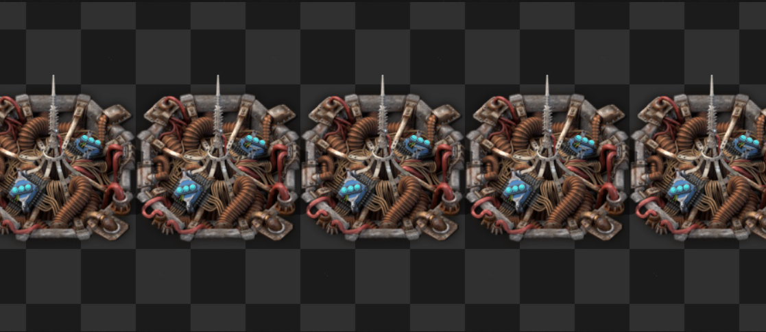
after
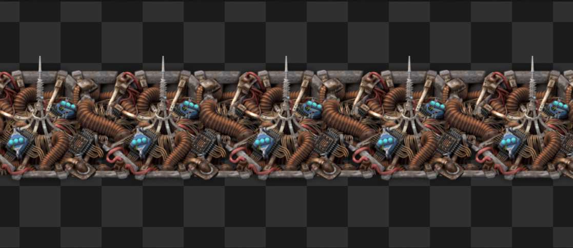
The connection is just a "tile" that fit between two beacons
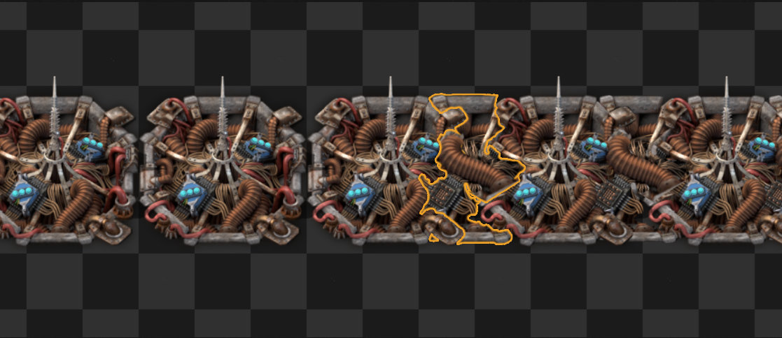
before
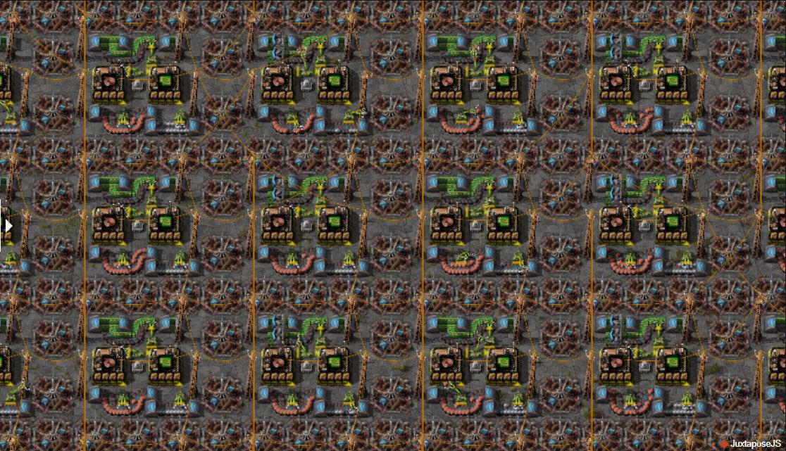
after
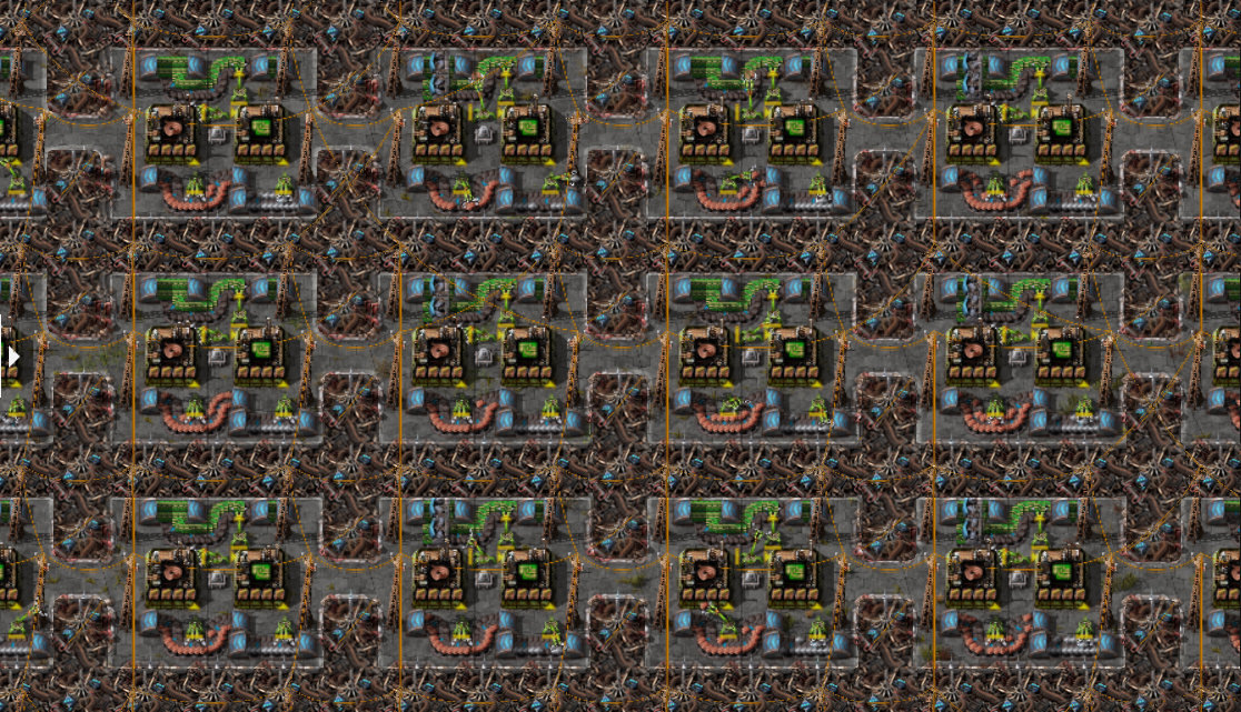
Borders are sharper and the beacons darker to make the lines even more visible. I hope you like it!
In most layouts, the beacons are aligned and stick together, so it would be really interesting to show how to use these beacons and make players want to align them!
In addition, these connections allow you to create a grid that visually organizes the base from a distance.
I made a photoshop to see what it could look like, I hope it will convince you!
before

after

The connection is just a "tile" that fit between two beacons

before

after

Borders are sharper and the beacons darker to make the lines even more visible. I hope you like it!
Re: Friday Facts #351 - Beacon re-redesign & Simplified fluid mixing
Wonderful ideas and I look forward to both.
May the devs forgive me, but I have to ask:
1. Can the pipe flushing be automatic when pipes are disconnected from all fluid sources (such as Offshore Pumps, Refineries, Chemical Plants, and Fluid Tanks)?
2. Can pipe flushing be conditionally circuited?
3. Can the fluid source be disconnected using circuited fluid pumps (when the upstream pump is turned off, the fluid is disconnected)?
This would allow folks to go crazy with using pipes for multiple fluids, just only one fluid at a time.
Though, preventing mixing might be more complicated. Perhaps, a pump could detect both in/out fluids are the same before it turns on.


