Friday Facts #351 - Beacon re-redesign & Simplified fluid mixing
Re: Friday Facts #351 - Beacon re-redesign & Simplified fluid mixing
I like the new beacon.
Is the power switch HD next on the list for 0.18?
Is the power switch HD next on the list for 0.18?
Re: Friday Facts #351 - Beacon re-redesign & Simplified fluid mixing
I really like the new beacon design, looks cool but gives a lot of breathing room for the important buildings. Considering how low they are, will you be able to walk on them? 
I also think the in-building visualization of the modules is very cool! But you literally have a whole section on what is displayed in Alt-Mode in the settings, why not just add a checkbox for beacon modules? The fact that mods can change everything shouldn't make you rely on that. I can see why some would prefer the more consistent overlay-style display.
And I also had the thought that the tower looks a bit thin and flimsy, or even spiky. Making it a bit more sturdy-looking would be nice, although I'm not sure I would like to see it look like mobile network antennas...
Bit thumbs up on the fluid flushing! That should have been in the game from the start I think.
Re: Friday Facts #351 - Beacon re-redesign & Simplified fluid mixing
We will probably add the setting, it makes sense. 
Re: Friday Facts #351 - Beacon re-redesign & Simplified fluid mixing
I'm happy you've listened to that negative feedback over the first redesign iteration. I like new iteration much more.
Interesting idea to show modules. Good job!
Interesting idea to show modules. Good job!
Re: Friday Facts #351 - Beacon re-redesign & Simplified fluid mixing
Its great that you listen to the audience and was able to move to re-design a sauron's eye to the new breed of beacon.
Flat, hand-made post-apo feel. With great feature of visible modules. Details of color glow are cherry on top.
Tip/Qestion : the new beacons is so flat that would be greeat to enable walk on edges (half of tile walkable) so player can easy walk between. That way becons not only bring visual reefresh but also gameplay bonus >> More easyier move inside the top tier factories.
Flat, hand-made post-apo feel. With great feature of visible modules. Details of color glow are cherry on top.
Althou visible modules are surpringly great, for sake of consistent UI, option "Show modules overlay for beacon" ON by default.
Tip/Qestion : the new beacons is so flat that would be greeat to enable walk on edges (half of tile walkable) so player can easy walk between. That way becons not only bring visual reefresh but also gameplay bonus >> More easyier move inside the top tier factories.
Re: Friday Facts #351 - Beacon re-redesign & Simplified fluid mixing
In the redesign, it looked like the base was under an alien attack
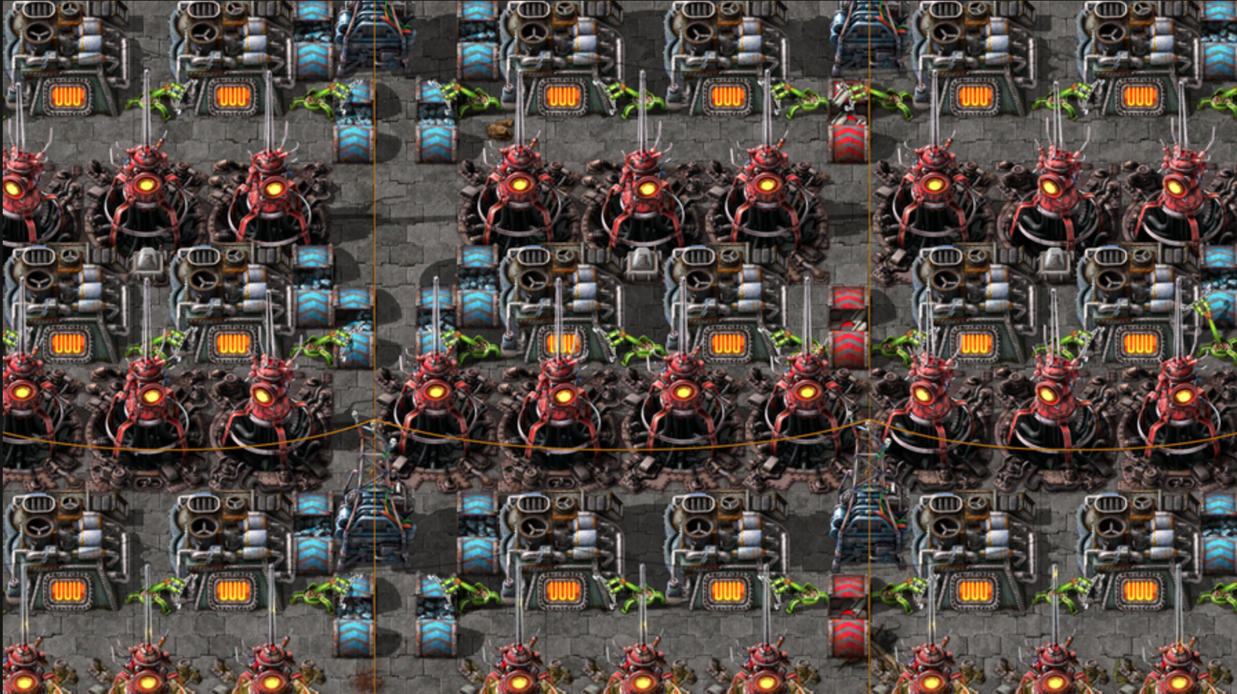
The re-redesign makes it look like they are destroying everything
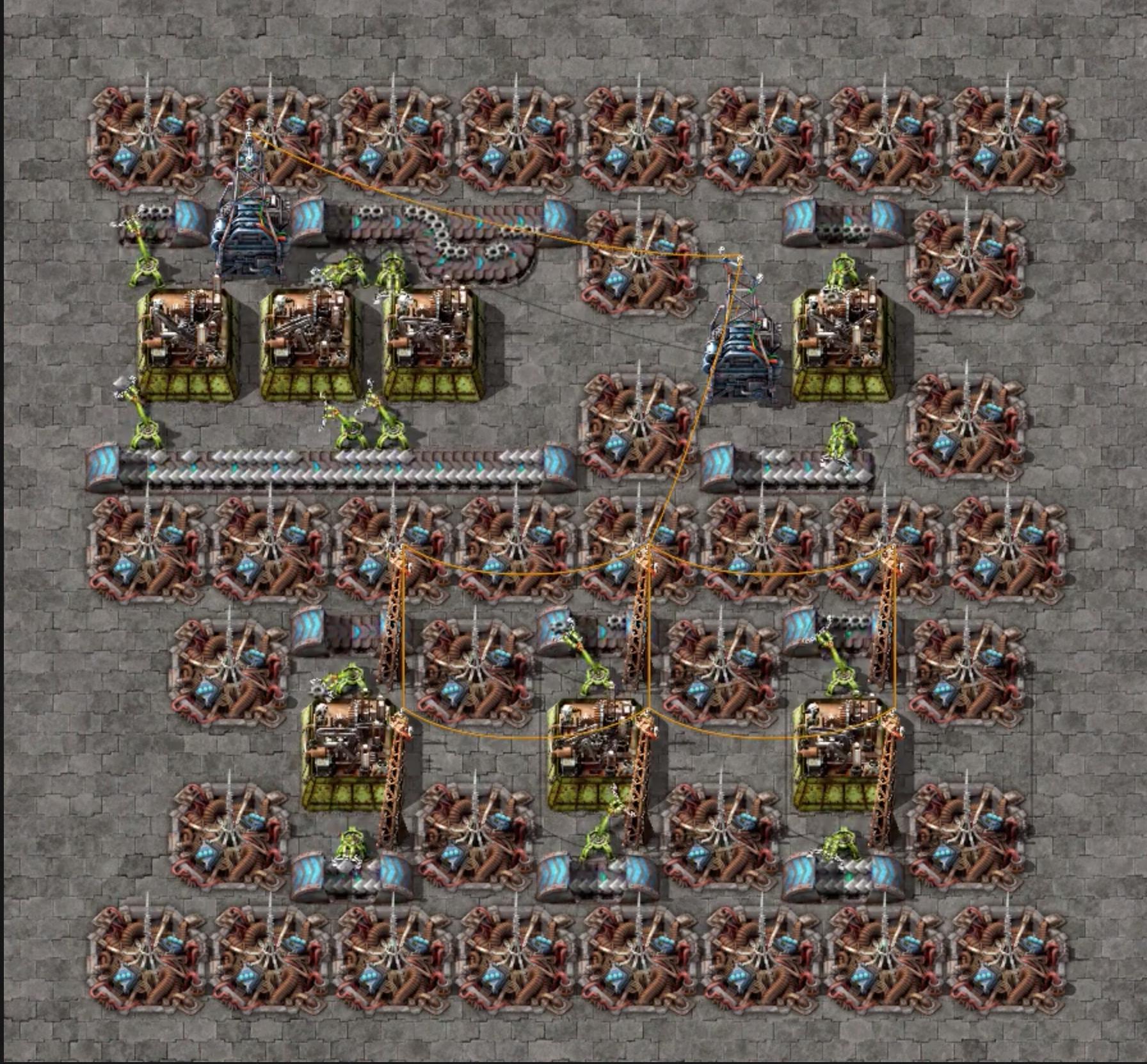
I didn't like it at all. It looks like a destroyed entity or dirt on the ground. The antenna looks this pointy little thing completely out of place.
I always thought the beacon was this bulky ugly thing I never like it. Now I'm hoping you would just leave it alone.

The re-redesign makes it look like they are destroying everything

I didn't like it at all. It looks like a destroyed entity or dirt on the ground. The antenna looks this pointy little thing completely out of place.
I always thought the beacon was this bulky ugly thing I never like it. Now I'm hoping you would just leave it alone.
Re: Friday Facts #351 - Beacon re-redesign & Simplified fluid mixing
Thank you for listening to us and redesigning the beacon - much better now. The old one is very cool though, so I hope you will find a good use for it somewhere. Some sort of alien tech maybe.
I second a setting for how ALT displays the beacon. We already have such settings for other entities. Should not have to use a mod to do this.
Also, good solution for the fluid mixing issue.
I second a setting for how ALT displays the beacon. We already have such settings for other entities. Should not have to use a mod to do this.
Also, good solution for the fluid mixing issue.
Attila's QuickBar Mod - Auto-links hand crafted item to first free quickbar slot if not already linked.
Attila's Signals Mod - Alternate signals to use in same circuit as standard signals.
Attila's Zoom Mod - Modifies zoom functionality.
Attila's Signals Mod - Alternate signals to use in same circuit as standard signals.
Attila's Zoom Mod - Modifies zoom functionality.
Re: Friday Facts #351 - Beacon re-redesign & Simplified fluid mixing
This new iteration should improve beaconed factories significantly.
The recent trend to integrate alt-mode or bottleneck information into vanilla is hopefully continued into the Assembler redesign.
The recent trend to integrate alt-mode or bottleneck information into vanilla is hopefully continued into the Assembler redesign.
-
ritzcrackers
- Burner Inserter

- Posts: 5
- Joined: Sun Oct 15, 2017 4:45 pm
- Contact:
Re: Friday Facts #351 - Beacon re-redesign & Simplified fluid mixing
Love the new beacon design. I like that it's similar to the rocket silo. Also, having it more recessed in to the ground and having less height looks really great in large numbers - it makes the floor a little more interesting.
I welcome fluid deletion with open arms!
I welcome fluid deletion with open arms!
-
DrParanoia
- Inserter

- Posts: 37
- Joined: Tue Mar 19, 2019 6:25 pm
- Contact:
Re: Friday Facts #351 - Beacon re-redesign & Simplified fluid mixing
I really feel bad for saying this - but I don't like the new design  For me it looks too messy, and the version without the antenna looks like some sort of anus and with the antenna, it's a pit of worms
-
TyrHeimdal
- Burner Inserter

- Posts: 16
- Joined: Sun Jan 14, 2018 7:48 pm
- Contact:
Re: Friday Facts #351 - Beacon re-redesign & Simplified fluid mixing
I like the new beacon concept, but the angles seems off on the module top right. It looks like it's far less vertical than the front one. It actually almost makes me feel uneasy.
How about putting both in front, mirroring the left one so that the right one is facing right at the same angle as the left one is facing left?
Or alternatively making the socket's lay flat down in the middle of the beacon?
I apologize in advance for butchering the visuals done by you pros, but I'm a coder not a designer and all I had was MS Paint
I like this far right idea best. It makes the modules really pop out and are easy to see.
Re: Friday Facts #351 - Beacon re-redesign & Simplified fluid mixing
The new beacon... I hate to say it, but this isn't it either.
Now my base is gonna look like a spike trap in Prince of Persia.
Now my base is gonna look like a spike trap in Prince of Persia.
Re: Friday Facts #351 - Beacon re-redesign & Simplified fluid mixing
Can we walk on top of the new beacons? I assume not, but it seems like it would feel awkward walking "against" that, since the majority of the beacon is a flat surface at seemingly ground level.
-
Ringkeeper
- Fast Inserter

- Posts: 143
- Joined: Wed Feb 03, 2016 7:16 pm
- Contact:
Re: Friday Facts #351 - Beacon re-redesign & Simplified fluid mixing
Better than sauron invasion.
New beacons are nice. Beacons have no visual significance for me. I need them for better factory but I don't need to see them. They provide no important information in general.
The new one fulfille this. I take everything that needs less pc power. Getting to limit with 6k spm already is too early for my taste. There the factory just started to become big.
-
Omarflyjoemacky
- Fast Inserter

- Posts: 104
- Joined: Tue Nov 15, 2016 10:56 pm
- Contact:
Re: Friday Facts #351 - Beacon re-redesign & Simplified fluid mixing
Like the new design, an improvement over the first choice for sure.
But will likely continue using the Built In Beacons mod. Love me some true spaghetti.
But will likely continue using the Built In Beacons mod. Love me some true spaghetti.
"And then Bender ran."
Re: Friday Facts #351 - Beacon re-redesign & Simplified fluid mixing
Honestly I still don't understand why the underground beacon concept was chosen, but I like this iteration of the idea much better. Definitely looking forward to seeing how it looks in game.
On the fluid mixing, do you plan to revert some of the strictest prevention measures now that there's another solution? I think the most annoying one was when changing recipes.
On the fluid mixing, do you plan to revert some of the strictest prevention measures now that there's another solution? I think the most annoying one was when changing recipes.
Re: Friday Facts #351 - Beacon re-redesign & Simplified fluid mixing
There were some entity renames scheduled for 0.18.0 ... but were reverted due to stylistic rules and desire not to break things for everyone unnecesserily.DaemosDaen wrote: Fri Jun 12, 2020 1:16 pmNo it's not. The game has not even been released. If you can't tell I find it stupid and would welcome the change.V453000 wrote: Fri Jun 12, 2020 11:30 am I agree and I've been saying this for years, a Beacon is a really wtf name. But indeed, it's too late to change that now.
The stylistic rule is, that if you have entity with english display name Beacon, it's internal identifier needs to be beacon also, as should be name of item that builds it, as should be name of C++ class that implements logic this entity. This is doable, but every mod that interacts with beacons in any way would have to be fixed (which is why the renames were supposed to happen at a new major release), and all blueprint strings that reference the renamed entities/recipes/items would be broken (and this is why the changes didn't make it in.)
The game is too large and feature creeped for changes like this and we should have left early access 2 or 3 years ago ... there, I said it.
Re: Friday Facts #351 - Beacon re-redesign & Simplified fluid mixing
I am extremely happy that the module color is integrated into the beacon animation. I was debating making a mod for this but I won't have to now! One question, though: does the tower animation glow at night?
Re: Friday Facts #351 - Beacon re-redesign & Simplified fluid mixing
I do like the final new beacon design, but removing the alt view from it is a very bad thing imo. It's inconsistent with the modules in asm and it's very much harder to see if the beacon has modules inserted compared to alt mode which is there to actually give that improved overview.
The alt view gui is above all other entities and has great contrast. So what about this case here from the FFF now
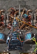
How many modules are inserted here? what color do they have? Is it level 1 2 or 3? I can see that at all.
Following the logic we could also remove alt view from chemical plants or from pipes, because you can see the set recipe from the fluid color in the window ;P
But it's not helping with the overview specifically at far zoomed out game-play.
I hope you reconsider alt mode for beacons!
The alt view gui is above all other entities and has great contrast. So what about this case here from the FFF now

How many modules are inserted here? what color do they have? Is it level 1 2 or 3? I can see that at all.
Following the logic we could also remove alt view from chemical plants or from pipes, because you can see the set recipe from the fluid color in the window ;P
But it's not helping with the overview specifically at far zoomed out game-play.
I hope you reconsider alt mode for beacons!
Re: Friday Facts #351 - Beacon re-redesign & Simplified fluid mixing
There will be an option


