
At some point it was mentioned (not sure where the source is) that the technology icons will be touched again (redesigned?) after all entities and item icons were done. This icon is from the logistics tech, so it should be done in that later round of polishing. After all, many techs and these crafting category icons make reference to entities and items in the game. So it would be backwards to overhaul tech icons before items and entities are finished.Thrawcheld wrote: Sun May 24, 2020 6:49 pm The "logistics" icon still uses the ancient cargo wagon design (see also the logistics techs in the current version). I hope this will be fixed for 1.0!
fff-348-new-gui-styles.png
Friday Facts #348 - The final GUI update
Re: Friday Facts #348 - The final GUI update
-
RobertTerwilliger
- Fast Inserter

- Posts: 196
- Joined: Wed Nov 18, 2015 10:12 am
- Contact:
Re: Friday Facts #348 - The final GUI update
Fair enough.Twinsen wrote:So finally I decided to put my foot down, call it good enough and say no to the constant stream of changes.
In my native language there is a proverb:
"Better is a foe to good".
It means, you always can do better, but at some point it becomes wasteful usage of resources (including time, for sure).
Holding formation further and further,
Millions of lamb stay in embrace of Judas.
They just need some bread and faith in themselves,
BUT THE TSAR IS GIVEN TO THEM IN EXCHANGE!
Original: 5diez - "Ищу, теряя" (rus, 2013)
Millions of lamb stay in embrace of Judas.
They just need some bread and faith in themselves,
BUT THE TSAR IS GIVEN TO THEM IN EXCHANGE!
Original: 5diez - "Ищу, теряя" (rus, 2013)
-
xenoscepter
- Manual Inserter

- Posts: 4
- Joined: Tue May 28, 2019 12:09 am
- Contact:
Re: Friday Facts #348 - The final GUI update
They seem to me like something out of a Mobile Game, at least aesthetically.
It looks almost... cartoon like.
It looks almost... cartoon like.


Re: Friday Facts #348 - The final GUI update
I think most of the new icons look really great, good work!
Some constructive criticism I have:
Most critically, the (what I assume to be) nuclear reactor doesn't really work for me. It reminds me mostly of a radioactive diving helmet with bonfire logs behind it... Maybe the main problem is that the perceived scale is way smaller than a building. I think it would need some features that reinforce that it's actually a huge building.
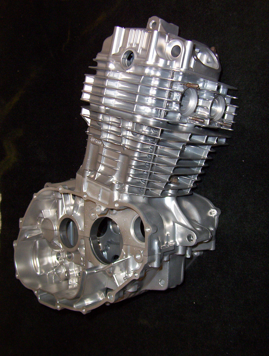
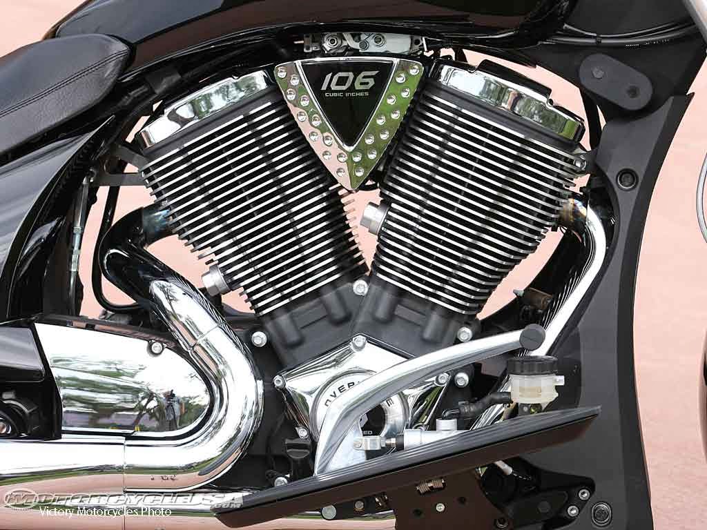
Secondly, the already mentioned engine does not remind me of an engine at all. At first I thought a more obvious depiction could be something like the electric engine but with more parts around it. Then I thought, maybe something like a one cylinder motorcycle engine would work well. Especially with this characteristic headsink.
Lastly, a few small things:
Some constructive criticism I have:
Most critically, the (what I assume to be) nuclear reactor doesn't really work for me. It reminds me mostly of a radioactive diving helmet with bonfire logs behind it...
- Diving helmet.png (10.94 KiB) Viewed 11442 times
Secondly, the already mentioned engine does not remind me of an engine at all. At first I thought a more obvious depiction could be something like the electric engine but with more parts around it. Then I thought, maybe something like a one cylinder motorcycle engine would work well. Especially with this characteristic headsink.
Engines
Lastly, a few small things:
- The battery is not particularly intuitive for me, but I guess I can get used to it. Maybe making it look like it's two round batteries strapped together rather than one block would help?
- The sulfur looks a bit off. At first I thought it's the color (green tint?), then I thought the shading may add to that.
- The rocket silo could show the rocket, that would make it clearer what it is. I mean, that's what it ultimately looks like.
- I agree with others that the locomotive and rail car are too square, it looks kinda silly and unrecognizable.
- The strong contrast that the inner shadow of the steel bar produces makes them too attention-grabbing in-game.
- The way the conductive traces on the electronic circuits protrude even more unrealistically than before bothers me.

Yeah, the fact that the save dialog doesn't show dates boggles my mind every time._Attila_ wrote: Sun May 24, 2020 10:12 am I would trade all of the art and sound changes for functionality polishing. Blueprint book library and a creation date displayed on the save game loading screen at the very least and sort on that date would be nice. Every time I want to start playing with a major mod, I resist because I already have 20 BP books and it is already a chore to find anything. I also have lots of save games and cannot tell which ones I played last. Annoying and gives a feeling of unfinished functionality.

Re: Friday Facts #348 - The final GUI update
There is this icon for the fluid section in the menu which always tricks me in thinking it's the section for science packs.
Is it planned to change this for the final version?
I'm talking about this:

mmh, no bottles just drops

ahh, there are the bottles (packs)

Is it planned to change this for the final version?
I'm talking about this:
mmh, no bottles just drops
ahh, there are the bottles (packs)


Re: Friday Facts #348 - The final GUI update
+1. Always.sthag wrote: Mon May 25, 2020 4:08 pm There is this icon for the fluid section in the menu which always tricks me in thinking it's the section for science packs.
Re: Friday Facts #348 - The final GUI update
I am convinced it is on their agenda. I can repeat once again, the current round of icon updates were for items. The crafting or item selecton icons will (and have to!) depend on what the finalized versions of the items will look like. You can easily see in your own screenshots that the other category icons do not reflect the new icon set, either. The devs must be aware of the fact that all these icons need to be changed in order to give a coherent look and feel.sthag wrote: Mon May 25, 2020 4:08 pm There is this icon for the fluid section in the menu which always tricks me in thinking it's the section for science packs.
Is it planned to change this for the final version?
Re: Friday Facts #348 - The final GUI update
+1 for this.Ron_Quiney wrote: Sat May 23, 2020 3:11 pm and Coal Liquefaction looks messy with ingredients overlayed
Oil drop looks simply dirty
Maybe separate a drop and coal like this?
In addition, this new Coal liquefaction icon contributes to some trypophobiс feelings.
It will be good to separate a drop and coal.
Re: Friday Facts #348 - The final GUI update
Wait... The final GUI update? So... The rest of the UI will remain untouched?
- No little button to toggle the minimap on and off without going through three menus each time?
- No scrolling the contents of the logistic networks and chests, or hovering to see the tooltips?
- No additional zooming out of the god view so that you can at least have it at the same zoom level as the player view?
These are three things off the top of my head that would QoL updates, most significantly for modded playtroughs such as AngelBob, and basically any mod that introduces significant amounts of additional items. It gets to the point where you cannot see the entire content of your networks. Toggling the minimap helps, but it's clunky, and even then, sometimes the space just isn't enough.
If this really is the final GUI update... It seems a little lacking compared to the rest of the game.
-
scooter010
- Inserter

- Posts: 25
- Joined: Tue Apr 30, 2019 6:09 am
- Contact:
Re: Friday Facts #348 - The final GUI update
- Bildschirmfoto von 2020-05-26 16-16-17.png (9.93 KiB) Viewed 11181 times
- Bildschirmfoto von 2020-05-26 17-23-05.png (10.66 KiB) Viewed 11181 times
- ???
- Bildschirmfoto von 2020-05-26 17-23-17.png (7.68 KiB) Viewed 11181 times
- Bildschirmfoto von 2020-05-26 17-23-12.png (6.6 KiB) Viewed 11181 times
- Bildschirmfoto von 2020-05-26 17-22-57.png (8.69 KiB) Viewed 11181 times
Re: Friday Facts #348 - The final GUI update
Damn, now I know why my eyes kept jumping back to this icon. It also looks a bit like eyes somehow.Mion wrote: Tue May 26, 2020 5:16 amIn addition, this new Coal liquefaction icon contributes to some trypophobiс feelings.
-
5thHorseman

- Smart Inserter

- Posts: 1194
- Joined: Fri Jun 10, 2016 11:21 pm
- Contact:
Re: Friday Facts #348 - The final GUI update
Re: Friday Facts #348 - The final GUI update
Yeah cartoon looking icons its sadxenoscepter wrote: Mon May 25, 2020 7:26 am They seem to me like something out of a Mobile Game, at least aesthetically.
It looks almost... cartoon like.
Re: Friday Facts #348 - The final GUI update
Overall a very good job! But ...
New icons i can not stand:
- Engines: both normal and electric
- Modules (still using old ones pre 3d)
- Coal liquefaction (look like a little face it's terrible!!!)
- Battery (i will keep using the old beloved "copyrighted" one)
Some other i am trying to get used ... but maybe i will go back to originals (i.e.: concrete, loco ...). I am very classic person, tend to stick with what i like first.
Can't say the same for the sound part ... hate to say it was better the old way for most part. Personal laser sound "laser-beam.ogg" it's total mess ... did you intend to annoy your players with that??? Please fix that one soon!!!
-
Overlord218
- Inserter
- Posts: 36
- Joined: Tue Apr 17, 2018 7:42 pm
- Contact:
Re: Friday Facts #348 - The final GUI update
Hi! I think, all people appreciate amount of efforts you put in icon but here some problem:
New icons too brigth and "soft" like plush toys (especially nuclear reactor, pumpjack, heat pipe and some others). Old icons were "rust" and feels like they was literally hand-maded. Rust and dirt on old icons doesn't look like some "cosmetic feature only for aesthetic" it looks like nature thing.
New icons too brigth and "soft" like plush toys (especially nuclear reactor, pumpjack, heat pipe and some others). Old icons were "rust" and feels like they was literally hand-maded. Rust and dirt on old icons doesn't look like some "cosmetic feature only for aesthetic" it looks like nature thing.

Re: Friday Facts #348 - The final GUI update
- community-be-like.png (253.58 KiB) Viewed 10906 times
Icons were being designed as "caricatures" of entities they represent for a long time now. The original nuclear reactor icon back from 2017 was caricatures as well. As Vaclav wrote in FFF: "Reworking all icons is a gargantuan project, but redoing individual icons can be very quick and done silently without breaking any mods" - if you don't like overall style, unfortunatelly that's not something we are able to act upon, but we will try to improve icons about which lot of people feel like they are not good representation for items they are associated with.
-
5thHorseman
- Smart Inserter
- Posts: 1194
- Joined: Fri Jun 10, 2016 11:21 pm
- Contact:
Re: Friday Facts #348 - The final GUI update
OH. That's a HEAT PIPE.
I swear I thought it was laser beams. I don't mind the style at all but the "+" is pretty important for me for recognition. I mean, now that I know it doesn't matter but I'd never have thought of it myself.

Re: Friday Facts #348 - The final GUI update
If there just would be any overlay which shows the name in crafting menu...5thHorseman wrote: Thu May 28, 2020 12:18 amOH. That's a HEAT PIPE.
I swear I thought it was laser beams. I don't mind the style at all but the "+" is pretty important for me for recognition. I mean, now that I know it doesn't matter but I'd never have thought of it myself.

-
5thHorseman
- Smart Inserter
- Posts: 1194
- Joined: Fri Jun 10, 2016 11:21 pm
- Contact:
Re: Friday Facts #348 - The final GUI update
I've not loaded the game since the update dropped because I've been very busy IRL. But none of this changes the fact that some of the icons are less then recognizable.steinio wrote: Thu May 28, 2020 4:33 amIf there just would be any overlay which shows the name in crafting menu...5thHorseman wrote: Thu May 28, 2020 12:18 amOH. That's a HEAT PIPE.
I swear I thought it was laser beams. I don't mind the style at all but the "+" is pretty important for me for recognition. I mean, now that I know it doesn't matter but I'd never have thought of it myself.
And FTR 99% of the icons look fine to me. I'm not too hip on the engine, heat pipe,
Except coal liquefaction as it doesn't have an actual look in game. The proposed icon just freaks me the hell out.
- coal-liq-soon.jpg (3.67 KiB) Viewed 10833 times

Re: Friday Facts #348 - The final GUI update
The item icons looking minimalistic is fine by me given they're kinda, well, minimal by nature. I mean, you don't want a lot of details on things that appear en masse on belts and in cramped inventory grids. In fact, one of the worst offenders on this front had been the old battery redesign, which felt too visually noisy with the colored wires and LEDs, so glad that's fixed.
also, objective facts:
also, objective facts:
- Attachments
-
- your memes end here.png (64.61 KiB) Viewed 10824 times