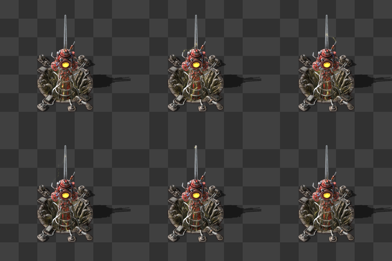
Friday Facts #339 - Beacon HR + Redesign process
Re: Friday Facts #339 - Beacon HR + Redesign process
I find myself ambivalent towards the new beacons. Probably because I rarely, if ever, use them.
Artistically; I can see that a lot of effort and creativity has been put into it, and that the practicalities are also being considered (occlusion), so that is commendable.
Stylistically; it seems to be quite a departure from the usual diesel punk aesthetic, so as others have commented, will stand out amongst the rest of the factory. Should we assume that other entities are likely to get the same stylistic changes too?
Conceptually; I've never been comfortable with beacons at all. The JFM[1] nature of them just doesn't sit right, and I've always felt they are somewhat of a kludge for late game productivity increases. I do like the idea of adjacency, but not the area of effect, and would rather see these buildings needing to be directly adjacent to the affected building, and/or a new conduit method (including short range energy beams) that have some plausibility in how the effect is being transmitted. This would still leave the player with the need for creative connectivity solutions given the limited number of sides/connection possibilities, just without the magic.
I can't help but feel that now would be the right time/opportunity to make a few necessary conceptual changes rather than purely stylistic ones.
1: Just Frick'n Magic
Re: Friday Facts #339 - Beacon HR + Redesign process
I'd very much like the colours of the lights to change in accordance to the used module, meaning blue/green/orange arcs and center light. This could make visibility better with disabled ALT-mode, but could easily lead to a mess that looks like a christmas tree. Idk.
I also prefer the red to be less saturated. Can't say how fitting it would feel, without having it in game.
I also prefer the red to be less saturated. Can't say how fitting it would feel, without having it in game.
-
IronCartographer
- Filter Inserter

- Posts: 464
- Joined: Tue Jun 28, 2016 2:07 pm
- Contact:
Re: Friday Facts #339 - Beacon HR + Redesign process
Agreed.Pinga wrote: Fri Mar 20, 2020 3:34 pm If I may, I think you guys forgot the most important aspect of beacons: they are support units. They don't do anything, they just exist so stuff around them do things better.
...
Beacons are spammed, it's the most frequent unit in a lot of games. I believe they should be simple, and have neutral colors. That way, the actual production buildings can dictate how a segment of the factory looks. Right now, those beacons are drawing all attention to themselves. Every end game base will be a sea of red and swords, and I think that's a terrible idea.
If the beacons properly faded into the background compared to the production they enhanced, I would be less opposed to their variability, as well.
-
Henry Loenwind
- Long Handed Inserter

- Posts: 59
- Joined: Fri Mar 09, 2018 7:33 pm
- Contact:
Re: Friday Facts #339 - Beacon HR + Redesign process
Looks like something the biters would build. Alien. Menacing.
Re: Friday Facts #339 - Beacon HR + Redesign process
The new beacon is overpowering the surroundings. It says "look at me, I am new and shiny", but it takes away from what I really want to see, my factory and the machines in it.
As others have said, it should be far less conspicuous.
As others have said, it should be far less conspicuous.
Attila's QuickBar Mod - Auto-links hand crafted item to first free quickbar slot if not already linked.
Attila's Signals Mod - Alternate signals to use in same circuit as standard signals.
Attila's Zoom Mod - Modifies zoom functionality.
Attila's Signals Mod - Alternate signals to use in same circuit as standard signals.
Attila's Zoom Mod - Modifies zoom functionality.
-
Omarflyjoemacky
- Fast Inserter

- Posts: 104
- Joined: Tue Nov 15, 2016 10:56 pm
- Contact:
Re: Friday Facts #339 - Beacon HR + Redesign process
Definitely a "mad scientist" vibe. Eye of Sauron. It looks like a lot of things, but not an effect transmission.
Not a big fan.
Not a big fan.
"And then Bender ran."
-
Omarflyjoemacky
- Fast Inserter

- Posts: 104
- Joined: Tue Nov 15, 2016 10:56 pm
- Contact:
Re: Friday Facts #339 - Beacon HR + Redesign process
That's me.cynicalwanderer wrote: Fri Mar 20, 2020 3:09 pmCame here to post this too. Factorio for many people is a game for people who delight in orderly designs, and having randomised crookedness, when all you want is the joy of a straight line, is gonna drive some people mad.
"And then Bender ran."
Re: Friday Facts #339 - Beacon HR + Redesign process
This may have been mentioned before, or more likely won't really get seen, but i was thinking that the light in the center could change respective of what effect it's transmitting. there's only 3 combinations of effects that can be transmitted, so it would be fairly easy to code i would imagine. if all the modules inside the beacon are speed, make the light blue. if they're all effeciency, make the light green, and if it's a mix, make it blueish green? maybe make them show a grey light or something if they don't have any modules? I don't know, but it was just a thought to make the beacon just a tiny bit more informative at a glace.
Re: Friday Facts #339 - Beacon HR + Redesign process
Does it have to have the spire? I would prefer mine to not have the spire element.
Re: Friday Facts #339 - Beacon HR + Redesign process
I usually love the redesigns, so I was excited about the new beacon, hoping to replace the bulky current thing... but, man, that new design is... strange. It totally dominates the attention, even without any animation... if you add in the sparks, it'll be insane.
After reading the intro, I was hoping for a lean and modern antenna tower. This thing looks like aliens took over the base and installed angry laser cameras everywhere.
After reading the intro, I was hoping for a lean and modern antenna tower. This thing looks like aliens took over the base and installed angry laser cameras everywhere.
Re: Friday Facts #339 - Beacon HR + Redesign process
Too bad about the redesign but just remove the beacons from the game.
They don't fit at all and the mechanic is not explainable even with alien tech.
They don't fit at all and the mechanic is not explainable even with alien tech.
Re: Friday Facts #339 - Beacon HR + Redesign process
I know how bad it feels to spend a lot of time, polishing some idea, post it to public and receive so much negative feedback, as I see here.
Yet I log in just to add my 2 cents: this redes is terrible, and you probably should revert. It looks out of place, color scheme is wrong, it's too noticable, variations make factory arrays look chaotic, ect ect. Pretty much everything about it is bad except for sheer texture and animation quality.
P.S. Unlike many who posted, I use beacons a lot, and I'm into large complex drone/train factories.
Re: Friday Facts #339 - Beacon HR + Redesign process
The beacon mechanic itself is not foreign to me. I don't mind it as others do.
The design of it fit the game. I don't think the new one does. I think it's too far removed from other entities in the game, style-wise.
It's like a squid or an octopus, and the colour is too bright and different.
In fact, I kinda preferred the image shown in the middle of the page:

This one could match better in the game. The red colour of it is not dominating the entity, and the electric effect is more subdued and again doesn't make itself too distinct from others.
Still it might be better to use the colour scheme of furnaces and constructors and not make it too red.
The design of it fit the game. I don't think the new one does. I think it's too far removed from other entities in the game, style-wise.
It's like a squid or an octopus, and the colour is too bright and different.
In fact, I kinda preferred the image shown in the middle of the page:

This one could match better in the game. The red colour of it is not dominating the entity, and the electric effect is more subdued and again doesn't make itself too distinct from others.
Still it might be better to use the colour scheme of furnaces and constructors and not make it too red.
Re: Friday Facts #339 - Beacon HR + Redesign process
Is it possible that the electric arcs in the beams can change color depending on what modules are inserted? Also, depending on the level of the module, the saturation and value increases with the module level (least saturated and bright at lowest module level, maximum color saturation and brightness at third module level).
As far as resolving the color when different modules are combined in one beacon, just use the difference of the rgb values and output that color.
As far as resolving the color when different modules are combined in one beacon, just use the difference of the rgb values and output that color.
Re: Friday Facts #339 - Beacon HR + Redesign process
I like the redesign a lot but i even like that version in the middle better!

The Red light makes it look a bit meaty. I think I'd prefer blue personally.
Overall great work!

The Red light makes it look a bit meaty. I think I'd prefer blue personally.
Overall great work!
Re: Friday Facts #339 - Beacon HR + Redesign process
New beacon looks nice bo I don't think it fit. It have too organic looks, some kind of tech-organic hybrid.
I imagine "beacon" like computing unit that optimize production process. Combination of server and borg cube
I imagine "beacon" like computing unit that optimize production process. Combination of server and borg cube
Re: Friday Facts #339 - Beacon HR + Redesign process
I am not one of those people. I like the organization to a degree, especially in a zoomed out sense, but I think the subtle adjustments and asymmetry they're going for here is great and adds texture when zoomed in. As long as things remain on grid, I see the proposed randomness here as being subtle enough to be ignored.Omarflyjoemacky wrote: Fri Mar 20, 2020 3:57 pmThat's me.cynicalwanderer wrote: Fri Mar 20, 2020 3:09 pmCame here to post this too. Factorio for many people is a game for people who delight in orderly designs, and having randomised crookedness, when all you want is the joy of a straight line, is gonna drive some people mad.
Ofc, if in your game you must have it be so uniform at that level, I can't see why you couldn't force it via a options setting. After all, not using 2 to 3 other textures for the same entity would save system resources.
Re: Friday Facts #339 - Beacon HR + Redesign process
I do not think that the new beacon fits the factorio Style. In itself it is a very cool creation, but it has neither the rugged industrial look, nor the classic artistic style that I personally have come to love about this game.
Re: Friday Facts #339 - Beacon HR + Redesign process
... and the prospect to have variations of other entities what was mentioned in FFF is simply the worst horror I can imagine.Omarflyjoemacky wrote: Fri Mar 20, 2020 3:57 pmThat's me.cynicalwanderer wrote: Fri Mar 20, 2020 3:09 pmCame here to post this too. Factorio for many people is a game for people who delight in orderly designs, and having randomised crookedness, when all you want is the joy of a straight line, is gonna drive some people mad.


