Tbh I don't like the new design. It doesn't fit in the style of Factorio, it's to futuristic and looks more like a sci-fi rocket while the rest of the game looks more like steampunk. Also it doesn't look like it's emitting something.
And as someone else said already, the beacon shouldn't catch attention as there are a lot of beacons in the late game.
Friday Facts #339 - Beacon HR + Redesign process
-
BrainlessTeddy

- Fast Inserter

- Posts: 103
- Joined: Sun May 19, 2019 7:50 pm
- Contact:
Re: Friday Facts #339 - Beacon HR + Redesign process
Please consider english is not my native language.

Re: Friday Facts #339 - Beacon HR + Redesign process
Thank you for sharing another peek into the behind the scenes!
I quite like the new beacon sprite, but I feel that there is too much red. Maybe keep the red highlight on the legs but make the housing dome a metallic or rusty color.
To me this huge amount of red makes them stand out too much, as some other replies have also said.
I've made a quick mockup of a less-saturated version, to give an impression of my thinking in this.
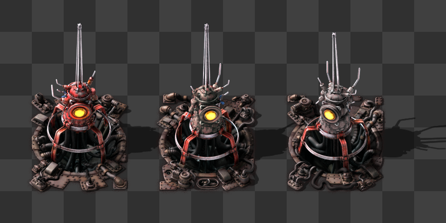
Current, Brown-ish, Gray-ish
I quite like the new beacon sprite, but I feel that there is too much red. Maybe keep the red highlight on the legs but make the housing dome a metallic or rusty color.
To me this huge amount of red makes them stand out too much, as some other replies have also said.
I've made a quick mockup of a less-saturated version, to give an impression of my thinking in this.
Current, Brown-ish, Gray-ish
Last edited by ThaPear on Fri Mar 20, 2020 2:35 pm, edited 2 times in total.
My mods: Red Alert Harvesters - Clean Pipes - Filtered Splitters
Re: Friday Facts #339 - Beacon HR + Redesign process
I don't know. I like the idea behind it and it's not altogether horrible, but the look doesn't quite fit with the rest. The red color is very different from other entities
Re: Friday Facts #339 - Beacon HR + Redesign process
It's ugly, I don't like it - I have 30k beacons on my map - NO THANKS!
My color birthday was May 2nd 2020 - Thank you Enchroma
-
ickputzdirwech

- Filter Inserter

- Posts: 803
- Joined: Sun May 07, 2017 10:16 am
- Contact:
Re: Friday Facts #339 - Beacon HR + Redesign process
In my opinion it looks TOO good. A lot of late game bases are completely full of beacons and I think your eye should be drawn towards the machines the beacons support, not the beacons themselves.
Mods: Shortcuts for 1.1, ick's Sea Block, ick's vanilla tweaks
Tools: Atom language pack
Text quickly seems cold and unfriendly. Be careful how you write and interpret what others have written.
- A reminder for me and all who read what I write
Tools: Atom language pack
Text quickly seems cold and unfriendly. Be careful how you write and interpret what others have written.
- A reminder for me and all who read what I write
Re: Friday Facts #339 - Beacon HR + Redesign process
As always, I love getting a peek behind the scenes, a little insight into what you are thinking. Thank you Albert for sharing the evolution of the life of a beacon with us!
My own personal Factorio super-power - running out of power.
-
prandinister
- Manual Inserter

- Posts: 1
- Joined: Fri Mar 20, 2020 2:26 pm
- Contact:
Re: Friday Facts #339 - Beacon HR + Redesign process
I know beacons are a good mechanic for the game, but i dont like the space they needded to get their max efficiency.
On FFF-336 the "Mod spotlight - Built in beacons" is amazing, this concept pleases me more, but not totally, maybe beacon could also be a engine that can be docked one the machines that way we get more spaces and efficiency, it would be awesome (or not lol) if i had skills to try mod that i would
On FFF-336 the "Mod spotlight - Built in beacons" is amazing, this concept pleases me more, but not totally, maybe beacon could also be a engine that can be docked one the machines that way we get more spaces and efficiency, it would be awesome (or not lol) if i had skills to try mod that i would
Re: Friday Facts #339 - Beacon HR + Redesign process
What about a version that looks like the first beacon, with the thin tower and giant spire...
...but then lower the tower much further into the hole?
So the "eye" part of the beacon barely pokes out of the hole.
Then the spire can still be as tall as it is, but without overlapping other factory elements as much.
In fact, instead of a tower with a spire, the beacon could be a squat little machine with a spire, so you still get the "transmission" aspect from the spire.
Last edited by Kyralessa on Fri Mar 20, 2020 2:37 pm, edited 1 time in total.


Re: Friday Facts #339 - Beacon HR + Redesign process
As a late-game structure the Beacon should look more modern and clean compared to the entry-tier structures, but i kinda agree that it doesn't fit the rest of the world of Factorio right now.
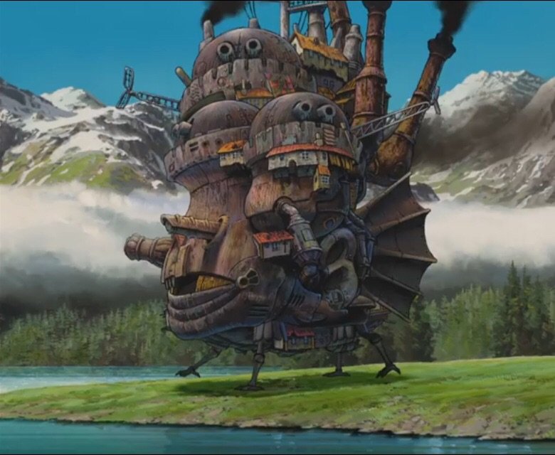
This end design looks nonsensical. A bulky structure on 4 thin legs (that reminds me of Howl's Moving Castle) over what looks like a giant empty hole in the ground (i can barely tell, even in the close-up image, that they're cables going up into the structure, instead of down into an abyss)? What the hell were you thinking?
What repulses me the most, however, is the fact that it's RED. It's an aggressive color, so it doesn't look like a supporting structure, but as other people said: an attacking/defense mechanism.
Some time ago you had a nice idea of making the chemical plants create smoke of a color depending on what they're crafting, and i think you should apply the same logic here: make it glow in the color of the modules which are inside of them. Or to make it simpler just make it blue, because like 99% of beacons use speed modules. This current red color is especially ironic here, as the red modules, productivity ones, are the only ones you can't actually use with beacons normally.
I'd prefer the first new design. A tower placed in a hole still looks silly, but better.
Maybe make the hole less obvious? Or place it on the ground level, but in the bottom row of tiles? Or just place it in the center, but make even slimmer (move the bulky part near the bottom?), and remove the useless 'sword' at the top?
Also if you don't want it to attract so much attention just make it less flashy - make those lightnings rarer.
As of the varying looks: while i love that in the raw ores, i'm not so sure here.
It is a nice touch for a building that is mostly in long rows/squares, so it's not as repetitive...
However, again, it's an end-game structure, that just doesn't make sense to be looking so randomly. The design should be "perfected", and the automated crafting should make them identical.
I would love to see this kind of randomness/'roughness' in mostly hand-crafted stone furnaces, but for beacons it just doesn't make sense. It's basically the same reason why it makes sense for ores to be randomized, but the smelted plates are identical.
PS: https://cdn.factorio.com/assets/img/blo ... ations.png is not a PNG image, stop 'lying'. :c
-
IronCartographer
- Filter Inserter
- Posts: 464
- Joined: Tue Jun 28, 2016 2:07 pm
- Contact:
Re: Friday Facts #339 - Beacon HR + Redesign process
Agreeing with both of you. Variation in natural entities, and the ores yet to be processed, is great. Variation in one entity made by the player violates an otherwise consistent aesthetic choice creating a glaring inconsistency which goes the other direction and feels irregular, not natural.kendfrey wrote: Fri Mar 20, 2020 1:53 pmI came here just to post this. The random variations of beacons really destroy the factory aesthetic, where everything is supposed to be clean, organized, and mechanical, especially at the later stages of the game when beacons get used. It might make a nice graphical option, but please don't require it.irbork wrote: Fri Mar 20, 2020 1:44 pm Love the general idea and concept. Hate the placement variation, it does not fit the rest of factory where everything is nice and tidy.
Good point.ickputzdirwech wrote: Fri Mar 20, 2020 2:10 pm In my opinion it looks TOO good. A lot of late game bases are completely full of beacons and I think your eye should be drawn towards the machines the beacons support, not the beacons themselves.
I think the main sticking point was on the "It has to be a tower" premise. Vanilla beacons really don't have that much range. It could have been flattened out, avoiding the height problem, with a ring of emitters linked by heavy cable and surrounding a "module box" in the center, close to the ground.
That would also help them blend into the background, leaving the machines as the focus. Unfortunately it would risk the appearance of them interacting with each other between adjacent emitters.
Regardless, the design in this FFF gives more of a modded feel, with how it clashes against furnaces, though it would likely fit nicely against the rocket silo. Dampening the colors to some extent might help, based on examples in the Discord discussion.
-
Deadlock989

- Smart Inserter

- Posts: 2529
- Joined: Fri Nov 06, 2015 7:41 pm
Re: Friday Facts #339 - Beacon HR + Redesign process
I really like the design and the energy effects. Putting things into pits seems to be all the rage at the moment ...
I have very mixed feelings about the enormous spike on top. Tall entities that exceed their collision box, that are centred on an odd number of tiles, have historically not worked well with inserters positioned behind them ...
That said, I personally think beacons shouldn't even be in the game, and productivity modules are highly questionable as well. But modders can do what they like in that regard.
Last edited by Deadlock989 on Fri Mar 20, 2020 3:05 pm, edited 1 time in total.
Re: Friday Facts #339 - Beacon HR + Redesign process
I second this idea. The light in the tower seems to mess with the visual (turn down its glow?). I like the spark but as an electrical "haze" to keep the effect more subtle I think works as well. Real air borne electricity from tesla coils has a purple/blue haze/glow about it. Some silver ball instead might be better without the light port... keep the pointy bit on top but make something come out of it: a spark with the glow - its meant to overpower/overclock the other assemblers etc after all. Subtle wave circles emitting power to the other neighbors is another alternative but maybe it turns into wifi...Lord Darkness wrote: Fri Mar 20, 2020 1:31 pm ...
Personally I find the image with "max occlusion/collision box" much more appealing, especially the version that is not red.
The absence of color makes it look more clean, so any subtle lightning on it would be easy to read without having to be aggressive.
If the center is the problem visually, well, just leave the iron rings there, working as its structure as well, so you'd be able to see the hole behind it.
So, very readable, subtle and high-tech, to me at least.
Personally, I'd remove the "round window", making it a perfect sphere at the top with no details.
Maybe the lightning color should tell what kind of beacon that is.
...

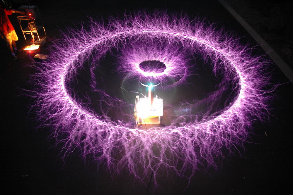
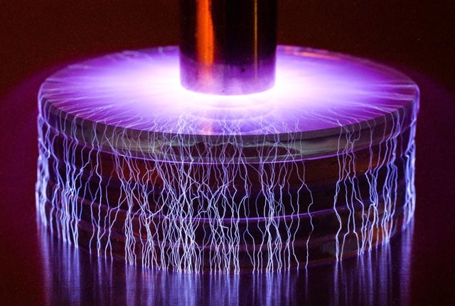
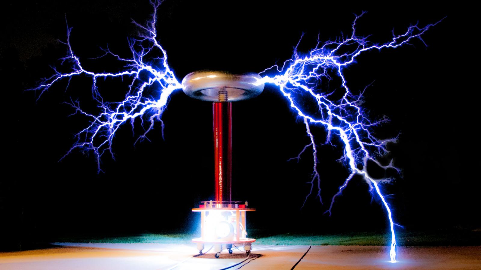
For examples of the "electrical color" (ionization?) here's a few examples of blue/indigo/violet:
http://tesladownunder.com/TeslaRotBreak ... ew1000.jpg
http://petapixel.com/assets/uploads/201 ... C_5402.jpg
http://cameronprince.com/sites/default/ ... coil_0.jpg
I'd suggest toning down the excitement of the effect as these are fairly dramatic examples of tesla coils. I think more subtlety is needed. I've also got bases that are littered with these things and having dramatic graphics for each beacon will make the whole thing an explosion of light that will distract and after awhile just annoy... some balance in between would be good. A subtle lightning or pulsing haze effect might work better.
Art is hard. All the discussion around our little group of players just turned into concept art for various energy weapons.

Re: Friday Facts #339 - Beacon HR + Redesign process
It is ugly. Posters provided better alternatives in this thread.
-
IronCartographer
- Filter Inserter
- Posts: 464
- Joined: Tue Jun 28, 2016 2:07 pm
- Contact:
Re: Friday Facts #339 - Beacon HR + Redesign process
The second part was quite clear from certain examples you've created.Deadlock989 wrote: Fri Mar 20, 2020 2:54 pmThat said, I personally think beacons shouldn't even be in the game, and productivity modules are highly questionable as well.
To the first, and I don't mean to derail discussion here, but: Have you considered the possible evils of "burner" beacons with beacon-specific modules as a "fuel" type so they get burned up and beacons require input, complicating beacon layouts?

Re: Friday Facts #339 - Beacon HR + Redesign process
Any chance the light in the middle of the beacon could adjust its color depending on what module is used inside it? Blue for speed, green for efficiency and puple/red for production?
-
cynicalwanderer

- Burner Inserter

- Posts: 8
- Joined: Fri Jan 17, 2020 5:01 pm
- Contact:
Re: Friday Facts #339 - Beacon HR + Redesign process
Came here to post this too. Factorio for many people is a game for people who delight in orderly designs, and having randomised crookedness, when all you want is the joy of a straight line, is gonna drive some people mad.irbork wrote: Fri Mar 20, 2020 1:44 pm Love the general idea and concept. Hate the placement variation, it does not fit the rest of factory where everything is nice and tidy. I think I will be placing and picking up beacons until I get my variation of choice, not cricket ones. Unfortunately it will be nightmare late game when bots are placing lots of beacons but I will build beaconed designs far away from main factory not to see it unless I want to deconstruct the build.
Another idea I had is maybe the electrical arcs could be coloured according to the type(s) of modules being used. This would give a more visual indicator of what modules are in the beacon. If you have a mix of module types, then perhaps alternate separately coloured arcs, or even a colour blend of the two.
-
Deadlock989
- Smart Inserter
- Posts: 2529
- Joined: Fri Nov 06, 2015 7:41 pm
Re: Friday Facts #339 - Beacon HR + Redesign process
Unfortunately beacons can only have an electric or void energy source, like roboports, presumably due to GUI limitations.IronCartographer wrote: Fri Mar 20, 2020 3:05 pm To the first, and I don't mean to derail discussion here, but: Have you considered the possible evils of "burner" beacons with beacon-specific modules as a "fuel" type so they get burned up and beacons require input, complicating beacon layouts?
Much more interested in burner or fluid- (steam-) powered roboports if I'm honest.
I like the way some mods have re-adapted beacons into "racks" that aim to expand the functions of a very limited number of machines or even just one. Like adding modules, but modules that take up physical space. Then you upgrade the "rack". The precise opposite mentality to other venerable mods where there's 5 tiers of every single machine and you spend half your time running around replacing machines with green- and purple-tinted versions of the exact same thing. But the vanilla minigame of optimally packing space with various rectangles has little appeal, personally. The whole thing with modules both inside and outside machines is just ... odd.
Last edited by Deadlock989 on Fri Mar 20, 2020 3:24 pm, edited 3 times in total.
-
knightelite
- Fast Inserter
- Posts: 133
- Joined: Fri Oct 05, 2018 3:49 pm
- Contact:
Re: Friday Facts #339 - Beacon HR + Redesign process
Have you considered the idea of coloring the beacon (or maybe the lightning?) based on the type of module inside the beacon? Or maybe split the colors if there is more than one type of module?
-
mikes61293
- Burner Inserter
- Posts: 17
- Joined: Fri Oct 12, 2018 12:16 am
- Contact:
Re: Friday Facts #339 - Beacon HR + Redesign process
I agree with most of the things that have been posted here. This new beacon design really misses the mark. I like the original concept drawings, but I think each iteration looks progressively worse. The final product looks like bunch alien overseers in the middle of the factory.
Things I like: The tower design in the first rendered iteration, the energy effects.
Things I dislike: Random rotation, the large eye, the color, the legs, the hole in the ground.
Things I like: The tower design in the first rendered iteration, the energy effects.
Things I dislike: Random rotation, the large eye, the color, the legs, the hole in the ground.
Re: Friday Facts #339 - Beacon HR + Redesign process
If I may, I think you guys forgot the most important aspect of beacons: they are support units. They don't do anything, they just exist so stuff around them do things better.
Let's take a look at this: https://cdn.factorio.com/assets/img/blo ... sition.png
If you show this picture so someone who doesn't know the game, and ask them which are the main production buildings, and which are the support buildings, I bet you'd get varied results.
The proposed beacon is very busy. And red is a strong, hot color, something designers use when they want to highlight or get some sort of emotional response. Also, those swords are huge, repetitive, and increase their complexity a lot.
Beacons are spammed, it's the most frequent unit in a lot of games. I believe they should be simple, and have neutral colors. That way, the actual production buildings can dictate how a segment of the factory looks. Right now, those beacons are drawing all attention to themselves. Every end game base will be a sea of red and swords, and I think that's a terrible idea.