Tbh, I think it's the other way round. Left is after and right is before.bobingabout wrote: Fri Nov 15, 2019 4:59 pm I can definitely say, that with the exception of the map, the right hand side looks way better in every image, the left looks too bright and cartoony, which completely breaks the feel of a game like Factorio. the left hand side of the map looks better though.
Considering left is before, and right is after (unless you're insane), then this is a good change.
Friday Facts #320 - Color correction
-
BrainlessTeddy

- Fast Inserter

- Posts: 103
- Joined: Sun May 19, 2019 7:50 pm
- Contact:
Re: Friday Facts #320 - Color correction
Please consider english is not my native language.
-
BattleFluffy

- Fast Inserter
- Posts: 216
- Joined: Sun Mar 31, 2019 4:58 pm
- Contact:
Re: Friday Facts #320 - Color correction
I am late to the party. My top thought about this:
Will this make the colored lights at night look better?
This would be SO cool if it does! At the moment, some of them don't look right to me, they seem "painted" instead of "glowing", I think it's because they don't cast an appropriately colored glow. I would love if my various colored lights designs cast colored glows on nearby ground and objects.
Re: Friday Facts #320 - Color correction
I know, that was touched on in another post of mine, and is also why I specified Linear RGB (instead of sRGB) as the start and end of that chain. The best way to go about it is to convert everything to linear light at the start, do most operations on those values (including the Von Kries transformation I outlined), and then convert the result back into non-linear sRGB just before output. Everything from blending to scaling should be done with linear values instead of sRGB values.Ext3h wrote: Thu Nov 14, 2019 7:33 am Slight misassumption here - this is tone mapping, and that's usually not using a linear transfer function to begin with. Neither in sRGB (linear), RGB (gamma corrected), YUV nor HSL space. So you can't even express it as a color twist matrix to begin with. The actual transfer function which corresponds to what the artist can do in Photoshop is pretty hard to approximate with anything but a LUT mapping the entire color cube (which is - not so much of a coincidence - what these LUTs actually include). And even that approximation is wrong, as Photoshop has several filters which are actually based on convolutional filter kernels.
However, it's worth noting that some APIs (I think including OpenGL) have special support for sRGB's transfer characteristics (more accurate term for what is often called a 'gamma curve'; sRGB in particular only uses a gamma/power curve for part of it, but it's squished and has a linear section at the start), but they call display-native RGB 'linear RGB', while linear light RGB ends up getting called 'sRGB'. While technically incorrect, I believe they do this because from an API standpoint, the values returned from their 'linear RGB' work linearly, while they work non-linearly from their 'sRGB'.
I believe this is largely due to the calibration and gamut of your monitor.Ext3h wrote: Thu Nov 14, 2019 7:33 am As for the actual color correction employed here, day mode, mixed feelings.
Some texture had been over-saturated before, and now just hurt. E.g.:
- Circuits
- Modules
- That red-green spotted grass texture
- Purple inserters
- Green inserters
This indicates you might have a configuration problem with your monitor, if you're seeing textures as overexposed. It might be that your monitor expects values to be in the range of 16-235 (so-called 'TV Range', as it's often used for video signals), while your computer is sending it data ranging from 0-255 instead (so-called 'Full Range', or sometimes 'PC Range'). Alternatively, some contrast or other adjustment on either your monitor or in your video card's settings may be responsible, or your display's transfer characteristics might be favoring light values and not giving enough bits to darker values.Ext3h wrote: Thu Nov 14, 2019 7:33 am Some textures already had highlights before, fighting against that grey-filter, and are now overexposed.
Actually about every instance of "blank metal texture", be it on power poles, top of assemblers, or iron plates.
There are a few websites I know of with excellent test images that help diagnose problems like this. The first is Lagom LCD Test Images, in this case specifically the 'Black level' and 'White saturation' pages (linked at the top of that page).
As for whether or not the problem lies in the transfer characteristics of your display, making some things darker or lighter than they should be, that might best be tested using a test image from this page instead. The third image on that page tests the entire brightness range of your display against other values from your display, to determine if the curve fits what the sRGB standard specifies.
In fact, I developed a shader that implements a variation of that sort of image, which you can view here. It seems to more accurately reflect my own monitor's calibration (at least, how DisplayCal calibrated it), and I can verify it is mathematically accurate, so I personally prefer it. However, I understand that some displays that are set up to use something like VGA or other analog video standards, might not work so well with the 'pixel checkerboard' pattern I use in my own variation - a problem that the original image from that website sought to account for.
Note: there is no way to judge if your monitor has a higher gamut (thus more saturated/chromatic colors) than others unless you have a colorimeter and can directly measure the light it puts out. Your monitor's gamut could be why you see many of the colors as 'hurting' now from oversaturation. If your monitor supports the DCI-P3 or AdobeRGB color spaces, this could be why - those color spaces have a larger gamut than sRGB.
I agree, but thankfully this might be easily fixable now by just making a custom night-time LUT.Ext3h wrote: Thu Nov 14, 2019 7:33 am As for night mode, well, could use more dynamic range. I know, it's supposed to be "night" and visibility is supposed to be "limited". But that's not how it works when actually playing this game. The actual effect is that I can't see shit if there is any ambient light in my room, especially in the summer, while I'm still seeing clear as day when playing at (real life) night.
Artists choice aside, you just got to make the "dark" areas at night use more of the available brightness range. Just a matter of basic usability.
I would say that it's not so much stressful on the eyes, but stressful on the brain, since there's less information and thus more processing involved to recognize the color difference. It can also cause issues for colorblind users if the two colors are close to the same confusion line for their form of color blindness when plotted on a chromaticity diagram (for those who don't know, chroma is similar to saturation, while chromaticity is kinda like a combination of chroma and hue). However, it can help if the hue is constant while only chroma changes - differences in chroma alone can usually be distinguished by color blind users, as long as the hue line from the white point doesn't move along a confusion line.Ext3h wrote: Thu Nov 14, 2019 7:33 am The map? Better, but still not great. While the updated color schema makes it easier to distinguish biomes in the first place, you should really give something else a try. Flat color next to flat color is just stressful on the eyes, especially if the only difference between biomes is on chroma.
E.g. consider simply adding solid borders around biomes. Darken each border pixel of each biome by like 30-50%, in order to get a hard border in the perceivable luminescence. I guarantee, not just color blind players are going to favor that.
Borders between biomes in the map view would be great, but often the transition from one biome to another is smooth and you can't pinpoint exactly where one ends and another begins. It might be difficult for the devs to implement that sort of thing.
-
bobingabout

- Smart Inserter

- Posts: 7352
- Joined: Fri May 09, 2014 1:01 pm
- Contact:
Re: Friday Facts #320 - Color correction
of course it is, this is just my silly way of saying "You made the game worse."BrainlessTeddy wrote: Sat Nov 16, 2019 6:09 pmTbh, I think it's the other way round. Left is after and right is before.bobingabout wrote: Fri Nov 15, 2019 4:59 pm I can definitely say, that with the exception of the map, the right hand side looks way better in every image, the left looks too bright and cartoony, which completely breaks the feel of a game like Factorio. the left hand side of the map looks better though.
Considering left is before, and right is after (unless you're insane), then this is a good change.
-
BrainlessTeddy
- Fast Inserter
- Posts: 103
- Joined: Sun May 19, 2019 7:50 pm
- Contact:
Re: Friday Facts #320 - Color correction
-.-bobingabout wrote: Sat Nov 16, 2019 8:14 pm of course it is, this is just my silly way of saying "You made the game worse."
But I don't agree with you. The factory is too bright but I think it's better than before. The environement, the so called "nature" looks way better I think. And the map is better, too.
Please consider english is not my native language.
-
bobingabout
- Smart Inserter
- Posts: 7352
- Joined: Fri May 09, 2014 1:01 pm
- Contact:
Re: Friday Facts #320 - Color correction
you have the right to disagree with me, I'm just voicing my opinion after all.BrainlessTeddy wrote: Sat Nov 16, 2019 8:57 pm-.-bobingabout wrote: Sat Nov 16, 2019 8:14 pm of course it is, this is just my silly way of saying "You made the game worse."
But I don't agree with you. The factory is too bright but I think it's better than before. The environement, the so called "nature" looks way better I think. And the map is better, too.
it's not like they're going to listen to me and undo it.
Re: Friday Facts #320 - Color correction
Looks like Factorio with reshade with colourfulness, for me not big deal, but im still missing beacon in HR 

Re: Friday Facts #320 - Color correction
The fact that i like ponies but i hate Diablo ponies and definitely hate factorio ponies. Please keep ponies out of our games. Especially color palette.

Re: Friday Facts #320 - Color correction
It's called brony.

Re: Friday Facts #320 - Color correction
Ok seriously, all the people saying "color corrected monitors" need to just stop and instead consider...
How many users use the same color profiles and have monitors set up for that? How many users use the exact "correct" color settings on their screens when playing games?
The first part of that sentence is what matters the most here... there are practically as many different settings (regardless of how professional you are) and as many different eyes (colorblind people spring to mind) out there as there are users on these forums.
Let's just play with the thought... just for a brief moment... that regardless of what hardware is used, players will have varying opinions based on TASTE.
To me, the examples show BAD TASTE. It's an opinion of mine and it has NOTHING to do with what setup i am running.
Which brings me to what you colorphiles are really saying. "buy a real monitor that can cost hundreds if not over a thousand dollars for a game that costs $25"
And then what? Complain about all the other games that doesn't run toyland color settings being too dark?
It's about averages really and if i compare factorios current color scheme (before change that is) with other nice to look at games it's almost perfect to me (not including minimap in that statement BTW)
The only thing i don't like about it currently is there's some things that are too smudged/smooth/indistinct. Pipes come to mind and i made a test for that while i was looking to make different shaped storage tanks and i realized i am not really a "sprite artist".
One can make a game colorful and bright without making it look like a toybox BTW. Simply increasing saturation and brightness is NOT a decent approach to this end. IF you want to make the game look nicer you will have to re-think your whole atmosphere. You can't just add more saturation and assume it will look good.
The artwork right now isn't perfect but at least it doesn't make me feel like i am playing a kids game.
-
thatguy321
- Inserter

- Posts: 47
- Joined: Tue Jul 19, 2016 1:35 pm
- Contact:
Re: Friday Facts #320 - Color correction
Just throwing my vote into the mix...
Please, please, please don't change the color scheme. We don't need Fortnite themed Factorio. The current more drab theme is more realistic and more visually appealing to me. The ONLY reason for most of the colors is to distinguish between the different structures; it doesn't need to be all bright and cartoony.
I feel very, very, very certain about this, but just my opinion. Thank you for all the hard work you do on the game.
"I have come here to smelt iron ore and kick biter ass.....and I'm all out of iron ore." -me
Re: Friday Facts #320 - Color correction
Cadde wrote: Mon Nov 18, 2019 8:50 am Ok seriously, all the people saying "color corrected monitors" need to just stop and instead consider...
How many users use the same color profiles and have monitors set up for that? How many users use the exact "correct" color settings on their screens when playing games?
The first part of that sentence is what matters the most here... there are practically as many different settings (regardless of how professional you are) and as many different eyes (colorblind people spring to mind) out there as there are users on these forums.
I think you misunderstand what the importance behind a color calibrated monitor is. It's not important in the sense that it should be the only thing to consider, or even the 'only way to play'. Heck, the sRGB standard has a sub-par gamut to begin with anyway, so it's clearly not up on some pedestal as something to achieve.Cadde wrote: Mon Nov 18, 2019 8:50 am Which brings me to what you colorphiles are really saying. "buy a real monitor that can cost hundreds if not over a thousand dollars for a game that costs $25"
And then what? Complain about all the other games that doesn't run toyland color settings being too dark?
It's about averages really and if i compare factorios current color scheme (before change that is) with other nice to look at games it's almost perfect to me (not including minimap in that statement BTW)
What it does, however, is provide a baseline for how things will typically look in an average, every-day and non-calibrated usage scenario. So in that way, while it's not the only thing that matters or anything, it can be considered to be the only thing the developers themselves need to test their color choices against.
That said, monitors with higher gamuts are becoming more and more popular these days. Monitors that use AdobeRGB are very popular in the print industry, as it supports a wider gamut in the blue/green area of human vision, and thus can more accurately represent cyan printer ink. TVs and 'gaming' monitors are increasingly supporting DCI-P3, and a few even try to support Rec. 2020 (though it's extremely hard to do Rec. 2020 as a raw output, since each primary color is a single wavelength of light).
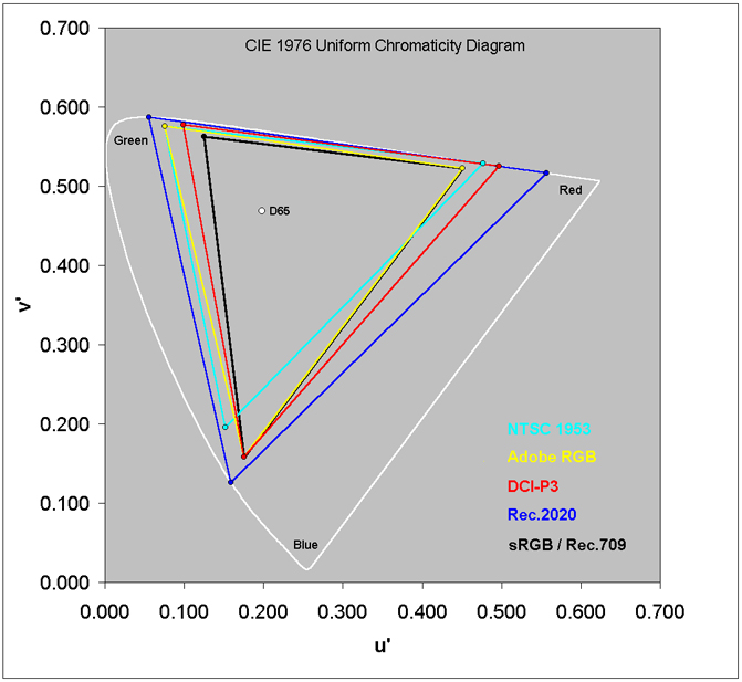
Cheaper high-gamut monitors will usually have very poor calibration and quality control, not really supporting any particular standard at all. These are the ones you'll see comparing themselves to NTSC (which teechnically had a higher gamut than sRGB, but sRGB has a much more chromatic blue primary, so the two really shouldn't be compared the way they often are). If you see something like '129% sRGB & 108% NTSC', that's how you know you'll have no way to predict what you'll get (fun fact, that monitor I linked to has fine print stating they measured those two percentages with different chromaticity spaces; NTSC coverage was measured in the more perceptually uniform CIE u'v' chromaticity space (released in 1976), while the sRGB percentage was measured in the less perceptually uniform CIE xy chromaticity space (released in 1931). See this chart for a comparison of the various mentioned gamuts in the u'v' chromaticity space).
People like me who keep emphasizing judging these things in environments where the monitors are properly calibrated, are not saying that uncalibrated hardware isn't important... But we are saying that the devs don't need to go out of their way to track down whatever cheap monitor you have and make sure it will look correctly on your specific display. It's not their fault if the colors look way too saturated and 'blinding' on your display, it's the manufacturer of your display's fault. Or, if you purposefully bought a cheap monitor that had higher-saturation colors and was wowed by how much the colors 'popped', it's your fault for not thinking about if there would ever be a scenario in which you wouldn't want that anymore.
That said, many high-gamut monitors have a setting in them to change them to a low-gamut mode for you. Even many phones have this. It might be called 'sRGB mode', or maybe something like 'Natural' vs. 'Boosted'. You can probably turn it to 'sRGB' or 'Natural' while you play Factorio, and it'll look more similar to what the developers intend.
No, that's what mods are for. If you want different colors - a darker/grungier look; a brighter, colorful, cheery look; or something like a 'permanent night' look; those are things that you can decide to install or create as mods. Different users have different tastes, and that's why mods exist.Cadde wrote: Mon Nov 18, 2019 8:50 am Let's just play with the thought... just for a brief moment... that regardless of what hardware is used, players will have varying opinions based on TASTE.
To me, the examples show BAD TASTE. It's an opinion of mine and it has NOTHING to do with what setup i am running.
What you are doing here is unnecessarily insulting the tastes and preferences of the developers. And it is their game, not yours. Developing and creating assets for a video game is a form of art, and the primary purpose of art is to represent an aspect of the person creating it - whether that aspect is an opinion, a thought process, an abstract idea, a memory, or anything else that's personal to them.
You have no right to tell them how they should represent themselves through their art, and while there might be merit to complaints like, "I can't see the difference between these two colors because I am color blind," or, "Most modern monitors end up using a 2.2 power as their gamma curve instead of something like sRGB/BT.1886, so the darker colors are probably darker than you intend for most people," both of those are a matter of practicality - with the intention of helping the developers better express their art to various sorts of users. Neither have anything to do with taste, opinions, or personal preference.
I think I remember them saying they actually create the sprites with 3D models, rendering them at a decent size and then scaling them down in photoshop, tweaking the final look afterward. I've dabbled in 3D modeling before, but I must admit the same weakness: visual arts are a very weak part of my skill set.Cadde wrote: Mon Nov 18, 2019 8:50 am The only thing i don't like about it currently is there's some things that are too smudged/smooth/indistinct. Pipes come to mind and i made a test for that while i was looking to make different shaped storage tanks and i realized i am not really a "sprite artist".
Despite what I say above, having spent the last couple years studying colorspace conversions and color manipulation algorithms for various effects, I can tell you now that what they're doing with this update isn't remotely as simple as 'increasing saturation and brightness'.Cadde wrote: Mon Nov 18, 2019 8:50 am One can make a game colorful and bright without making it look like a toybox BTW. Simply increasing saturation and brightness is NOT a decent approach to this end. IF you want to make the game look nicer you will have to re-think your whole atmosphere. You can't just add more saturation and assume it will look good.
The artwork right now isn't perfect but at least it doesn't make me feel like i am playing a kids game.
They have hand-tweaked numerous individual sprites' colors using LUTs, and to do that means they likely did something more akin to increasing chroma (similar to saturation, but doesn't affect luminosity/lightness) on some things, shifting the hue here and there, and occasionally tweaked the luminosity. For the day/night part, it's clear they also changed and adapted the white point.
Re: Friday Facts #320 - Color correction
Tynach wrote: Tue Nov 19, 2019 2:40 am You have no right to tell them how they should represent themselves through their art
As always, let us know what you think on our forum.
There are 10 types of people: those who get this joke and those who don't.
Re: Friday Facts #320 - Color correction
That's relating to the guy trying to say different players have different tastes, but that only the developers' own personal tastes were bad. I don't believe that's constructive or anything but rude.

Re: Friday Facts #320 - Color correction
Spot on... the monitor had shifted to game profile with a weird transfer function increasing hue. Back to calibrated sRGB profile, and it looks actually plausible.Tynach wrote: Sat Nov 16, 2019 6:19 pmThis indicates you might have a configuration problem with your monitor [...] or your display's transfer characteristics might be favoring light values and not giving enough bits to darker values.
Re: Friday Facts #320 - Color correction
Thank you for clarifying.
There are 10 types of people: those who get this joke and those who don't.

Re: Friday Facts #320 - Color correction
Wow! The last time I checked the FFF on color corrections I realized that my preference depended on viewing angle onto my monitor. Weird enough. Now I went through the Lagom LCD Test Images to check my monitor settings, adjusted so that it is "correct". Checked the FFF on color correction again. Now I prefer the new colors*. I had just no idea how badly my monitor was set up. I really only changed the settings of my monitor. No external measurement device.Tynach wrote: Sat Nov 16, 2019 6:19 pm There are a few websites I know of with excellent test images that help diagnose problems like this. The first is Lagom LCD Test Images, in this case specifically the 'Black level' and 'White saturation' pages (linked at the top of that page).
Not only the new colors for Factorio as presented in the FFF, but also other things look just better now. I am very grateful for this hint, and super happy that everything is better now.
Thanks, Tynach!
*The heavy blue tones by night are very atmospheric (All cats are grey by night!) but will get some getting used to. Just as the reduced contrast on the stone path sprites. But these are my only complaints after adjusting my monitor settings.
Re: Friday Facts #320 - Color correction
And i think you overestimate the average humans interest in caring for all that which you said about color calibration.Tynach wrote: Tue Nov 19, 2019 2:40 am I think you misunderstand what the importance behind a color calibrated monitor is.
*Words words words*
Furthermore, i did say average here. Meaning Wube should strive for the middle ground that makes everyone happy, not just the ones with monochrome monitors from the 60's or those who spent waaaaay too much effort looking up which monitor is "elite" enough to qualify for the visualphile hipsters.
Ah yes here we go. "If you don't like it then mod it"
So if an overwhelming majority of players who don't like the childish colors have to run mods to enjoy the game, that's all good because the underwhelming minority has such an interest in color calibrated monitors that everything looks dark and gloomy to them unless the brightness and saturation is turned all the way up to 11?
Cool, let's assume Wube removes belts from the game and replaces them with logistic robots all the way through the game... Let's imagine you like belts...
"That's what mods are for! If you want belts you can add them with mods dude"
You are killing your own argument here. Mods exist for the FEW that want something more or different with the game. If a MAJORITY doesn't like the way the game plays then you have a problem with the game. In this case i'd say a majority is going to have problems with the color changes while the visualphiles who think it's all about pixels and nothing at all about personal taste will drown any such discussion with technical details.Tynach wrote: Tue Nov 19, 2019 2:40 amDifferent users have different tastes, and that's why mods exist.
And besides that, mods exist to allow the community to be creative with the game engine. They don't exist to make a game playable for the majority of players.
So negative feedback is insulting to you then? Great! Maybe you should become a game developer and at the first mention that you've made a bad choice you can call them insulting and ignore them and keep making a game with glaring flaws that will turn most of your customers at the door.Tynach wrote: Tue Nov 19, 2019 2:40 amWhat you are doing here is unnecessarily insulting the tastes and preferences of the developers. And it is their game, not yours. Developing and creating assets for a video game is a form of art, and the primary purpose of art is to represent an aspect of the person creating it - whether that aspect is an opinion, a thought process, an abstract idea, a memory, or anything else that's personal to them.
From my own experience though, Wube at least knows how to listen to negative feedback and not get all touchy feely about it. And in fact change their minds about something controversial from time to time.
The only ones who can't take negative feedback are those living in a bubble thinking everything they do is perfect.
As much as you want this to be some kind of dictatorship where you get to tell people what to think and say, i am sorry to say that you have no such control here or anywhere else for that matter.Tynach wrote: Tue Nov 19, 2019 2:40 amYou have no right to tell them how they should represent themselves through their art
I have every right in the world to provide feedback, especially when they ASKED for it in the first place.
And even if they didn't ask for it i would give it when i feel they are doing something bad. Without unfiltered feedback you have what amounts to an echo chamber.
Even if you push out the nastiest sulfur turd of a game, in an echo chamber, you would be praised for it because everyone is so damn PC that they don't dare tell the truth. I am not that kind of person and that's called freedom.
Even if you take my life, you cannot take my freedom so how about you stop trying kk?
I KNOWTynach wrote: Tue Nov 19, 2019 2:40 amI think I remember them saying they actually create the sprites with 3D models, rendering them at a decent size and then scaling them down in photoshop, tweaking the final look afterward. I've dabbled in 3D modeling before, but I must admit the same weakness: visual arts are a very weak part of my skill set.


Feel free to throw a fit over how bad it is, i would like to hear about it so i can take in what you have to say and depending on your choice of words i might actually become better at it.
Or would you rather hear "You have no right to give my negative feedback... negative feedback. My feels might be hurt! I am calling the cyberbully police!"
EDIT: Forgot my second take on an iron pipe.

Re: Friday Facts #320 - Color correction
Seems like my monitor wasn't set up correctly either. The green circuits look fine now and not oversaturated 
-
FasterJump
- Filter Inserter

- Posts: 304
- Joined: Sat Jul 09, 2016 11:43 am
- Contact:
Re: Friday Facts #320 - Color correction
Thank you, this change is very welcomed. Before, I was forced to increase my monitor luminosity to 100% to have a clear view of my character's surroundings.
This change is not only graphical. For me, it's readability and it prevents headaches.
When will this change be effective?
This change is not only graphical. For me, it's readability and it prevents headaches.
When will this change be effective?
Last edited by FasterJump on Wed Nov 20, 2019 7:52 am, edited 1 time in total.