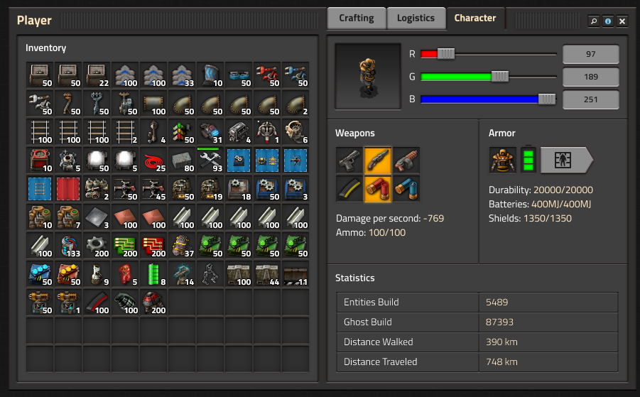
Friday Facts #289 - Character GUI

Regular reports on Factorio development.
User avatar
Alice3173
Fast Inserter
Fast Inserter
Posts: 124
Joined: Sun Apr 24, 2016 11:35 pm
Contact:

Re: Friday Facts #289 - Character GUI

Post by Alice3173 »

Zaflis wrote: ↑Fri Apr 05, 2019 7:26 pmPersonally i'm the opposite. Bright screen irritates my eyes and i favor dark themes whenever possible. It also causes the famous dark under-eye-patches for people for being exposed to bright lights hours and hours a day.

But it shouldn't be too hard to some point later make UI color themes customizable.
I don't have astigmatism like TheoMarque does but I have some pretty bad eye issues myself and have to avoid eyestrain as much as possible. Dark themes actually exacerbate the issue when you're properly handling your lighting situation. Using something like f.lux to get a natural color temperature and setting your monitor's brightness to match the room's ambient light will result in light themes looking very natural and comfortable to use. And for someone with eye-related issues, significantly more comfortable than a dark theme. (And having a bunch of sites/games where dark themes are the only option actually is worse than everything just having a dark theme because switching between a dark theme and a light theme is physically painful.)

So customizable ui themes (or at least having an option between light and dark) seem like something they should absolutely support.
ManaUser
Filter Inserter
Filter Inserter
Posts: 263
Joined: Sat Aug 12, 2017 9:41 pm
Contact:

Re: Friday Facts #289 - Character GUI

Post by ManaUser »

Mmmmmmorten wrote: ↑Sat Apr 06, 2019 5:24 am On thing in the character gui that is bugging me might be just me using it wrongly...
[snip]
Is there a way to only move items (all at once) from inventory to empty chest - without moving the locked in place stuff?
You kinda are using it wrong, honestly. It's a filter, not a lock. It means "save this space for X", not "don't move this" The way it interacts with inventory sorting is really almost a side effect. I think what you're asking for would be a totally worthwhile feature, but it's not currently the intended purpose of the filters.
equitime77
Long Handed Inserter
Posts: 54
Joined: Mon Mar 28, 2016 11:07 am
Contact:

Re: Friday Facts #289 - Character GUI

Post by equitime77 »

TheoMarque wrote: ↑Fri Apr 05, 2019 7:17 pm Please, I beg you, do not make darker slots in gui (under items) I have form of astigmatism - light emiting pixels are blurry in my eyes, so i use light IDE, bright themes, because I must to use it. Too much contrast of background making game for me unplayable (white numbers on dark background). Please, add hide option to allow lower contrast or something. I love the game, but these GUI change will be my end of playing a factorio.

Yes, I play only light themed games, with light GUI's.

If it's possible - how can i redraw Gui theme? for lighter (as today)
Of course, upcoming style is better than actual but too dark.

EDIT: I see new GUI in that way (of course, not that extreeme, only the numbers are a problem)
Image
I hope they do something about this. Factorio is a very dark game and I have problems seeing it/eye strain after a while. Not that I have your problem tho. It could do with brightening up a lot.
User avatar
brunzenstein
Smart Inserter
Smart Inserter
Posts: 1117
Joined: Tue Mar 01, 2016 2:27 pm
Contact:

Re: Friday Facts #289 - Character GUI

Post by brunzenstein »

I love dark mode!
Last edited by brunzenstein on Sat Apr 06, 2019 9:23 am, edited 1 time in total.
AndrewIRL
Fast Inserter
Fast Inserter
Posts: 240
Joined: Fri Mar 24, 2017 2:17 pm
Contact:

Re: Friday Facts #289 - Character GUI

Post by AndrewIRL »


Looks fantastic! :D :D :D
kovarex
Factorio Staff
Factorio Staff
Posts: 8207
Joined: Wed Feb 06, 2013 12:00 am
Contact:

Re: Friday Facts #289 - Character GUI

Post by kovarex »

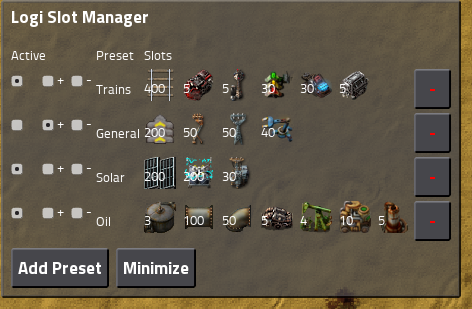
IronCartographer wrote: ↑Fri Apr 05, 2019 7:33 pm It would be amazing to see things taken one step further as demonstrated in this 0.16 mod: https://mods.factorio.com/mod/Logistic_Slot_Manager

Image

Basically: Toggling groups of requests per-task, with request, idle, and trash states depending on the desired composition / transition between each set.

As a bonus, it would integrate the much-requested "Toggle Logistic Requests" functionality (might need a clear toggle for 'every' profile as well as each profile) which is helpful when you respawn and don't want to be inundated with items.
This is actually really cool. The possibility to make presets and select any combination of presets. Conflict is not a problem, it would just select the maximum of the request/trash amount of each individual item mentioned in more presets.

To make it clear, we are not planning this feature for now, but I'm definitely putting this idea into the trello category of (advanced UI features for later).
yoyo
Manual Inserter
Manual Inserter
Posts: 1
Joined: Sat Sep 22, 2018 6:07 am
Contact:

Re: Friday Facts #289 - Character GUI

Post by yoyo »

About the background color showing the state of delivery: what about a "progress bar" in the background of the tile similar to the train orders fulfilment status? Maybe a three-part progress bar, that shows how many items you have (green or normal backgroud?), how many are on the way (yellow) and how many are actually unavailable (red)? I haven't tried a mockup, so no idea if might be too cluttered behind the icons to be actually useful... but it might be nice to be able to actually watch it as the orders fill up...

Also it should be probably vertical to match the min-max numbers placement. (Oh, and for some reason the min at the top, max at the bottom seems wrong to me...)
noob_hoarder
Inserter
Inserter
Posts: 26
Joined: Sun May 06, 2018 12:47 pm
Contact:

Re: Friday Facts #289 - Character GUI

Post by noob_hoarder »

lf_ wrote: ↑Sat Apr 06, 2019 5:08 am Finally, we *need* the ability to toggle on and off stuff: exoskeletons, logistics requests (turn off automatically if the player dies; this pretty much requires ephemeral requests since you might want to order new armor but not get a load of other crap), belt immunity (for walking on belts and getting a speed boost), personal roboports.
Not sure why you included exoskeletons and personal roboports in there, since you already *can* turn these on and off... ;) But other than that, i think you're right, having two more toggles for those would be great.
Mmmmmmorten wrote: ↑Sat Apr 06, 2019 5:24 am Most of the time this is fine - excempt when I do this close to home base (read: mall) and all my logistic bots leap to work to fill up all my, now empty, blue slots that most of them has a logistic request to autofill.
Consider going out of logistic network range when emptying inventory? In 0.16 i used to always have a deconstruction planner in my hotbar to check the LN boundaries so i could either avoid the bots or allow them to "catch up" to me, and now it's even easier with the new Alt+D shortcut (so i don't even need to keep the item on me at all times).

PS On the FFF subject, all the ideas i thought of asking about are already mentioned in the comments above, and also some great ones that i didn't even think about, so hope a lot of the feedback is considered and even implemented soon. :)
User avatar
MarvinCZ
Long Handed Inserter
Posts: 59
Joined: Fri Jun 03, 2016 7:11 pm
Contact:

Re: Friday Facts #289 - Character GUI

Post by MarvinCZ »

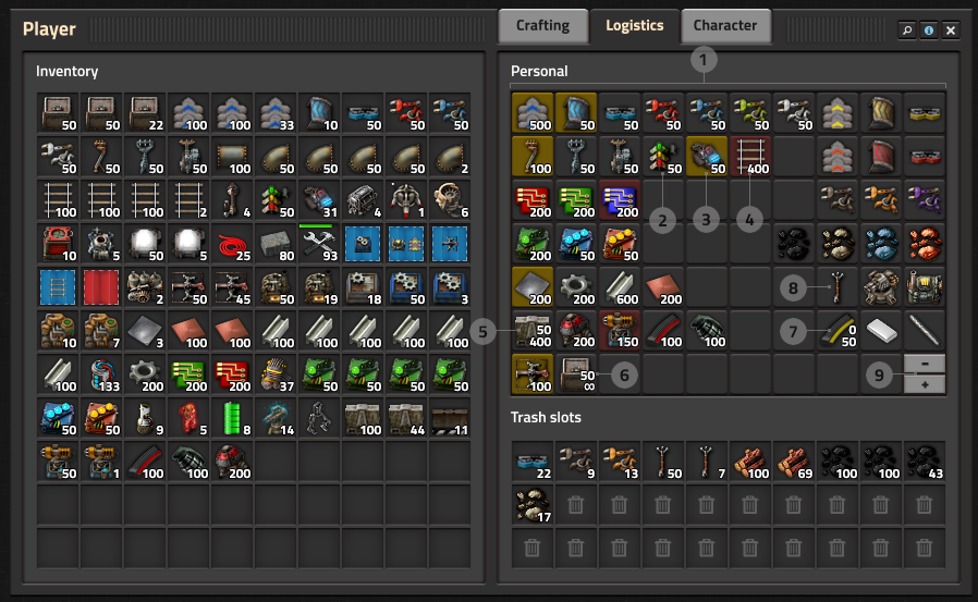
MarvinCZ wrote: ↑Fri Apr 05, 2019 7:23 pm I also noticed that there is missing the description of mysterious "+/-" button marked as (9) in the Logistics tab image. :D
Nobody's curious about this button? :D
Koub
Global Moderator
Global Moderator
Posts: 7784
Joined: Fri May 30, 2014 8:54 am
Contact:

Re: Friday Facts #289 - Character GUI

Post by Koub »

MarvinCZ wrote: ↑Sat Apr 06, 2019 9:56 am
MarvinCZ wrote: ↑Fri Apr 05, 2019 7:23 pm I also noticed that there is missing the description of mysterious "+/-" button marked as (9) in the Logistics tab image. :D
Nobody's curious about this button? :D
Those who don't seem to be curious have probably guessed it added/removed additional lines of logistic requests :).
Koub - Please consider English is not my native language.
rizmage
Burner Inserter
Burner Inserter
Posts: 7
Joined: Sun Mar 17, 2019 8:31 pm
Contact:

Re: Friday Facts #289 - Character GUI

Post by rizmage »

This all looks very nice.
One small thing though,it would be nice to have a separate slot for bots you carry for personal roboports.
It seems that they should be in the roboport(s) and not in your inventory.
A slot for bots would go nice on the character tab with the armour.
Other than that I am looking forward to using the new UI.
Keep up the good work!
User avatar
SuperSandro2000
Filter Inserter
Filter Inserter
Posts: 742
Joined: Sun Jan 12, 2014 3:54 am
Contact:

Re: Friday Facts #289 - Character GUI

Post by SuperSandro2000 »

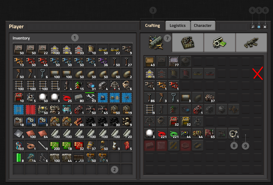
To get my point clear: Those squares look horrible. Give the players an option to hide them or don't even implement them. In modded my crafting screen is like 4 times as high as this one and they would distract me from the important things.
Continuing: I don't like 3 either as I do not have a quick overview of which items do I request from the logistic network. i request about 20 to 30 items right now and have no interest in constantly switching tabs.
Then 4, 5 and 6 are to little like the quick tool bar X. I have a really hard time hitting it right now and would like to not see a continuation of that struggle elsewhere.
I like that in 8 was thought about modding. Looking forward to reduce my category rows.
About 9: Distracts my attention and annoys.
Image

I like that the logistic and trash tabs get combined. Good change.
5 is confusing. Should be made more clear what those 2 numbers mean. Maybe Color them or add a icon? Or move the 2nd number to a corner.
8 looks like a bug. Where are my numbers? Does it get requested or what? Maybe add a slight gray overlay to it to make it very clear what happens.
Image

Could we get a hex input for colors? My brain does not Understand RGB well and I just want to google a color and copy one code over.
I don't think that stats fit here and they miss some important things like kills.
Image
User avatar
SuperSandro2000
Filter Inserter
Filter Inserter
Posts: 742
Joined: Sun Jan 12, 2014 3:54 am
Contact:

Re: Friday Facts #289 - Character GUI

Post by SuperSandro2000 »

TheoMarque wrote: ↑Fri Apr 05, 2019 7:17 pm Please, I beg you, do not make darker slots in gui (under items) I have form of astigmatism - light emiting pixels are blurry in my eyes, so i use light IDE, bright themes, because I must to use it. Too much contrast of background making game for me unplayable (white numbers on dark background). Please, add hide option to allow lower contrast or something. I love the game, but these GUI change will be my end of playing a factorio.

Yes, I play only light themed games, with light GUI's.

If it's possible - how can i redraw Gui theme? for lighter (as today)
Of course, upcoming style is better than actual but too dark.

EDIT: I see new GUI in that way (of course, not that extreeme, only the numbers are a problem)
Image
Why is this pic so unsharp? It actually makes me dizzy.
User avatar
TheBloke
Fast Inserter
Fast Inserter
Posts: 123
Joined: Mon Dec 03, 2018 2:48 am
Contact:

Re: Friday Facts #289 - Character GUI

Post by TheBloke »

kovarex wrote: ↑Sat Apr 06, 2019 9:06 am This is actually really cool. The possibility to make presets and select any combination of presets. Conflict is not a problem, it would just select the maximum of the request/trash amount of each individual item mentioned in more presets.

To make it clear, we are not planning this feature for now, but I'm definitely putting this idea into the trello category of (advanced UI features for later).
Awesome, it's great to hear you're interested in this. This would be a fantastic feature to have. I would love to be able to make categorised presets, like "rail", "exploration/combat", "outpost building", etc, and then be able to toggle the presets appropriate for my next planned activities. That would be so convenient and a great time saver.
SuperSandro2000 wrote:Continuing: I don't like 3 either as I do not have a quick overview of which items do I request from the logistic network. i request about 20 to 30 items right now and have no interest in constantly switching tabs.
This is a fair point. In later game I almost never use crafting but very regularly use logistic requests/trash.

Suggestion: the inventory remembers the last tab that was opened, and returns to it when the inventory is next opened. So if you had Logistics selected when you last closed inventory, logistics will be selected when you next open it.

And/or: a Settings->Interface option for "Default inventory tab". Or the ability to specify this with an API call.
Henry Loenwind
Long Handed Inserter
Posts: 58
Joined: Fri Mar 09, 2018 7:33 pm
Contact:

Re: Friday Facts #289 - Character GUI

Post by Henry Loenwind »

so in order to keep a compact design
let me translate that for you:

"so in order to waste more space as useless empty space around the GUI"
bobucles
Smart Inserter
Smart Inserter
Posts: 1708
Joined: Wed Jun 10, 2015 10:37 pm
Contact:

Re: Friday Facts #289 - Character GUI

Post by bobucles »

The character tab is missing the most important statistic of all: trees killed. :lol:

There are a number of mods that dramatically increase inventory space or logistic slots. Will the UI be able to handle it?

One slight annoyance in multiplayer is when you die, and respawn, and have a flood of bots rushing your now empty inventory. Now your inventory is full and you can't loot the body! Will there be a global logistic on/off button, and preferably one that disables when a player respawns?

Will a deconstruction planner be able to loot bodies? This is potentially MP griefable so it may need a player permission setting.
pleegwat
Filter Inserter
Filter Inserter
Posts: 278
Joined: Fri May 19, 2017 7:31 pm
Contact:

Re: Friday Facts #289 - Character GUI

Post by pleegwat »

Regarding request/trash thresholds, how about adding inequality signs to indicate the meaning of the threshold?

For a request, write β‰₯50. For trash, write ≀200. If both are set, write both. If they are set to the same value, merge them and write =100.
unobtanium
Inserter
Inserter
Posts: 31
Joined: Fri Nov 04, 2016 11:58 am
Contact:

Re: Friday Facts #289 - Character GUI

Post by unobtanium »

For the Logistic tab: Since the request slots will be infinite, why not

A) just display the crafting menu with the different tabs again and set the min/max numbers there. This way the player does not have to manually manage the slots. He is already familiar with the Crafting layout, thus he knows where which item is.

or B) take it even one step further and integrate it into the Crafting tab directly and removing the Logistic Personal slots entirely (just the trash slots would remain). Not sure on how the player would set the min/max numbers with a hotkey, when left and right (and CTRL combos) already are used to start crafting. Maybe middle mouse button?
TheoMarque
Long Handed Inserter
Posts: 94
Joined: Tue Feb 27, 2018 6:06 pm
Contact:

Re: Friday Facts #289 - Character GUI

Post by TheoMarque »

And one logistic issue, - prevent use deconstruction for personal bots.
for example, marked chests with wood to be deconstructed but my own personal costruction bots taking wood and fullfil my personal inventory. factory roboport covers deconstruction place. maybe prioritize usage of factory bots than personal?
Why is this pic so unsharp? It actually makes me dizzy.
I showed you how my eyes are disfunctional in high contrast of white text over dark backround
User avatar
<NO_NAME>
Filter Inserter
Filter Inserter
Posts: 295
Joined: Tue Aug 02, 2016 9:52 am
Contact:

Re: Friday Facts #289 - Character GUI

Post by <NO_NAME> »

Please, do not listen to people complaining that the new UI looks bad. It look awesome IMO. I love the dark.
lf_ wrote: ↑Sat Apr 06, 2019 5:08 am I think this is a step in the right direction but there is one big problem with this tabbed concept: where is the indication when I trash something and more generally why do I need another click to trash stuff given that it is a very common operation?

Another major deficiency of the current system is that you can't request something only once and remove the request as it is delivered. I am calling this feature "ephemeral requests" for the purpose of this post.
Yes this is very common problem.
E.g. I want to order like 5 pumps to finish my refinery setup. I need to create a request, wait for all of them are delivered, cancel the request and only then I can start building.
It would be easier to just grab them manually if I had any recollection of where they are produced.
lf_ wrote: ↑Sat Apr 06, 2019 5:08 am If ephemeral requests is implemented, it brings about some very useful functionality that would complement it very well. For instance, given a blueprint, request a certain number of copies worth of materials in an ephemeral request.
That would be really useful. I cannot express how useful it would be.
I am a translator. And what did you do for Factorio?
Check out my mod "Realistic Ores" and my other mods!
Post Reply

Return to β€œNews”