Friday Facts #289 - Character GUI
- brunzenstein
- Smart Inserter

- Posts: 1156
- Joined: Tue Mar 01, 2016 2:27 pm
- Contact:
Re: Friday Facts #289 - Character GUI
Cannot wait to see all this as downloadable update - when?
Last edited by brunzenstein on Fri Apr 05, 2019 7:55 pm, edited 1 time in total.
Re: Friday Facts #289 - Character GUI
Nice GUI  .
. How will do mods that add new tabs in the crafting part ?
[Edit] Derp, I missed that part that answers my question. I'm still curious to see what it will look like with some massively modded games I have seen that add a shitload of crafting categories though.
[Edit] Derp, I missed that part that answers my question. I'm still curious to see what it will look like with some massively modded games I have seen that add a shitload of crafting categories though.
Koub - Please consider English is not my native language.
-
AsherMaximum
- Burner Inserter

- Posts: 17
- Joined: Tue Mar 08, 2016 12:44 am
- Contact:
Re: Friday Facts #289 - Character GUI
For the colors, how about green for robots on the way, and there is enough items to fill request, yellow for bots on the way but not enough to fill request, and red for no bots on the way, not enough to fill request.
edit:
another thing that would be really, really helpful would be a toggle to turn off/on logistics. Currently, I frequently find myself in scenarios where I don't want anything delivered at the moment, but I don't want to clear the slots, as I will want them delivered again soon. For example, going to a remote base that has bots and chests, I don't want anything delivered there, but as soon as I get back to my main base, I do again. Or, driving/walking around doing a base survey or fortifying defenses, I want delivery off for a bit so bots aren't tied up going in circles, but again, I'd want all my deliveries back on as soon as I was done running around like crazy.
Last edited by AsherMaximum on Fri Apr 05, 2019 7:17 pm, edited 1 time in total.
-
HammerPiano
- Fast Inserter

- Posts: 233
- Joined: Thu Dec 31, 2015 7:36 am
- Contact:
Re: Friday Facts #289 - Character GUI
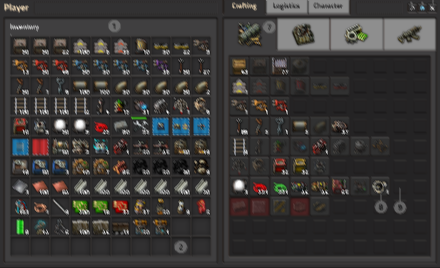
In the Logistics Tab, what does the +/- buttons do (number 9 in the pictures)?
I really like the new update, makes everything looks cleaner, simpler and easier to use!
I really like the new update, makes everything looks cleaner, simpler and easier to use!
Re: Friday Facts #289 - Character GUI
You guys are the best! Nice pic!!! This game when finished (well, when even more completed) will be an example on how to properly develope and programming a masterpiece of a game!
- brunzenstein
- Smart Inserter

- Posts: 1156
- Joined: Tue Mar 01, 2016 2:27 pm
- Contact:
Re: Friday Facts #289 - Character GUI
When can we play that GUI?
-
Quarnozian
- Inserter

- Posts: 32
- Joined: Tue May 01, 2018 7:24 pm
- Contact:
Re: Friday Facts #289 - Character GUI
under logistics: Items requesting 0 and max set to 0... instead of having nothing on them, how about having a tiny trash can icon?(8) Item is not requested and maximum amount is 0: When you don't want the item to be ever in your inventory, in this case, we just show no number, same as it is in the auto trash slots now.
Last edited by Quarnozian on Fri Apr 05, 2019 7:19 pm, edited 2 times in total.
-
TheoMarque
- Long Handed Inserter

- Posts: 94
- Joined: Tue Feb 27, 2018 6:06 pm
- Contact:
Re: Friday Facts #289 - Character GUI
Please, I beg you, do not make darker slots in gui (under items) I have form of astigmatism - light emiting pixels are blurry in my eyes, so i use light IDE, bright themes, because I must to use it. Too much contrast of background making game for me unplayable (white numbers on dark background). Please, add hide option to allow lower contrast or something. I love the game, but these GUI change will be my end of playing a factorio.
Yes, I play only light themed games, with light GUI's.
If it's possible - how can i redraw Gui theme? for lighter (as today)
Of course, upcoming style is better than actual but too dark.
EDIT: I see new GUI in that way (of course, not that extreeme, only the numbers are a problem)

Yes, I play only light themed games, with light GUI's.
If it's possible - how can i redraw Gui theme? for lighter (as today)
Of course, upcoming style is better than actual but too dark.
EDIT: I see new GUI in that way (of course, not that extreeme, only the numbers are a problem)

Last edited by TheoMarque on Fri Apr 05, 2019 7:27 pm, edited 1 time in total.
Re: Friday Facts #289 - Character GUI
Will we be able to see the trash slots when opening a chest, so i we can help the bots and dump things manually?
-
AsherMaximum
- Burner Inserter

- Posts: 17
- Joined: Tue Mar 08, 2016 12:44 am
- Contact:
Re: Friday Facts #289 - Character GUI
Quarnozian wrote: Fri Apr 05, 2019 7:16 pm under logistics: Items requesting 0 and max set to 0... instead of having nothing on them, how about having a tiny trash can icon?
Yeah, I think that's a good idea
Re: Friday Facts #289 - Character GUI
Very good.
The game is definitely getting close to its completion.
The game is definitely getting close to its completion.
Re: Friday Facts #289 - Character GUI
So, 2 years ago I posted a request to have the GUI highlight matching items (and dim everything else out) when searching:

Re: Friday Facts #289 - Character GUI
Finally there's a "Close" button in the top corner of window.  Now I only wish if all the windows could get it.
Re: Friday Facts #289 - Character GUI
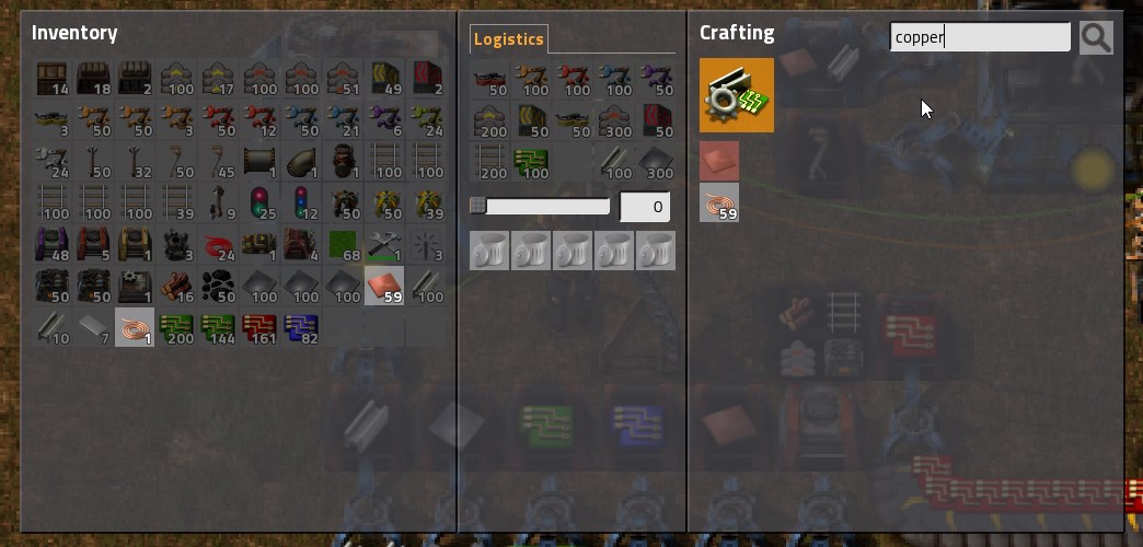
I'm concerned about how incredibly tiny that search button is on the mock up.
Re: Friday Facts #289 - Character GUI
I like the idea of merging requests and auto-trash, but the way the numbers are in this mockup is a bit confusing in my opinion. The fact that the way each is displayed depends on the state of the other seems more complicated than necessary. I think it would be better if they each had their own style, and used it all the time.
For example requests could be at the top of the box and maximums at the bottom. Or Requests could be green and maximums red. They could either both be visible all the time, or when one isn't set it could just be blank, rather than showing 0 or ∞.
The way you have it now, almost seems to assume that most items will have both, which is probably not true for most players.
Overall all though, I like this redesign. Putting an easily accessible color changer in there is a plus too. I've noticed new players frequently have to ask how to do that, since the /color command isn't very obvious.
Last edited by ManaUser on Sat Apr 06, 2019 5:43 am, edited 4 times in total.
Re: Friday Facts #289 - Character GUI
I also noticed that there is missing the description of mysterious "+/-" button marked as (9) in the Logistics tab image. 
-
Quarnozian
- Inserter

- Posts: 32
- Joined: Tue May 01, 2018 7:24 pm
- Contact:
Re: Friday Facts #289 - Character GUI
Double Background ColorThere could be one more color for when robots are on the way, but there isn't enough in the logistic network, as when you request something that is just being slowly produced, you will have always one robot coming with the freshly created product, but it would take a long time until there is produced enough. But we need to consider whether it is worth to do it or not.

Re: Friday Facts #289 - Character GUI
I thought that too, although you can always use ctrl+f. The button is probably there more as a hint that that you can do so than anything else. I would assume the tooltip also tells you the shortcut. If not it should.ixnorp wrote: Fri Apr 05, 2019 7:22 pm I'm concerned about how incredibly tiny that search button is on the mock up.
Re: Friday Facts #289 - Character GUI
Please add an Armor tab - that one is missing and will make moving personal items easier. Overall great changes especially infinite logistic slots.
I would still love to see the logistic groups/presets (eg. for building trains I need 1000 rails but not when I am expanding the base. Or add armors up to MK5 so we have huge inventory space.
I would still love to see the logistic groups/presets (eg. for building trains I need 1000 rails but not when I am expanding the base. Or add armors up to MK5 so we have huge inventory space.
Last edited by ethernal on Fri Apr 05, 2019 7:26 pm, edited 1 time in total.


