

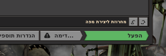
I have shortened the string of the Mod Settings button as a temporary solution, but this isn't a good permanent solution imho.
Then it's a "bug" in the intention. Perhap's I'm in a minority opinion here, but to me it doen't make any sense from a UI/UX standpoint to give the green button huge amounts of needless padding, while another button is squeezed to the point of unreadability.
Unfortunately, I don't have the luxury of inventing new words my language (that is, as long as I want to be understood). Am I supposed to start using abbreviations? Keep non-fitting strings untranslated?
This ellipsis is a general resource for texts. But it shouldn't happen in a button if we can avoid it. In this case, we can avoid it, so we are fixing it.Dev-iL wrote: Wed Feb 27, 2019 12:16 pm Instead of making the window wider (or the rightmost button smaller) to accommodate the string, an ellipsis was added.
I have shortened the string of the Mod Settings button as a temporary solution, but this isn't a good permanent solution imho.
