2. It's hard to tell does UI using any grid at all, but some random spacings and element sizes suggest that it doesn't. Because there is no vertical rhythm, defined by main line height, some sizes feel unbalanced in relation to each other or at least a bit off.
3. Can't get rid of the feeling that's something misaligned here

It would be safer to align h1 to the bottom of the decorative element.
4. A spacing between the decorative element and body text feels too small and inconsistent

5. Buttons clearly missing focus state. Though, I'm not sure about plans to support keyboard\gamepad navigation at all.
6. A subjective thing, but glows on hovers and some presses are too aggressive and make UI very cheap and plastic. I'd review them.
7. "Press" state actually should be called "active".
8. Unclear, why sliders inputs have almost identical to buttons appearance. They aren't buttons. They're inputs.
9. Slider's filled area somehow is thicker than a notch
 Mind games?
10. Good disabled buttons are always hard to design. This one feels close, but the label is too bright, which feels like it's another type of the button or filled input. Or like it's a disabled input.
11. Completely unclear why Confirm button has another disabled colors, as well as Cancel button. I tried to justify it for myself, but there is no motivation to make its appearance different.
12. An idea to align labels of Confirm and Back buttons doesn't worth it, and looks especially od and harder to read when placed next to each other, due to emptiness between them. Align labels at center, don't create unjustified system exceptions. Even when they will be placed at sides, centered labels will give better, consistent readability. Don't make the user search label on Confirm button.
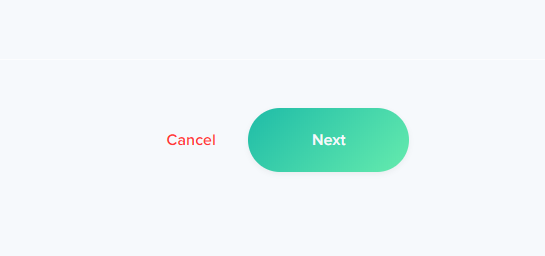
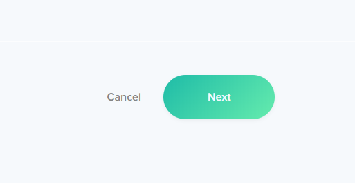
13. Cancel button appearance is very questionable. I'd recommend making its appearance more different than regular buttons since it is usually dangerous action. For instance, it could be a "ghost" button, which will attract much less attention
 .
.The complete visual difference makes it clear that it is very different action and forces the user to think before clicking it.
I'd even argue that it shouldn't be red

because red makes it stand out too much and instead of protecting the user from stupid actions encourages him to do it.
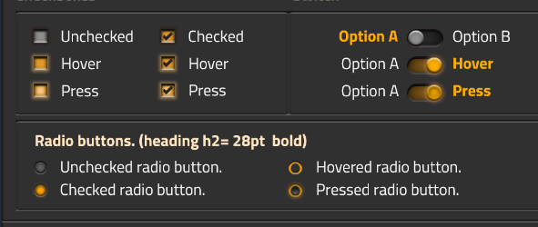
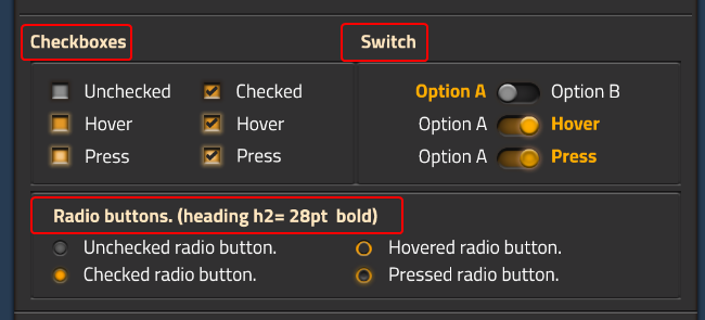
14. It is unclear why checkboxes have such different appearance than switch and radio buttons

For some reason, it's hovered above the background, like a button, on contrary to other similar element types, which are embedded.
15. Not important, but unclear why some headings have been putted outside of the frame, while other — inside

16. Loading bar "Loading sprites" label placed in illogical place. Loading bar moves from left to right, and constantly catching user attention, while the label is at the right side. When user will try to read the label, it will make user's eyes jump back and forth without any reason. Center it.
17. The idea between stickers, crafting button, and virtual slot design is very obscure. If they are important to be visually different, I must admit that even in that example they're almost too similar to tell the difference.
18. I'd question that often usage of hover on buttons and some interactive elements. Hovers should facilitate some specific interaction, but when we're talking about buttons and most form elements, interaction is clear enough without hover, while hover itself becomes just a constantly annoying noise. At best hover, if present, should be subtle, to help, but avoid noise and collisions with active elements. In most examples hover effect is just too "in the face".


