Friday Facts #238 - The GUI update (Part II)

Re: Friday Facts #238 - The GUI update (Part II)
It's maybe not the right place for a feature design, but since we're talking research gui anyway: please add a percentage indicating the progress, since it's very hard to guess how many science-packs you still need when dealing with late-game and mod research requiring hundreds, thousands and even millions of packs
Re: Friday Facts #238 - The GUI update (Part II)
Still no love for the colorblind (red-green, mostly)?
Wikipedia tells us that about 8% of the male population are affected. And by just taking a wild guess I'll assume that most of your playerbase is male. So by sticking to the green, yellow, orange, red colorscale (research dialog for example), you're more or less neglecting about 8% of your players.
Please, have a heart and think about it. There are other colors available, or even better, you could express the different states by also using icons/graphics at the same time.
Yes, exactly this:
Ilesere wrote:...
* The yellow and orange are a little similar and may be difficult for some users to distinguish, it might be worth considering blue
* It's definitely worth running the colours you use through various colour blind tests. Even with the classic red-green color blindness it is possible to select reds and greens that are distinguishable from each other by picking different tones.
...
Last edited by Yes-Man on Sat Apr 14, 2018 9:10 am, edited 2 times in total.

Re: Friday Facts #238 - The GUI update (Part II)
Why do you think, that there is almost twice the probability for the average Factorio player to be color blind than for the average male?Yes-Man wrote:Wikipedia tells us that about 8% of the male population are affected. And by just taking a wild guess I'll assume that most of your playerbase is male. So by sticking to the green, yellow, orange, red colorscale (research dialog for example), you're more or less neglecting about 15% of your players.
Re: Friday Facts #238 - The GUI update (Part II)
his math is as troubled as his vision 
Re: Friday Facts #238 - The GUI update (Part II)
It's early in the morning and the kids are troubling me .. have some pity. I corrected the mistake ^^dasiro wrote:his math is as troubled as his vision
-
POPISowyNumer
- Long Handed Inserter

- Posts: 75
- Joined: Thu May 05, 2016 1:31 pm
- Contact:
Re: Friday Facts #238 - The GUI update (Part II)
I'd really love to see what you plan for other parts of gui, because as many have pointed out already, both standardization and modding capability are simply a must have in Fugtorio.
Queue and Queued is also weak choice, since translations will screw this over tenfold, and colors also aren't distinguishable enough. Maybe blue for queued? Old Civs used it with no problems.
Also are you planning on incorporating some of best mods into game?
Again, there are other games that did it with success, and things like RSO or FARL would be superb additions to vanilla.
-
Deadlock989

- Smart Inserter

- Posts: 2529
- Joined: Fri Nov 06, 2015 7:41 pm
Re: Friday Facts #238 - The GUI update (Part II)
What an unpleasant tone. First post on the thread, and it reads like a threat. Nasty.Jürgen Erhard wrote:This looks just different for difference's sake. No, different or "new" isn't automatically better.
What is striking compared to current is it's much brighter, much more "screaming". I like the current more subdued look. Well, maybe it'll be moddable. Hint: it *better be*.

Re: Friday Facts #238 - The GUI update (Part II)
Personally, despite the location, I thought it was very obvious it was a button immediately. I agree with you on the change to "Add to queue" though. That would make it more clear.daniel34 wrote:Agreed, I actually had to read the FFF a second time (this time thoroughly and comparing the images) to find the Queue button since it's visually not very distinguishable from the other states. Also the text seems misleading, "Queue" could mean the queue itself (noun) or the action of queueing the item (verb), it might be better to rename it to "Add to queue" or similar to make the intention clearer.FFF #238 wrote:I personally had problem understanding, that the Queue button is actually a button on a first glance.
Which brings me to another point that you should consider when finalizing the design: Translations.
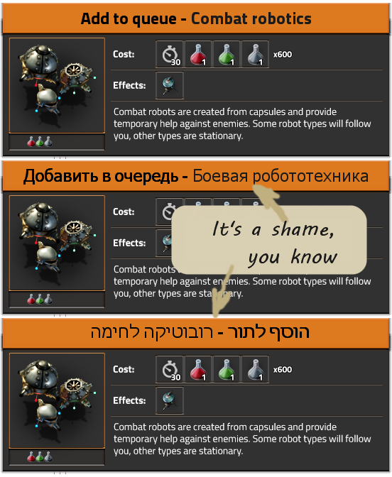
Queue is a short word in the English language and can be used as noun and verb. In German it's usually translated as "Warteschlange" (noun), and it cannot be directly used as a verb. "(add) to queue" is usually translated as "Zur Warteschlange hinzufügen", which I'm certain does not fit into the current space.

Re: Friday Facts #238 - The GUI update (Part II)
My suggestion where to put action buttons.

Re: Friday Facts #238 - The GUI update (Part II)
Good point.Let's take a step back. Who was complaining about the old GUI? No-one!
M2C:
- The blueprint dialog is fine. For me the preview part is NOT part of the dialog.
- I like the old gray and minimal look a lot. Keep colors to the items themselfes. Maybe just refine it a bit. Avoid lines for separation!
- Only use pictogram-buttons. Helps with translations. (you can add tooltips with variable dimensions to them)
- I do like colors here: Filling a gauge with orange, hover effect for buttons and buttons being switched on, headlines.
Re: Friday Facts #238 - The GUI update (Part II)
Perhaps this should go into another section, but since this FFF relates to the GUI, i will post my very humble suggestions here:
% done on research (and/or number of packs used/number of packs left) - it would be great to see science packs being consumed, and know how many left are needed
"resume" button on the bottom of the menu - since every menu deeper has "back" at the bottom, you have to click the bottom button a couple times to get back to the main options menu, then you have to hit the 2nd button on the main.
"resume" button renamed to "back" - i remember when i first started, i couldnt figure out how to unpause the game (resume didnt work)
graphics menu having options that clarify cpu/gpu load if turned on (like good/better/ultra in other games) (would be nice for interface as well, i dont know if most people know how much cpu time the minimap takes)
basic permissions profiles - "start walking" to move and "write to console" to chat wasnt intuitive for me to figure out or search for to toggle.
allow the research queue to work with infinite research, or allow a toggle to automatically keep researching something that is infinite
allow the research queue to queue up final products and automatically queue the prerequisites in order of science pack level (everything that just needs red / green first, then everything that needs red/green/blue, etc)
and going off on a small tangent a bit -
pushing Q without having the item in inventory instead defaults to a ghost of the entity
pushing Q on cliffs puts explosives in your hand
pushing Q on water puts a water pump in your hand, similar to ore patches. and perhaps pushing Q on water again with a water pump in your hand changes it to landfill, so you can cycle what you want to use.
thank you in advance for taking any suggestions of mine or others into consideration, thank you for the FFFs, and thank you for making a great game. GUI
-
SteelWolf300

- Inserter

- Posts: 30
- Joined: Sat Apr 09, 2016 11:21 am
- Contact:
Re: Friday Facts #238 - The GUI update (Part II)
Hey guys ! I found the new technology interface wonderful, it makes me feel exited !
I doesn't have much time to play Factorio thoses days, but I keep me updated every week with your FFFs. Continue like that !
I doesn't have much time to play Factorio thoses days, but I keep me updated every week with your FFFs. Continue like that !
-
Sander_Bouwhuis
- Filter Inserter

- Posts: 292
- Joined: Mon Dec 07, 2015 10:45 pm
- Contact:
Re: Friday Facts #238 - The GUI update (Part II)
First, I too am a BIG proponent of sticking to standards! The checkmark in the right-top of the window is awful.
Second, and actually more important:
Could you please Please PLEASE with sugar on top have an item crafting tree like the research tree? Especially if you try mods like Bob's mods the amount of steps required to create something is insane.
Take for example an electronic logic board and look at the insane amount of steps required.
We really Really REALLY need an ingame tree for this:
Example:
stuff
As you can see, it's almost impossible to figure out what is needed without being aided by a tree that displays the steps. And, no, alt-tabbing out of the game to go to the wiki is NOT fun.
Last edited by Sander_Bouwhuis on Sat Apr 14, 2018 3:43 pm, edited 3 times in total.
Re: Friday Facts #238 - The GUI update (Part II)
Yes! Please continue updating the GUI.
I like the new look: It looks much more professional for a game.
I get confused with the current UI: Depending on the window on screen I have/may press E, Q, or ESC to close it. I encourage you to simplify those use cases for the casual player, aka me
With regard to the „enqueue“ button: on the technology screen, there is basically one standard action to perform:
- If it is orange, dequeue it.
- If it is yellow, enque it.
- If it is red or green do nothing, or enqueue everything required to research this.
-
Deadlock989
- Smart Inserter
- Posts: 2529
- Joined: Fri Nov 06, 2015 7:41 pm
Re: Friday Facts #238 - The GUI update (Part II)
Is it the dev team's job to "fix" incredibly convoluted mods that have poor documentation? Personally I don't think so.Sander_Bouwhuis wrote:As you can see, it's almost impossible to figure out what is needed without being aided by a tree that displays the steps. And, no, alt-tabbing out of the game to go to the wiki is NOT fun.
But they've already said there will be more in game resources for looking up recipe chains and it's in the roadmap.
Re: Friday Facts #238 - The GUI update (Part II)
The "Queue" and "Queued" are very similar, when I first saw it I thought you had used the same image twice. You might want to consider changing "Queue" to "Add to Queue".
Also the colour change between 'available' and 'queued' is hard to distinguish.
Also the colour change between 'available' and 'queued' is hard to distinguish.
Re: Friday Facts #238 - The GUI update (Part II)
I see a lot of people complaining about "Queue" vs "Queued". imo, that isn't an issue. I like shorter/cleaner terminology instead of long ones like "Add to queue". It shouldn't really be an issue at all if the colour wasn't so similar.
Someone suggested using blue or something for queued research and I like that idea a lot. Yellow vs orange is not as obvious as it should be. Queued research is in the same category as "completed" research. You queue it and forget about it. So it should look different from non-researched/ non-queued things.
Alternatively, queued research could have a colour somewhat similar to the "researched" green.
That is my take on it anyway.
The first time you play the game is when you read the actually read things. Afterwords, you rely more on other visual cues. With that perspective, shorter wording is always better, less visual clutter. Overall, i like the direction the UI design is heading in.
Re: Friday Facts #238 - The GUI update (Part II)
I had to look for several minutes in the friday facts post about where this queue button that Kovarex mentioned, was hiding. I and I absolutely agree that it's not easy to spot.
But I absolutely love the queue feature and hope to play with it soon.
Things I hope for:
- That there be an easy way to queue a technology, like double- or right-clicking a technology on the left side of the tech window.
- An auto-queue feature for infinite research in lategame. Like having the research auto-queue mining productivity without requiring my attention.
- The ability to drag or otherwise put one research in between two others in the research queue. If I have 3 researches queued, but suddenly another research is more critical. I would like to be able to insert it in the queue, rather than removing the queue and then re-adding it.

Re: Friday Facts #238 - The GUI update (Part II)
I prefer minimalist UI's and don't care at all for bling. Functionality and features > blingy UI.
-
Killcreek2

- Long Handed Inserter
- Posts: 73
- Joined: Sat Dec 10, 2016 8:39 am
- Contact:
Re: Friday Facts #238 - The GUI update (Part II)
I applaud the choice to focus on gui function rather than gui pretty. Bravo!
A clean & uncluttered gui aids readability tremendously.
First impressions:
"Whoa, that's kinda garish." ~ the colours are a bit too vibrant. Tone them down a bit please, the green is the worst.
What confirm button?! ~ I had to read through three times to realise that the research topic "status bar" was also a button. +1 Klonan.
Please make buttons look like buttons, & status bars look like status bars!
The labels on them could do with changing too, as others have said ~ "queue", & "queued" are almost visually identical. "Add to queue" & "In queue" would be much better.
Colour scheme ~ yellow AND orange are bad choices to use at same time ~ unless they are right next to each other they appear the same ~ I did not realise there even was a 4th colour, until they were shown lined up in a row together.
Why red-green-yellow-ORANGE? You are already using red-green-yellow-BLUE elsewhere, both for circuit connection indicators and for rail signals. Sticking to your established colours would be much more consistent & thematic imo. Bit surprised Albert missed that one.
& please do standardise the gui elements / buttons wherever possible. If you cannot fit a confirm button in bottom right of each window, then put it in top right instead ~ at least that will be consistent with the blueprint gui.
"Functional simplicity, structural complexity." ~ Appleseed