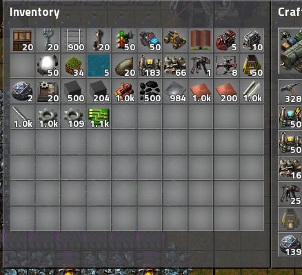
The slots in inventory look like there's a massive blur there, and there's something about it that messes with my eyes making it harder to focus on the screen. It doesn't take long before I start getting a headache due to this, and it's making it absolutely impossible to concentrate on the game at all. The flat colors were much MUCH better than the current hacky GUI look. If depth is to be added, you should just render a reasonably looking background for the tiles instead of slapping white/black radial gradient with a linear falloff on top of the colored tiles. Seriously, if you want to add some physical properties to the GUI look, it needs to make sense to the eyes, and the current look doesn't.
To add insult to injury, the fadeout on the recipes isn't distinguishable enough from non-faded ones to be a meaningful indicator, it's just serves to add unnecessary complication to the user experience. The background color (or tile borders or something) should be significantly different or the fadeout should be just entirely removed. Currently, the UI forces me to strain my eyes even more searching for the recipes I need. This makes early game quite a painful experience compared to how it used to be before.
Seriously, not only are the new UI graphics ugly, they're making it impossible for me to play the game at all. I used to play the game almost daily before 0.15, and I stopped for a few months ever since I tried the 0.15 in experimental branch. I was hoping I could play again once 0.15 was out, but that doesn't seem to be possible.
Edit: Oh man GUI reskin was in the roadmap for 0.16, I must be blind.