Friday Facts #195 - Poles re-design
- brunzenstein
- Smart Inserter

- Posts: 1156
- Joined: Tue Mar 01, 2016 2:27 pm
- Contact:
Re: Friday Facts #195 - Poles re-design
There should be at least on the big power poles a indicator light on top showing if connected.
-
PursuedMeatl325
- Burner Inserter

- Posts: 6
- Joined: Tue Oct 27, 2015 9:34 pm
- Contact:
Re: Friday Facts #195 - Poles re-design
I have a suggestion for the medium power poll.
(Sorry my drawing skills on paint is not good)
The main poll, going up to the head, is supposed to be the same as the medium power poll v2.a. The top is quite small so it does not cover anything in the background also the red and green wires run on the out side so it does not look like the old big power poll.
The main poll, going up to the head, is supposed to be the same as the medium power poll v2.a. The top is quite small so it does not cover anything in the background also the red and green wires run on the out side so it does not look like the old big power poll.
Re: Friday Facts #195 - Poles re-design
What I like about v1 poles is a sense of progression - small pole is one wooden pole, medium pole is one (and a half) metal pole, big pole is a metal structure.
From this, the body of big pole v2a looks too narrow, the bodies of medium poles v2 too wide, and the body of small pole v2 too bright (i.e. could be more easily confused with metal).
The heads were similar - the bigger the pole, the bulkier the head was.
Thus, the big pole's head v2a is too thin, medium pole's heads v2 are almost as thin as small pole's head (adding some more material would help IMHO).
Re: Friday Facts #195 - Poles re-design
Medium poles: Both v2 variations look awful. V2a looks like a poor man's big pole V1. V2b looks like a candle holder.
-
gallomimia
- Long Handed Inserter

- Posts: 55
- Joined: Fri Apr 22, 2016 6:20 pm
- Contact:
Re: Friday Facts #195 - Poles re-design
Me like.
Big pole 2a is better than 2b.
Medium pole 2b is very nice!
And the small pole is fine too.
In addition, I really like the warning signs. More signs, to indicate lots more things. Adding signs for power outages and warnings is great too!
Big pole 2a is better than 2b.
Medium pole 2b is very nice!
And the small pole is fine too.
In addition, I really like the warning signs. More signs, to indicate lots more things. Adding signs for power outages and warnings is great too!
- Darthlawsuit
- Fast Inserter

- Posts: 247
- Joined: Thu Feb 28, 2013 7:32 pm
- Contact:
Re: Friday Facts #195 - Poles re-design
Poland approves these poles


-
Medium_Pole
- Manual Inserter

- Posts: 2
- Joined: Fri Jun 23, 2017 7:23 pm
- Contact:
Re: Friday Facts #195 - Poles re-design
I agree with other users that the new medium pole needs to be diagonal, but I also like the top part of the medium v2b. I think a compromise between the two would look very nice.
(Quick sketch up done in blender):
(Quick sketch up done in blender):
Re: Friday Facts #195 - Poles re-design
For the poles i think the big one are ugly, The medium ones i like the V2.a and for the smal one is nice V.2.a and this have wood in the main recipe and the visual os Small V.2.b is ugly and we don´t see any wood! 
I like the original huge poles game are nice they only need to be polished... Keep the hard work
I like the original huge poles game are nice they only need to be polished... Keep the hard work
Re: Friday Facts #195 - Poles re-design
How does it look if you just render the current poles at 2x resolution?
-
R3markable
- Burner Inserter

- Posts: 7
- Joined: Mon Jun 27, 2016 9:34 pm
- Contact:
Re: Friday Facts #195 - Poles re-design
I like the large power pole v2.b, although it seems a bit too neat and clean still. I feel like it could use more bits bolted on randomly, and perhaps some coloured insulators. I also like the idea of having a small indicator light on it that shows if it is connected to power.
I honestly think the medium pole v1 looks best. I still remember what I thought when I first saw it: "diagonal, odd.. but it looks really cool". I think it captures the punky look of Factorio, with the diagonal strut, and the copper top part. It does not need to make sense, it just needs to look punky, messy and awesome. It is a style that is done so well in the HD textures of the locomotives, the train stops and the pumps. As mentioned, the v1 medium power pole is unique. I'm sure it would be possible to update the design whilst keeping some of this unique look.
The small pole v2.a looks good. I would have missed the copper colour, if this pole had not have some colour in the wooden part anyway.
Thank you, devs, for all the effort you are putting into making this amazing game.
-
RobertTerwilliger
- Fast Inserter

- Posts: 196
- Joined: Wed Nov 18, 2015 10:12 am
- Contact:
Re: Friday Facts #195 - Poles re-design
Speaking about "iconic" medium poles, why noone memorizes old trains??? They were much more iconic, and unlike poles they also were noticeable! Where they are now? On the graveyard of history, and we okay with that.
Just make these poles anything you like, after 15mins of game you will not notice the graphics, and after 5h you will barely see them even if you want to - only big poles are noticeable enough, because of being the only thing situated along our railroads.
Just make these poles anything you like, after 15mins of game you will not notice the graphics, and after 5h you will barely see them even if you want to - only big poles are noticeable enough, because of being the only thing situated along our railroads.
Holding formation further and further,
Millions of lamb stay in embrace of Judas.
They just need some bread and faith in themselves,
BUT THE TSAR IS GIVEN TO THEM IN EXCHANGE!
Original: 5diez - "Ищу, теряя" (rus, 2013)
Millions of lamb stay in embrace of Judas.
They just need some bread and faith in themselves,
BUT THE TSAR IS GIVEN TO THEM IN EXCHANGE!
Original: 5diez - "Ищу, теряя" (rus, 2013)
Re: Friday Facts #195 - Poles re-design
Because old trains looked far worse than current ones?RobertTerwilliger wrote:Speaking about "iconic" medium poles, why noone memorizes old trains???
-
golfmiketango
- Filter Inserter

- Posts: 549
- Joined: Fri Jan 29, 2016 2:48 am
- Contact:
Re: Friday Facts #195 - Poles re-design
I agree the new trains are far prettier, but I sometimes feel the drab utilitarian aesthetic of the old trains was more thematically appropriate to the rest of the game than the anthropomorphic / "fun" aesthetic of the new ones. To be fair, I get the impression most other factorians aren't bothered by this at all.Zeblote wrote:Because old trains looked far worse than current ones?RobertTerwilliger wrote:Speaking about "iconic" medium poles, why noone memorizes old trains???
Mostly the newer HD graphics look really great to me. Especially red desert terrain, holy cow, it's beautiful! Speaking of which, I'd say any of the poles presented in the FFF would be a welcome upgrade from the ones we have now, except the wooden one, which I feel needs more texture work if it's going to look appropriately weathered (not to mention, wooden).
Re: Friday Facts #195 - Poles re-design
Glex, thanks a lot for reading and graciously responding to the feedback. Much appreciated - keep it up!glex wrote:Thanks a lot for your opinions.
-
super_aardvark
- Inserter

- Posts: 38
- Joined: Thu Sep 15, 2016 6:27 am
- Contact:
Re: Friday Facts #195 - Poles re-design
All I want from an electric pole redesign is to have the small pole centered in its tile. It drives me crazy the way it can move from one side of its tile to the other just based on its connections to other poles. This makes it really hard to place, because it looks like I've moved it from one tile to another when in fact it's just rotating.
Re: Friday Facts #195 - Poles re-design
Yes! Thats extremely annoying.super_aardvark wrote:All I want from an electric pole redesign is to have the small pole centered in its tile. It drives me crazy the way it can move from one side of its tile to the other just based on its connections to other poles. This makes it really hard to place, because it looks like I've moved it from one tile to another when in fact it's just rotating.
-
vanatteveldt
- Filter Inserter

- Posts: 954
- Joined: Wed Nov 25, 2015 11:44 am
- Contact:
Re: Friday Facts #195 - Poles re-design
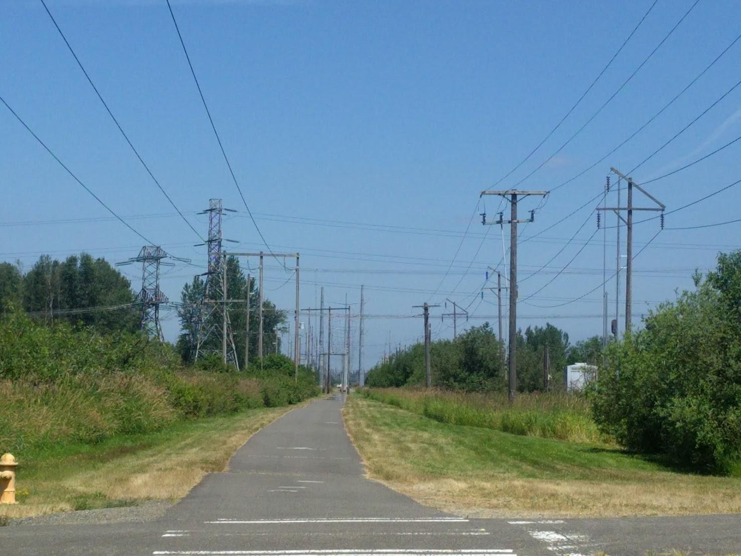
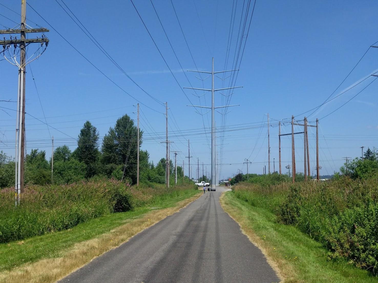
Not sure if you guys are still working on this, but on a recent bike ride in the Seatlle area I found a very nice concentration of different pole designs:
inspiration
Re: Friday Facts #195 - Poles re-design
I have one generall question concerning the pylons. Currently they have three identical connection points for each wire type (electricity, red, green) which gives it symmtrical look. Why not have one big ass insulator for the high voltage wire and small clamps for the logic wires? They don't need insulators since they carry only small voltages. Also I would like to see a design with the wires at different levels. Put the electricity wire on top and the others below. Of course not directly under each other so they don't overlap.
Re: Friday Facts #195 - Poles re-design
i think we have a winnerPursuedMeatl325 wrote:I have a suggestion for the medium power poll. (Sorry my drawing skills on paint is not good)
The main poll, going up to the head, is supposed to be the same as the medium power poll v2.a. The top is quite small so it does not cover anything in the background also the red and green wires run on the out side so it does not look like the old big power poll.
- Attachments
-
- WINNER.png (2.95 MiB) Viewed 13378 times
Re: Friday Facts #195 - Poles re-design
Was just wondering whatever happened to the hi-res version of the poles?

