Vertical gui.left

User avatar
Mooncat
Smart Inserter
Smart Inserter
Posts: 1196
Joined: Wed May 18, 2016 4:55 pm
Contact:

Vertical gui.left

Post by Mooncat »

Now the gui.left is back to normal. (Thanks devs :D )
I think it is time to discuss whether do we really need it to be horizontal.
gui.top and gui.left are very close to each other, and I think it would be better if gui.left is vertical.


Use case:
A common use case will be having 2 or more mods that use gui.left for displaying their custom GUI. For example, Nexela's Circuit Alerter uses it to display messages from the alerter:
Image
It is reasonable for it to use gui.left instead of gui.top: the list of messages can be long. If it is on gui.top, it will make its height too large, affecting all GUI using gui.left.

Now, my Creative Mode. My mod uses gui.left for displaying custom entity GUI. For example, when you select a Creative Chest, a sprite button of the chest is shown. When you click the button, a detailed GUI for configuring the chest will be displayed.
The GUI is created only when a chest is selected and I don't want the top bar (gui.top) to be changed too frequently, that's why I use gui.left.
If it is shown while Circuit Alerter is there, it will look like this:
Image
A little bit unrealistic, but possible situation will be: binbinhfr's SpaceBook is also opened.
Image
The entire screen is blocked.

What I expected is that gui.left should be completely different from gui.top. It can take advantage of the unused space below it:
Image

There may be some mods that rely on current gui.left's direction to align their GUIs horizontally. But even if gui.left has vertical direction, we can still align GUI horizontally by adding a container (flow or table, while table is more reliable) outside the GUI. It is how I make the GUI for Creative Chest.
Image
This way, I can
1) change the spacing between the sprite button and the frame
2) easily adjust the spacing between my GUI and anything above it by just changing the top-padding of the container, and
3) avoid change between the sprite button and frame if there is any changes on gui.left, e.g. style

However, without vertical gui.left, it is impossible align GUI from multiple mods vertically. So, I hope the direction of gui.left is changed, or more reliably, it becomes a table with colspan = 1
(because even with vertical direction, checkboxes still align horizontally when added inside flow that is big enough)
Nexela
Smart Inserter
Smart Inserter
Posts: 1828
Joined: Wed May 25, 2016 11:09 am
Contact:

Re: Vertical gui.left

Post by Nexela »

Thanks Devs for moving gui.left where it goes!!!

This proposed change to gui.left direction=vertical would be much appreciated
User avatar
aubergine18
Smart Inserter
Smart Inserter
Posts: 1264
Joined: Fri Jul 22, 2016 8:51 pm
Contact:

Re: Vertical gui.left

Post by aubergine18 »

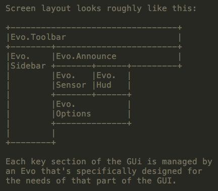
In the rework of Narc's EvoGUI that I'm been tinkering with the past few weeks, I'm adding a set of APIs for toolbars, sidebars and HUDs.

The vague layout is like this:
Image
And here's an old photoshop mockup I did several weeks ago:
Image
It's not actually using player.gui.left at all. Instead, there's a few frames/flows in gui.top that allow me to maintain consistent toolbar along the top, and then a vertical button bar (those buttons show/hide sidebars) and placeholder for active sidebar, then HUDs that appear under the top toolbar but can get pushed sideways (or auto-hidden based on priorities) when a sidebar is displayed.

The main reason I'm not using gui.left is that I can't seem to eradicate vertical space between gui.top and gui.left, although it might just be some stupid mistake on my part. If that spacing can be reliably removed, I would prefer to use gui.left for the sidebar and HUDs, and in which case a vertical layout would certainly be preferable.
Last edited by aubergine18 on Sat Sep 10, 2016 12:50 am, edited 2 times in total.
Better forum search for modders: Enclose your search term in quotes, eg. "font_color" or "custom-input" - it prevents the forum search from splitting on hypens and underscores, resulting in much more accurate results.
User avatar
Mooncat
Smart Inserter
Smart Inserter
Posts: 1196
Joined: Wed May 18, 2016 4:55 pm
Contact:

Re: Vertical gui.left

Post by Mooncat »

aubergine18 wrote:In the rework of Narc's EvoGUI that I'm been tinkering with the past few weeks, I'm adding a set of APIs for toolbars, sidebars and HUDs.
You caught my attention! If it goes well, not only my original problem is solved, but it can also solve the problem when too many GUIs are opened... imagine when I open the detailed GUI of Creative Chest, Spacebook is automatically closed. Or in reverse, when SpaceBook is opened, Creative Chest is closed.
I will use your API for sure when it is ready (and stable enough). :P

But I just hope that your toolbar and icons will look more Factorio-like. And you may also need to consider that some mods will still use gui.top. So, your system will not look as expected if there is any GUI added to gui.top before yours.
And don't use the whole top bar. Leave some space for the others.
The main reason I'm not using gui.left is that I can't seem to eradicate vertical space between gui.top and gui.left, although it might just be some stupid mistake on my part. If that spacing can be reliably removed, I would prefer to use gui.left for the sidebar and HUDs, and in which case a vertical layout would certainly be preferable.
I think there is no spacing between gui.top and gui.left by default. The space is caused by GUI that is higher than the others. For example,
Image
You can see that there is no space between the timer and the Spacebook, because the timer (and the EMC button) has the largest height on gui.top.
In short, gui.top's height is dynamic. It depends on its child elements.

However, if I were you, and also if we can control the order for adding GUI into gui.top, I would also use gui.top so we can have full control for the whole set of GUI.
User avatar
aubergine18
Smart Inserter
Smart Inserter
Posts: 1264
Joined: Fri Jul 22, 2016 8:51 pm
Contact:

Re: Vertical gui.left

Post by aubergine18 »

But I just hope that your toolbar and icons will look more Factorio-like. And you may also need to consider that some mods will still use gui.top. So, your system will not look as expected if there is any GUI added to gui.top before yours. And don't use the whole top bar. Leave some space for the others.
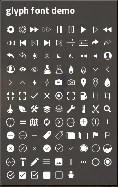
I'm still working on the icons - ultimately, mod devs can put whatever icon they want in there (they can add buttons, sprite-buttons, labels, etc). But it's my hope that the Glyph font mod (which in next release has over 250 icons) will evolve quickly and substantially enough to handle most icon requirements; by having them as fonts the color can easily be changed (eg. to pulsate an icon color to grab player attention, or dim colors at nighttime, or have "color themes" for the UI).
Image
Also, the top-bar doesn't extend all the way over (it does in my mockup image above, but in reality I don't think that's even possible to do as we don't know width of gui.top etc). Here's roughly what the top bar looks like at the moment with just a few basic elements on it (I'm still fiddling with stylesheets and a bunch of other stuff):

Image
Better forum search for modders: Enclose your search term in quotes, eg. "font_color" or "custom-input" - it prevents the forum search from splitting on hypens and underscores, resulting in much more accurate results.
User avatar
Mooncat
Smart Inserter
Smart Inserter
Posts: 1196
Joined: Wed May 18, 2016 4:55 pm
Contact:

Re: Vertical gui.left

Post by Mooncat »

aubergine18 wrote:eg. to pulsate an icon color to grab player attention
Now I am thinking about a tweening system. :P

Code: Select all

remote.call("tween", "tween_color",
{
    target = element,
    from = {r = 1, g = 1, b = 1, a = 1},
    to = {r = 1, g = 1, b = 1, a = 0.5},
    style = "ease-in-out",
    method = "pingpong"
})
So evil.

If your UI system will include the Glyph mod, I think it will be more acceptable. I personally don't like to depend on the Glyph mod which has so many characters while I only need one or two of them.
aubergine18 wrote:Also, the top-bar doesn't extend all the way over (it does in my mockup image above, but in reality I don't think that's even possible to do as we don't know width of gui.top etc).
Ah, yes, you remind me that I need to make request for supporting percentage width and height, just like CSS.

Code: Select all

width = "100%"
Also maybe we need "margin" for buttons. Oops, a little bit off-topic. I will make a request for that later. :P
User avatar
aubergine18
Smart Inserter
Smart Inserter
Posts: 1264
Joined: Fri Jul 22, 2016 8:51 pm
Contact:

Re: Vertical gui.left

Post by aubergine18 »

A tweening system is planned, derived from this: https://github.com/kikito/tween.lua (commonly used in Löve2D games, so designed for fast operation)

I'm hoping that pulsating things will be as simple as putting `pulse = true` in an update object (or `pulse = numPulsesRequired` to pulse set number of times).

Eventually the glyph font could be included - despite the number of icons, the .ttf file itself is remarkably small due to them being vectors. However, I'm not sure how the game handles fonts - does it turn them in to sprites in the atlas, or does it use some API to render direct from the .ttf file?

I'm not sure how much use percentage width/height will be, although I had hoped that flow settings such as "resize_row_to_width` and `resize_to_row_height` would behave better than they do (in many cases, they seem to have little to no effect - maybe specific width/height settings are mandatory for them to work?)

Having consistent margin and padding settings on all UI elements would be very desirable. In current api I'm never quite sure whether padding is internal or external to the element (I'm still testing to find out where it does and doesn't work as expected).

Another thing being included (which I'll be releasing as separate mod first for people to inker with) is a style, image and sound API that makes defining gui style prototypes much, much nicer, for example:

Code: Select all

  style.frame 'evo_toolbar_frame' {
    padding    = {0,6,3,0};
    autoSize   = true;
    background = image.composite 'toolbar.png' { corner = 3 };
    title      = { padding = 0, color = colors.default };
    flow       = { padding = 0, spacing = 0, autoSize = true };
  }
Anyway, I think I'm veering wildly off topic now so I'll stop typing
Better forum search for modders: Enclose your search term in quotes, eg. "font_color" or "custom-input" - it prevents the forum search from splitting on hypens and underscores, resulting in much more accurate results.
User avatar
Mooncat
Smart Inserter
Smart Inserter
Posts: 1196
Joined: Wed May 18, 2016 4:55 pm
Contact:

Re: Vertical gui.left

Post by Mooncat »

aubergine18 wrote:I'm not sure how much use percentage width/height will be, although I had hoped that flow settings such as "resize_row_to_width` and `resize_to_row_height` would behave better than they do (in many cases, they seem to have little to no effect - maybe specific width/height settings are mandatory for them to work?)
Originally, I wanted to request read-only properties for getting LuaGuiElement's width/height, but because the elements can change size dynamically, I quickly realise such properties don't have much use.
Instead, having percentage margin will be much useful, and will be the only solution for having true center- or right-aligned elements.

In current api I'm never quite sure whether padding is internal or external to the element (I'm still testing to find out where it does and doesn't work as expected).
I think padding always means internal spacing?
Without margin, it is really painful to align buttons.

Anyway, I think I'm veering wildly off topic now so I'll stop typing
I think it is fine. We are talking about GUI anyway. And my request has already been made by the title, it is simple as that. :lol:
Last edited by Mooncat on Mon Sep 12, 2016 2:59 pm, edited 1 time in total.
User avatar
aubergine18
Smart Inserter
Smart Inserter
Posts: 1264
Joined: Fri Jul 22, 2016 8:51 pm
Contact:

Re: Vertical gui.left

Post by aubergine18 »

Instead, having percentage margin will be much useful, and will be the only solution for having true centre- or right-aligned elements.
What if `flow`, `frame` and `scroll_pane` elements had an `align` property (specifically on the flow component of those elements)?

This way you could center- or right-align all buttons (or whatever) in a flow simply by setting the align property.

My style mod is now in the mod portal if anyone wants to tinker with it and give feedback: https://mods.factorio.com/mods/aubergine18/Style
Better forum search for modders: Enclose your search term in quotes, eg. "font_color" or "custom-input" - it prevents the forum search from splitting on hypens and underscores, resulting in much more accurate results.
User avatar
Mooncat
Smart Inserter
Smart Inserter
Posts: 1196
Joined: Wed May 18, 2016 4:55 pm
Contact:

Re: Vertical gui.left

Post by Mooncat »

aubergine18 wrote:What if `flow`, `frame` and `scroll_pane` elements had an `align` property (specifically on the flow component of those elements)?

This way you could center- or right-align all buttons (or whatever) in a flow simply by setting the align property.

But align works internally. It means you have to know the size of parent element first, then set the size of such button container as large as possible without affecting the parent, in order to make align works.
It is not convenient, and leads to "if I already know the parent's size, why I don't just add a space (flow) on the left of the button to align it?"

I have already tried using container + right-align when making the Creative Chest UI:
CreativeProviderChest_UI.png
CreativeProviderChest_UI.png (416.96 KiB) Viewed 6853 times
but it didn't even work. The worst part was, it affected the center-alignment of the group number (became top-aligned). :(
It made me feel that it is much more reliable to add flow on the left.
User avatar
aubergine18
Smart Inserter
Smart Inserter
Posts: 1264
Joined: Fri Jul 22, 2016 8:51 pm
Contact:

Re: Vertical gui.left

Post by aubergine18 »

What does the `resize_row_to_width` property do on a flow_style prototype? I thought setting that to true would make the flow resize to the width of its parent element?
Better forum search for modders: Enclose your search term in quotes, eg. "font_color" or "custom-input" - it prevents the forum search from splitting on hypens and underscores, resulting in much more accurate results.
User avatar
Mooncat
Smart Inserter
Smart Inserter
Posts: 1196
Joined: Wed May 18, 2016 4:55 pm
Contact:

Re: Vertical gui.left

Post by Mooncat »

aubergine18 wrote:What does the `resize_row_to_width` property do on a flow_style prototype? I thought setting that to true would make the flow resize to the width of its parent element?
Based on my observations, it has nothing to do with the parent. It works completely internally. It means "equalize the width of each child base on the widest one".
Here is a flow with 3 frames inside it.
Without resize
With resize
Only its widest child can affect the overall width. Applying resize_row_to_width together with width (I used minimal_width for quick testing) to the flow won't make its children use its full width:
Resize and minimal_width 2000
User avatar
aubergine18
Smart Inserter
Smart Inserter
Posts: 1264
Joined: Fri Jul 22, 2016 8:51 pm
Contact:

Re: Vertical gui.left

Post by aubergine18 »

Oh wow, urm, ok. That's not quite how I expected it to work.

For my next dumb question, .... "resize_to_row_height"?
Better forum search for modders: Enclose your search term in quotes, eg. "font_color" or "custom-input" - it prevents the forum search from splitting on hypens and underscores, resulting in much more accurate results.
User avatar
Mooncat
Smart Inserter
Smart Inserter
Posts: 1196
Joined: Wed May 18, 2016 4:55 pm
Contact:

Re: Vertical gui.left

Post by Mooncat »

While resize_row_to_width affects width, resize_to_row_height affects height.
If I can rename it, I would choose "resize_column_to_height". :P
User avatar
aubergine18
Smart Inserter
Smart Inserter
Posts: 1264
Joined: Fri Jul 22, 2016 8:51 pm
Contact:

Re: Vertical gui.left

Post by aubergine18 »

I assume resize_to_row_height suffers same problem as resize_row_to_width, in that if element has set height or min/max height, it will cease working (which is why I've never been able to get it to work - was pulling my hair out with the toolbar API I've been working on because I wanted all buttons same height)? I assume also that it will only work when the direction is set to horizontal?

Some more dumb questions for bits of the styles that I've never managed to get working...

1. What are the border props on monolith images? They don't seem to have any effect.

2. What is the max_on_row prop on flows? I was hoping it would set the 'word wrap' of a row in a flow, so if there are > max_on_row items, a new row would be started automatically or something? Also, what happens when direction is vertical?

3. What is cell_pading on table elements? All the cell elements have their own padding, the spaces between rows/cols are set by spacing, and the table itself has internal padding. Cell padding seems somewhat redundant?
Better forum search for modders: Enclose your search term in quotes, eg. "font_color" or "custom-input" - it prevents the forum search from splitting on hypens and underscores, resulting in much more accurate results.
User avatar
Mooncat
Smart Inserter
Smart Inserter
Posts: 1196
Joined: Wed May 18, 2016 4:55 pm
Contact:

Re: Vertical gui.left

Post by Mooncat »

Yes, it works when direction is set to horizontal. About the set height problem, it works if you set the height of one of its children rather than the parent itself. I think setting its size explicitly violates the word "resize".

I don't know about the properties in your followup questions (I don't even know there are max_on_row and cell_padding), so I can't answer them.

About cell_padding, I guess it is different than setting the cell element's padding... Think of a table of buttons, changing the button's padding will affect the button's contents but not the button size. With increased cell_padding, I would expect it actually makes all buttons smaller, as if they are all contained by flows with padding. Don't take my word for it though, as I haven't tried it. :P
kovarex
Factorio Staff
Factorio Staff
Posts: 8207
Joined: Wed Feb 06, 2013 12:00 am
Contact:

Re: Vertical gui.left

Post by kovarex »

I always thought that the direction is vertical. I will change it to vertical, but in 0.15, so I don't break stuff in the "almost stable" version.
User avatar
Mooncat
Smart Inserter
Smart Inserter
Posts: 1196
Joined: Wed May 18, 2016 4:55 pm
Contact:

Re: Vertical gui.left

Post by Mooncat »

kovarex wrote:I always thought that the direction is vertical. I will change it to vertical, but in 0.15, so I don't break stuff in the "almost stable" version.
That's great. Thanks a lot! :D
Post Reply

Return to “Implemented mod requests”