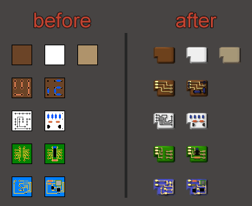
As always, my graphics patch is updated. Have a nice day all
Bob's Mod Graphics Update Discussion
Moderator: bobingabout
Re: Bob's Mod Graphics Update Discussion
Graphics Update: MCI - Alloy Processing
Source Icons Link
As always, my graphics patch is updated. Have a nice day all
As always, my graphics patch is updated. Have a nice day all
Re: Bob's Mod Graphics Update Discussion
Inventory Size Tech Icon
Link to source icons
Re: Bob's Mod Graphics Update Discussion
Boy am I late to this one. Sorry, my internet's been nonexistent for the last week or so (barring jumping on reddit with my phone every now and then.
I have a couple of criticisms; most of the icons are a bit too glossy. The P tier it makes sense, but a lot of the others above it (T1-3, most of S) just feels too damn shiny, which clashes with the slightly grungy aesthetic of vanilla Factorio.
The other is to do with grouping metals by tier. I know I'm going completely counter to what you and Bob have been discussing for the last couple of pages, but you've got a good example with the steel tiers. Everything is based off that initial steel beam graphic, which is good design, actually. Cobalt-steel is kinda the odd one out so it's appropriate that its graphic is unique. The alien alloys also exist on their own branch (making the double-sided segmented look even more appropriate), so no complaints there. However making ST2 and then ST3 identical feels counterintuitive to me, when they should be 'Ti' and 'W' paths.
All of which is a very long-winded (sorry) way of saying that I think you should swap the shapes of the nitinol and tungsten graphics for a more consistent form-to-function relationship.
For the rest of it, arguably I would toss that whole arrangement and change it again to mostly group by function. Iron and iron derivatives or substitutes using one type of icon, copper using another, with a few special icons for the materials that are used in the production of other intermediates. The way gunmetal already looks like a more pronounced version of brass is a good example. Silicon shouldn't really be here IMO, since it's only ever melted to make glass or refined into boules for use in electronics (cut up as wafers or powdered). Hopefully this will make sense:
'Final' materials used to make things
Steel -> Cobalt-steel
Steel -> Titanium -> Nitinol
Steel -> Tungsten -> Copper-tungsten
Steel -> Orange/Blue Alloy
Iron -> Bronze -> Invar/Aluminium
Copper -> Brass -> Gunmetal
'Intermediates' for alloying or making other intermediate materials
Tin/Lead -> Solder plate
Tin -> Zinc -> Nickel
Cobalt, Lithium
'Prrrrrecious'
Silver, Gold, Electrum
Re: Bob's Mod Graphics Update Discussion
Thanks for the criticism. I'll try to respond to your points the best I can.
 .
.

The logic behind my hierarchy is much simpler: The decisive gameplay factor is production. How difficult is it to produce, around when in the game would you access that tier comparatively. Hence, I can make straight one dimensional coarse-to-fine gradient of graphics with chroma/lighting effects for distinguishing certain metals. From basic to badass. Every played a traditional RPG? Kinda like the leveled item tiers in those. This personally clicked for me and is pretty intuative for newcomers to the mod I would imagine (like for example the dull and beaten up T1 metals are all metals which can be found from ores in the starting area thrown in a basic furnace; the badass scifi looking ST3 metals are the most complex end game alloys).
Anyways, there is a high probability I failed to understand some of your points properly . If you want to propose an alternate hierarchy, pls be clear, tell me exactly which of my graphics prototypes used in which metals (since im averse to making any new ones) and what colors/sheen/lighting those metals would have. Use my earlier posts as a reference of how to present it.
At this point since Bob greenlighted these graphics, I'll continue on with them. Thanks for taking the time to post though .
.
I think the shinyness/constrast of the icons are exacerbated by the preview image (eg the shadow used and the forums background, etc). Nonetheless, that is a fair point. I do mess with various graphical tweaks as I implement the icons in updates of my graphics patch mod to make sure everything meshes properly. The post earlier was just a preliminary demonstration to get Bob's greenlight.Degraine wrote:most of the icons are a bit too glossy. The P tier it makes sense, but a lot of the others above it (T1-3, most of S) just feels too damn shiny, which clashes with the slightly grungy aesthetic of vanilla Factorio.
Hmm, from what I understand, you are trying to say is that the generic orginization of metals be by the usage of the metal rather than its production tier. I didnt really understand the part about nitinol and tungsten... are you recomending creating a custom icon shape just for tungsten seperate from titanium? If that is the case, I would have to remind you that I do not have the intention of creating any more metal shapes outside of my prototypes listed earlier. Personally I could justify it by saying that having more visual variation past simple chroma adds noise to the entire graphical line which would not be justified by the little improvement it may or may not provide on the user-friendliness/visual-identification sector. The other part of is that Im lazy and messing with colors and saturation is by far easier than adding entirely new graphics tiersDegraine wrote:The other is to do with grouping metals by tier. I know I'm going completely counter to what you and Bob have been discussing for the last couple of pages, but you've got a good example with the steel tiers. Everything is based off that initial steel beam graphic, which is good design, actually. Cobalt-steel is kinda the odd one out so it's appropriate that its graphic is unique. The alien alloys also exist on their own branch (making the double-sided segmented look even more appropriate), so no complaints there. However making ST2 and then ST3 identical feels counterintuitive to me, when they should be 'Ti' and 'W' paths.
All of which is a very long-winded (sorry) way of saying that I think you should swap the shapes of the nitinol and tungsten graphics for a more consistent form-to-function relationship.
Alright, I see where your coming from. Ideally every item would have its own icon and be colored realistically while following visual patterns dependant on some gameplay factor to ease comprehension and visual flow. The gameplay factor which you propose (iiuc) is that of functional tiers: organized by metals and items similar in gameplay function: "final building materials" and "intermedate materials" for example. The sub categories completely elude me howeverDegraine wrote:For the rest of it, arguably I would toss that whole arrangement and change it again to mostly group by function. Iron and iron derivatives or substitutes using one type of icon, copper using another, with a few special icons for the materials that are used in the production of other intermediates. The way gunmetal already looks like a more pronounced version of brass is a good example. Silicon shouldn't really be here IMO, since it's only ever melted to make glass or refined into boules for use in electronics (cut up as wafers or powdered). Hopefully this will make sense:
'Final' materials used to make things
Steel -> Cobalt-steel
Steel -> Titanium -> Nitinol
Steel -> Tungsten -> Copper-tungsten
Steel -> Orange/Blue Alloy
Iron -> Bronze -> Invar/Aluminium
Copper -> Brass -> Gunmetal
'Intermediates' for alloying or making other intermediate materials
Tin/Lead -> Solder plate
Tin -> Zinc -> Nickel
Cobalt, Lithium
'Prrrrrecious'
Silver, Gold, Electrum
The logic behind my hierarchy is much simpler: The decisive gameplay factor is production. How difficult is it to produce, around when in the game would you access that tier comparatively. Hence, I can make straight one dimensional coarse-to-fine gradient of graphics with chroma/lighting effects for distinguishing certain metals. From basic to badass. Every played a traditional RPG? Kinda like the leveled item tiers in those. This personally clicked for me and is pretty intuative for newcomers to the mod I would imagine (like for example the dull and beaten up T1 metals are all metals which can be found from ores in the starting area thrown in a basic furnace; the badass scifi looking ST3 metals are the most complex end game alloys).
Anyways, there is a high probability I failed to understand some of your points properly
At this point since Bob greenlighted these graphics, I'll continue on with them. Thanks for taking the time to post though
-
WoodyDaOcas
- Long Handed Inserter

- Posts: 67
- Joined: Wed Apr 02, 2014 9:06 am
- Contact:
Re: Bob's Mod Graphics Update Discussion
same here, just realized you're not supplying bob with new icons, which will be eventually released..  and I DLed your mod just now. Gonna test it out (not so far in the game, yet) but so far so good
Thank you
Thank you
Re: Bob's Mod Graphics Update Discussion
Hey everyone,
So i really enjoy bob's mod, but i could not stand the bob's electronic component textures, so I made my own before seeing this thread, here i wanted to make them look just like the vanilla component but keeping the bob's spirit, so if anyone want them i have packaged them and here is the link :
For 0.13 or later : link or mod portal link (place in mod folder)
For older versions : link and read readme.txt
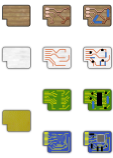
Here is what they look like :

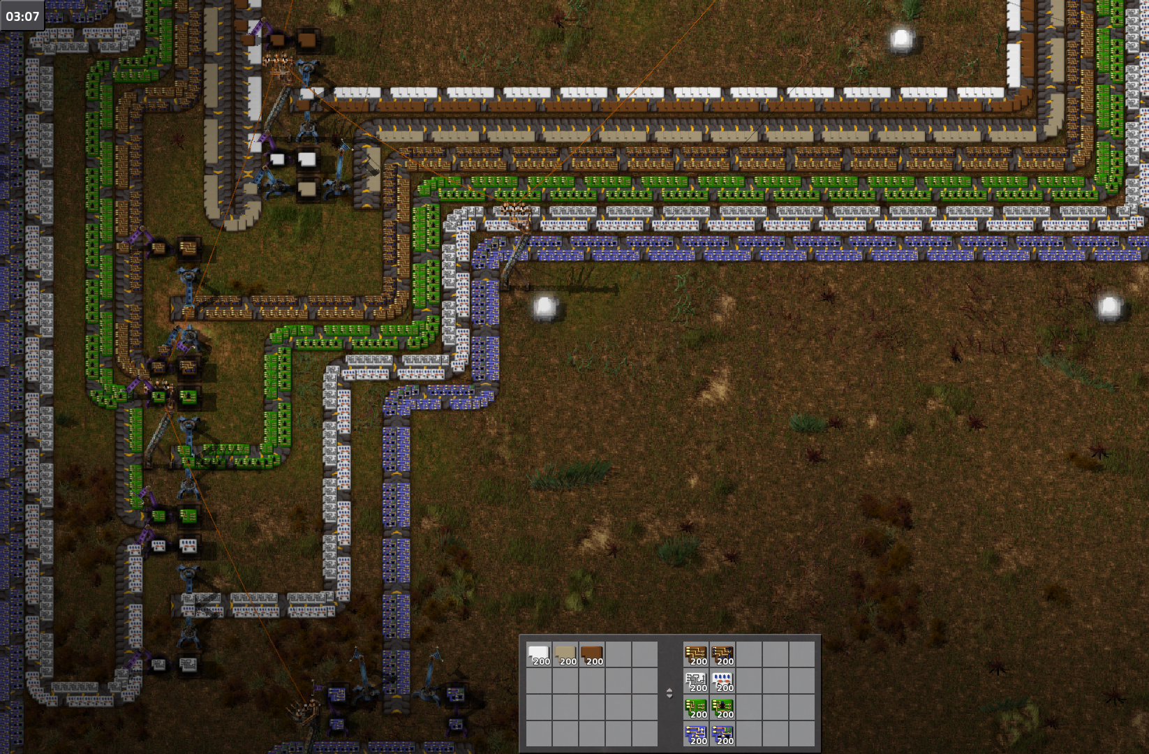
and a screenshot of what they look like ingame :
Hope you enjoy them, and i give full permission to anyone to use these everywhere they want.
So i really enjoy bob's mod, but i could not stand the bob's electronic component textures, so I made my own before seeing this thread, here i wanted to make them look just like the vanilla component but keeping the bob's spirit, so if anyone want them i have packaged them and here is the link :
For 0.13 or later : link or mod portal link (place in mod folder)
For older versions : link and read readme.txt
Here is what they look like :

and a screenshot of what they look like ingame :
Ingame Screenshot
Hope you enjoy them, and i give full permission to anyone to use these everywhere they want.
Last edited by Necriptos on Sat Jul 30, 2016 10:57 pm, edited 2 times in total.
Re: Bob's Mod Graphics Update Discussion
Well looks nice but after each update of Bob's mod it would vanish.
Maybe you could build a quick mod as upgrade of Bob's mod with them?
Greetings steinio
Maybe you could build a quick mod as upgrade of Bob's mod with them?
Greetings steinio
Re: Bob's Mod Graphics Update Discussion
steinio wrote:Well looks nice but after each update of Bob's mod it would vanish.
Maybe you could build a quick mod as upgrade of Bob's mod with them?
Greetings steinio
@Necriptos, if you want me to add your icon to my graphics mod with an option to choose between your icons and mine, let me know. That way people wont have to modify bob mods core files to get the graphics they want.
Alternitavely, you can create your own lightwieght patch mod. Use mine as reference for code if you need it. Make sure to put dependencies on electronics and my gfx-patch.
Re: Bob's Mod Graphics Update Discussion
Thanks for the offer, i will take a look at your code and make a small mod for my icons, someone else asked me to do it but i had no idea where to look at so thanks a lot  , never made a factorio mod before.
EDIT : okay i have made it into a mod, i updated my post with the mod link for 0.13 thanks for the suggestion again.
EDIT : okay i have made it into a mod, i updated my post with the mod link for 0.13 thanks for the suggestion again.
Re: Bob's Mod Graphics Update Discussion
They do look nice - would be cool if bob would simply add them to electronics mod.
Re: Bob's Mod Graphics Update Discussion
This looks awesome.Necriptos wrote:Hey everyone,Necriptos
Is your's in the mod portal as well? Couldn't find it. I now there's a link in the op, but ingame downloads are much more convenient.Aonova wrote:steinio wrote:Well looks nice but after each update of Bob's mod it would vanish.
Maybe you could build a quick mod as upgrade of Bob's mod with them?
Greetings steinio
@Necriptos, if you want me to add your icon to my graphics mod with an option to choose between your icons and mine, let me know. That way people wont have to modify bob mods core files to get the graphics they want.
Alternitavely, you can create your own lightwieght patch mod. Use mine as reference for code if you need it. Make sure to put dependencies on electronics and my gfx-patch.
Re: Bob's Mod Graphics Update Discussion
Its not. Originally I thought of my graphics patch as an extension of this thread rather than any real mod. I suppose if people want me to put it on mod portal I could...ytsejam wrote: Is your's in the mod portal as well? Couldn't find it. I now there's a link in the op, but ingame downloads are much more convenient.
Re: Bob's Mod Graphics Update Discussion
It's really interesting how many contributors want to help with graphics for Bob's.Aonova wrote:Graphics Update: MCI - Electrolysisnot sure about these tech icons though...Source Icons Link
So Bob has more time for great code
Well maybe put only a roman number in the picture (I / II)?
The small square with red and green don't explain the level to me.
Greetings steinio
- bobingabout
- Smart Inserter

- Posts: 7352
- Joined: Fri May 09, 2014 1:01 pm
- Contact:
Re: Bob's Mod Graphics Update Discussion
Electrolysis was one I was having trouble with re-doing myself.
Also, for the plates... I know you were working on them, but as far as I can tell, you never actually posted the finished icons anywhere.
Also, for the plates... I know you were working on them, but as far as I can tell, you never actually posted the finished icons anywhere.
Re: Bob's Mod Graphics Update Discussion
Sorry I've been taking quite the break from gaming overall, trying to take my freshmen college semester seriously haha 
I promise I'll get around to all the icons systematically. Probably starting next week, after I get used to my schedules and stuff (and get a laptop which can actually play games and work)
I promise I'll get around to all the icons systematically. Probably starting next week, after I get used to my schedules and stuff (and get a laptop which can actually play games and work)
Re: Bob's Mod Graphics Update Discussion
I keep the updated versions of icons on my drive folder in the link and on my graphics patch mod. The little icons on the top left indicate the defining recipe for each technology. I used the same idea for the alloy techs. IIRC Electrolysis 1 is defined by the "water -> H + O" recipe while Electrolysis 2 is defined by the "salt + water -> hydroxide + chlorine + oxygen" recipe, hence the respective colors in the icons. I find it more intuitive than just roman numerals, especially for a new player to the mod, which I consider myself as.steinio wrote: Well maybe put only a roman number in the picture (I / II)?
The small square with red and green don't explain the level to me.
Well there is always the base icon available for bob to use if he wants
Thanks for the criticism.
Re: Bob's Mod Graphics Update Discussion
Hello
I have to say that those metal graphics look so damn awesome! Can't wait to hopefully use them!
I did some alternate graphics for electronics a while ago:
 . They're nothing special, but I thought I might as well submit them.
EDIT: I should probably post the link to the full set, though.
EDIT2: Full svg's
I have to say that those metal graphics look so damn awesome! Can't wait to hopefully use them!
I did some alternate graphics for electronics a while ago:
Electronics Graphics
Use them if you want, or don't EDIT: I should probably post the link to the full set, though.
EDIT2: Full svg's
Re: Bob's Mod Graphics Update Discussion
You guys (Aonova, Chreutz) should do what necriptos did, and upload your textures to the mod portal. This is good stuff.
Re: Bob's Mod Graphics Update Discussion
Could you pleae publish an update for 0.14?Chreutz wrote:Hello
I have to say that those metal graphics look so damn awesome! Can't wait to hopefully use them!
I did some alternate graphics for electronics a while ago:
Electronics GraphicsUse them if you want, or don't. They're nothing special, but I thought I might as well submit them.
EDIT: I should probably post the link to the full set, though.
EDIT2: Full svg's
You must probably only edit the info.json.
Greetings steinio


