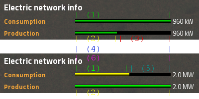
The top picture is when you have excess power production and the bottom for when you don't have enough power production.
The way it is meant to be read is:
- (1): Current power consumption
(2): Current power production
(3): Unused power production
(4): Total possible power production (part of top picture)
(5): Shortage of power production
(6): Maximum power consumption (part of bottom picture)
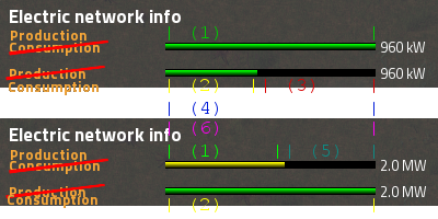
Now the labels are:
- (1): Total power production
(2): Total power consumption
(3): Power available for consumption
(4): Total consumable power
(5): Extra power to produce
(6): Total power to produce
A bigger issue is (in my opinion) that either labelling doesn't tell you the information you need or want. Power consumed/produced a fun stat, but in the end you can't do anything with it. A more useful stat would be (3) and (5), the power you have excess and the power you are short respectively. This information gives you the ability to guesstimate whether or not you can build that extra mining outpost or how many steam engines you need to place. And because (1) and (2) are the same there is no need to display it twice. So I'd suggest to combine both bars into one in one of the following ways:
1.
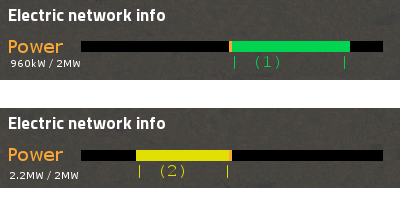
- (1): Excess power production
(2): Excess power consumption
2.
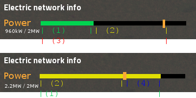
- (1): Power required
(2): Excess available power
(3): Total available power production
(4): Extra needed power
So let me know how you feel about this.