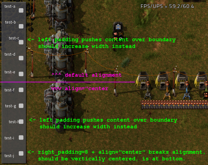
- On labels, padding does not increase the element size. Instead it forces the content off the label (most apparent with left_padding).
- Right padding breaks vertical alignment (align="center") if it is too large (which is its own issue, but also would not occur if the above was not an issue too).
Consider the following styles:
Code: Select all
data.raw["gui-style"].default["test-base"] = {
	type = "label_style",
	parent = "label_style",
	minimal_height = 50,
	left_padding = 0,
	top_padding = 0,
	right_padding = 0,
	bottom_padding = 0
}

-- default alignment:
data.raw["gui-style"].default["test-a"] = {type = "label_style", parent = "test-base"}
data.raw["gui-style"].default["test-b"] = {type = "label_style", parent = "test-base", left_padding = 2}
data.raw["gui-style"].default["test-c"] = {type = "label_style", parent = "test-base", left_padding = 8}
data.raw["gui-style"].default["test-d"] = {type = "label_style", parent = "test-base", right_padding = 2}
data.raw["gui-style"].default["test-e"] = {type = "label_style", parent = "test-base", right_padding = 8}
-- same as above but align="center":
data.raw["gui-style"].default["test-f"] = {type = "label_style", parent = "test-base", align = "center"}
data.raw["gui-style"].default["test-g"] = {type = "label_style", parent = "test-base", align = "center", left_padding = 2}
data.raw["gui-style"].default["test-h"] = {type = "label_style", parent = "test-base", align = "center", left_padding = 8}
data.raw["gui-style"].default["test-i"] = {type = "label_style", parent = "test-base", align = "center", right_padding = 2}
data.raw["gui-style"].default["test-j"] = {type = "label_style", parent = "test-base", align = "center", right_padding = 8}Code: Select all
local test_parent = player.gui.top.add({type="frame",style="inner_frame_in_outer_frame_style",name="test-frame"})
test_parent = test_parent.add({type="table",style="table_style",colspan=2})
test_parent.add({type="label",style="test-a",caption="test-a"})
test_parent.add({type="checkbox",style="checkbox_style",state=false})
test_parent.add({type="label",style="test-b",caption="test-b"})
test_parent.add({type="checkbox",style="checkbox_style",state=false})
test_parent.add({type="label",style="test-c",caption="test-c"})
test_parent.add({type="checkbox",style="checkbox_style",state=false})
test_parent.add({type="label",style="test-d",caption="test-d"})
test_parent.add({type="checkbox",style="checkbox_style",state=false})
test_parent.add({type="label",style="test-e",caption="test-e"})
test_parent.add({type="checkbox",style="checkbox_style",state=false})
test_parent.add({type="label",style="test-f",caption="test-f"})
test_parent.add({type="checkbox",style="checkbox_style",state=false})
test_parent.add({type="label",style="test-g",caption="test-g"})
test_parent.add({type="checkbox",style="checkbox_style",state=false})
test_parent.add({type="label",style="test-h",caption="test-h"})
test_parent.add({type="checkbox",style="checkbox_style",state=false})
test_parent.add({type="label",style="test-i",caption="test-i"})
test_parent.add({type="checkbox",style="checkbox_style",state=false})
test_parent.add({type="label",style="test-j",caption="test-j"})
test_parent.add({type="checkbox",style="checkbox_style",state=false})
Note that right_padding=2 (test-i) remains vertically centered, but right_padding=8 (test-j) forces the text to the bottom. The inconsistency of vertical alignment all around is visible very clearly in the labels only (no checkboxes) in a horizontal flow:

In that example, test-a thru e should all be in the exact same vertical position (default alignment on all, same styles, only horizontal padding differs), and f thru j should also be the same (all centered, same styles, only horizontal padding differs). But d/e/i/j are all over the place (these are the ones with right_padding>0).
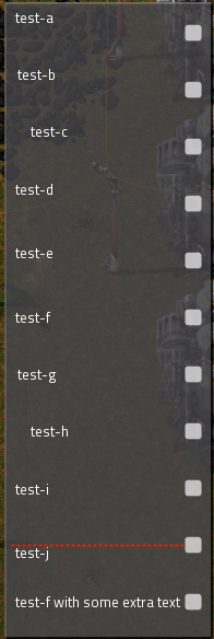
Testing a theory that right padding only breaks alignment if it would increase the label width to larger than the parent, I added a long label to the first example above to increase the first column width. The problem still occurs -- therefore I do not know what the threshold is for right_padding before it breaks (additionally I have not looked closely enough to say whether or not the subtler differences illustrated in the horizontal flow image above are present in vertical layouts, I can only say for certain that j is not correct):

There, test-j (right_padding=8, align="center") is still forced to bottom. I've drawn a red dotted line through the vertical center line.
The expected results of all this, for the two issues originally listed, are:
- Horizontal padding should increase the element width to compensate (this is arguably "not a bug", but the current behavior is not particularly useful nor consistent with behaviors present in other styling systems).
- More importantly, horizontal padding should not affect vertical alignment. In particular, in the horizontal flow image above, the first 5 labels should be at the same vertical position (top), as well as the last 5 (centered).
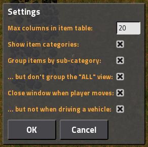
This is only somewhat of an edge case, as there are fairly mundane situations in which this can be recreated. For example, I discovered it when styling the following dialog (problem not shown):

When I attempted to add a bit of right_padding to the orange labels to add some space between the labels and the text fields / checkboxes, it forced the labels to the bottoms of their table cells.

