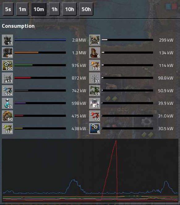
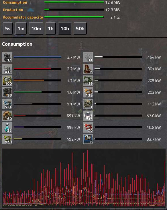
And in this example, a small child scribbled red lines all over my graph:
For each of the time ranges:
- 5s: The graph is not useful for the earlier half of each game day while accumulators charge.
- 1m: The graph is not useful for the majority of each game day.
- 10m, 1h, 10h, 50h: The graph is never useful.
That alone would solve the above issue, but in addition I think that when an item is hidden, it also shouldn't take up one of the slots for lines that get a color; and if this is done for the production graphs as well, it'd mean you have a way to see a bit more detail in the graphs about the lower production items if you want.
I think implementing this as described above would be a relatively straightforward new feature that would make both the power and production graphs tremendously more useful and usable.
PS As a somewhat related bonus, it'd be really handy if the current scale value (i.e. max energy consumption in the selected time range) was displayed on the graph; maybe a number in the top left corner of each graph.