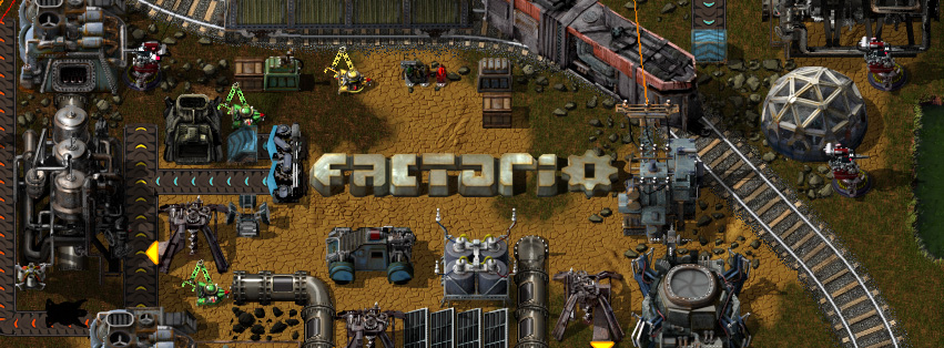
Friday Facts #12
Friday Facts #12
Better late than newer. Here comes the 12th FFF: http://www.factorio.com/blog/post/fff-12
As mentioned in the post Albert prepared two proposals for the new Factorio logo. You can also help us to decide which one to use by indicating your preference in the polls and / or giving some opinions in the discussion.
EDIT: I updated the poll with two extra choices for old logo and none of the presented logos. However this caused the reset of the polls when there were around 17 votes. So feel free to cast your vote again if this concerns you. No manipulation intended:D
- Attachments
-
- logo proposals (Logo#1 on the left, Logo#2 on the right)
- logo-comparison.png (78.89 KiB) Viewed 27389 times
Re: Friday Facts #12
In my opinion none of them because they're worse than the current one.
I think it would be better to draw logo and game title with normal font.
Something like that:
http://www.monstercommute.com/wp-conten ... ctory1.gif
http://www.thelogofactory.com/wp-conten ... y-logo.jpg
http://wearetrue.com/art/code-factory-logo.gif
http://www.firestormcs.com/wp-content/u ... go_001.jpg - this one is without logo but nice
http://www.muno.pl/static/obrazy/logokl ... ogo220.jpg
You can put in logo two the most recognizable elements like belt and inserter
Re: Friday Facts #12
Ditto about the logo. The gear in original logo looks much nicer than in new ones.
Re: Friday Facts #12
Great improvement! It's about time! The actual logo is the ugliest thing in Factorio.
I would say the #1 is nicer, I like the rounded corners and the inside lines, they generate movement and make it more dynamic, more like Factorio is.
I find the second one too stiff.
I would say the #1 is nicer, I like the rounded corners and the inside lines, they generate movement and make it more dynamic, more like Factorio is.
I find the second one too stiff.
Re: Friday Facts #12
I prefer the old one. The old one is not good, but in my opinion both new logos look "painfully amateurish", not the old one. :/
Of the new logos: I would like the texture of the first, with the form of the letters of the second. The color... Well, the copper red of the old logo is pretty nice. ^^
What i dislike about the old logo: The font. I like the color and particularly the gear. The gear looks really nice and is a pretty good icon for factorio.
(I completely disagree with pil. ^^)
Re: Friday Facts #12
The concept of the logo, apart of being heavy-industrial, is also a game object. It takes the perspective and lighting of any object in Factorio.


Re: Friday Facts #12
What was the reason to put the wheel at the end?
Cool suggestion: Eatable MOUSE-pointers.
Have you used the Advanced Search today?
Need help, question? FAQ - Wiki - Forum help
I still like small signatures...
Have you used the Advanced Search today?
Need help, question? FAQ - Wiki - Forum help
I still like small signatures...
Re: Friday Facts #12
The gear at the center of the word like in the first logo version, splits the word in two parts, FACT-O-RIO, in order to get balance and a compact shape is much better to put the gear at the end, like a separated object but integrated.ssilk wrote:What was the reason to put the wheel at the end?
Also a logo has to be simplier, concerning shapes. By the simplification of shapes you can reduce it much better. Remember that the logo is not only printed at the loading screen full of colours, it must work also very tinny and with 1 colour only.
That's the reason why the new logo has a simplier wheel, not only that, the new wheel has 8 directions, like the player movement. ; )
Re: Friday Facts #12
Yeah, the logo fits inside the game world. But has the logo to fit inside the game world? All in all i just miss the design of the old gear. I really liked it. (But I understand your arguments, glex.) ^^
Oh, and maybe the question is stupid, but who is glex? ^^
Oh, and maybe the question is stupid, but who is glex? ^^
Re: Friday Facts #12
1-the old gear reduced is just a blurry circle, this can be considered a graphic bug. Factorio likes to kill bugs.Nova wrote:Yeah, the logo fits inside the game world. But has the logo to fit inside the game world? All in all i just miss the design of the old gear. I really liked it. (But I understand your arguments, glex.) ^^
Oh, and maybe the question is stupid, but who is glex? ^^
2-the integration of the logo in to the game world is concept, not only that, it takes you to the view of the player immediately, like when playing, so consider it like a door to the Factorio world.
3- the question is not stupid, I'm very shy specially in the forums. glex is the guy who made the logo, and all the graphics in the game.
: )
-
LoSboccacc
- Filter Inserter

- Posts: 253
- Joined: Wed Feb 20, 2013 9:35 pm
- Contact:
Re: Friday Facts #12
ah! you should try skiing uphill!too tired yesterday to do anything, after all the day going downhills
anyway. is the gear O rotating during load? i.e. automation logo.
Re: Friday Facts #12
I really like the first new logo when placed in the game world as in Glex's post, however I have to agree with others that on their own they aren't a huge improvement over the original. I'm not a graphics artist, so I can't give you any useful suggestions on improving it. Perhaps looking at logos for similar games might help, such as:
Railroad Tycoon
Transport Tycoon
Tansport Giant
Industry Giant 2
Railroad Tycoon
Transport Tycoon
Tansport Giant
Industry Giant 2
Re: Friday Facts #12
This is an idea that I share with you, I was talking with Tomas about it, and let's see, maybe. ; )LoSboccacc wrote:anyway. is the gear O rotating during load? i.e. automation logo.
but the priority now is graphics for gameplay, and new machines.
Re: Friday Facts #12
Good to see the right logo winning, definitely looks more approachable.
Re: Friday Facts #12
I like the shape and texture of the first, but lighting of the second. The first looks too dark and dull, maybe give it some glint as the second one and it's perfect.
Re: Friday Facts #12
Light intensity is something provisional yet, I'll keep in mind your comment for the final art.FrozenOne wrote:I like the shape and texture of the first, but lighting of the second. The first looks too dark and dull, maybe give it some glint as the second one and it's perfect.
Anyway those aspects can vary for future versions or different applications. We're thinking in changing materials and other stuff depending on the context for the logo, like future releases centered in oil industry or whatever it comes. The idea is to express the main subject through the logo. The meaning of the threat is about general shape.
- aussiegaylord
- Inserter

- Posts: 33
- Joined: Thu Dec 12, 2013 7:10 am
- Contact:
Re: Friday Facts #12
i like the fact that the first one has a really cool way that the actual letters don't actually join together, their is those little gaps. i think if you added those to the font of the second one you would really have something special because the letters in the first one just don't look right being that small, especially that F.( just the way that you have shaved about an extra 50% of that edge just doesn't go right with the theme of factorio i think) the lighting in the second one also definitely looks better. hope this helps 
Re: Friday Facts #12
And that's something I do not like.aussiegaylord wrote:i like the fact that the first one has a really cool way that the actual letters don't actually join together, their is those little gaps.
- aussiegaylord
- Inserter

- Posts: 33
- Joined: Thu Dec 12, 2013 7:10 am
- Contact:
Re: Friday Facts #12
feel free to explain why, i personally like it because it adds the fact that everything is not always straight cut, if you want or need to you can make things overly complected that make you computer crash ( done it 5 times alreadyNova wrote: And that's something I do not like.
Re: Friday Facts #12
Thanks for the comments guys. Interesting to see such a variety of opinions. Based on your comments I have also added two options to the polls: the old logo and none of them.
EDIT: Bummer. PHPBB obviously decided to reset the polls after adding the new 2 options Probably to keep them fair.
EDIT: Bummer. PHPBB obviously decided to reset the polls after adding the new 2 options


