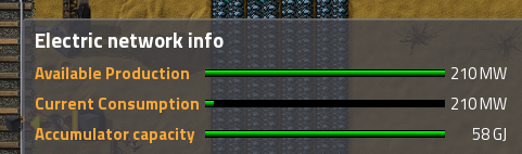
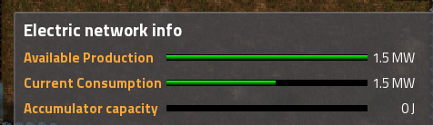
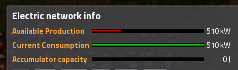
It's a very easy fix actually. Just rename "Consumption" to "Available Production" and "Production" to "Current Consumption". Might also want to show actual values (in W) for both, but that's not super important. Then you get the following:ssilk wrote:I dunno why this little detail is discussed here. It's off-topic.
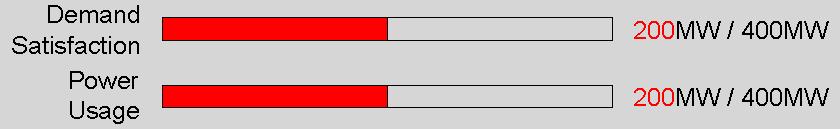
This counter-intuitive screens have been criticized many times. The devs found a provisional solution (making the consumption yellow, when missing power). This helped a lot. For more than 95% of all players this works. But it's clear since 2 years or so, that the info-screen must be rewritten. This is a big complex, because there is the need to implement own displays for modders. And other infoscreens.
Sometimes, anywhere, "when they have time".
And of course this will be fixed then. But until then I want them to invest their time into "more important" things.
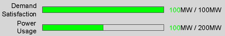
- Available production bar is shorter than consumption if you don't have enough energy.
- Consumption bar is shorter than available production if you do have enough energy.
- The two bars intuitively show the ratio between available production and current consumption, especially to new players.
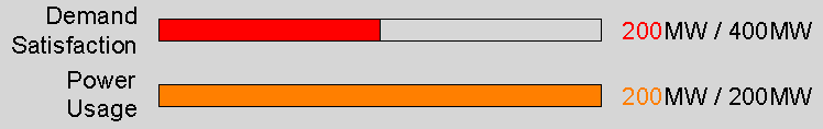
Additionally, make the available production bar red if missing power.
Now you have a gui that makes sense, without the need to write any new code