Friday Facts #238 - The GUI update (Part II)

Regular reports on Factorio development.
User avatar
Mike5000
Fast Inserter
Fast Inserter
Posts: 133
Joined: Sun Mar 25, 2018 3:57 am
Contact:

Re: Friday Facts #238 - The GUI update (Part II)

Post by Mike5000 »

QGamer wrote:
Philip017 wrote:I think the ideal maximum is around 8 or so
The ideal maximum, with appropriate handling of infinite technologies, is the number of available technologies.

That said, there is no compulsion for any player to queue more than 8 technologies, or to use more than 8 assemblers, or 8 chunks, or to use bots or to not use bots, if that is how that player wants to play today.

Break.

The proposed UI seems to lack a distinction between manually queued technologies and their automatically queued necessary precursors. The difference is relevant when canceling or re-prioritizing queued technologies.
Jap2.0
Smart Inserter
Smart Inserter
Posts: 2378
Joined: Tue Jun 20, 2017 12:02 am
Contact:

Re: Friday Facts #238 - The GUI update (Part II)

Post by Jap2.0 »

A few things:

On queued and available techs:

The colors are somewhat close. I believe that it might help if one of them (I'm leaning slightly towards queued) became blue.
I also think that it's strange that all of them mention their current state, except available technologies, which give an action - it confused me at first as well. It would help if you changed "queued" to "available" (although you would have to add a queue button elsewhere), or change "queue" to "add to queue", although that would break the pattern of 1-word labels.

Also agreed that colors are a bit vibrant and saturated at the moment - Factorio generally has a darker style.

Standardization would also be nice.
jaworeq wrote:So if we're getting a queue, will I be able to click on some further tech and have all the required techs queue up?
For example, if I wanted to queue up accumulators, batteries could be automatically added to the queue.
This is a must.
Mike5000 wrote:Why not fix map generation instead?
It's significantly improved in 0.17.
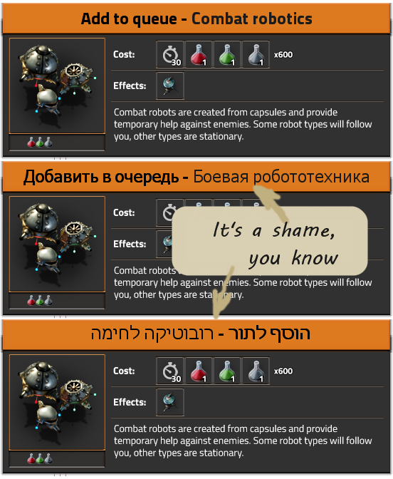
tetryon wrote:Please fix the typo of 'Unavaliable' -> 'Unavailable'. (see combat robotics screenshot)

Literally unplayable!
:O
Koub wrote:How about a research interface that works like Galactic Civilization II's ?
Spoiler
No - it's far too busy, wouldn't work well with many-tiered/infinite techs, doesn't include a place for queued researches (that I see), etc.
dasiro wrote:It's maybe not the right place for a feature design, but since we're talking research gui anyway: please add a percentage indicating the progress, since it's very hard to guess how many science-packs you still need when dealing with late-game and mod research requiring hundreds, thousands and even millions of packs
This. Because percentages are cool. (and for math.)
There are 10 types of people: those who get this joke and those who don't.
User avatar
QGamer
Fast Inserter
Fast Inserter
Posts: 215
Joined: Fri Apr 14, 2017 9:27 pm
Contact:

Re: Friday Facts #238 - The GUI update (Part II)

Post by QGamer »

Mike5000 wrote:The proposed UI seems to lack a distinction between manually queued technologies and their automatically queued necessary precursors. The difference is relevant when canceling or re-prioritizing queued technologies.
That is very true. I agree with this. It would solve the issue I raised earlier about what happens if canceling a technology that is very deep in the tree.
I suppose this would be handled similarly to the handling of the manual crafting queue--it knows the difference between product items and intermediate items needed to craft the final products.
"Adam fell that men might be; and men are, that they might have joy."
BlackHat
Long Handed Inserter
Posts: 74
Joined: Sat Apr 09, 2016 9:45 am
Contact:

Re: Friday Facts #238 - The GUI update (Part II)

Post by BlackHat »

Deadlock989 wrote:This already looks like a big improvement. Readability/contrast is very important for a lot of us, we don't all have 20/20 vision (hint hint: mod portal font and colours, especially discussion text).
Oh my god yes... As it stands now, due to the color scheme I can not read the discussion text in the Mod Portal. The Light grey on Lighter grey for the age of the comment, and the black text on dark grey background for the comments are so hard on my eyes. It really put a strain on my eyes trying to read it. I am a fast reader, but because of the color contrast, I have to focus on each word trying to see it so I can read it. A post which I might spend 5-10 seconds reading in standard color schemes I need to spend 30 seconds trying to pick out the words to read it.

Fortunately I recently found a trick to make it better. I found a wall of text comment about a problem in one mod that I was interested in reading. So I selected the text so I could copy and paste it to Notepad so I could read it. Lo and behold the "selected text" turned into a White Text on Blue Background showing which text had been selected. MUCH more readable.

Now If I want to read a discussion topic, when it opens I just press "Ctrl-A" (Select All) and the whole page is highlighted and readable.

But seriously, the color scheme if the Mod Portal needs to be changed, or other select-able color schemes should be implemented. Just like they are here in the forum (I like the Factorio color scheme of the forum, but long ago switched to prosilver for readability. (Mainly due to the black un-bolded text on dray grey background was to difficult to read).
Last edited by BlackHat on Sun Apr 15, 2018 7:53 pm, edited 1 time in total.
User avatar
Dev-iL
Filter Inserter
Filter Inserter
Posts: 304
Joined: Thu Jul 02, 2015 2:48 pm
Contact:

Re: Friday Facts #238 - The GUI update (Part II)

Post by Dev-iL »

Let me start by saying that I like the preview! ... and now that this is out my system, let's proceed to the actual discussion:
hitzu wrote:My suggestion where to put action buttons.
Image
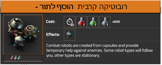
Unless they changed anything fundamental to include proper support of RTL (*ahem* *ahem*) it will probably end up looking like this:
Image
Few other things:
  1. Regarding the Queue not looking like a button - I agree. Perhaps a good way to fix it is change the text into something that is clearly a verb (although perhaps less common in English): "Enqueue". Then, the other state can stay "Queued" or also turned into a verb: "Dequeue".
  2. I join the question - what happens when the cost/effects/description has too much items/text to fit in one line? Will line-wrapping be applied and additional lines created for the required section(s)? Will you add a "..." icon so that the info that didn't fit will appear in a popup?
Other than that - it must be a tough choice whether to invest development time in what could benefit "most players" (i.e. non-colorblind people with ok-ish vision that use English as the UI language) vs. trying to accommodate very niche audiences (while possibly ruining the experience for many others). IMHO, the optimal solution is adding UI settings like "high contrast" and/or "colorblind mode" instead of trying to create a "one size fits all" color scheme. This takes time of course, but will keep players happy w/o it coming at the expense of other players.
Leading Hebrew translator of Factorio.
bobucles
Smart Inserter
Smart Inserter
Posts: 1708
Joined: Wed Jun 10, 2015 10:37 pm
Contact:

Re: Friday Facts #238 - The GUI update (Part II)

Post by bobucles »

The ideal maximum, with appropriate handling of infinite technologies, is the number of available technologies.
I disagree. For starters, a player won't necessarily KNOW their tech order, nor should they. If you have a complete tech path planned from the second you enter the game, you've been playing factorio for too long. There will always be times when players decide that they need to prioritize one research over another, whether it's weapons, bots, picking an easier research for now, or simply rushing the rocket. An unlimited queue means they have to sift through a gigantic list of JUNK before reaching the things they want.

Secondly, players will change technology in multiplayer. Unlimited queues make way for unlimited trolling.

A simple queue of 3-5 researches will dig as far into the future as most players can reasonably predict their needs. In addition, a "repeat infinite" tag can deal with end game infinite researches.
dood
Filter Inserter
Filter Inserter
Posts: 360
Joined: Wed Mar 21, 2018 8:36 am
Contact:

Re: Friday Facts #238 - The GUI update (Part II)

Post by dood »

So, while you're all about combing over things with a contrast checker, do that with the map.
Have yourselves a nice game of "find the stone in the desert" which should be representative of 90% of the game because everything is desert now.

Yes, the new map colors look nice, all like a real life map and stuff but consider the functionality.
How often do you actually need to know about the type of ground? Is that what people press "M" for?
User avatar
Oktokolo
Filter Inserter
Filter Inserter
Posts: 884
Joined: Wed Jul 12, 2017 5:45 pm
Contact:

Re: Friday Facts #238 - The GUI update (Part II)

Post by Oktokolo »

BlackHat wrote:As it stands now, due to the color scheme I can not read the discussion text in the Mod Portal.
As the mod portal discussion system does not even feature notifications for new messages, other usability stuff does not really matter. We only need a way to disable discussions for our mods. Then discussions will land in the linked forum thread. The usability of the forum is good enough.
bobucles
Smart Inserter
Smart Inserter
Posts: 1708
Joined: Wed Jun 10, 2015 10:37 pm
Contact:

Re: Friday Facts #238 - The GUI update (Part II)

Post by bobucles »

Have yourselves a nice game of "find the stone in the desert" which should be representative of 90% of the game because everything is desert now.
This is certainly a valid concern. Maybe it's time to invest in a little color theory?

A good map draws the human eye towards important things and skips things that aren't important. This is done with careful selection of colors. Bright, shiny colors stand out and demand the eye's attention while bland, grey colors fall into the background. The number and quantity of important colors you can choose from is limited; choose too many and they blend together, or fill the map in colors and it becomes a blinding rainbow.

I'll be blunt. Factorio does have some bad choices for map colors. The biggest fault lies with terrain colors. Terrain is given too much of the color wheel when the actual distinction between dirt and crushed dirt means nearly nothing to gameplay. Similarly trees have a whole green palette to themselves when the only important distinction is between living and dead trees.

The color choice for biters is fine. They get RED and nothing else competes for their attention on the map. I think it might help to at least have 2 shades for structures and mobile biters, but whatever. Power poles look excellent on the map; finding a broken wire is very easy. It's tragic there's no "color wire" mode. Ore colors are a bit subdued and could stand to pop out more like uranium does. "Show rail signal states" is great but normal and chain signals should probably have distinct shapes instead of both being dots. It's still good enough to be enabled by default. Train stations, trains and vehicles pop out very well but it can still be tricky to find a lost vehicle that might be parked anywhere.

Some things don't get the unique colors they deserve. For example gun turrets are very important structures to pay attention to, but their map color is the same as belts!

You can see in the pic that even when the visual quality is extremely bad the important things still stand out. Resource nodes immediately pop out, unit colors pop out, and key terrain details like pathing or terrain modifiers are still visible.
sc2 mappu.png
sc2 mappu.png (88.72 KiB) Viewed 7365 times
User avatar
Omnifarious
Filter Inserter
Filter Inserter
Posts: 276
Joined: Wed Jul 26, 2017 3:24 pm
Contact:

Re: Friday Facts #238 - The GUI update (Part II)

Post by Omnifarious »

bobucles wrote:Power poles look excellent on the map; finding a broken wire is very easy. It's tragic there's no "color wire" mode.
I think you have a point with most of your post, but this really stands out for me. I whole-heartedly agree. There are no wireless circuit signals in the base game, so if you need a signal to go a long ways, you have to string it across the landscape. But then finding broken spots is really hard. And these are much easier to have happen with the circuit network because the system will not automatically place circuit wires between poles.
dood
Filter Inserter
Filter Inserter
Posts: 360
Joined: Wed Mar 21, 2018 8:36 am
Contact:

Re: Friday Facts #238 - The GUI update (Part II)

Post by dood »

I think the biggest problem is the ore dithering.
Make it a solid color, add a black border around it like starcraft 2 does with points of interest and it'll be a huge improvement already, even in the case of gray stone against pastel colored terrain.
Right now, ore on the map is complete visual noise.
Last edited by dood on Sun Apr 15, 2018 4:16 pm, edited 1 time in total.
User avatar
Omnifarious
Filter Inserter
Filter Inserter
Posts: 276
Joined: Wed Jul 26, 2017 3:24 pm
Contact:

Re: Friday Facts #238 - The GUI update (Part II)

Post by Omnifarious »

I would love to get my hands on a 0.17 beta sooner rather than later. Allegro interacts with my Linux kernel and my nvidia driver in a way that causes my system to frequently freeze when I exit Factorio.

This is definitely a bug in the kernel or nvidia driver, but it is very difficult to deal with those kinds of bugs. The kernel people won't touch them, nor will the nvidia people.

One of the more vexing issues here is that while I can mitigate the problem significantly (though not completely) by killing Factorio rather than exiting it, Factorio insists on restarting when you change the mod configuration, which frequently results in a system freeze.

Other games don't have this problem, so I assume it must be something specific about what Allegro is doing, so I'm very much looking forward to your replacement of Allegro in 0.17.
User avatar
Deadlock989
Smart Inserter
Smart Inserter
Posts: 2529
Joined: Fri Nov 06, 2015 7:41 pm

Re: Friday Facts #238 - The GUI update (Part II)

Post by Deadlock989 »

Omnifarious wrote:
bobucles wrote:Power poles look excellent on the map; finding a broken wire is very easy. It's tragic there's no "color wire" mode.
I think you have a point with most of your post, but this really stands out for me. I whole-heartedly agree. There are no wireless circuit signals in the base game, so if you need a signal to go a long ways, you have to string it across the landscape. But then finding broken spots is really hard. And these are much easier to have happen with the circuit network because the system will not automatically place circuit wires between poles.
+1
User avatar
Deadlock989
Smart Inserter
Smart Inserter
Posts: 2529
Joined: Fri Nov 06, 2015 7:41 pm

Re: Friday Facts #238 - The GUI update (Part II)

Post by Deadlock989 »

bobucles wrote:I'll be blunt. Factorio does have some bad choices for map colors. The biggest fault lies with terrain colors. Terrain is given too much of the color wheel when the actual distinction between dirt and crushed dirt means nearly nothing to gameplay. Similarly trees have a whole green palette to themselves when the only important distinction is between living and dead trees.
In my set up, I alter all the map terrain colours to be 33% of their default values, so the background is very dark, because I use the map to look at terrain less than 1% of the time. You can still distinguish grass from desert if you want, but everything non-terrain (i.e. everything I built) pops out much better.
Attachments
screenshot.png
screenshot.png (84.64 KiB) Viewed 7325 times
Daeruun
Inserter
Inserter
Posts: 43
Joined: Thu May 04, 2017 8:37 pm
Contact:

Re: Friday Facts #238 - The GUI update (Part II)

Post by Daeruun »

Deadlock989 wrote:
bobucles wrote:I'll be blunt. Factorio does have some bad choices for map colors. The biggest fault lies with terrain colors. Terrain is given too much of the color wheel when the actual distinction between dirt and crushed dirt means nearly nothing to gameplay. Similarly trees have a whole green palette to themselves when the only important distinction is between living and dead trees.
In my set up, I alter all the map terrain colours to be 33% of their default values, so the background is very dark, because I use the map to look at terrain less than 1% of the time. You can still distinguish grass from desert if you want, but everything non-terrain (i.e. everything I built) pops out much better.
I've never come across a possibility to change these colors - where have you done that?
Is this a mod?
User avatar
Deadlock989
Smart Inserter
Smart Inserter
Posts: 2529
Joined: Fri Nov 06, 2015 7:41 pm

Re: Friday Facts #238 - The GUI update (Part II)

Post by Deadlock989 »

Daeruun wrote:Is this a mod?
Yes, just a few lines of code

Code: Select all

function multiply_colour(colour, factor)
	return {r=colour.r*factor, g=colour.g*factor, b=colour.b*factor, a=colour.a}
end

for i,v in pairs(data.raw["tile"]) do
	if data.raw["tile"][i].map_color then data.raw["tile"][i].map_color = multiply_colour( data.raw["tile"][i].map_color, 0.333) end
end
BlackHat
Long Handed Inserter
Posts: 74
Joined: Sat Apr 09, 2016 9:45 am
Contact:

Re: Friday Facts #238 - The GUI update (Part II)

Post by BlackHat »

Oktokolo wrote:
BlackHat wrote:As it stands now, due to the color scheme I can not read the discussion text in the Mod Portal.
As the mod portal discussion system does not even feature notifications for new messages, other usability stuff does not really matter. We only need a way to disable discussions for our mods. Then discussions will land in the linked forum thread. The usability of the forum is good enough.
True, BUT, a large number of Mods in the Portal do not HAVE linked forum threads.
Zavian
Smart Inserter
Smart Inserter
Posts: 1649
Joined: Thu Mar 02, 2017 2:57 am
Contact:

Re: Friday Facts #238 - The GUI update (Part II)

Post by Zavian »

BlackHat wrote:
Oktokolo wrote:
BlackHat wrote:As it stands now, due to the color scheme I can not read the discussion text in the Mod Portal.
As the mod portal discussion system does not even feature notifications for new messages, other usability stuff does not really matter. We only need a way to disable discussions for our mods. Then discussions will land in the linked forum thread. The usability of the forum is good enough.
True, BUT, a large number of Mods in the Portal do not HAVE linked forum threads.
In my opinion all the mods in the portal should have a discussion thread on some forum somewhere. (There are some mods have their homepage point to https://mods.factorio.com/user/xxxx which is kind of useless). Preferable a thread on forums.factorio.com, but if the mod author really wants to use another forum, or instead wants to use github, then I can live with that.

I've never actually used the mod portal discussion page, but in my opinion a proper forum thread with support for other people to subscribe, get notifications and contribute to the discussion is better. That goes double if the mod portal is really lacking any feature to notify the mod author of new posts. That way even if the mod author loses interest other people can step in and answer questions, etc.
Rayfie
Manual Inserter
Manual Inserter
Posts: 3
Joined: Mon Jan 08, 2018 8:42 pm
Contact:

Re: Friday Facts #238 - The GUI update (Part II)

Post by Rayfie »

QGamer wrote:
Philip017 wrote:adding a deep tech should add all prerequisites of course. and removing a tech from the que will also remove everything that requires it.
This actually raises a few interesting issues...

1) If I queue a technology that is deep in the tree, it should add all of the prerequisites to the queue. But what if there are more prerequisites than the maximum queue length? In this case, I think it should gently tell the player that he/she should try queuing a technology that less deep in the tree.

2) If I remove a technology that is deep in the tree, what happens to its prerequisites? I may have wanted to keep some of them, but not all. Or I may have wanted to keep none of them. What happens in this case? Does the queue remove only the deep technology, or does it remove its prerequisites as well? Or does the queue remove only the prerequisites that were added because of the deep tech, and keep the ones that the player had previously (explicitly) stated that he/she wants to queue? This is a tricky question that I'm not sure how to put into words.

As an aside question, what is the maximum length of the queue? I think the ideal maximum is around 8 or so...
As someone mentioned earlier, it's not the best idea to let the player plan out the entire game (i.e. queue all of the technologies) at the very beginning. One of the most important elements of the game is uncertainty about the future. In this case, the player shouldn't know which technologies he/she will research 10-20 researches down the line.
There would still be an issue with this: The tech tree does not include all the required tech to be able to research deep tech. This means that not all types of science packs need to be researched before you can unlock something deeper in the tech tree. For example the new Cliff Explosives tech does not require Military 2 and therefore you would not be able to create Military science packs, however you do need them to research the prerequired Explosives tech. Just check http://davemcw.com/factorio/tech-tree/.
To solve this, maybe the tech tree can be split up by types of science pack required, and researching a new type of science pack could unlock a new part of the tech tree. This would also limit the possibility of queueing too much and planning too far ahead. As suggested earlier, splitting up the completed tech would create even more overview.
User avatar
Omnifarious
Filter Inserter
Filter Inserter
Posts: 276
Joined: Wed Jul 26, 2017 3:24 pm
Contact:

Re: Friday Facts #238 - The GUI update (Part II)

Post by Omnifarious »

Zavian wrote:I've never actually used the mod portal discussion page, but in my opinion a proper forum thread with support for other people to subscribe, get notifications and contribute to the discussion is better. That goes double if the mod portal is really lacking any feature to notify the mod author of new posts. That way even if the mod author loses interest other people can step in and answer questions, etc.
Yes, the mod forum is basically an attractive nuisance. It's so under-featured that it's basically useless. But it's there, so people do. IMHO, it should either be completely removed, or some system that links this forum and the mod portal should be made so that every mod gets a discussion thread here or something.
Post Reply

Return to “News”