OP doesn't tell there are so many people who have issues, just that it would be helpful for those who do to visualize it on a glance, and I do agree with OP on that.
improve train block overlay: add directions
Moderator: ickputzdirwech
Re: Quality of life improvement: Visualize one-way rails with arrow
Koub - Please consider English is not my native language.
Re: Quality of life improvement: Visualize one-way rails with arrow
This could also be helpful while designing intersections and such.
I am a translator. And what did you do for Factorio?
Check out my mod "Realistic Ores" and my other mods!
Check out my mod "Realistic Ores" and my other mods!
- CheeseMcBurger
- Long Handed Inserter

- Posts: 88
- Joined: Sun May 19, 2019 9:57 pm
- Contact:
Re: Quality of life improvement: Visualize one-way rails with arrow
Gatekeeping never helped anyone. It's a game, not replacing electric wires in a house hold.coppercoil wrote: ↑Tue May 12, 2020 8:10 amI think the player even shouldn't start using rails without such understanding. A good tutorial is a must. There are good tutorials.jasper-bear wrote: ↑Mon May 11, 2020 9:30 pm If a new player is trying to make this rail a 2-way rail, this will help them immensely, even if they don't yet understand how rail signals work.
Then, just a little practice required. That "new player" mode lasts very short.
-
jasper-bear
- Burner Inserter

- Posts: 6
- Joined: Wed Apr 29, 2020 8:28 pm
- Contact:
Re: Quality of life improvement: Visualize one-way rails with arrow
The devs didn't have to put a trash-can icon on the player's trash slots. By your logic, with a good tutorial, players will soon learn that these are trash slots, and the trash-can icon becomes unnecessary. Nevertheless, they are a good idea, and it was good that they put the icon there.coppercoil wrote: ↑Tue May 12, 2020 8:10 amI think the player even shouldn't start using rails without such understanding. A good tutorial is a must. There are good tutorials.jasper-bear wrote: ↑Mon May 11, 2020 9:30 pm If a new player is trying to make this rail a 2-way rail, this will help them immensely, even if they don't yet understand how rail signals work.
Then, just a little practice required. That "new player" mode lasts very short.
As a general principle, visualizations are beneficial for learning; but also visualizations just makes things easier and more fluid.
Anything that makes tutorialization obsolete is generally better. Some people prefer to learn as they play, rather than stopping their play in order to go view or do a tutorial and then go back to playing.
Even now that I understand perfectly well how the signals work, I want the arrows. I won't have to zoom in as far to see the signals. I have poor eyesight. Other people do too.
Re: Quality of life improvement: Visualize one-way rails with arrow
And how would it be if you make the arrows yourself? For example: put some hazard concrete on the side where you placed the signals. Can be seen from far away and from map.
There is also a - in my eyes very useful and should be standard - debug view option, which turns on signals in map view. As the signals are always righthand you can see the direction.
No need to paint extra arrows and questionable gameplay value.
There is also a - in my eyes very useful and should be standard - debug view option, which turns on signals in map view. As the signals are always righthand you can see the direction.
No need to paint extra arrows and questionable gameplay value.
Cool suggestion: Eatable MOUSE-pointers.
Have you used the Advanced Search today?
Need help, question? FAQ - Wiki - Forum help
I still like small signatures...
Have you used the Advanced Search today?
Need help, question? FAQ - Wiki - Forum help
I still like small signatures...
Re: Quality of life improvement: Visualize one-way rails with arrow
From what I see in multiplayer games, I estimate that 60%+ of the players do not understand signalling in general. But I don't see one-/two-way signalling mistakes a lot. Maybe because it becomes apparent immediately when the trains are no-pathing, but I think most helpful is the visual indicator, that shows, in what direction a train has to go to be affected by a particular signal or station.
When I recall correctly, then the track segmentation is visible when holding a signal, but the directionality is not. To see the directionality one has to hove over an already placed signal or station.
When I recall correctly, then the track segmentation is visible when holding a signal, but the directionality is not. To see the directionality one has to hove over an already placed signal or station.
-
coppercoil
- Filter Inserter

- Posts: 502
- Joined: Tue Jun 26, 2018 10:14 am
- Contact:
Re: Quality of life improvement: Visualize one-way rails with arrow
If we really need visual indications, I suggest answering more general questions: where the train is able to move and why? Where this train cannot move and why? That "why" is the key.
This is mostly about signaling issues, but it may include direction indication as well.
This is mostly about signaling issues, but it may include direction indication as well.
Last edited by coppercoil on Thu May 21, 2020 8:49 am, edited 1 time in total.
Re: Quality of life improvement: Visualize one-way rails with arrow
If you don't need them, then there's little chance you'll understand why others need them.
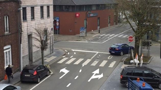
By your standards, would these arrows would be of questionable value too ?
Arrows on the ground
I would personnally not need them, because it's obvious to me where I should be depending on where I'm going.If :
1) It doesn't cost too much dev time
2) Doesn't degrade performance
Then why bother even refusing this QoL to people who struggle with trains ?
Koub - Please consider English is not my native language.
-
Septimus ii
- Inserter

- Posts: 26
- Joined: Fri Mar 25, 2016 10:59 pm
- Contact:
Re: Quality of life improvement: Visualize one-way rails with arrow
Direction is implied by the train blocking which is shown when placing a new signal, but I don't see any harm in making it clearer, especially for new players. It can always be made as an option which can be turned off in the graphics menu.
Re: Quality of life improvement: Visualize one-way rails with arrow
Hmm, I thought a bit about it.
(“They say in radio there is a ghost driver. I see hundreds!” )
)
I think the suggestion is not detailed enough, not specific enough.
It makes of course sense
- to have arrows in front of/ after crossings.
- for long tracks with no signal, that there is an arrow every n tile, eventually depending on resolution.
- to paint “no enter” into this rail after a switch.
And more things I don’t think of yet.
And it will cost performance but only for rendering and while doing anything on the tracks.
But I really doubt this will be implemented before 1.0.
I think that’s the problem with this. Because I imagined some straight rails. And what sense would it make to paste arrows on an autobahn?
(“They say in radio there is a ghost driver. I see hundreds!”
I think that’s not the point here.By your standards, would these arrows would be of questionable value too ?Arrows on the groundI would personnally not need them, because it's obvious to me where I should be depending on where I'm going.
I think the suggestion is not detailed enough, not specific enough.
It makes of course sense
- to have arrows in front of/ after crossings.
- for long tracks with no signal, that there is an arrow every n tile, eventually depending on resolution.
- to paint “no enter” into this rail after a switch.
And more things I don’t think of yet.
I think this is not really complicated, because most things must be already programmed - only how to calculate the places where arrows should be displayed and what arrows (or no entry).If :
1) It doesn't cost too much dev time
2) Doesn't degrade performance
Then why bother even refusing this QoL to people who struggle with trains ?
And it will cost performance but only for rendering and while doing anything on the tracks.
But I really doubt this will be implemented before 1.0.
Cool suggestion: Eatable MOUSE-pointers.
Have you used the Advanced Search today?
Need help, question? FAQ - Wiki - Forum help
I still like small signatures...
Have you used the Advanced Search today?
Need help, question? FAQ - Wiki - Forum help
I still like small signatures...
Travel arrows capping Rail block visualizer
I would like to suggest that the rail block visualization be modified to indicate the permitted direction of automatic travel. Currently, each segment ends in a flat line at each end. That line could be turned into an arrow to indicate a single direction. Two way travel could be indicated by a diamond, or something could be done with the arrow from the other side of the signals, as they could work together to indicate single or dual directional travel. Perhaps there could also be an indication if a train is allowed to wait behind a signal, perhaps by bringing back the current flat line, to add to the arrow, similar to the style of the old play/pause button.
Re: Travel arrows capping Rail block visualizer
And why do you think this will improve gameplay?
Cool suggestion: Eatable MOUSE-pointers.
Have you used the Advanced Search today?
Need help, question? FAQ - Wiki - Forum help
I still like small signatures...
Have you used the Advanced Search today?
Need help, question? FAQ - Wiki - Forum help
I still like small signatures...
Re: Travel arrows capping Rail block visualizer
I think it might help building and troubleshooting rail networks if one can see the direction of travel in the block visualizer. Many players have difficulty understanding rail signals and train pathfinding, and having an indication of what direction the trains are willing to travel could help reduce the number of players that struggle with these parts of the game.
Re: Travel arrows capping Rail block visualizer
+1 good idea
Add arrows to "Block display" for rails when holding signals
Image: 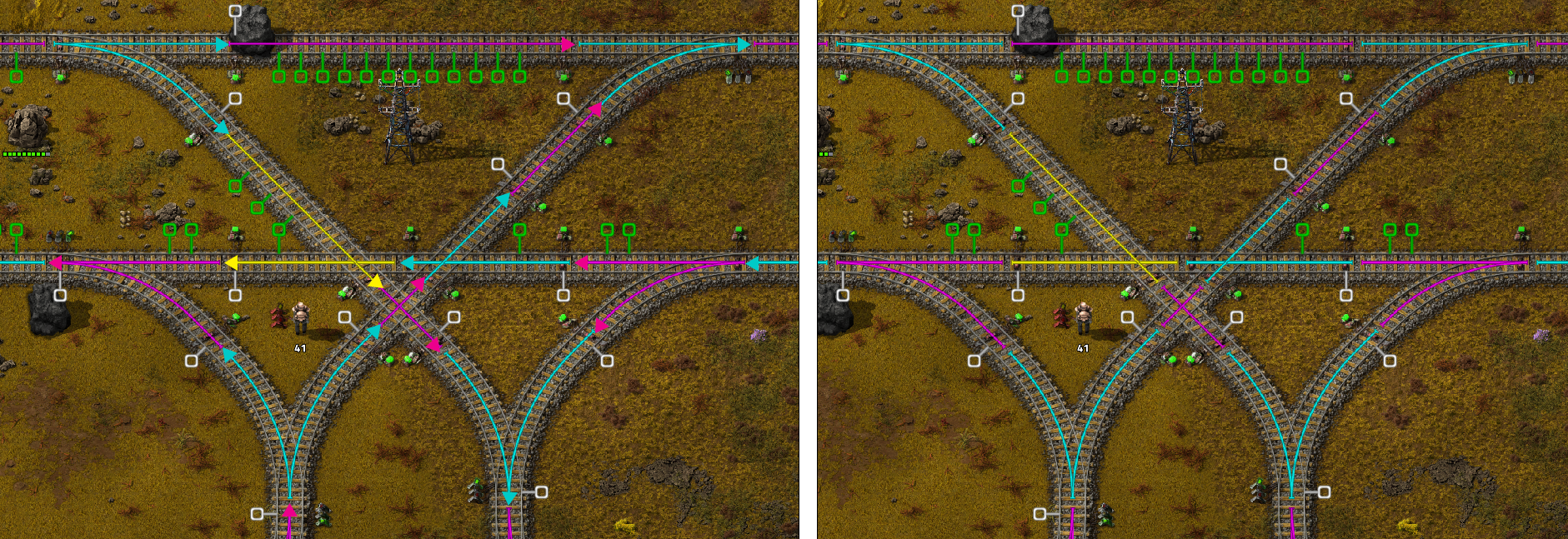
By adding arrows a shown, it immediately becomes much more obvious that you've screwed up signal placement, as there would be two arrows "colliding". Bonus points if such a collision was somehow indicated more clearly with an icon or something that indicated "no trains can pass here"
Why? The reddit among other places are ALWAYS filled with people who can't work out why their train has no path. This would help to massively alleviate this, while also being far more "readable" for the main purpose of blocks.
Also, I believe it's a relatively straightforward change, as the code already exists for both colouring and highlighting block sections. All this requires is to check directionality at the same location and add a sprite over the top.
- NotRexButCaesar
- Smart Inserter

- Posts: 1133
- Joined: Sun Feb 16, 2020 12:47 am
- Contact:
Re: Add arrows to "Block display" for rails when holding signals
In my opinion it also just looks much nicer.
Ⅲ—Crevez, chiens, si vous n'étes pas contents!
Re: Add arrows to "Block display" for rails when holding signals
Maybe an easier way to implement something like this would be to have an arrow associated with the signal, instead of the block, indicating the direction a train is allowed to pass it.
Tired of manually backing up your saves? Check this out! -> Factorio Backup
Re: Add arrows to "Block display" for rails when holding signals
Yeah Durr, that's definitely a nice way to get the same (notably missing at the moment) information to the user.
Re: improve train block overlay: add directions
[Koub] Merged several older threads with the same suggestion.
Koub - Please consider English is not my native language.
Re: improve train block overlay: add directions
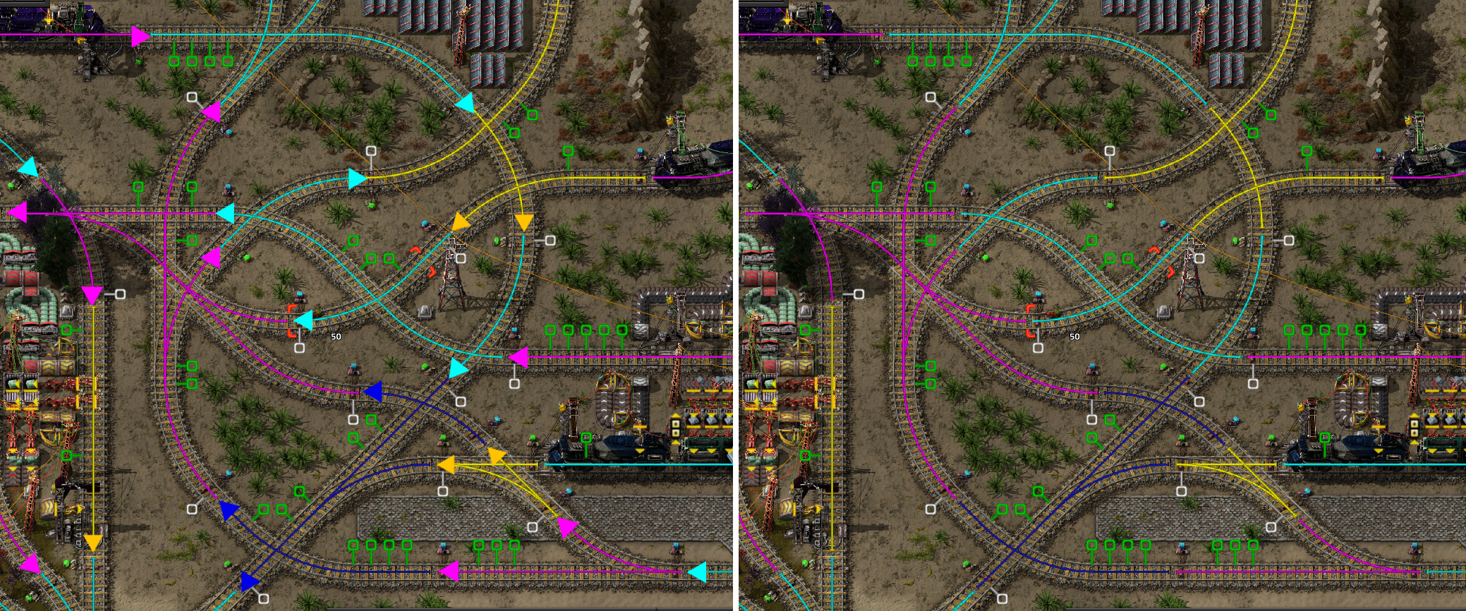
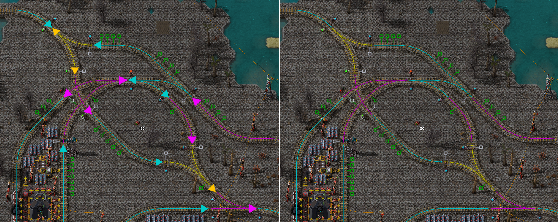
Welp, apparently I'm at least the third person along to think of this. I kind of like the mini signal arrows by DaleStan too, although they're quite busy, they make the "WRONG WAY" aspect quite clear.
Two more demonstration images I made, to hopefully make it clear how useful these are for dealing with spaghetti:


Two more demonstration images I made, to hopefully make it clear how useful these are for dealing with spaghetti:
