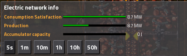
While this is a clear improvement over the current situation, I still don't see the need/use of two bars. I still think you can combine those bars into a single one with a marker for maximum power generation.
Could you explain why you need two bars?
Moderator: ickputzdirwech
I think this response from ribsngibs explains things from the layman's POV pretty well:MrDoomah wrote:Could you explain why you need two bars?
Basically, it's better to definitively show the relationship between demand, current power generation, and capacity, all over a percentage-based scale. An appropriately detailed single-bar approach might be able to convey the same information as what I've shown, but it wouldn't do it as effectively.ribsngibs wrote:Are you arguing that because your maximum power generation capacity does not fluctuate (it only changes if you build more or have some emergency like biter attack or boilers run out of fuel), whereas your demand is all over the place, that it makes more sense to have the maximum power generation fixed on the readout while demand is the moving bar? That totally makes sense. I suppose with my method, it would not intuitively make sense to watch your "power" bar drop dramatically in relation to a fixed "demand" mark when a bunch of assemblers come online - it makes more sense for the consumption and generation bars to both move to the right in such a case, while the scale of the X axis remains fixed (with 100% on the far right).Vuliev wrote:Demand is a constantly moving target--it's not a fixed condition to satisfy and move on.
1 Watt is 1 Joule of energy consumed in 1 second. it makes sense.Vuliev wrote:The other thing they really need to do is change their energy units from joules to watt-hours, and add a game-time clock like the EvoGUI mod. Having energy in watt-hours is so much faster/easier to work with when trying to determine how much energy storage you actually have.
Here is my take on this. It's similar to previous suggestions from you and ribsngibs, but hopefully more clear for new players. Not sure if this exact idea was in any previous thread.Vuliev wrote:Basically, it's better to definitively show the relationship between demand, current power generation, and capacity, all over a percentage-based scale. An appropriately detailed single-bar approach might be able to convey the same information as what I've shown, but it wouldn't do it as effectively.
Btw I prefer the version without the excess capacity hatching. Again, from a layman'so point of view, if both bars are the same I am happy because I know my energy needs are met, and I can tell from the size of the bar in relation to the end of the graph what %utilization I am at. If the bars are different lengths, I need to doublecheck which is larger and make sure I am still ok. Well, I guess the color coding helps with that too. But I found your original diagram simplest.Vuliev wrote: [EDIT] Here's an alternate version with hatching for excess capacity as well.
...yes, that's how unit conversion works.bobingabout wrote:If you consume 1W of power for 1 hour, it would be 3600 Joules consumed in that hour.
No, it was done because it eliminates an unnecessary unit conversion. In power, the energy consumed by the system is the integral of power demand with respect to time, and time is measured in hours, not seconds. Average power demand multiplied by time equals energy consumed in that time. Even if your power meter measured time in seconds, it would in all likelihood use units of watt-seconds, because that's very simple to understand. Yes, 1J = 1Ws, but that's not the point--calling a watt-second a Joule is an abstraction necessary for higher science, not the layperson.bobingabout wrote:It was basically done for one reason only... so that your electric meter doesn't show stupid big numbers.
...except for the fact that your power bill is measured in kWh, all news reporting on energy consumption uses kWh/MWh/GWh, and watt-hours as a measure of energy (as distinct from power) is a very simple concept to grasp.bobingabout wrote:There is absolutely no reason why a game like this needs to use a "Dumb person's" name being used, the much more proper Joules and Watts is good, especially considering you can actually quite easily see Watts being used...
...you'd use kW/kWh, MW/MWh, GW/GWh, TW/TWh, all the way up the SI prefixes. Just like the world has done for power generation for the past 90+ years.bobingabout wrote:My question would be, what would you use if thousands or millions of Kilowatt hours were being consumed? Kilo Kilowatt hours? Mega Kilowatt hours? that really does sound dumb, instead... you'd use Megawatts and Megajoules, Gigawatts, Terawatts etc.
I appreciate what you've done with this, but as a player that's already unsatisfied with the amount of detail in my power statistics, this would be extremely frustrating for me to use. There are other means of increasing accessibility without stripping out information/features/mechanics.Linosaurus wrote:A single bar for demand. It goes up to 150%, with a clear mark at 100% of capacity.
- It's identical to the current production bar until that hits 100%.
- When production is 100% and consumption bar is above 67%, you get the same information from the extended bar in this new system. (Because 100/150 = 66.67%)
- When the current consumption bar drops below 67% you get no further information at all. But you should be too busy panicking to look at bars.
- In particular - when you don't generate any power at all the bar should in theory be infinite. But again, you should be too busy panicking to care.
(For sudden production crashes, the over time graph is more useful anyway in my opinion).
- It doesn't explicitly show current power generation, but that is sort of 'obvious' when looking at the bar.
Exactly, and that's I believe that simplifying the power bars will only make things worse--it really doesn't offer anything beyond the current "Consumption green = good, consumption not green = bad" approach of the existing power bars, and it strips out the implicit information therein.Linosaurus wrote:I know some players find the current bars perfectly intuitive.
Excellent! I wasn't sure if people would prefer to see the capacity hatching or not.ribsngibs wrote:Btw I prefer the version without the excess capacity hatching. Again, from a layman'so point of view, if both bars are the same I am happy because I know my energy needs are met, and I can tell from the size of the bar in relation to the end of the graph what %utilization I am at. If the bars are different lengths, I need to doublecheck which is larger and make sure I am still ok. Well, I guess the color coding helps with that too. But I found your original diagram simplest.
+1 hereAutoMcD wrote:Current demand vs total production is all I really care to see as a simple meter.
No it is not! That is exactly the problem with the old interface. As some seem to miss, the white indicator exactly shows the current power generation relative to the current demand. So please put an appropriate scale (label).Linosaurus wrote:It doesn't explicitly show current power generation, but that is sort of 'obvious' when looking at the bar.