Change UI paradigm from Toolbelt to Toolbar

Suggestions that have been added to the game.

Moderator: ickputzdirwech

Engimage
Smart Inserter
Smart Inserter
Posts: 1069
Joined: Wed Jun 29, 2016 10:02 am
Contact:

Re: Change UI paradigm from Toolbelt to Toolbar

Post by Engimage »

AileTheAlien wrote: I feel that having the toolbar act differently from the inventory systems in the game (player, chest, train, etc) would lead to more confusion than what would be solved by using something standard from other games. (i.e. The idea of a toolbar, which does not exist anywhere else in Factorio.) In my opinion, one UI element which is consistent with other games, but which is inconsistent with the rest of the UI in Factorio, would make for a worse UI than one which is internally consistent.
If your goal it to make toolbelt fully compatible with inventory - you are doing it wrong.
Toolbelt (or a toolbar) it a tool to provide you with certain features which would make your life easier. It should not mimick the inventory behaviour but it should be really close to it when hanlding linked items.

First of all lets find out what features would you expect from a toolbar(belt).
1. Having most used items in short reach (bar - yes, belt - yes)
2. Keeping track of items total count (bar - yes, belt - NO)
3. Allowing you to manage your toolbar(belt) easily (bar - yes, belt - yes)
4. Keeping your tool predictable. (bar-yes, belt - NO). Items are placed in your toolbelt prioritized over inventory even if you wish to keep a slot empty. Also I mentioned item jumping around.
5. Behaviour of items on hotbar(belt) should be expected. (bar - yes, belt - yes). Toolbar represents a link to a certain item in your inventory. So clicking it will be equal clicking this item in your inventory.

Here I can identify several problems in existing system.

1. You can't see the total number of toolbelted items in your inventory. And if you replace the number on a toolbelt it will break the idea on the toolbelt. The only option would be displaying both numbers but it will clog the icon.
2. You can't see the total remaining number of items when placing them. Yes there is a mod for that. But this is true for the whole current system and does not directly apply to toolbelt.
3. The actual item pickup works differently from toolbelt and inventory (consistensy, yes). When you pick item from toolbelt it will "reserve" the toolbelt slot (hand icon) until you either spend or return (Q) the item there. Clicking in inventory will pick up items letting the space be taken by other items right away. Remember that chest placement for wood chopped by bots when your inventory is full? You just end up with a stack of chests in your hand unable to do anything until you place them somewhere. Using toolbar would effectively prevent you from picking up items on click and they would leave your inventory only if you make an action (place them in the world, or even inside containers, shift-click for a stack, Ctrl-click for all items etc).

Actually the same is true for the ammo. Currently ammo slots are containers with the same flaws. Can't remember how many times I stayed out of ammo cause the current count display is useless with your inventory holding 5 stacks of ammo (or not holding, can't tell)

Anyways. The goal is not to mimick the inventory behaviour. The goal is to create a useful tool. The tool has to get a smooth learning curve but in the end it should provide the best experience possible.
Both toolbar and toolbelt can be learned to use within minutes. This is not the issue. The issue is the end result.

AndrewIRL
Fast Inserter
Fast Inserter
Posts: 240
Joined: Fri Mar 24, 2017 2:17 pm
Contact:

Re: Change UI paradigm from Toolbelt to Toolbar

Post by AndrewIRL »

Haven't tried this mod yet (waiting for stable release of 0.15 before upgrading) but it looks promising:
This mod will avoid the problem where you pick an item from the quickbar, then pick another item without hitting "Q". The base game behavior leaves the first item in the second item's inventory slot, rather than putting it back in your quickbar.
https://mods.factorio.com/mods/sparr/gr ... ar-filters

Seems to be 0.15 only.

Azzinoth
Inserter
Inserter
Posts: 38
Joined: Sat Apr 29, 2017 12:10 am
Contact:

Re: Change UI paradigm from Toolbelt to Toolbar

Post by Azzinoth »

AileTheAlien wrote: I feel that having the toolbar act differently from the inventory systems in the game (player, chest, train, etc) would lead to more confusion than what would be solved by using something standard from other games. (i.e. The idea of a toolbar, which does not exist anywhere else in Factorio.) In my opinion, one UI element which is consistent with other games, but which is inconsistent with the rest of the UI in Factorio, would make for a worse UI than one which is internally consistent.
But the current toolbelt is not consistent. Some items go prioritized in your toolbelt, other items (like intermediate products) not. So, if you pick up circuits you have to search your inventory, if you pick up inserters you have to search your toolbelt. Is that consistent or intuitive? If you split a stack in half and put it back in your inventory, it will add them up to one full stack, but in the toolbelt they stay two seperate stacks. You can set filters in your toolbelt, but not in your inventory. When you pick item from toolbelt it will "reserve" the toolbelt slot (hand icon) until you either spend or return (Q) the item there. Clicking in inventory will pick up items letting the space be taken by other items right away.

In fact, the toolbelt seems to be an inventory with a lot of exceptions to make it act more like a proper toolbar. It would be easier to just implement it as a toolbar (as the term toolbar is described here in this thread). This would solve ALL quirks i have experienced with the toolbelt, that i can think of at the moment. I dont know how you can be against it, since you could use the new toolbar in the same way as you used the old toolbelt. Instead of picking up a stack of items by left clicking on it, you pick up the link, and you place items by left click. You dont have to press Q after every item used, but you could still do so, if you dont want to change your habit. If you run out of items (because of bots or otherwise) you could still use your link to place ghost entities. I see only advantages and not a single disadvantage. The toolbar is just objectively superior over the toolbelt.
Rhamphoryncus wrote: Disadvantages
  • Less total inventory space (but this can be compensated by increasing the main inventory)
This is not a disadvantage, you add the old inventory from the toolbelt to the main inventory and you have the exact same total inventory size.

Rhamphoryncus wrote: [*]Less ability to subdivide stacks before ctrl-clicking them into something[/list]
This is already quirky: Lets say i want to take 20 iron plates from a stack of 100 iron plates. I can either right click 20 times the target slot (one time per item for right clicking), or i can split the stack to 50 and move it to the toolbelt (because main inventory adds them again), then split them again to 25 and then 5 times right click on one of the stacks to reduce the 25 to 20. And if my toolbelt is already full with other stuff, i cant even do so. Why not adding this: If you middle click an item in your inventory, a window opens where you can enter the number of items you want on your cursor.
ssilk wrote: - It's hard to change the toolbelt now. I would say there is some rewrite of the item-handling needed then. Questionable
I dont think its so difficult to implement. You dont need to tell the game all that exceptions that you currently have for the toolbelt (e.g. put inserters in toolbelt but not circuits), because they will be obsolete. But of course only the devs know how much work it would really be. But i think it would really improve user-friendlyness.
rseding91 wrote: I've literally never seen a new player (after watching several start for their first time through streams) start the game and not know how to use the quickbar.
I agree, i have never seen that. But every player i know has run in at least some of the quirks mentioned is this thread.
rseding91 wrote: They put an item on it and then can take it off a gain. They don't want it there anymore and they move it somewhere else.
The same applies to the suggested toolbar.
rseding91 wrote: I like the idea of adding the ability to have a slot reference all of one item type but making it that by default is not something I'll ever get behind.
So, you dont use the filtered slots at all? How do you manage your toolbelt? If you dont sort them you need to search for your items every time. If you order them without filtered slots, the game will not keep that order. For example, if you run out of that item and you pickup something else, it puts that in your empty slot. If that doenst happen, than it behaves like the suggested toolbar: If you want a new item in that slot, you drag it from the inventory and switch it for an item that you use more frequently. But what about all the other problems mentioned above, that would be solved by the toolbar?
Last edited by Azzinoth on Wed May 17, 2017 6:30 pm, edited 1 time in total.

aka13
Filter Inserter
Filter Inserter
Posts: 793
Joined: Sun Sep 29, 2013 1:18 pm
Contact:

Re: Change UI paradigm from Toolbelt to Toolbar

Post by aka13 »

Macros would be nice, but just a toolbar instead of a toolbelt would be also good. Like space engineers, I guess, if we were to bring up examples. I have about 2k hours on factorio, and about 500 on engineers, I don't think it would be counterintuitive.
Pony/Furfag avatar? Opinion discarded.

Azzinoth
Inserter
Inserter
Posts: 38
Joined: Sat Apr 29, 2017 12:10 am
Contact:

Re: Change UI paradigm from Toolbelt to Toolbar

Post by Azzinoth »

I have created a list of the advantages that have been mentioned so far:

- Displays total count of items in inventory, as the stack size is irrelevant for the player while building.
- Works even if bots steal your last item (you can still place ghosts).
- You dont need to search two different places to find where the item is.
- No slot jumping.
- All items are placed in your inventory consistently.
- You can switch your current item without pressing Q every time you want to switch your item (this are actually two keypresses for one simple action!).
- Aliases/links would allow much more things. Not even items but complete macros, like swap the power suit/ toggle nightvision or personal roboport/ console macros. (this is just a possibility)
- By putting the shortcuts there yourself, it's much more likely you will remember what is where. You are more likely to remember if an item in in the toolbar or in your inventory.
- You are able to switch your cursor item even if your inventory is full. The current behaviour is that you are stuck with whatever is on your cursor, because it has no space to fit in your inventory.
- Another possibility for later: You can remove blueprints as items completely. They are now obsolete and its annoying to synchronize your blueprints between the items and the library. Instead you have your blueprints only in the library, and shift clicking them creates a link to them in your toolbar. Right clicking the link opens the edit menu from the library. You create new blueprints from the button in the library or by a "new blueprint" macro that you can drop on your toolbar.

User avatar
AileTheAlien
Filter Inserter
Filter Inserter
Posts: 289
Joined: Sat Mar 11, 2017 4:30 pm
Contact:

Re: Change UI paradigm from Toolbelt to Toolbar

Post by AileTheAlien »

Azzinoth wrote:
AileTheAlien wrote: [some stuff]
But the current toolbelt is not consistent.
Having played more of the game since I made my other post, I'm now on the "toolbar" side. (As long as you can re-order it.) The current toolbelt is fiddly and annoying, and actually isn't consistent with other containers, since chests don't have filters. Nuts to toolbelt! :)

AndrewIRL
Fast Inserter
Fast Inserter
Posts: 240
Joined: Fri Mar 24, 2017 2:17 pm
Contact:

Re: Change UI paradigm from Toolbelt to Toolbar

Post by AndrewIRL »

Azzinoth wrote:In fact, the toolbelt seems to be an inventory with a lot of exceptions to make it act more like a proper toolbar. It would be easier to just implement it as a toolbar (as the term toolbar is described here in this thread).
Agreed. If you look at the change history the new features requested have moved it to behave more toolbar and less toolbelt.
  • Originally couldn't filter toolbelt slots as that's not a feature in any other container. But feature request was made and implemented - making it behave more toolbar like.
  • When already holding a filter item and clicking on another without hitting Q, just smoothly switch - again no other container does this but this is exactly what a toolbar would do. eg Switch from bold to italic in Word
What would the next requests be?
  • When trying to click on a filtered position when NOT already holding a filtered item, just switch without an error.
  • Invert the design so that using items from the toolbelt is a first class (left click) action and rearranging the toolbelt is a second class (middle or other click) action.
  • Make every toolbelt slot filtered by default - as soon as the first item is placed, filter that spot so it doesn't move about.
  • If there are items in inventory them automatically push them to the toolbelt, don't leave a filtered spot with none.
  • Provide the total inventory count in the toolbelt so we can see at a glance how many we have.
The underlying concept of all these changes, the ones implemented and the ones we want is -> toolbar. Once you reimagine those icons at the bottom of the screen as a Word or Excel toolbar the needed changes are clear. The only complication is stack size - taking a stack or half-stack and applying it to an assembler.
Chapter 5: Consistency and Other Hobgoblins

It’s hard to overestimate just how much consistency helps people to learn and use a wide variety of programs.

Consistency is a fundamental principle of good UI design, but it’s really just a corollary of the axiom “make the program model match the user model”, because the user model is likely to reflect the way that users see other programs behaving. If the user has learned that double-clicking text means select word, you can show them a program they’ve never seen before and they will guess that the way to select a word is to double-click it. And now, that program better select words when they double click (as opposed to, say, looking the word up in the dictionary), or else you have a usability problem.

If consistency is so obviously beneficial, why am I wasting your time and mine evangelizing it? Unhappily, there is a dark force out there that fights against consistency, and that is the natural tendency of designers and programmers to be creative.

In most UI decisions, before you design anything from scratch, you absolutely have to look at what other popular programs are doing and emulate that as closely as possible. If you’re creating a document editing program of some sort, it better look an awful lot like Microsoft Word, down to the accelerators on the menu items that you have in common.
https://www.joelonsoftware.com/2001/10/ ... ogrammers/

User avatar
Lav
Filter Inserter
Filter Inserter
Posts: 384
Joined: Mon Mar 27, 2017 10:12 am
Contact:

Re: Change UI paradigm from Toolbelt to Toolbar

Post by Lav »

My personal take on the issue.

About 10 minutes after I started the game for the first time, I discovered that only 5 first slots are easily accessible, grumbled a bit about "wtf were the devs thinking", rebound the keys so that 1..0 are assigned to 10 toolb(ar/elt) slots, and have been happy ever since.

I can switch the toolbelt rows with "X", that is fine.

I miss the ability to assign Shift-(1..0) keys to the second row though, that would be even better.

MiniHerc
Fast Inserter
Fast Inserter
Posts: 176
Joined: Fri Jun 26, 2015 11:37 pm

Re: Change UI paradigm from Toolbelt to Toolbar

Post by MiniHerc »

I LIKE the toolbelt. I use a steelseries merc stealth keyboard that lets me access 1 thru 0 with my left hand without moving my hand and - for switching rows. I also play modded and end up with 3-4 toolbelt rows by late game.

If you're going to think about something like this, then increase inventory size by the number of lost toolbar inventory slots. Perhaps also let us define an arbitrary number of toolbelt rows and have the research just increase max inventory instead.


e. More toolbelt rows are always welcome. The 2 default with the base game are just not enough.. I need 3 at an absolute minimum.


e2. Perhaps you can override max stack sizes of favorited items in inventory? When one tries to pick up a stack, it'll still default to max non-favorite stack size.


e3. 'Twinsen01: "The equipment inventory from the bottom right will be removed and replaced with just a view of the currently equipped weapon and ammo."'

God, no. I like seeing what weapons I have access to.

e4. AndrewIRL. I like this equipment view. Please do not mess with or remove this equipment view. At the very least, if you make those inventory tab changes, make this equipment view toggleable from options.
Image
Last edited by MiniHerc on Fri May 19, 2017 6:54 pm, edited 2 times in total.

User avatar
irbork
Fast Inserter
Fast Inserter
Posts: 241
Joined: Fri Jul 04, 2014 1:17 pm
Contact:

Re: Change UI paradigm from Toolbelt to Toolbar

Post by irbork »

Great idea. I am all for it with like 3 years playing Factorio. Just please give us the inventory space back we can loose during the change :roll:

AndrewIRL
Fast Inserter
Fast Inserter
Posts: 240
Joined: Fri Mar 24, 2017 2:17 pm
Contact:

Re: Change UI paradigm from Toolbelt to Toolbar

Post by AndrewIRL »

irbork wrote:Great idea. I am all for it with like 3 years playing Factorio. Just please give us the inventory space back we can loose during the change :roll:
Twinsen has heard your plea and addressed it here:
FFF-191 wrote:No one is taking away your inventory space. Main inventory will be increased to compensate for the slots lost in the shortcut bar
https://www.factorio.com/blog/post/fff-191

Azzinoth
Inserter
Inserter
Posts: 38
Joined: Sat Apr 29, 2017 12:10 am
Contact:

Re: Change UI paradigm from Toolbelt to Toolbar

Post by Azzinoth »

Since Twinsen announced that he thinks about implementing the toolbar, i was thinking further about the problem of splitting stacks, that i have already mentioned above. With the new toolbar, we cant put half stacks etc. in the toolbar inventory to split stacks. I think that the best solution to this problem is mentioned in this thread: viewtopic.php?f=6&t=47938
BenSeidel wrote:Added feature:
while holding a stack of items in your hands, be able to use the mouse scroll wheel to change the "held" stack size.
Pick up a stack of 50, pull the scroll wheel back until you are holding 5 items, place 5 items in things until you are out of them/clear your hand.
In the FFF Twinsen said that clicking the toolbar would move one stack of that item in your hand.
I suggest to make it work like this: Holding shift and scrolling changes the stack size by 1 per mouse-wheel-tick and holding ctrl and scrolling changes the stack size by 10 per mouse-wheel-tick. The stack size is remembered as long as you hold the stack. For example to put 10 coal in all my furnaces i would first pick up a stack of coal, then hold ctrl and scroll 4 ticks down to get a stack size of 10, then hold ctrl and move my mouse over the furnaces to put 10 coal in every one of them.

Right click would not longer be needed to grab half a stack, which means that we have right click on toolbar now free for another function. My suggestion would be, maybe let right clicking an item in the toolbar craft that item. For example you have a shortcut to train stations in your toolbar, but you have zero train stations. Right click on the train station shortcut to add one train station to the crafting queue.

What do you think?

User avatar
Agomy
Burner Inserter
Burner Inserter
Posts: 18
Joined: Thu Jun 12, 2014 3:34 pm
Contact:

Re: Change UI paradigm from Toolbelt to Toolbar

Post by Agomy »

To me Factorio is always a game of logic and so i have, to me a natural thing, always tried to explain the way the game works to myself with logic. Logic that is more or less also like in real life.

So all i say from now on is based on my own thinking and i'm not trying to force my opinion onto anyone or trying to imply that everyone thinks like that.

The toolbelt thing was always a logical thing to me as you can only have so many items in it and when you have free space and take something from your inventory and craft it you would put it away the fastest way possible (the toolbelt) and keep it accessible as it is very likely you crafted it because you need it. To be honest it is sometimes annoying and impractical but is a logical thing for me. So it would make sense that you don't see all the items of a kind you have in your inventory and on the toolbelt combined as you don't have a overview of it that easily (even though you might have memory of it). Being able to set filters onto the toolbelt was to me like shaping the pockets specially for those items and therefore only allowing that item unless you explicitly wanted to change it.

All in all i never had any troubles with the basic understanding how the belt works and it was easy to use. It took some time to understand the advanced options like the filtering and taking less items than the whole stack but that's nothing that couldn't be fixed with a small tutorial.

One annoying thing to me is that once you have reached the personal robot hangar and placed ghosts of items you are holding they would be placed by the personal robots until the item stack is empty not allowing you to place any more of that item unless you have a blueprint. It would be logical as you don't have the item you wan't to place anymore of course, but as a human being you would be clever enough to hold back at least one item of that kind to be able to continue the work with ghost items.


So what i would see become in really handy if the change to a toolbar is made is definitely the already mentioned option to being able to place ghosts indefinitely as well as easier setup of filters for the items i want.
But if that change is made it should be expandable kinda like the personal trashcan. Since it isn't bound anymore to a logical toolbelt limitation as it is rather a mindset of the player. This would also make sense then with the full item count rather than only one stack.

Once a item is crafted by hand it would be then a nice touch if you would get a notification next to the toolbar allowing you to click it and having that item equipped/in hand directly. This way it wouldn't be "random" in the toolbar but still quickly accessible after it has been build if needed. It would then vanish automatically after some time or be replaced in case you craft a new - final - item (in case pre-crafting is required for the final item you want).
It would be great if it got unified where the item is crafted to (inventor or toolbar) but to me it is always a hassle to find the newly crafted item in the current system as to me there is no logic in where it is placed in the inventory.
If i do not have the inventory open i am very often unable to find it and have to find it on the right crafting site to see then where it blinks in the inventory.

As for putting away the whole inventory:
Disadvantages I see:
Putting your entire inventory in a chest while keeping your toolbar inventory is no longer possible
I bet this could be countered with still keeping items that are filtered in the toolbar and only putting away every item that is not filtered.


For the tab situation in the character screen i can only say that this would be a nice touch and if that is something that is going to happen it definitely needs a display of what items are currently delivered to you by robots. Even better would be to see a eta but that would be more of a cherry on the top.


Now i have written wayyy to much :/ hope you guys did't get bored.
Username: Agomy
Joined: 2014
Membership: Mining Drill Operator
Logged hours in Steam: 300+
Hours in total: 1000+

rdragonrydr
Manual Inserter
Manual Inserter
Posts: 2
Joined: Wed May 24, 2017 1:50 am
Contact:

Re: Change UI paradigm from Toolbelt to Toolbar

Post by rdragonrydr »

As a player of Fortresscraft, I have to say that the third most annoying feature of the game is the toolbar vs toolbelt decision (No. 2 is the crappy keybinding system, and no. 1 is lack of steam sync) (P.S. I really like the Factorio key config menu system.). Minecraft has a toolbelt, Factorio has a toolbelt, but Fortresscraft has a toolbar. It is horribly annoying because it always fills up with items you no longer have in inventory, and then you can't find your item and have to reload it with the item you want. Over and over and over...

Please keep the toolbelt! It adds extra inventory this way, and more importantly, it is more intuitive. If you use up an item, it is no longer in the toolbelt. Dragging an item to the toolbelt displaces an item in it, and you often have empty slots to put things in. I understood this principle from the day I started playing, but I was really confused and frustrated by the toolbar system in Fortresscraft. It took me weeks of play to figure out how to re-order it or empty a slot. To be fair, Fortresscraft is less mature, but still, it is not an ideal system to manage items.

Tl;DR: The toolbelt should stay!

P.P.S. You should warn people that the forum needs a separate login.

Islandir
Inserter
Inserter
Posts: 23
Joined: Thu Oct 02, 2014 3:47 am
Contact:

Re: Change UI paradigm from Toolbelt to Toolbar

Post by Islandir »

Factorio has evolved since the toolbelt was created and it is time it evolves the toolbelt to toolbar.

Here are some of the current issues:
  • - We can now have ghost items to allow planning our designs but ... ooops no item no planning. It does not really make sense
  • - You add your belts to the toolbelt, start walking and laying down the belts until ..... no more. Now you need to go replenish and part of getting more inventory is placing it AGAIN on the toolbelt. Why ? that is an unnecessary mandatory gesture as I will put it back to where I am used to
  • - Because the toolbelt is a container, there is no forward planning possible. I cannot set what I like to have on my belt where I want it UNTIL I researched it and built one of it
  • - Because the toolbelt is a container, developer had to limit the amount of elements there
Going to a toolbar will solve all those issues as:
  • - It has already been announced that the inventory size will be increased to compensate
  • - Emptying the whole inventory like today can easily be implemented with a feature that removes all items from inventory except on stack of each items present on the toolbar
    • It will allow a way for the future as:
      • - Finally I can ghost build immediately and thus start planning the layout of my base without waiting to have the items
      • - Being a toolbar, there is no more constraint on inventory so, please allow us to get as many rows as we want as well as positionning those icon rows vertically/horizontally ....... grouped 4x4 ..... provide us with the ability to shape the UI we like
      • - Allow us to save the setups we want, maybe different profiles like early game, mid game, end game ... we can have as many as we want so that next game we can chose profile we want when we want
There is more and more and more benefits to that change and it opens so many possibilities to the player. Please please do it

- Islandir

User avatar
hitzu
Filter Inserter
Filter Inserter
Posts: 537
Joined: Tue Sep 09, 2014 5:55 pm
Contact:

Re: Change UI paradigm from Toolbelt to Toolbar

Post by hitzu »

Image
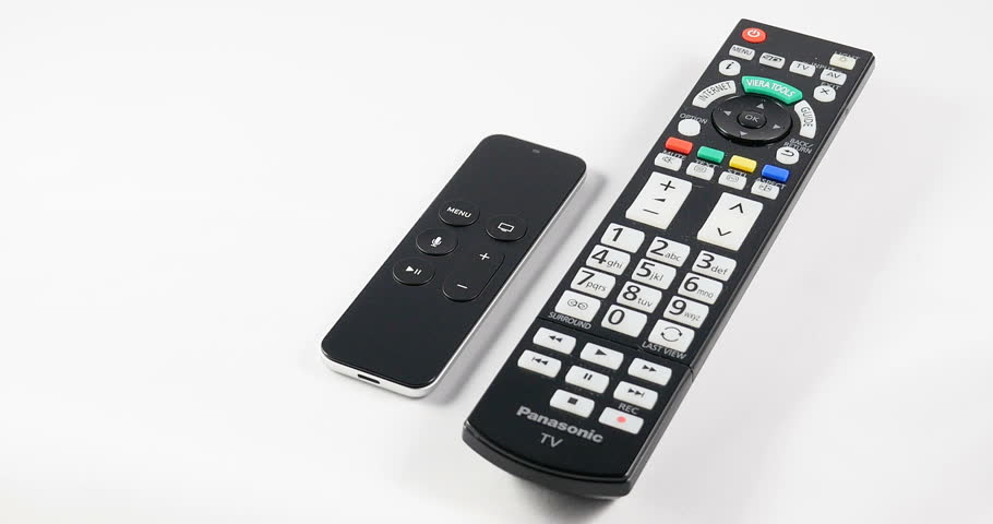
Designres vs engeneers. Engeneers, let designers make their work. They're better in UI.
Make toolbar a thing. It has a lot more advantages, than the current design invented by Notch.

User avatar
5thHorseman
Smart Inserter
Smart Inserter
Posts: 1193
Joined: Fri Jun 10, 2016 11:21 pm
Contact:

Re: Change UI paradigm from Toolbelt to Toolbar

Post by 5thHorseman »

hitzu wrote:Image
I hate those little remotes. The TV ends up having to guess - and guess incorrectly - what I want when I hit one of the too-few buttons. Or the complexity gets transferred to the TV and I have to scroll around in menus for the option I used to have the button for memorized.

User avatar
ickputzdirwech
Filter Inserter
Filter Inserter
Posts: 787
Joined: Sun May 07, 2017 10:16 am
Contact:

Re: Change UI paradigm from Toolbelt to Toolbar

Post by ickputzdirwech »

This has been implemented.
Mods: Shortcuts for 1.1, ick's Sea Block, ick's vanilla tweaks
Tools: Atom language pack
Text quickly seems cold and unfriendly. Be careful how you write and interpret what others have written.
- A reminder for me and all who read what I write

Post Reply

Return to “Implemented Suggestions”