Tighter GUI: smaller titles, smaller frames/bounding boxes

Post your ideas and suggestions how to improve the game.

Moderator: ickputzdirwech

Post Reply
SirHannes
Burner Inserter
Burner Inserter
Posts: 18
Joined: Wed Sep 02, 2020 6:49 pm
Contact:

Tighter GUI: smaller titles, smaller frames/bounding boxes

Post by SirHannes »

Hi,

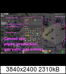
I'd like to suggest to make the main title fonts smaller (like "inventory") as well as the frames/ bounding boxes.

Why: These windows are always in the center, hiding everything behind. As a beginner I often find myself re-looking again, what was needed in that building - oh wait but this information is always hided behind the inventory -> close again.

On the picture you see it again. Also an idea to place the inventory always on the right side to keep the screen clean. :-)
Image
When I ask for features or improvements, it's because I like this game and I think, others could like it too.

conn11
Filter Inserter
Filter Inserter
Posts: 385
Joined: Wed Sep 14, 2016 5:02 pm
Contact:

Re: Tighter GUI: smaller titles, smaller frames/bounding boxes

Post by conn11 »

You know, that you can drag and drop GUIs to any location an the screen?

User avatar
steinio
Smart Inserter
Smart Inserter
Posts: 2633
Joined: Sat Mar 12, 2016 4:19 pm
Contact:

Re: Tighter GUI: smaller titles, smaller frames/bounding boxes

Post by steinio »

An alpha setting for a look through gui option would be neat.
Image

Transport Belt Repair Man

View unread Posts

User avatar
darkfrei
Smart Inserter
Smart Inserter
Posts: 2903
Joined: Thu Nov 20, 2014 11:11 pm
Contact:

Re: Tighter GUI: smaller titles, smaller frames/bounding boxes

Post by darkfrei »

Player inventory in the middle, but entity information OR entity inventory on the right side is a good solution.

Post Reply

Return to “Ideas and Suggestions”