Icons for filter setting icons with generic icons

Post your ideas and suggestions how to improve the game.

Moderator: ickputzdirwech

blizgerg
Inserter
Inserter
Posts: 31
Joined: Thu Apr 28, 2016 11:18 pm
Contact:

Icons for filter setting icons with generic icons

Post by blizgerg »

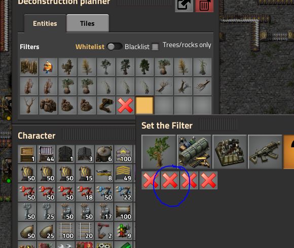
Some of the deconstruction planner filter icons are just a generic 'X' mark and one has to mouse over the icon and read the tool tip to figure out which one does what. This is annoying, inconvenient, and is hard for new players to even find out what they do. Specifically these:

Image
As you can see in the image, you can't tell what any of those filters are just by looking.

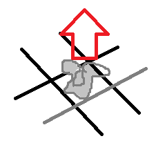
I have an idea for the "Item on Ground" filter which may or may not be applicable to the others. I was thinking that for the item on ground you could do something like a stylized item on a stylized ground with an arrow pointing up similar to something like:


Image

I was thinking the elements in the above image but stylized like this:
Image

I am sure artists can take an idea like this and make something much better.
Post Reply

Return to “Ideas and Suggestions”