I lurk on the forums, but I've seen discussions and mods to help colorblind players. Now, I am not colorblind myself, but I think accessibility is important, so I wanted to brainstorm some ways the game could be more friendly to colorblind players with more visual shorthands, and should not be difficult to implement from a technical standpoint so players who don't want these features can turn them off.
Inserters and Belts
In the field, give inserters a black colored band (I believe this would make it stand out visually against the colored areas) around the two segments of the moving arm, in the shape of an ^ or >, to indicate the inserter's speed in the same manner as belts and underground belts. Burner inserters have none, normal inserters have one, fast inserters have two, and stack inserters have three. For the upcoming bulk inserters, have one and two bands but at increased thickness.
In the menu, differentiate between them by small sideways > signs in the upper-right corner of the icon, once again none for burner, one for normal, two for fast, three for stack, and one and two thicker symbols for incoming bulk inserters. For long-handled inserters, use a -->, easy shorthand to indicate range.
I'd also suggest this system be applied to belts - yellow belts have more frequent yellow arrows on them, reds have them a bit more infrequent, and blue have them least frequent. In the menu icons, yellow belts have one arrow, red have two, blue have three. Undergrounds already have > markings on them, just recolor them a little to pop out more and once again go one-two-three. For splitters, there's a little less real estate for color, but it could still work - a single vertical stripe down the middle of the inserter's V shape for yellow, two on either side for red, three for blue. In the menu once again use arrows in the upper-right corners.
Products
For circuitboards, currently there are three wires running along their length, and that lends itself easily to a visual indicator - green circuits have a single wire, red circuits have two, and blue have three.
Modules, change the formation of the lights on them - left-right diagonal for efficiency, right-left diagonal for speed, clustered in the middle for productivity.
Explosives and cliff explosives, change one to have a single white band around them. Alternatively could just flip or rotate one of them, as-is I wouldn't mind a slightly different icon anyway.
Science packs - different shapes of flasks could be used, if there is a willingness for new models. There's the current one, simple vials/tubes, rounded bottoms, etc. Alternatively and more simply, you could stamp a letter on them for their type - A, L, M, C, P, U, S. This could also be applied to logistics chests - A, B, P, R, S.
Firearm magazines, once again the number of stripes on the side of the magazine - one for tier one, two for armor-piercing, three for uranium. Shells already have color differences one could see, as do rockets, they could simply be made to cover more of the projectile. I'd also make explosive shells have more of a rounded head to make them easier to tell apart from piercing shells; rockets have a smaller profile and fins, so I don't think confusion would arise. Poison and slowdown capsules, I'd make slowdown dark red instead of yellow for better contrast.
Fluids
I think this is the big one that would be a pain, since there's so many fluids in the game. For menu icons, I'd keep the droplet icon already in use for crude oil, use two smaller droplets side-by-side for heavy oil, and three smaller droplets in a triangle (like the heavy-to-light cracking icon) for light oil; the heavy-to-light cracking icon could be changed to two drops with an arrow pointing between them, as this is the only fluid-to-fluid icon one has to worry about keeping track of. For water, a faucet icon with a droplet coming out of it. Finally for lubrication, a droplet being dripped between two gears, kinda similar to the light oil-to-petroilium gas icon, but the gears should make it different enough. Alternative, could be a droplet dripping down from between two gears.
Then comes showing these differences in pipes and barrels in the field. Once again could stamp letters on barrels and pipes - C, H, Li, P, W, S, Lu. A bit more complex, but, barrels could have different lines along the side - one for crude oil, two for heavy oil, three for light oil, four for petroleum. Water could be zero lines, and sulfuric acid, and lubricant could be horizontal lines, one and two.
-------------
I'm very open to feedback, especially from players who are colorblind, on what people think of these ideas and if they have their own.
Concepts for Color-Blind options
Re: Concepts for Color-Blind options
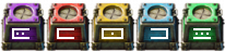
I'd always thought that iconography could be added for logistic chests to help both colorblind individuals as well as just to better communicate what they do. I've attached an example of something that has been kicking inside my head for a while.

Re: Concepts for Color-Blind options
The shape different shape of flasks i've seen a mod do : https://mods.factorio.com/mod/cb-scienceDrakeyC wrote: ↑Sat Jan 13, 2024 6:21 pm Science packs - different shapes of flasks could be used, if there is a willingness for new models. There's the current one, simple vials/tubes, rounded bottoms, etc. Alternatively and more simply, you could stamp a letter on them for their type - A, L, M, C, P, U, S. This could also be applied to logistics chests - A, B, P, R, S.
Different things are used to represent science by other mods , like datacards which as said for circuits have a straight square face like a paper sheet, good for placing a symbol like a gear, droplet, letter ... the risk being that at small scale it's difficult to differentiate without their colors which is the whole point.
I think i'm in the norm regarding seeing colors but i have been playing with mods that adds dozens of fluids, and there was just not enough colors, some ended up being almost the same, if they get mixed up you have to use filter inserters or splitters to have your factory sort them out, not you as a player because you can't ,visually, when they are "on the field" / "on belts".
It is also to some extend the case for ressources that should look very similar, like if you play with "coal", "crushed coal", "charcoal"," coal pellet", "ashes", "refined coal", "coal powder", "carbon", you end up necessarily with very similar looking icons when they are on belts, and it's not so easy to make sure which one is which and they are all the same color, it doesn't prevent playing but it sure does create some headaches and force to play differently, "around" those.
I read your ideas as "how to make good icons", what works and what doesn't, that could be used as guildelines for modders too.
It make sense when you think of it, i like it !
maybe it would be easier to understand if it was a "minus" (" - ") inside the purple chest , and a "plus" (" + ") inside the blue, or maybe a dot and an arrow pointing right on the purple and blue,inside the U, so that one time it show " things goes out" and the other "thing goes in" but it would break the mirror between red and blue, maybe just an arrow point right instead of the middle dot on the active provider, at this point i'm not sure it would have made it easier for me , or in general though
I think it would be funny to show that picture to someone who doesn't play factorio, and ask them what they think the chest of different colors do based on the symbol. Maybe it would be necessary to add some context, like it's in a warehouse or factory, and robots or aliens are moving items. I think it would be a nice puzzle ? riddle ? not sure the exact word but that's why i put the explanation in spoiler, you can make an easier version of "crack the alien code" where you tell beforehand that there exist 5 chests and what they do, and see if people can figure out and associate the function to the symbol, i think they would. I think such symbols could be an overlay from the alt view visible over the whole chest or as a setting or for minimalist /symbolic factorio.
Re: Concepts for Color-Blind options
So something like this?

Re: Concepts for Color-Blind options
I love those logistic icons, easy to identify function but still visually interesting.
Re: Concepts for Color-Blind options
This version i think is more explicit, i would have found faster what it means, but not sure it's better as an icon, not sure how necessary it is that the meaning is "always obvious" instead of something more minimalist like the other version. I like them both anyway
-
landmine752

- Inserter

- Posts: 27
- Joined: Sun Nov 19, 2017 3:35 am
- Contact:
Re: Concepts for Color-Blind options
This is a topic I've been trying to address in an unannounced mod I'm working on. Factorio relies a lot on recolouring, and I have put a significant amount of effort into trying to address this. In doing so, I believe it will help with quickly identifying and understanding an object, not just with accessibility.
You may not realize just how many recolours there are. Inserters, logistics chests, even the ores are recolours. If everything were black and white, you would need the text descriptions when hovering over something.
In the interest in improving the accessibility of Factorio - in the event this is seen by a dev - here is a comprehensive list of the recolours and my approach on a solution. Some are easy fixes, others more complex. My work is not perfect, but perhaps it can help find substitutions for the recolours.
My Solutions+Images