Friday Facts #195 - Poles re-design

Regular reports on Factorio development.
User avatar
MrGrim
Fast Inserter
Fast Inserter
Posts: 241
Joined: Sat Apr 09, 2016 7:58 pm
Contact:

Re: Friday Facts #195 - Poles re-design

Post by MrGrim »

These all look off to me. and I think I know why. In my head (and I have no idea if this is how it is meant to be) the structures of Factorio are to scale with the player. Everything is smaller than what we encounter in real life simply because the engineer is limited in that way without cranes and whatnot. Assembling machines are really chest high. Trains are really barely large enough to fit a few bodies in, etc. :)

The new pole graphics look like they're scaled to more traditional real life poles that are tens of feet tall if not taller. The "v1" poles, especially in relation to everything else in the game, look like the engineer can actually reach them to attach wires with a mild stretch for the large ones.

So, that's it to me.. the scale looks a bit off.
User avatar
bobingabout
Smart Inserter
Smart Inserter
Posts: 7352
Joined: Fri May 09, 2014 1:01 pm
Contact:

Re: Friday Facts #195 - Poles re-design

Post by bobingabout »

ribsngibs wrote:I think the diagonal support struts on the big poles (both v2.a and v2.b) are really confusing in the 45 degree diagonal rotations because of the isometric projection. They just happen to line up with the camera angle so that the diagonal supports look horizontal, and the opposing foreground and background diagonals cross in a perfect X, so your brain interprets the majority of it as if it were a picture taken from head on (no camera pitch), and then the top looks like it's stuck on broken and tilted on an angle.

i.e. when I look at it, my brain interprets the red lines as being horizontal support beams, not diagonal, and then the purple lines as being diagonal X shapes inside each square.

So it looks like a head on side view, and then the top looks like it's on wonky like an Escher drawing.
pole03.jpg
I have to agree. It just looks wrong.
Creator of Bob's mods. Expanding your gameplay since version 0.9.8.
I also have a Patreon.
waduk
Filter Inserter
Filter Inserter
Posts: 372
Joined: Tue Feb 10, 2015 5:44 pm
Contact:

Re: Friday Facts #195 - Poles re-design

Post by waduk »

I got to say, the new model is off for some reason.
I prefer big pole v2.a over v2.b (model wise).

The medium pole v2.b in my head is not rotating, but the top connection is skew.
Medium V2.a is okay though.

The new Small pole was okay, but the rotating shadows looks weird.
Fact_3011
Burner Inserter
Burner Inserter
Posts: 14
Joined: Tue Jun 24, 2014 11:41 am
Contact:

Re: Friday Facts #195 - Poles re-design

Post by Fact_3011 »

I am sorry to say that i don't particularly like any of the new designs. The old ones looked a lot more elegant to me. The new designs are functional, but far less interesting. Their geometry is very big but overly simple in camparison. Rather boring to be honest.

The old big pole had a beam over the top and looked very technical (But I believe I have actually seen similar one's in real life). The new big pole is just a huge vertical metal grid. The new medium pole pretty much got the same unfortunate simplification.

The wood of the small pole is way to bright in my opinion. To me it looks like it is luminous.

I also agree with what other people pointed out.
Xiphoris
Burner Inserter
Burner Inserter
Posts: 15
Joined: Fri Jun 16, 2017 9:04 pm
Contact:

Re: Friday Facts #195 - Poles re-design

Post by Xiphoris »

Feedback from my perspective:

The original poles had iconic shapes, sizes, and colors that made them visually easy to recognize. They also weren't too obtrusive (not too tall).

The new power poles (big v2.a and med v2.a) look too similar to each other, and miss out on the distinctive different shapes that each tier previously had. The angled aesthetic of medium pole v1 is distinctive and I'd recommend carrying it over in v2. The design and color of small pole v2.a is nice because it preserves the same aesthetic as the original.

The big pole v2 designs have a similar shape and color as v1, which is a plus, but I worry that all of the new designs are too large and tall. They seem like they will tower over the rest of the base and draw too much attention to themselves. I'd have to try them out in-game to know for sure, but I'd be concerned about this.

In my view, power poles don't need to be especially eye-catching by default. Once placed, power poles are one of the least important elements of the base. They should fade into the background. They are most relevant while placing buildings and other power poles. The game's display of the covered power grid area tells you what you need to know when placing buildings already with a blue highlight - you don't need to "see" the power poles.

It is helpful to see existing power structures when placing new ones. To make them easier to parse visually, perhaps you could consider giving power structures a colored border highlight while in placement mode, like a yellow glow around existing power poles, and a yellow glow displaying any new electrical lines that will result from the selected placement. I think visual effects that draw attention to the buildings when specifically in placement mode will be preferable overall to changing the artwork to make buildings larger.

Aside from placing new buildings and power poles, I'd like power poles to be recognizable but not dominate the appearance of other structures in the base. Perhaps the big power pole v2 artwork could be used for an extra-high-voltage power line that has even longer range than the original; thus its size could signify that it is an extra powerful version.
Supercheese
Filter Inserter
Filter Inserter
Posts: 841
Joined: Mon Sep 14, 2015 7:40 am
Contact:

Re: Friday Facts #195 - Poles re-design

Post by Supercheese »

I dunno, I like Poland and Polish people, I'm not sure they need a redesign... oh wait-
sekanz
Inserter
Inserter
Posts: 26
Joined: Sat Aug 08, 2015 12:15 am
Contact:

Re: Friday Facts #195 - Poles re-design

Post by sekanz »

Image

What are 7, 11, 12 and 13 for?
mestevesx
Burner Inserter
Burner Inserter
Posts: 7
Joined: Mon Sep 12, 2016 4:18 am
Contact:

Re: Friday Facts #195 - Poles re-design

Post by mestevesx »

sekanz wrote:Image

What are 7, 11, 12 and 13 for?
I guess for "No materials in logistic chests, something to do with roboports and Missing Bots
AndrewIRL
Fast Inserter
Fast Inserter
Posts: 240
Joined: Fri Mar 24, 2017 2:17 pm
Contact:

Re: Friday Facts #195 - Poles re-design

Post by AndrewIRL »

User avatar
DaveMcW
Smart Inserter
Smart Inserter
Posts: 3716
Joined: Tue May 13, 2014 11:06 am
Contact:

Re: Friday Facts #195 - Poles re-design

Post by DaveMcW »

Just avoid big electric poles if it bothers you. I stopped using them after my first game, medium electric poles are superior in every way.
hueich
Manual Inserter
Manual Inserter
Posts: 3
Joined: Sat Jun 17, 2017 7:03 am
Contact:

Re: Friday Facts #195 - Poles re-design

Post by hueich »

Could you make the colors of the warning signs more colorblind friendly? Right now the red and yellow look too similar.
Also, I did like the slanted medium pole from v1. It really makes it unique and steampunk feel. I won't mind style over realism. ;)
torham
Fast Inserter
Fast Inserter
Posts: 187
Joined: Sun May 25, 2014 1:40 pm
Contact:

Re: Friday Facts #195 - Poles re-design

Post by torham »

Some observations.
As MrGrim already said, I was under the impression that all of the machines in factorio are to scale with the player, with assembly machines being the size of perhaps 4x4 meters. The new poles look too high in that concept, but that is just a matter of personal perspective.

The big pole V2.b looks good, and is a perfect upgrade. V2.a also looks very good, but it looks too tall.

The new small pole looks good, but as people said before, the shadow looks weird, even if accurate.

The medium pole V 2.a looks better imo than the V2.b. It looks more practical. As you have pointed out the V1 pole has got iconic design, and I do not think that it is actually that crazy looking. Steel has got superb tensile strength, and should be capable of supporting a diagonal power pole, if the foundations are strong enough. You wouldn't even need the second small support beam. In fact, I have never noticed the small support beam until now.
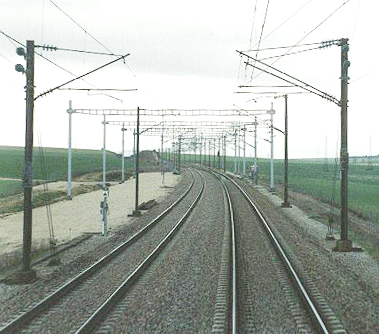
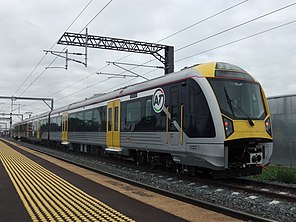
see real world for examples of imbalanced power poles:
Image

Image
kaptcha
Burner Inserter
Burner Inserter
Posts: 12
Joined: Fri Jan 02, 2015 3:30 pm
Contact:

Re: Friday Facts #195 - Poles re-design

Post by kaptcha »

The warning signals look like a logo of a hipster internet marketing startup. :x :x :x
They should get a more industrial/steampunk look.
luc
Fast Inserter
Fast Inserter
Posts: 225
Joined: Sun Jul 17, 2016 9:53 pm
Contact:

Re: Friday Facts #195 - Poles re-design

Post by luc »

Fact_3011 wrote:I am sorry to say that i don't particularly like any of the new designs. The old ones looked a lot more elegant to me.

[...]

The wood of the small pole is way to bright in my opinion. To me it looks like it is luminous.
This for me too. Also keep in mind that the small pole only uses wood and copper. A metal head is a stretch, but also metal on the bottom makes it even more of a metal structure.
User avatar
Tev
Fast Inserter
Fast Inserter
Posts: 149
Joined: Sun Aug 02, 2015 7:42 pm
Contact:

Re: Friday Facts #195 - Poles re-design

Post by Tev »

I love Albert's party-related work, but otherwise I was disappointed. Fact_3011 said it better than I could have:
Fact_3011 wrote:I am sorry to say that i don't particularly like any of the new designs. The old ones looked a lot more elegant to me. The new designs are functional, but far less interesting. Their geometry is very big but overly simple in camparison. Rather boring to be honest.

The old big pole had a beam over the top and looked very technical (But I believe I have actually seen similar one's in real life). The new big pole is just a huge vertical metal grid. The new medium pole pretty much got the same unfortunate simplification.

The wood of the small pole is way to bright in my opinion. To me it looks like it is luminous.
Please keep old medium pole's design.
Engimage
Smart Inserter
Smart Inserter
Posts: 1069
Joined: Wed Jun 29, 2016 10:02 am
Contact:

Re: Friday Facts #195 - Poles re-design

Post by Engimage »

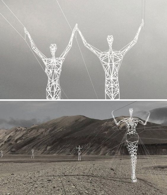
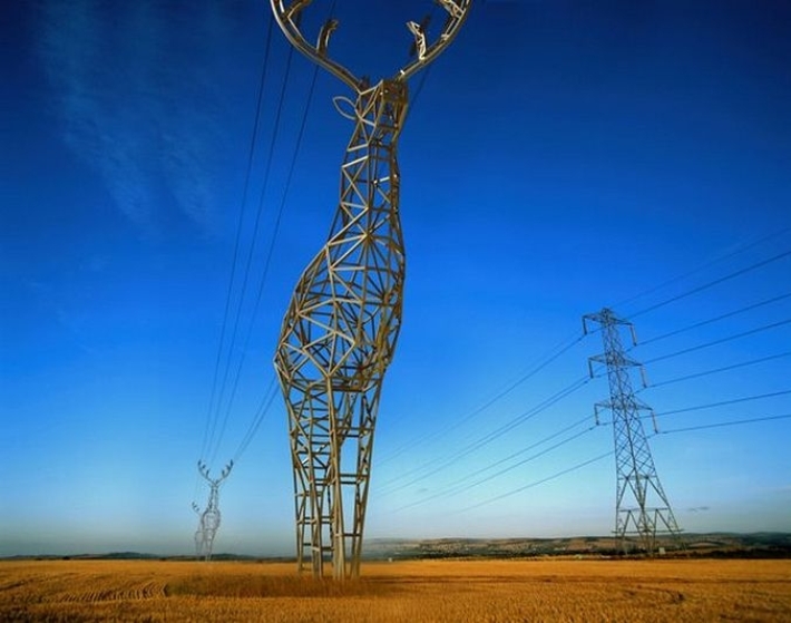
Just for lols. Getting creative with power poles:
Image
Image

But really I would expect the following:

Wooden pole being classicly wooden and symmetric like this
Image

Medium power pole is really iconic to Factorio as it is now so I would expect HD redesign of its current form

As for big poles - "a" looks too slim for 2x2 design. While "B" fits better imo it looks too "strong". I think it would look better if you used more slim bars in design while keeping its general design.
torham
Fast Inserter
Fast Inserter
Posts: 187
Joined: Sun May 25, 2014 1:40 pm
Contact:

Re: Friday Facts #195 - Poles re-design

Post by torham »

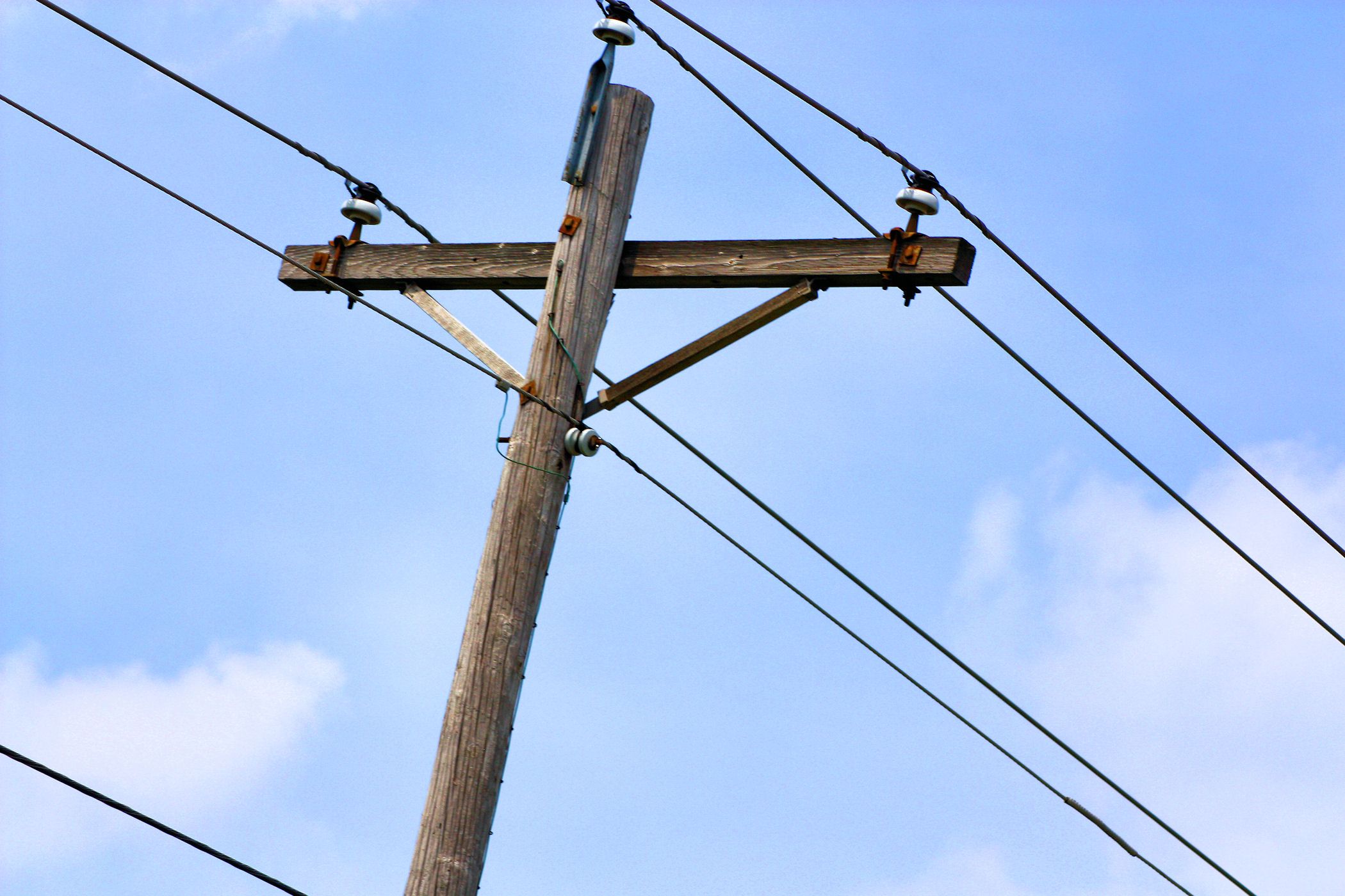
Just to throw it out there, I really liked this power pole that stands next to my house...
Attachments
power pole.jpg
power pole.jpg (140.71 KiB) Viewed 8456 times
mathturtle
Inserter
Inserter
Posts: 45
Joined: Sat Jan 21, 2017 8:19 pm
Contact:

Re: Friday Facts #195 - Poles re-design

Post by mathturtle »

The small and big poles I don't have a really strong opinion on although the new big pole looks *strange* for some reason (but I can't figure out why).
Also, I did like the slanted medium pole from v1. It really makes it unique and steampunk feel. I won't mind style over realism. ;)
This.
aober93
Filter Inserter
Filter Inserter
Posts: 453
Joined: Tue Aug 30, 2016 9:07 pm
Contact:

Re: Friday Facts #195 - Poles re-design

Post by aober93 »

I think the distinction of the poles has to have #1 priority. IMO the big pole's 2 tile wide base achieves this. But for medium to small pole i propose to make their tops stand out better. For example the wooden pole's top should be all wood. Or the medium pole having bigger insulators.
The big pole could also use bigger insulators
Escadin
Fast Inserter
Fast Inserter
Posts: 181
Joined: Thu Mar 17, 2016 3:15 pm
Contact:

Re: Friday Facts #195 - Poles re-design

Post by Escadin »

I don't like the new poles :x

1) I think they are too bright which would make them stand out in a negative way.
2) They look too... not sure how to call it. Sterile? I mean every other model has an abundance of cables, gears and tubes creating that magic, steampunk like machinery theme where there is lots to discover. It implies complexity vividness, makes them look playful and mysterious. On the other hand, these poles are nothing like that. It's just plain steel bars in perfect symmetry. I would have expected something more like the works of a mad scientist toying with electricity. Crude and with cables (not all of them connected or perfectly insulated) hanging everywhere. Or like the work of a lazy electrictian along the meme of "trust me, I'm an engineer" who skipped the steps of planning and designing before building.

The old models had more details to offer even in their subpar resolution. These new poles feel like a step back.
"--? How are commands compounded in a compounded compound command commanding compound composts." -defines.lua
Post Reply

Return to “News”