Friday Facts #212 - The GUI update (Part 1)
Re: Friday Facts #212 - The GUI update (Part 1)
I think... That is very hard for me, a non-GUI specialist, to send you good advice ! Some ideas come to my mind, but what if they're the common bullshit ideas every GUI noob comes with ?
I'd risk one : perhaps a little too much of "volumetric borders" (the ones that are clear at the top and dark at the bottom) ? Some are good, but now there seem to be volume in a volume in a volume in etc...
Anyway this is since FFF-191 my most awaited progress in the game development, and I like very much what you're planning !
Re: Friday Facts #212 - The GUI update (Part 1)
Wow this looks so awesome! A more interactive map view will help really much
This! Reorderable stops would really improve usability. Inserting a stop at the wrong place and having to remove and redo it is kinda tedious.maniak1349 wrote:New train UI is definitely looking good.
Will the stops and the rules be dragable?
-
- Fast Inserter
- Posts: 106
- Joined: Thu Jul 30, 2015 7:11 pm
- Contact:
Re: Friday Facts #212 - The GUI update (Part 1)
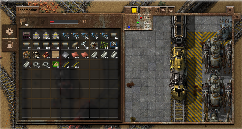
That rust skin looks awesome. The numbers in the color picker are a little hard to read, but it would be easy enough to fix.
Re: Friday Facts #212 - The GUI update (Part 1)
to be able to select trainstops on the drag/zoomable map to add them to the scedule is such a huge step. esp if you got 20+ unique stations. holy macaroni i love it.
-
- Fast Inserter
- Posts: 123
- Joined: Mon Oct 10, 2016 11:28 pm
- Contact:
Re: Friday Facts #212 - The GUI update (Part 1)
Does this mean 1.0 will be delayed? I think it was mentioned somewhere that 0.16 was supposed to be the release candidate, which after debugging would become 1.0. Now we are talking about 0.17...
I don't mind, just curious.
Re: Friday Facts #212 - The GUI update (Part 1)
Are the gui improvements you showed us in fff-191 going to be available in 0.16?
Because that is the change I want to see as soon as possible.
Last edited by Gergely on Fri Oct 13, 2017 8:40 pm, edited 1 time in total.
Re: Friday Facts #212 - The GUI update (Part 1)
I love everything presented about new gui including its stylish looks
-
- Burner Inserter
- Posts: 18
- Joined: Sat May 07, 2016 10:54 am
- Contact:
Re: Friday Facts #212 - The GUI update (Part 1)
Since you are reworking the train coloring window I would like to request that you add the ability to color the train based on an item's color (i.e. select a red science pot and the train's color is set to red, green science pot changes to green... etc) I have wanted my trains to be the color of it's cargo and I have a hard time finding good shades. I have seen mods that are able to do this and I think it is such a great idea that it could be incorporated into this GUI change.
On top of this request it would be nice if you could color different engines from the same GUI for example if you are running a double headed 3 engine train with 10 wagons (3-10-3) you could have 3 (mirrored on engines based on direction facing) or 6 (one for each engine) options of items to choose from to color the engines.
Thank you and keep up the awesome work!!!
Re: Friday Facts #212 - The GUI update (Part 1)
Get something working, try to kick it up a notch.
Repeat.
Love it.
---
For adding a station, could you have an option to order the list by pathfinder distance from the train's current location or the currently-gui-selected stop?
Repeat.
Love it.
---
For adding a station, could you have an option to order the list by pathfinder distance from the train's current location or the currently-gui-selected stop?
-
- Long Handed Inserter
- Posts: 67
- Joined: Fri Jan 02, 2015 11:46 pm
- Contact:
Re: Friday Facts #212 - The GUI update (Part 1)
Thanks. That helped me figure out order of operations. Unfortunately, as you said, UI is still an issue, and it makes things likeTeraka wrote:It doesn't solve the issue of it not being intuitive but here's an easy way to remember it: AND is like logical multiplication (1x0 = 0, 1x1 = 1) and OR is like logical addition (0+0 = 0, 0+1 = 1, 1+1 = ... well 1 but you get the idea), and just like for regular arithmetic, you resolve the multiplications before resolving the additions, so X AND Y OR Z = (X AND Y) OR Z.deef0000dragon1 wrote:Finally, I personally have always found it difficult to parse the train logic, so I am not always sure in what order the AND and OR conditionals apply. It may be useful to add parenthesis type conditionals or something to make it easier to read.
(q|w)&(e|r)
need to become become
(q&e)|(q&r)|(w&e)|(w&r)
which MAY show that the system needs a look over.
Re: Friday Facts #212 - The GUI update (Part 1)
I'm drooling over that new GUI. Also, 0.17 confirmed - which I'm assuming means some extra stuff will be added as well, because, you can't have a majority of the devs doing nothing forf the final version (assuming that 0.17 will be the final version). Also, 0.16... soon. I really need to get better at waitng for things, it appears.
There are 10 types of people: those who get this joke and those who don't.
Re: Friday Facts #212 - The GUI update (Part 1)
I don't like the look of the new GUI, even if I am all into all the quality of life improvments offers.
But fuck me, I'm here since 0.11 and it's your game.
You have my thumb up.
But fuck me, I'm here since 0.11 and it's your game.
You have my thumb up.
I'm not english, sorry for my mistakes
Re: Friday Facts #212 - The GUI update (Part 1)
Registered an account to post...
This. I would very much appreciate an option to turn off transparent windows as well. I think they look really nice, but it hinders clarity especially for certain items/situations. I'd much rather have a flat background color.stretch611 wrote:I'm probably in the minority here... but can you avoid the transparent windows please; or at least have an option to turn them off.
Re: Friday Facts #212 - The GUI update (Part 1)
I think others have touched on this... The current paradigm is that you pick a train and then you design a route for it.
I feel like it would make more sense to design a route, and then assign that route to one or more trains.
You could keep a set of routes like a set of blueprints.
You could copy a route and then modify it: For instance, use this "Drop off at iron ore processing" route but with this iron ore patch instead.
You could also modify a route and have all the trains assigned to it change, as when you want trains hauling iron ore to keep hauling it, but from a different patch.
Re: Friday Facts #212 - The GUI update (Part 1)
A few of quality of life improvements I would like for the GUI.
- Destinations should drag-able (or use up/down arrows) in order to rearrange the station list.
- The ability to switch a destination but keep the current wait conditions (useful for decommissioning a mining outpost and using the trains for other outposts).
- An option to have a train automatically switch to manual mode upon arrival at a designated station (personal and outpost building trains would massively benefit).
- A slim mode where only the stations are listed and the conditions are hidden, view-able by expanding the menu by clicking the station.
-
- Fast Inserter
- Posts: 230
- Joined: Wed Jun 08, 2016 6:16 pm
- Contact:
Re: Friday Facts #212 - The GUI update (Part 1)
These Graphics are the best I have ever seen(i think), and i love the ctrl-click temp station feature. <3
And i love the path coloring.
and i love... wait... Everything!!!
And i love the path coloring.
and i love... wait... Everything!!!
Re: Friday Facts #212 - The GUI update (Part 1)
I love the new gui design! It's a huge improvement. I hope you also add an option to change the order of the train stations, this was a feature I was always missing.
I like Marcus idea of adding a texture to the gui A LOT ! It looks so much better with this rust skin already, it just doesn't fit the current game style. But in general i think you should work with adding textures to the games gui, to give it a professional look.
Tomik wrote:Like [Marcus] 猛虎爆進拳 proposed on Steam, I support his motion to add an Alternate Skin option for the GUI..for those of us who love the Fallout-y look of the game:
-
- Burner Inserter
- Posts: 6
- Joined: Fri Dec 11, 2015 10:27 pm
- Contact:
Re: Friday Facts #212 - The GUI update (Part 1)
here's a thought (thank my brother), having a stop in a train schedule that the train visits on a condition (ex: low fuel)
maybe they would check the conditional stops first, then continue with their schedule before they leave a station
so you can have a refuel stop, and trains only visit it when their fuel is low;
or trains only go to the stations they have to, so if you're making more iron then copper, then the green circuit factory trains only go to the iron smelter when they're low/have no iron, letting them visit the copper smelter more often
-
- Fast Inserter
- Posts: 104
- Joined: Tue Nov 15, 2016 10:56 pm
- Contact:
Re: Friday Facts #212 - The GUI update (Part 1)
I totally second this. Or an option to keep favorite colors... every new game I go to the internet to find the right numbers or iron ore, copper, etc.kane.nexus wrote:Since you are reworking the train coloring window I would like to request that you add the ability to color the train based on an item's color (i.e. select a red science pot and the train's color is set to red, green science pot changes to green... etc) I have wanted my trains to be the color of it's cargo and I have a hard time finding good shades. I have seen mods that are able to do this and I think it is such a great idea that it could be incorporated into this GUI change.
On top of this request it would be nice if you could color different engines from the same GUI for example if you are running a double headed 3 engine train with 10 wagons (3-10-3) you could have 3 (mirrored on engines based on direction facing) or 6 (one for each engine) options of items to choose from to color the engines.
Thank you and keep up the awesome work!!!
I see that new sand there too... so much drool
"And then Bender ran."
Re: Friday Facts #212 - The GUI update (Part 1)
I hope we’ll be able to skin it and change layout.