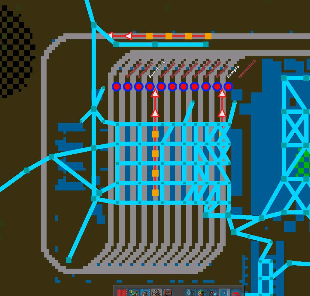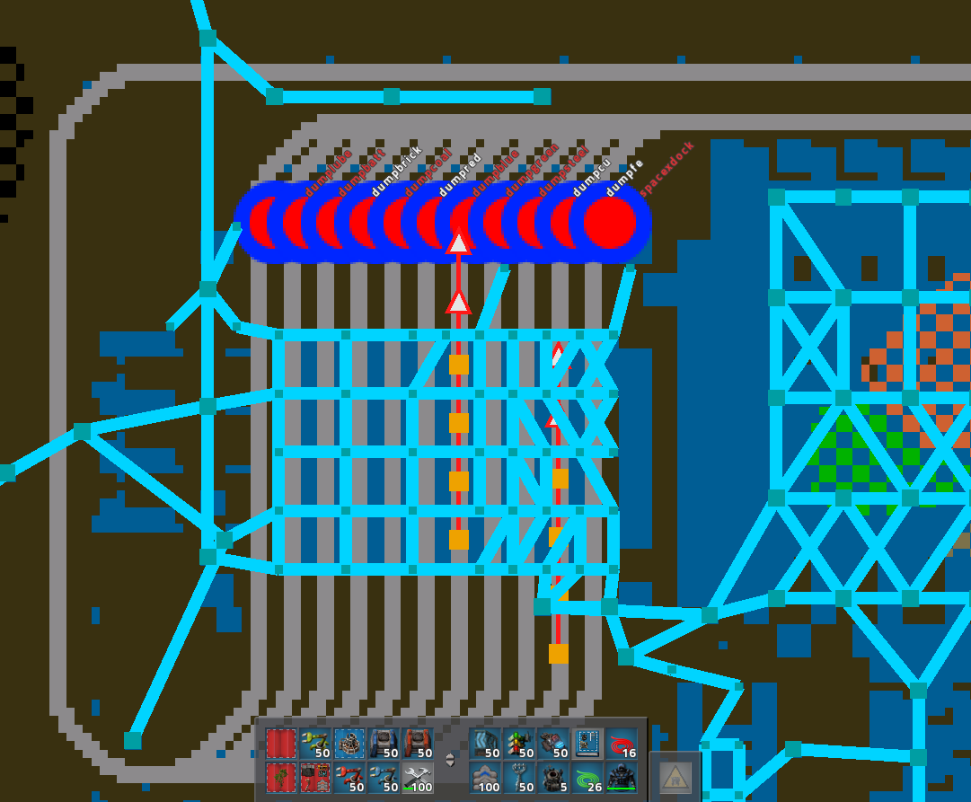
The station labels start at the edge of the circle icon for the station. But at higher zoom-in, the circle is disproportionately large for how big a station really is on the map, so they overlap and the station labels appear offset.
You can see in the image above that the "spacexdock" station label is on the circle for its station.
But because the circles for stations are so huge, the other labels, like "dumpfe" appear over top of the station to their right (though they are, in fact, starting on the edge of their own station circle icon).
Station labels appear offset due to size of station circle
-
- Manual Inserter
- Posts: 4
- Joined: Sun Jul 30, 2017 2:42 am
- Contact:
Re: Station labels appear offset due to size of station circle
Fixed for the next version. (The circles won't be so big when zoomed in).
-
- Manual Inserter
- Posts: 4
- Joined: Sun Jul 30, 2017 2:42 am
- Contact:
Re: Station labels appear offset due to size of station circle
The smaller circles do help distinguish near , but I would argue that the text's "radius" from the center of the circle should also be smaller, so that the station name begins closer to their circle.