A question, what are some good "introductory" settings for Rampant? I'd like it to give me a bit of a challenge defending my massive base, but not overwhelm me right off the bat (as happens with default settings).
While this is probably due to base design, I'd like to be able to tone things down a ...
Search found 4 matches
- Sat May 05, 2018 2:30 pm
- Forum: Mods
- Topic: [MOD 0.13.17+] Rampant
- Replies: 648
- Views: 524665
- Fri Dec 15, 2017 3:40 pm
- Forum: Resolved Problems and Bugs
- Topic: [16.3] Crash on start on: "d3d_lock_region"
- Replies: 15
- Views: 13180
Re: [16.3] Crash on start
I also have this error.
- Fri Aug 04, 2017 3:11 pm
- Forum: Resolved Problems and Bugs
- Topic: Station labels appear offset due to size of station circle
- Replies: 2
- Views: 3970
Re: Station labels appear offset due to size of station circle
The smaller circles do help distinguish near , but I would argue that the text's "radius" from the center of the circle should also be smaller, so that the station name begins closer to their circle.


- Sun Jul 30, 2017 2:49 am
- Forum: Resolved Problems and Bugs
- Topic: Station labels appear offset due to size of station circle
- Replies: 2
- Views: 3970
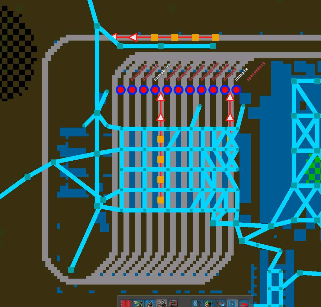
Station labels appear offset due to size of station circle
The station labels start at the edge of the circle icon for the station. But at higher zoom-in, the circle is disproportionately large for how big a station really is on the map, so they overlap and the station labels appear offset.
http://i.imgur.com/1lY27kl.png
You can see in the image above ...
http://i.imgur.com/1lY27kl.png
You can see in the image above ...