

Original post
I apologize in advance for how forceful this is going to be, I feel very strongly about this.
I've been very excited for the new character GUI and the GUI overhaul in general. I like GUIs, so much so that I have created several mods with large complicated GUIs that I make to fit the post-0.17 style. So when I saw that the character GUI had been released, I started foaming at the mouth.
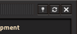
Then... I saw THIS:
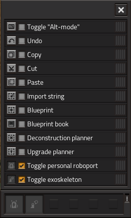
...WHAT!?
Here you have this nice, compact, easy-to-use interface. The buttons are sized relative to each other in a good way that makes them harmonize well. Then... THEN, you have this giant awful monster of a button up at the top that completely throws off the balance, and just looks bad. You can't honestly tell me that that close button actually looks good relative to the rest of that GUI. It doesn't fit in; it sticks out like a sunbather in a snowstorm. Just... ugh.
I would like to please, please, PLEASE request that the frame header button size be restored to what it was before. Before, the close button would fit in perfectly with the rest of the GUIs. Now... it's simply ugly.
This GUI is the best example of why I dislike the large frame buttons, but the same holds true with the rest of the GUIs that have close buttons. It looks bad everywhere.
/rant
I've been very excited for the new character GUI and the GUI overhaul in general. I like GUIs, so much so that I have created several mods with large complicated GUIs that I make to fit the post-0.17 style. So when I saw that the character GUI had been released, I started foaming at the mouth.
Then... I saw THIS:
...WHAT!?
Here you have this nice, compact, easy-to-use interface. The buttons are sized relative to each other in a good way that makes them harmonize well. Then... THEN, you have this giant awful monster of a button up at the top that completely throws off the balance, and just looks bad. You can't honestly tell me that that close button actually looks good relative to the rest of that GUI. It doesn't fit in; it sticks out like a sunbather in a snowstorm. Just... ugh.
I would like to please, please, PLEASE request that the frame header button size be restored to what it was before. Before, the close button would fit in perfectly with the rest of the GUIs. Now... it's simply ugly.
This GUI is the best example of why I dislike the large frame buttons, but the same holds true with the rest of the GUIs that have close buttons. It looks bad everywhere.
/rant


